
So you already know Sketch, but you would like to work faster. To achieve this you have to learn more advanced features and techniques.
Let’s move your workflow to the next level.
In this tutorial, you will learn how to:
- Speed up your workflow with Plugins
- Symbols help to reuse elements
- Improve design consistency with Styles
- Get most of the Color Variables
- Make Prototypes in Sketch
- Structure files in Libraries
- Share your projects in the Cloud
- Improve design quality with Assistants
Grab the mug of your favorite coffee and… Let’s begin!
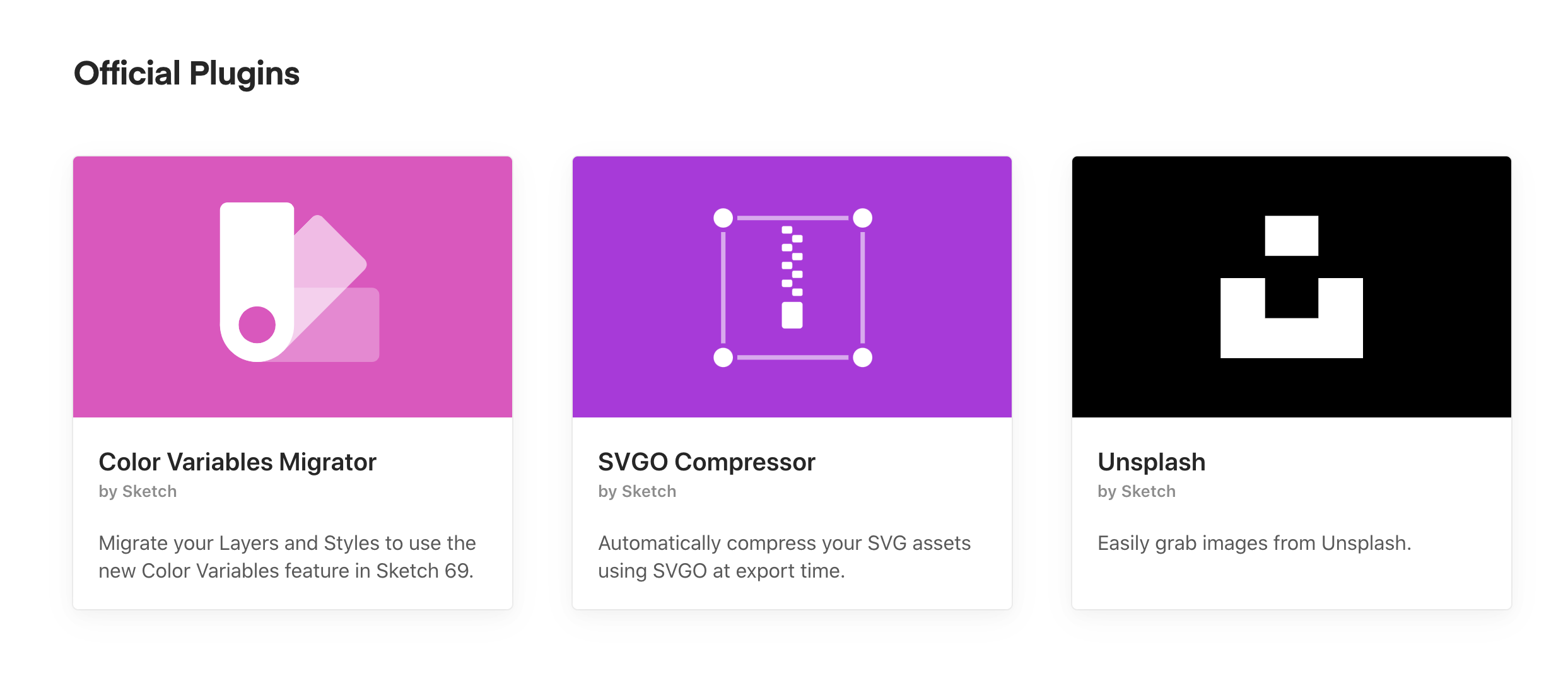
1. Plugins – lots of helping hands!
Sketch is an all-in-one tool for digital design. However, it may become even more powerful. Plugins are tiny pieces that bring more features to Sketch.
There are plugins that help you:
- Rename layers quickly
- Help you manage styles
- Automate parts of your work
- Export design to other programs (like After Effects)
- Export your work for print
- Create abstract graphics
- Tidy your workspace
To start your journey with plugins, I recommend to get the following ones:
- Automate Sketch – lots of useful actions that automates work
- Rename It – helper for batch rename layers and artboards
- Sketch Runner – is like a shortcut for lots of actions.
To pick more plugins that you may need – read the following article:
Sketch app Universe – Tools, Plugins, Services that saves your time
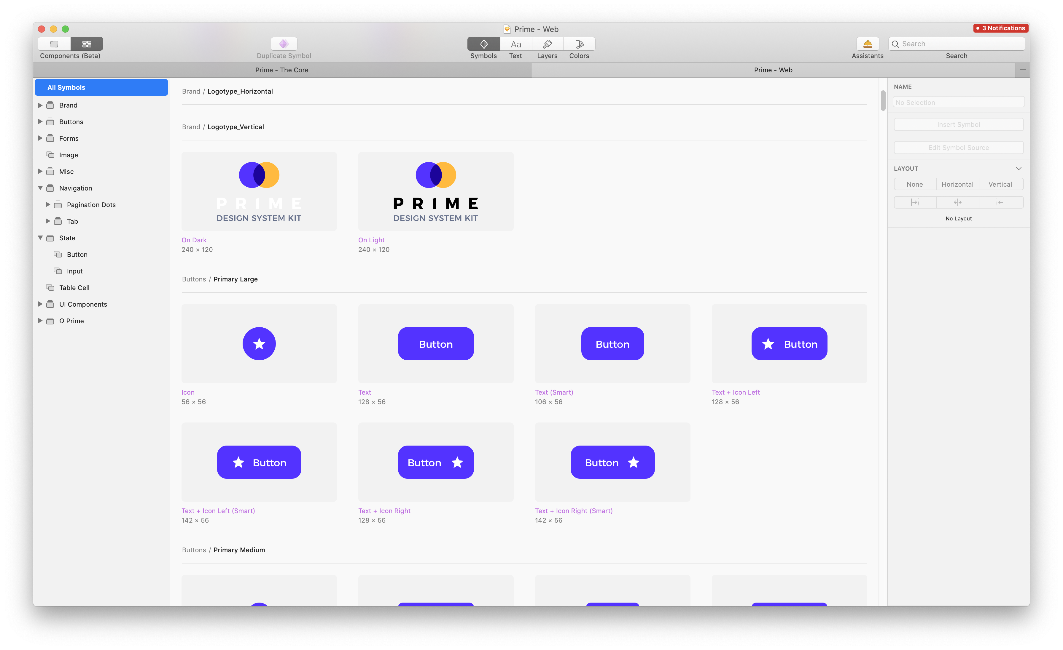
2. Learn to reuse elements with Symbols
Imagine the situation – you created a nice blue button; let’s call it – Primary Button. You placed it in a few mockups. It looks gorgeous, but you would like to modify the corner radius a bit. Now you have to edit all buttons in those 15 mockups! Time to discover Symbols! With Symbols, you will have to modify only one “core” element. All changes will be applied to the remaining instances.
What are Symbols?
Symbols help to reuse elements. Basically, Symbol is like an artboard, but you can use its instance in your designs. When Symbol changes, all the same elements are also updated.
To create a new Symbol, select the existing Artboard or group and choose “Create Symbol” option in the toolbar.
Usually, new Symbols created this way are moved to the new page called “Symbols.”
What are the Symbols Overrides?
Let’s stick to the “Primary Button example” – What if you would like to change its label? Symbols, by default, use the same appearance, but you may change it with Overrides!
Overrides allow you to modify the following Symbol’s instance parameters:
- Text content
- Layer Styles
- Text Styles
- Images
- Change nested Symbols (Symbols instances inside Symbol)
To start your journey with Overrides, select the created Symbol instance and look for the “Overrides” section in the Inspector Panel (the one on the right).
Learn more about Symbols Overrides
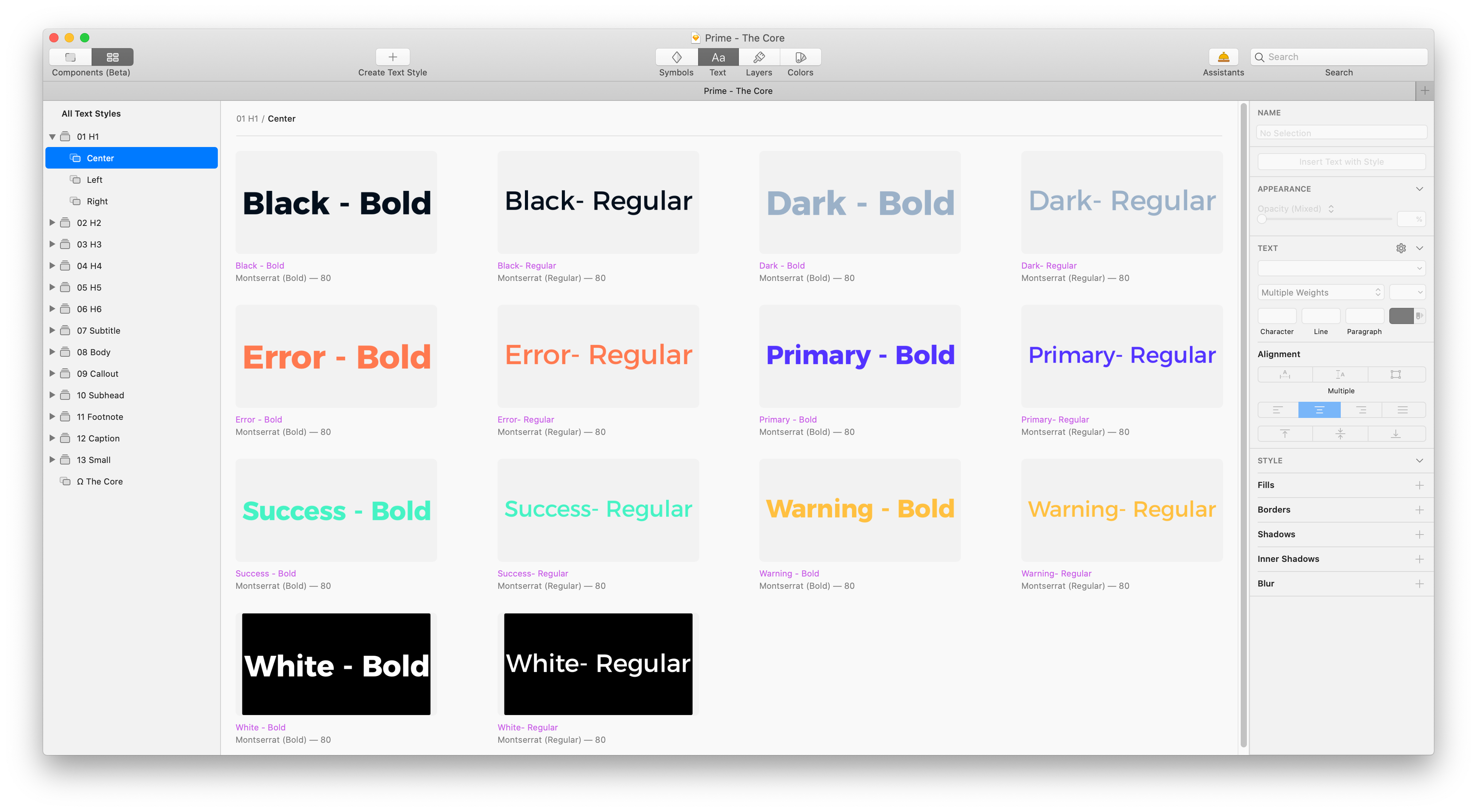
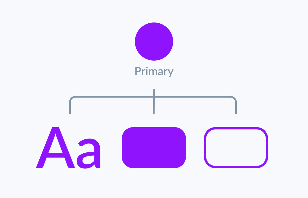
3. Improve UI consistency with Styles
Your Primary Button has got blue color, checkbox, and dropdown too. However, you would like to change it to a more vivid tone. Do you have to find all these elements to update the color? If you use Styles, you will have to change it only in one place!
Styles may be applied to Layers and Text. They help us to maintain consistency across the project. Thanks to them, you may modify the appearance of the elements quickly. With Styles, you may save multiple parameters.
Layer Style parameters:
- Fills
- Border
- Shadow
- Inner Shadow
- Blur
- Opacity
Text Style parameters:
- Font
- Weight
- Size
- Alignment
- Spacing
- Opacity
Organizing Styles
When you start organizing your styles, you will notice that a good naming convention is a key to the future speed of work.
I have described how to set up a good naming convention when I was creating my UI Design Starter Kit.
First of all, you have to know that to structure styles in groups. You should use “/”. Thanks to this, you may create styles named “Primary/Primary”, “Primary/Primary 50%”, and they will be visible in one group.
You should think of your styles when your project grows and modify them to adjust its requirements. To get most of the styles, you should know how to use the Components View and Insert Window.
Components View
To open Components View, press the tab in the top left corner to switch to full window components view.
On the top toolbar, you will find tabs to switch between Symbols, Layer and Text Styles, and Color Variables. This is the center for all your documents components. The components from Libraries are not available here.
You are able to create a new Style (Layer or Text) and Color Variable here. Optionally you may even duplicate the existing Symbol.
Components are easy to find, thanks to the search field – available in the top right corner.
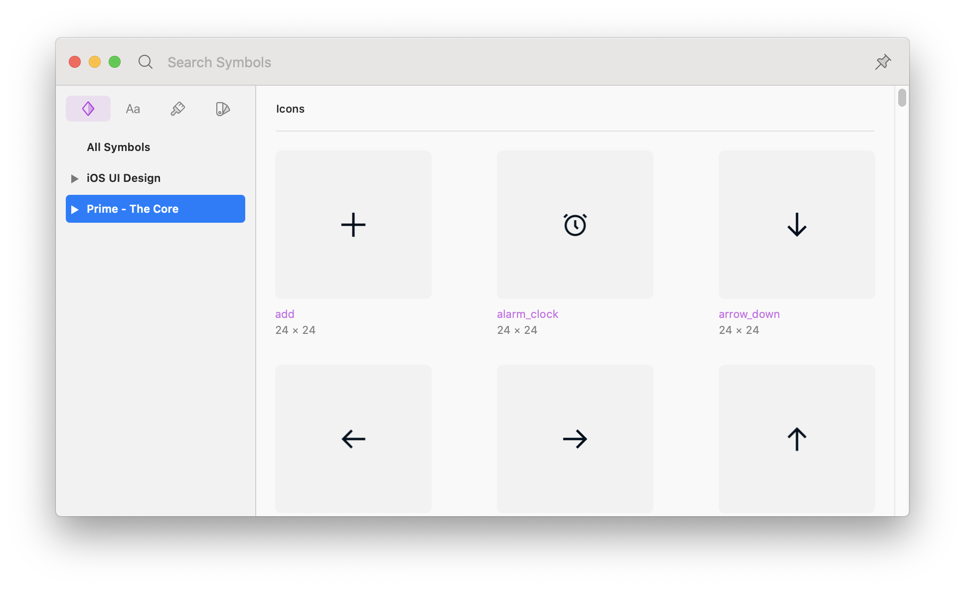
Insert Window
Libraries (You may find Libraries description in the next sections) includes lots of components. The fastest way to find them is to search them. Digging through endless menu levels is always slower.
The Insert Window is the best way of finding components. It is worth knowing how to use it. Here is a workflow that works for me the best.
- Launch Insert Window – press “C.”
- Select the component category (Symbol, Text or Layer Style, Color Variable)
- Pick a library (this may be all libraries, current document or a specific one)
- Browse or search (I love to search by typing names of components, but you may browse categorized grid)
I must admit that this is a very convenient feature, and my own UX/UI Kits are so fast to use with Insert Window.
2. Color Variables – helpers for your Styles
Color Variables are available since Sketch 69. They are basic blocks for your UI Library. Variables may be used as colors of all types of elements – Fills, Borders, Layer Styles or even Text Styles.
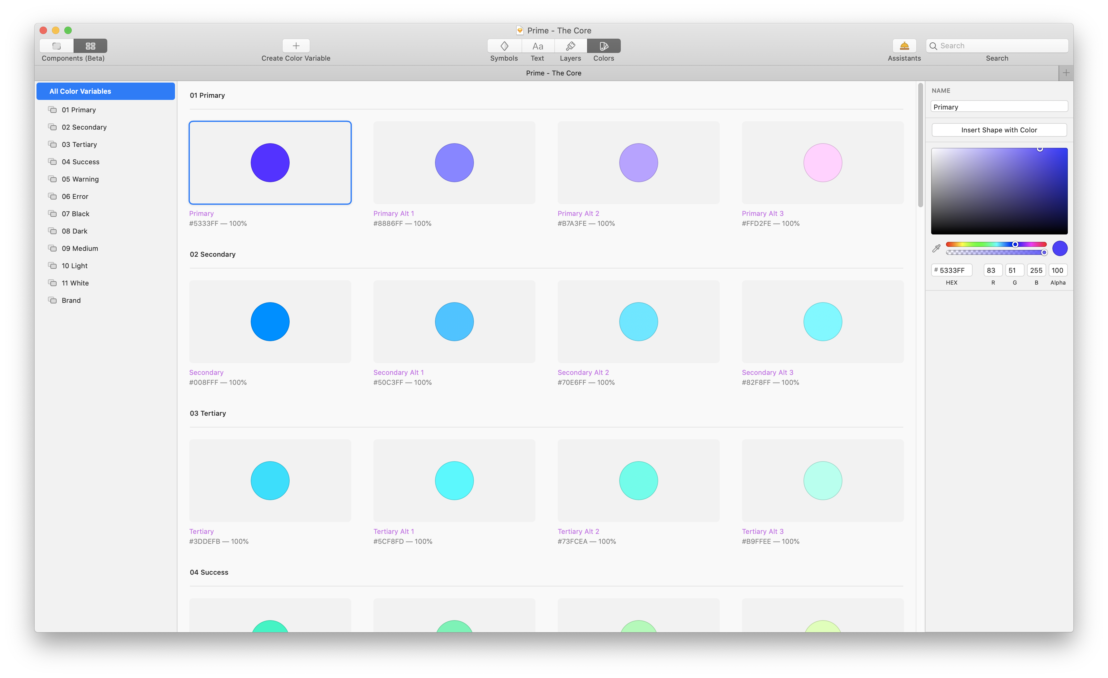 Creating, Editing, and Managing Color Variables
Color Variables work similar way as Layer Styles. However, they are more independent. They have got dedicated space for management. To learn how to add, delete, or edit them feel free to read this comprehensive tutorial:
Good Practices for Color Variables
Here are a few tips to start working with Color Variables:
- Just like with Styles, you have to name your variables with purpose. Do not use “Red, Yellow, Green or Blue”. Use meaningful names like “Primary, Secondary, Warning or Success.”
- Bind the same Color Variables with Fill, Border, and Text Styles. Thanks to this, when your “Primary Color” will change, it will be automatically updated in all mentioned elements.
- Use Variables instead of basic Layer Styles. If your Layer Styles include only color value, consider switching them right into Variables.
4. Discover Prototyping
Sketch is the perfect tool for simple prototyping. You do not have to export your mockups to other software.
To start the adventure with prototyping, select the element that will be clickable (it have to be inside Artboard) and go to the Prototyping section in the Inspector panel (on the right). Click “+” and select the Artboard that will be opened after the interaction.
You may add one of the basic transitions between the pages to create an illusion of the real app. It is worth mentioning that Links may be overridden, just like the styles.
To preview the prototype, find “Preview” icon in the toolbar or go to Prototype > Preview Prototype…
Learn more about prototyping in Sketch
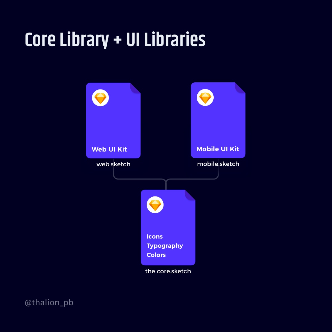
5. Structure your work with Libraries
When your project grows, you may want to organize your elements into multiple elements. One may be used to colors and styles. The second for icons. The other one for UI elements. These files will be your “Libraries.” You may link them in Sketch and use it with your Team.
Libraries give you access to included Styles and Symbols. Other files may use these elements. Normal artboards or elements will not be accessible outside the Library.
6. Share your projects – Learn to use Sketch Cloud
The ability to have your documents in the Cloud has got multiple benefits. First, backup – you do not have to worry that your files will be gone when you lost your mac. Second, file sharing, you may allow other designers to work with your file or share developer handoff with the team.
Third, file versioning, Sketch Cloud gives you access to file history.
With a Personal License – All documents are private by default, but you may share them with others. You may set up your file to let others leave comments, download documents, or make them as Libraries. Note: you have to have your Sketch License active.
With a Teams, subscription – You can do all things mentioned in Personal License. You may also invite members to collaborate inside a shared workspace. In the future, you will be able to work in Realtime with other designers on one file.
Sketch Cloud is also used to share prototypes.
Learn more about Sketch Cloud.

Design Faster in Figma and Sketch
Never start Your work from scratch. Use the Kit that already have 1500+ components with well structured styles, variants & auto layout.
Use Prime Design System Kit to boost your workflow. Create for Web, Mobile, and Desktop. You may use it as the entire UI Library for Design System or just create Landing Page for your next Client. Perfect for those who want to save time while creating UI designs and learn best practices of Figma and Sketch at the same time.
7. Let Assistants validate your files.
Assistants are a quite fresh thing is Sketch. They analyze your file and suggest improvements.
Assistants are automatically installed in Sketch when you click the link from the official directory. You have to select an Assistant for each file you work with.
You may explore official assistants directory to find the one for you.
8. Learn useful tricks
Sketch is a wonderful tool that lets you quickly start creating design stuff. It also includes some techniques and shortcuts that allow you to achieve more.
I have written some articles with unique tricks to achieve various effects in Sketch. Feel free to read them:
10 Sketch Tricks Useful in Your Daily Workflow
10 More Tips to Boost Sketch Workflow
To conclude
Now you know where to continue your journey in Sketch. Think of every included point as of the level in Sketch proficiency. I am sure you will learn all of them quickly.
By the way…
If you start a new project or would like to organize your UI Library in Figma — do not waste your time creating everything from scratch. Feel free to use the Prime — Design System Kit. It helps you design UI with the best Figma techniques — Component Properties, Variants, Auto Layout and more.See Prime in action.
To make it easier there is a gift 🎁 - Use UXMISFIT10 offer code to get 10% Off.

You can also Create User Flows faster in Figma & Sketch — With SQUID you can create User Flows directly in your favorite design tool. You may style them to your project brand within a couple of clicks. Prepare all kind of diagrams in minutes. See how it works.


