If you have always wanted to kick off your projects quickly, Prime is the tool that you need. Let me show you how within a few minutes, you will set up all foundations for the new project and be able to focus on the most exciting things.
What is Prime?
First, Prime is a Design System Kit, maybe called also Starter Kit. This means that it is not a standard UI Kit.
Its goal is to be quickly customized to your project branding and style and serve as the foundation for design work.
Prime for Figma includes the following categories of elements:
1. Foundations
The most base elements that you interact with at the beginning of your project:
- Color Styles
- Typography Styles
- Shadows
- Blur Styles
- Grids & Spacing
- Icons
What’s more, Prime adds to it handy resources useful for all projects. Some are top-notch resources from Figma Community creators, and some were made especially for kit purposes. There are literally more than a thousand of components in this category:
- Flags
- Company Logos
- Placeholder Logos
- Payment Methods
- Charts
- Vector Device Templates (MacBook, iPhone, Apple Watch)
2. Components
The vast collection of thousands of UI components includes all elements you need for Desktop, Web, and Mobile design.
Just to remind you, since the component property feature was released, it does not matter how many components the kit have. It’s more about the right usage of properties. All elements created in Prime natively support the latest Figma features to ensure the best comfort of use for you.
Just to briefly mention, categories of components including:
- Avatars
- Badges
- Alerts
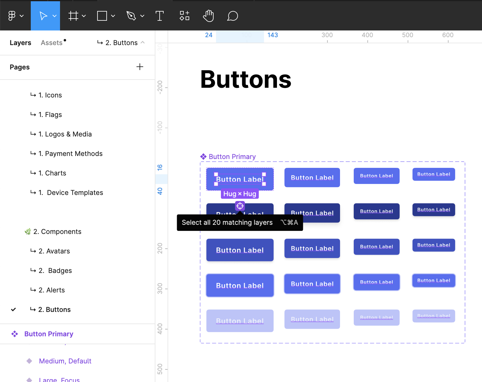
- Buttons
- Button Groups
- Breadcrumbs
- Cards
- Content Cards
- Inputs & Dropdowns
- List Items
- Modals
- Menus
- Pagination
- Pricing
- Progress indicators
- Sliders
- Tables
- Tabs
- Toggles
- Tooltips
There are also categories for the specific use of the components like Web ones, that include:
- Navigation Headers
- Sidebars
- Footers
For mobile design, Prime dedicates several native mobile elements for the most popular platforms:
- iOS
- Android
3. UI Templates
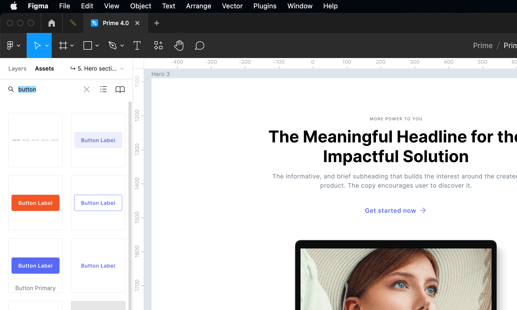
If you are going to prepare the website, like a landing page, again, there is no need to build it from scratch. With 100s of section elements, you may design for web superfast. There are the following template categories included in Prime:
- Webflow (supporting prebuild Webflow templates)
- Heroes
- Features
- Galleries
- Content
- Testimonials
- Contact
- Pricing
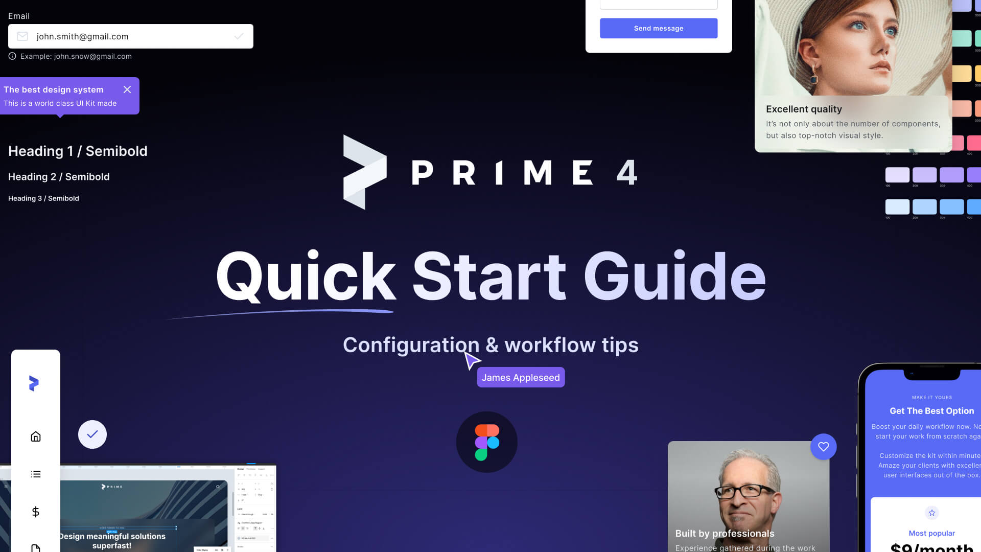
All of the above elements make Prime a battle-tested, robust kit for a wide variety of projects. Feel free to preview Prime 4.0 in Figma.
Working with Prime
Let me show you a few simple steps to kick off workflow with the kit.
Before you open the kit
Thanks to Figma, in most cases, there is no need to prepare any additional resources. However, if you are going to build apps for iOS, you have to take care of the fonts included for the platform.
Make sure your Figma includes the following fonts:
– SF Pro Display
– SF Pro Text
– Roboto
– Inter
In general, Inter is the most important font. It is used for all universal components across libraries. Inter & Roboto are web fonts, so as I mentioned, they should be available in Figma by default. SF Pro & Roboto are used only for native mobile components.
SF Pro had to be installed on your computer. Follow these steps to install local fonts in Figma.
Importing “Prime 4.0.fig” to Figma.
If you double-click on the document, it may not open in Figma by default. All local files have to be imported to work with this tool. To do it, follow these instructions:
- Open the Figma app
- Go to your Home page (click the home button in the top left corner).
- Click the “+ New” button, and the dropdown will appear
- Choose the “Import” option
- Pick the “Prime 4.0.fig” and upload.
Thanks to this, the file will be imported to your workspace, and you will be ready to go!
Note: Remember that the local file will be untouched even when you edit the Kit in your library. If you want to save it locally, you have to choose “File -> Save as .fig”.
That’s it!
Starting work with Prime
Ok, now you got the kit in your workspace – great! Now it is time to configure Prime for your project.
Note: You may use the kit for an unlimited number of projects. This is why I recommend you to leave the original document as is and copy the kit every time you start it for a new project.
The entire project kick-off will take you only a few minutes.
As the final result, you got a professional base of styles and a library of branded components.
1. Configure color, text & other global styles
Let’s make it fast, just like working in Prime in general.
The simplest way to modify Styles and match your project brand is to follow these steps:
- Unselect every layer. When you will do this, the panel on the right will reveal the document’s styles.
- The first section of the Styles is Text Styles. Below you will Find Colors, then Effects (Shadows, Blurs etc.), and the last section is dedicated to Grid styles.
- Go to the Styles section you want to customize.
- Select the style item you would like to edit and press the gauge icon on the right.
- The popup with settings option will open.
- Modify the necessary elements (even the name of the style), and it is done!
Would you like to edit your styles 10x faster? The above method is the simplest one and is supported natively in Figma. However, to speed up the entire process and edit multiple styles at once, you use Batch Styler Plugin.
Feel free to check quick video tutorials of how fast is updating color & text styles:
2. Using Prime Components
Prime is a comprehensive set of UI Elements & Components.
All Component Category has got their own page (Buttons, Inputs & Dropdowns, Alerts, etc.). Thanks to this, you may easily extend them with your own UI Controls.
While using the Prime, pay attention to the naming category, I have gathered components this way, so you are able to find every component within a couple of seconds.
To find the component quickly, go to the “Assets” tab from the left panel. In the search field, type the name of the component and drag it to your design.
Obviously, the majority of UI Elements are built as Variants. This means that you may configure them in the right panel to choose their different appearance, state, selection, etc.
What is unique about Prime is that the kit offers unique variants structure. It ensures the best possible exposure of the elements and a preview of their appearance right from the assets panel.
As you might also notice, the use of .base components was significantly reduced in the newest release. This is because the technique is not needed so much anymore.
If you want to modify the same element across the variants, all you need to do is to select this element and then tap on the “viewfinder” icon to select the same layer in other variants. It’s that easy!
3. Set up Prime as Library
Prime is not just UI Kit. It may serve as a fully featured Figma design system library. To make it work this way, set up the kit as library.
Note: If you are a user of the Free Figma plan, you may publish just the Styles of your library.
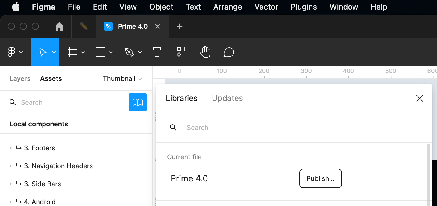
To publish Styles & Components of your Library, you have to switch the panel on the left to “Assets” and click the book icon.
The button with the book opens the modal page with libraries. You may also publish the currently selected file as a library. Click the button “Publish”.
Publishing components
To publish modified components at once. Unselect everything till you see the library name in the top toolbar. Click on the chevron nearby to display the menu.
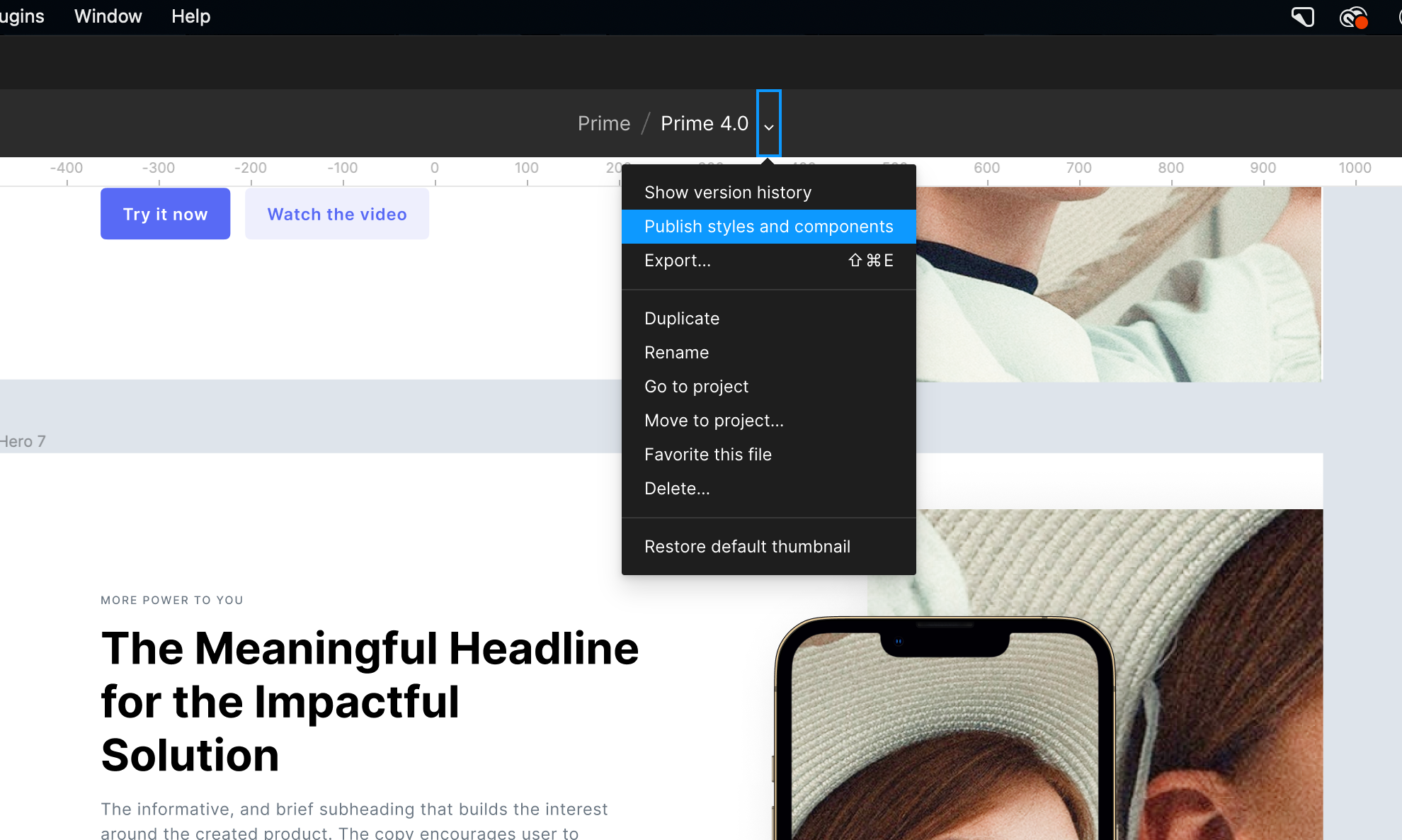
Click the option “Publish styles and components” to publish all or selected elements of your library.
Inside documents using library elements, you will notice a popup in the bottom right corner. Clicking on it will allow you to see changes and updated linked components.
More about Figma libraries
Using libraries in Figma is very useful, especially if you work with other designers. Learn more about them with the official Figma guide to libraries.
To conclude
All of the above instructions are also built into the kit itself. You never worry about finding them if you need to check something!
Prime 4.0 for Figma helps you design much faster with ready-to-use Styles, Components, and even UI Templates built with best design tool practices.
This quick start guide covers just topics that help you start using it. You may create all kinds of digital products with it.
If you have any questions feel free to send me a message.


