
Prime Design System Kit is the resource that assists you when you start the UI Design Project. This may be a quick one or the challenge that requires to build Design System. Prime saves lots of time for you and lets you use Sketch smartest techniques built right into the customizable components.
Important Note: Version 2.5 of the Kit brings lots of fresh features (like Color Variables). There are also multiple enhancements in the structure of Styles. Read summary of the new features of the Prime 2.5.
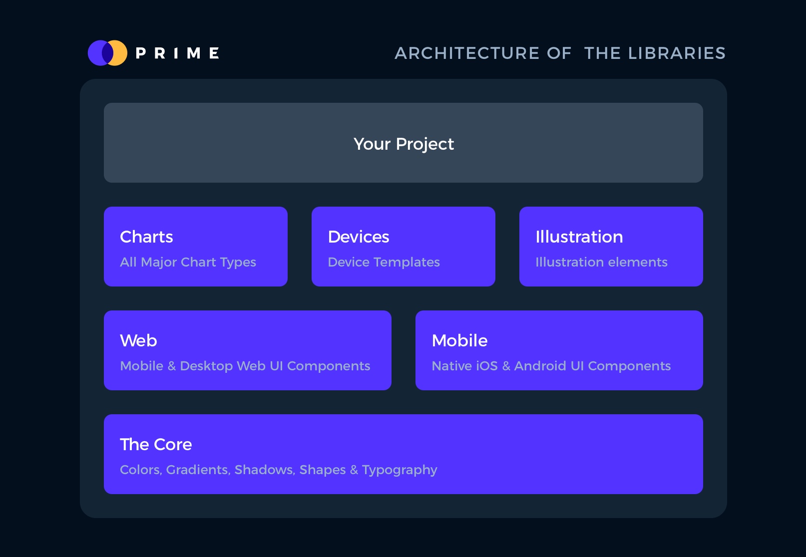
The Kit contains the following files with components:
- The Core – the foundation of the Kit. It includes all colors, shadows, shapes, basic icons, and typography scale. Shared Styles are prepared to work with Light and Dark Mode Themes.
- Prime Web – the UI Design Framework for Desktop and Mobile Web. It includes all necessary elements to build UI – from hundreds of essential elements (buttons, checkboxes) through more complex components (cards, page indicators, modals) into the entire Page Section Templates.
- Prime Mobile – The Library for iOS and Android Native Mobile UI Design.
- Prime Illustration System – the set of predefined and customizable elements for UI illustration purpose.
- Prime Devices – vector device mockups of iPhone, Apple Watch and MacBook Pro created for Sketch
- Prime Charts – a collection of all major data visualization types, ready to customize and use in your projects.
Overview
The quick start tutorial will guide you through the following steps:
- Library Setup
- Color Palette Setup
- Typography Setup
- UI Elements and Components
- Page Sections Web UI Kit
- Icons
- Charts
- Illustration System
- Symbols
Library Setup
Let’s start with the initial configuration. Remember to install the default “Montserrat” font before you start using the Kit. Thanks to this, you will be able to see all elements in the proper way from the beginning.
To add necessary files as libraries perform the following steps:
- Open Sketch -> Preferences
- Go to “Libraries” Tab
- Click “Add Library”
- Add “Prime – The Core.sketch” and “Prime – Web” as Libraries
- Optionally add “Prime – Charts” and “Prime – Devices” if your project needs elements of this category.
Thanks to adding files as libraries you will be able to use them efficiently and take benefits of shared Layer and Text Styles from “The Core” file.
Color Palette Setup
To create UI with Atomic Design philosophy, you know that you have to start with the fundamental elements of your UI Design Library. The colors are the particles, quarks or tokens (choose the name you want 😉 ) to the UI atoms. Obviously, it is the best way to start a design setup.
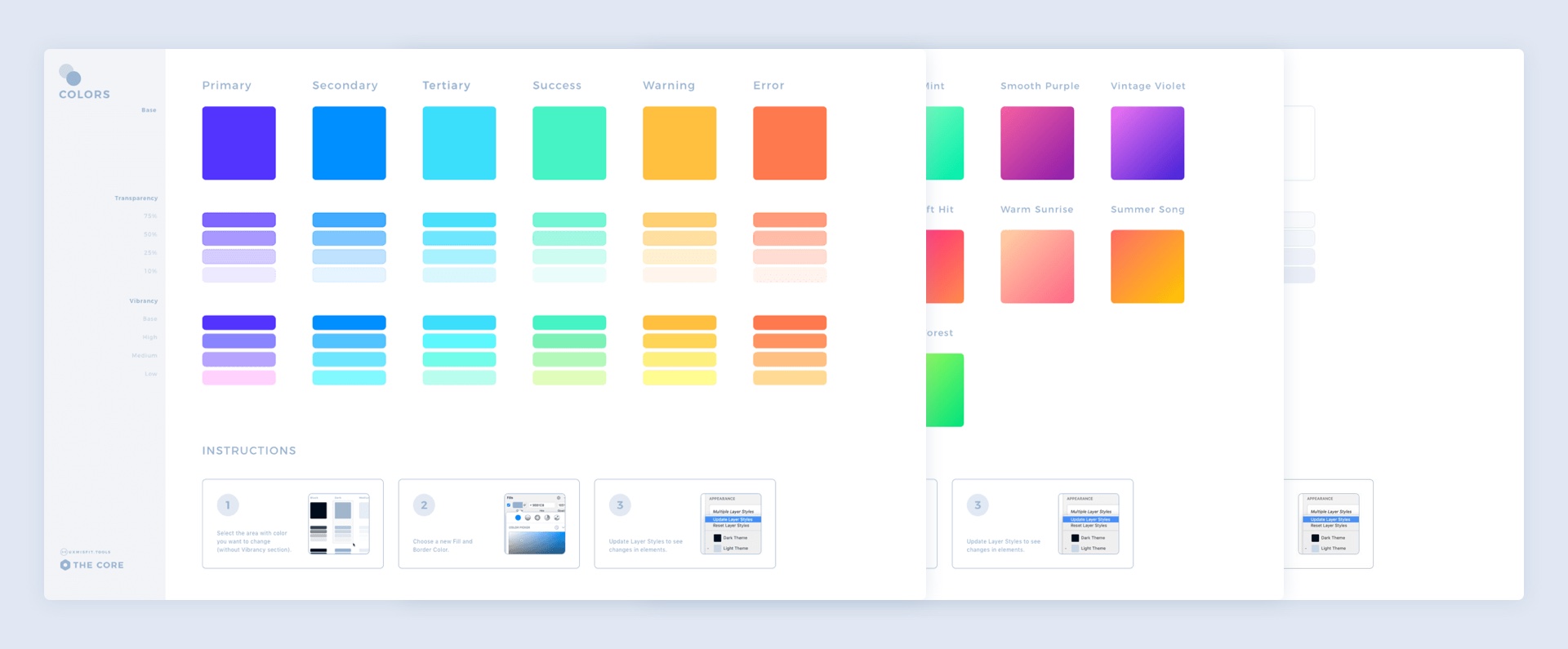
Prime contains the following colors:
- Primary,
- Secondary,
- Tertiary,
- Success,
- Warning,
- Error
This naming convention works well even if you change tones to the ones that match your project. You do not have to worry when your brand primary color is red, and for the error you use purple, Prime is prepared for that!
Obviously, there are additional colors included for more neutral elements:
- Black,
- Dark,
- Medium,
- Light,
- White.
All of the mentioned colors comes with Fills and Border comes with five opacity options: 100%, 75%, 50%, 25%, and 10%. What is more, Prime also includes vibrancy variations of colors, so your UI Library will be able to achieve modern soft color changes and stay consistent at the same time.
Thanks to this, you will be able to be consistent even with subtle UI elements.
Colors
To customize color fills and border follow these super easy steps:
- Open “The Core” Sketch file and select “🎨 Colors” Page.
- Choose the dartboard with colors you want to edit.
- Drag the cursor around the whole Column with the Colors (for example Primary Color) to select 5 tiles with shape layers. Note: do not select the last four tiles with variants – these require manual setup.
- Change the color fill and border using from the inspector panel (it’s the one on the right). Now update Layers Styles to apply changes.
- Save the file (Prime – The Core) to notify other libraries that changes were made.
Look at this video how it impacts the whole Library:
Adding a new Color
Prime is designed to be flexible, that means you can easily customize and add new elements even colors. For the best results prepare your new Layer Style in following naming conventions:
Color Fills:
- Color with 100% opacity: [Theme]/01 Fill [ColorName]/[ColorName]
- 10% opacity: [Theme]/01 Fill/[## ColorName]/[ColorName] 10
- 25% opacity: [Theme]/01 Fill/[## ColorName]/[ColorName] 25
- 50% opacity: [Theme]/01 Fill/[## ColorName]/[ColorName] 50
- 75% opacity: [Theme]/01 Fill/[## ColorName]/[ColorName] 75
Color Borders:
- Color with 100% opacity: [Theme]/02 Border/[ColorName]/[ColorName]
- 10% opacity: [Theme]/02 Border/[## ColorName]/[ColorName] 10
- 25% opacity: [Theme]/02 Border/[## ColorName]/[ColorName] 25
- 50% opacity: [Theme]/02 Border/[## ColorName]/[ColorName] 50
- 75% opacity: [Theme]/02 Border/[## ColorName]/[ColorName] 75
With this naming, your newly created color will act like the native element of the UI Framework.
Gradients
Gradients are new colors. More and more design contains these subtle color transitions. Prime includes the set of handpicked gradient palette, that may be expanded to your needs.
To modify gradient in “Colors” Page:
- Select the gradient you want to change.
- Change the fill using the inspector panel
- Update Layers styles to apply changes.
- Save the file (Prime – The Core) to notify other libraries that changes were made.
You can also add your own gradients. For the best results keep the following Layer Style naming convention:
- [Theme]/03 Gradient/[GradientName]
Shadows
Prime contains three types of shadows:
- Primary Shadow
- Secondary Shadow
- Tertiary Shadow
- Neutral Shadow
All shadows (except neutral one) should correspond softly with the color tone of colors having the same name. It is made this way because the new modern UI styles contain shadows that correspond to the element style (gradient or color). Thanks to this, UI looks like it is made from some type of “semitransparent material.”
Prime’s shadows are prepared in 4 styles:
- Shadow 100% with 40 blur points
- Shadow 75% with 24 blur
- Shadow 50% with 16 blur
- Shadow 25% with 8 blur
To modify a shadow:
- Select the one you want to change.
- Modify the shadow properties using the inspector panel.
- Update the Layers styles to apply changes
- Save the file (Prime – The Core) to notify other libraries that changes were made.
Dark & Light Theme
Prime is ready to help you prepare Styles for both themes. By default, all colors in Light and Dark Theme are the same (except natural ones).
If you would like to prepare Dark mode better, use the following tips to manipulate colors in the right directions:
Dark Mode – UI Design in Practice
Typography Setup
When the whole color palette is ready, it is time to prepare the Typography System.
Prime Library contains one font style inside “The Core” sketch file.
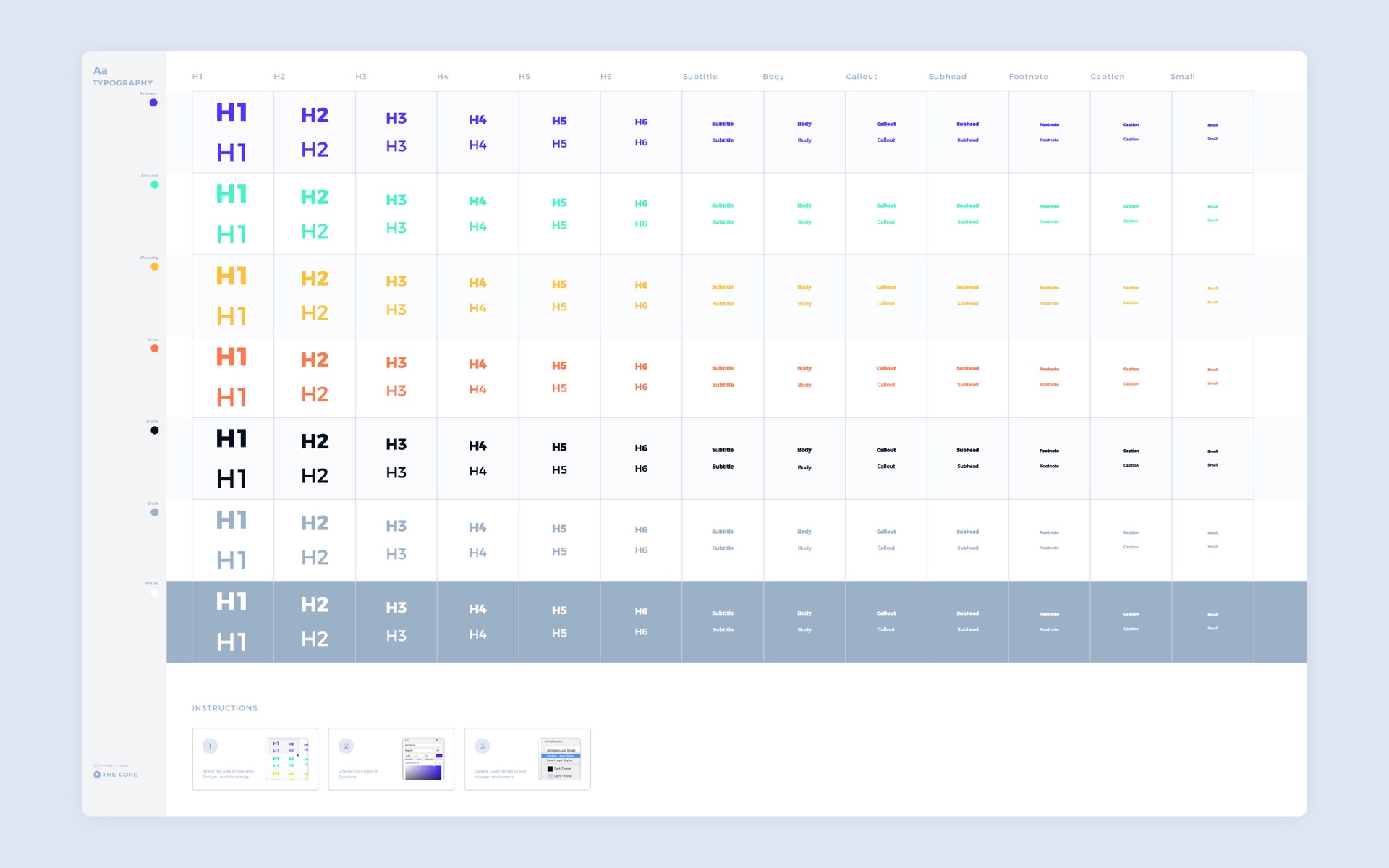
Typography systems contain the set of 26 Text styles (regular and bold ones) with 13 sizes and 7 colors:
- Black,
- Primary,
- Success,
- Warning,
- Error,
- Grey,
- White
To modify the particular set (for example Primary one) of Text Styles:
- Drag cursors around the single row to select all text items at once.
- Change the color or typeface using from the inspector panel on the right.
- After typeface modification, some new alignment of text layers may be useful for better visual appearance.
- When you are done, remember to update the Text Styles to apply changes.
- Save the file (Prime – The Core) to notify other libraries that changes were made.
Take a look at the video below how modification impacts the library:
Shapes Setup
To take care of the consistency, you can also modify basic shapes used across the whole design.
When you open “⚛️ Shapes” Page of “The Core” source file, you will notice a whole collection of shapes.
They are categorized by a radius (for Fill and Border Shapes). If your design requires a different set of Radius, feel free to adjust them to your needs.
By default, all shapes are placed in the following radius categories:
- Circle
- Large
- Medium
- Small
- Sharp (no radius)
UI Elements and Components
The main file of the library “Prime – Web” is the central point for all UI element related things.
All Symbols are located in “🧬 Symbols” Page. We will return to them in the next sections.
“🌱 UI Elements” Page contains a presentation of Atomic UI Elements like buttons, checkboxes, etc. All of the presented items are Symbols with override features. Some of them use Smart Layout to speed up the creation process.
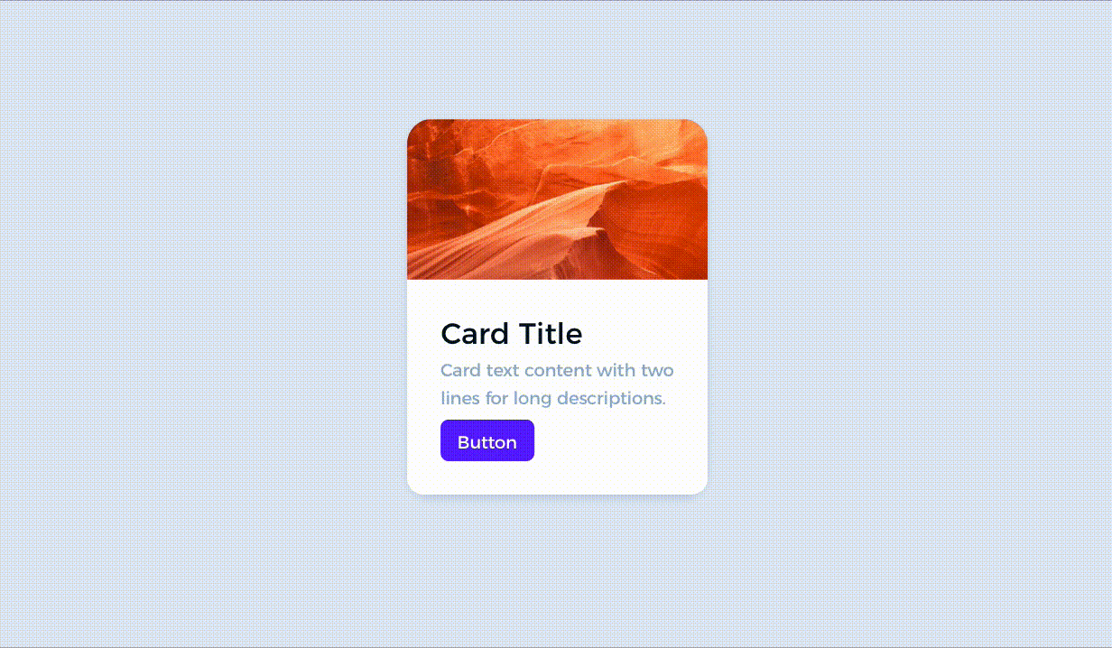
“🌿 UI Components” Page includes a showcase of more complex elements Atomic Design’s “Molecules and Organisms.”You will find there “Cards,” “Modals,” “NavBars,” and “Footers.” All items are also Symbols, and selected elements use Smart Layout.
👉 FULL PREVIEW OF UI COMPONENTS
Adding new components
If you would like to add a new element goes to “🧬 Symbols” Page and create it there.
Thanks to this, you will gather all atoms of your UI Design System in one place, for the best results analyze the structure of similar element already existing in the library. This will give you inspiration for how to build yours to keep the consistency of the system.
Let’s move to the next section that demonstrates the ultimate combination of these elements:
Page Sections Web UI Kit
Prime includes over 100 Web Page Sections UI Templates. Elements are not symbols (because they usually do not repeat in design and require individual treatment).
All sections use Colors, Fonts, UI Elements, and Components. Thanks to this, a single change has an impact on a whole Library, and you can use these templates to speed up your project.
There are 8 main categories of templates includes:
- Hero
- Features
- Gallery
- Pricing
- Content Left
- Content Center
- Content Right
- Customers
Each category has got its mobile and desktop version.
Icons
Prime 2.0 includes over 70 essential icons within 24×24 point grid. They are solid and outline ones. In the future releases, more icons will appear in the “💎 Icons” Page. All icons are designed to take advantage of Layer Style overrides.
If you look for more icons to build your website, Prime will work fine with these great consents:
- Font Awesome – probably the best and most comprehensive icon font in the web
- Material Icons – the most known icon set delivered by Google’s Material Design Team.
- Icons8 – the collection of thousands of icons with multiple styles. Free and premium set available.
Charts
Data Visualization is the next fundamental thing. Loot at Dribble and Behance Projects – almost every Dashboard contains a chart; it is good to have a consistent style of various type of visualizations in your Design System to use it in real solutions.
Prime contains all major types of charts including Linear (Line and Fill), Smooth (also Line and fill), Bar charts, Pie, Donut ones and Radar charts.
Customization is very simple. All Charts are Symbols with Shapes that use Shared Styles from “The Core” file.
If you need to change color, just use the ones from the dropdown list of available Shared Styles. You can also go to “The Core” and adjust color to match your needs (if you need a reminder on how to do it – go back to Color Palette Setup section above)
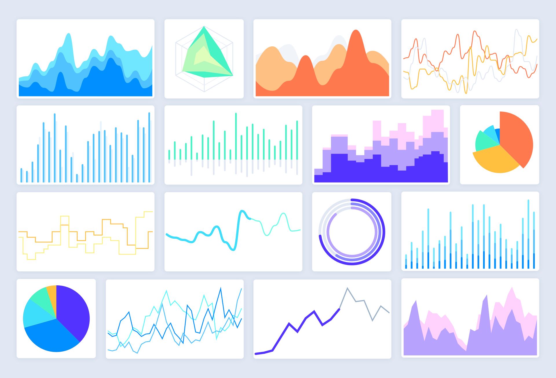
Illustration System
Prime was the first Design System Kit that contained customizable elements for illustration purposes. Version 2.0 also includes it the same separate file.
These elements were added to the Kit because more and more designers decide to put handmade visuals on the websites instead of stock photos.
With Prime Illustration System, you get multiple human figures, various elements like plants, credit card, devices or abstract visuals, and several subtle backgrounds.
All elements may be modified to match the brand style and color palette. To do this, use the same technique as in the 1.0 setup. Select Color Element to change the color fill using from the inspector panel. Remember to update Layers Styles to apply changes.
 Symbols
The Symbol Page in the “Web” Library file contains all the UI elements and components of the UI Framework. They were organized manually to increase readability and further expansion of new Symbols.
They are organized in groups similar to the ones you can observe in Sketch “Symbols” dropdown.
Feel free to extend the kit with your own stuff!
Symbols & Smart Layout – Yes, but not everywhere.
Smart Layout is a great feature introduced in Sketch 58. It helps to save time with many cases when content changes dynamically.
However, there are cases where it Smart Layout behavior is not the correct one. Sometimes buttons have to stretch the width to the whole card, not just a text inside them.
That is why Prime in Symbols Page, Symbols with Smart Layout include a special badge “Smart Layout” to show you that this specific Symbol uses the feature.
What is more, some Symbols, like buttons, have got two types: Classic and Smart Layout. Those with Smart Layout has got suffix “(Smart)” to inform you about its nature immediately when you pick them from Symbols menu.
 Summing up
This is Prime – the first All-In-One UI Design Starter Kit. This guide shows how it works… but how it feels like?
Do you know how it is to speed up the Lamborghini and hear its engine roar? Do you remember the first time when you unboxed your new MacBook and touched its aluminum surface? Now, enjoy new design experience with Prime.
By the way, 🎁 you can try it now 10% discount. Just use UXMISFIT10 offer code.
 If you have any further questions, feel free to contact me, I do my best to help!


