
This year’s Figma Config event revealed to us such a marvelous feature called Component Properties. It allowed us to simplify the components and rethink their structure. Now we receive a significant update to that feature.
If you would like to remind what exactly Component Properties are, feel free to read practical guide with tips.
Ok, let’s start with a brief description of what is updated in component properties:
- Preferred instances – when you create a property, you may curate the list of recommended instances, for instance swapping.
- Expose nested instances – Forget about clicking through levels of nested components to modify their properties. Now you may view and edit nested instances properties directly from the top-level component.
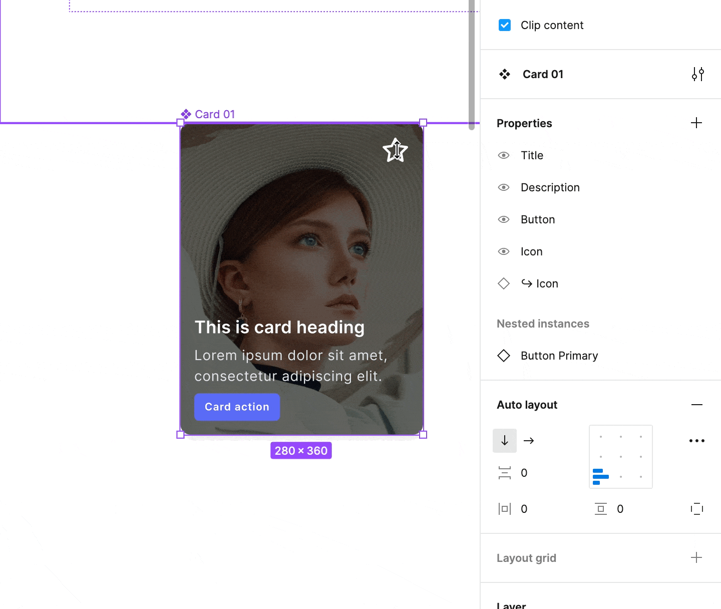
- Simplified instances – You may hide component layers & attributes that should not be visible to component users. This helps to focus on what you intended to be customized with component properties.
Note: Updates mentioned above are currently in Beta (Autumn 2022). To start using them, you have to activate beta features from your account settings.
Component Property updates in practice
If you wonder how to use mentioned changes in practice. Let me show you the list of recommendations that you may follow in your projects.
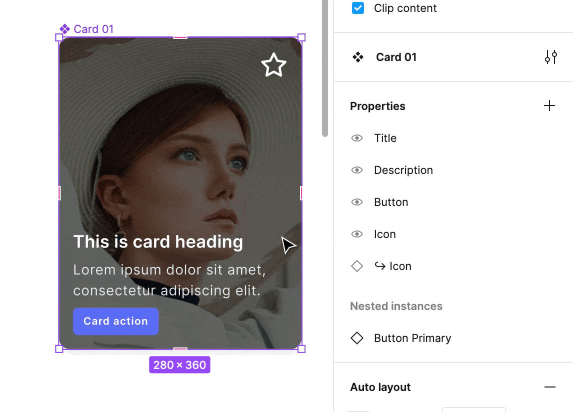
Preferred instances in practice
Think of that case. You prepared a button component, which includes a label and an icon. What’s obvious – you would like to allow some customization to the button’s icon. However, there is a set of symbols that you would like to recommend using. With preferred instances, you may create this kind of list quickly. Here is how to do that:
- Go to properties panel (Select variants group or a component if it is a single one)
- Select the edit icon of one of your “instance swap” property
- Click “+” icon to add the preffered value
Note: The designer can still pick from the “non-preferred” set, however, the feature is perfect for guiding users on which elements were intended to use in specific components.
Here is how to use preferred ones in your component instances:
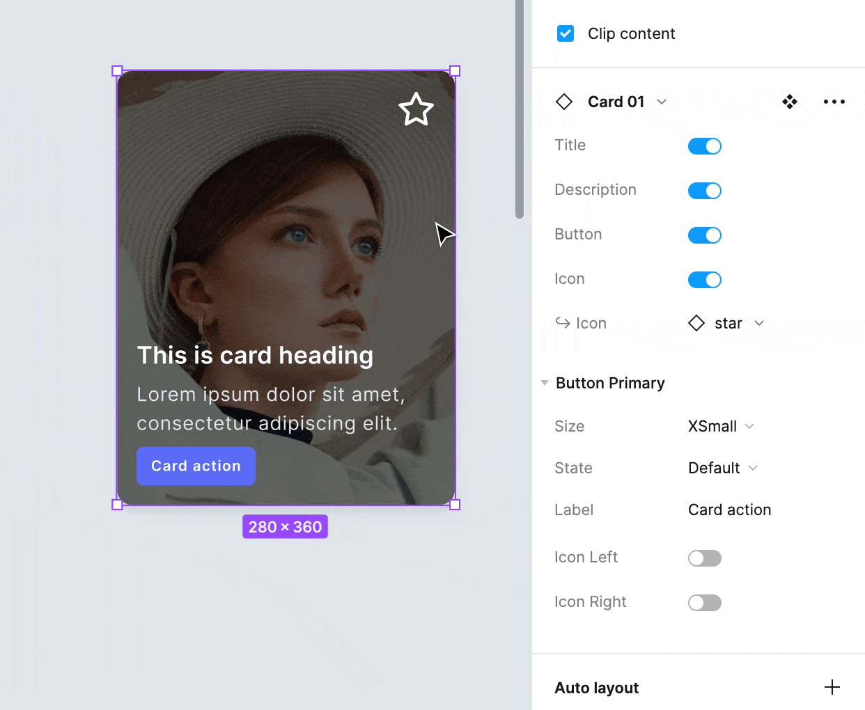
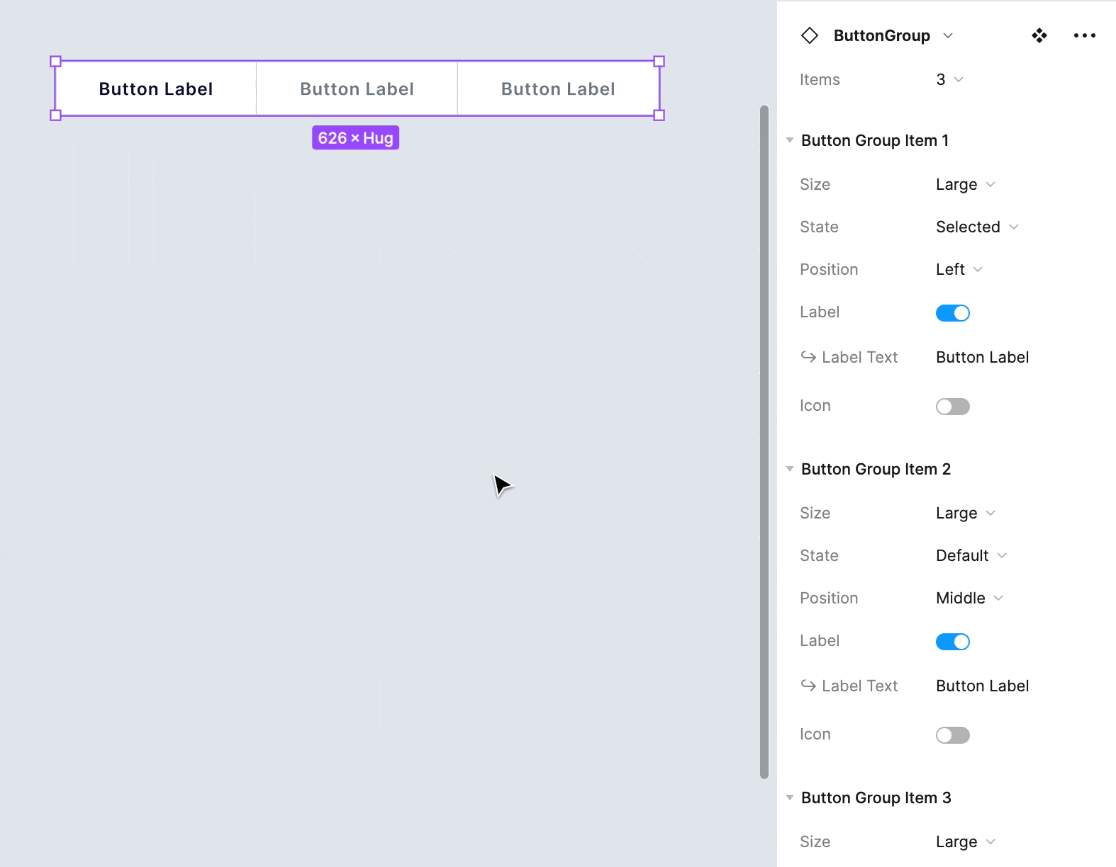
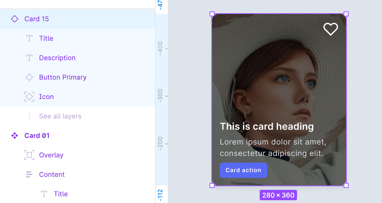
Expose nested components in practice
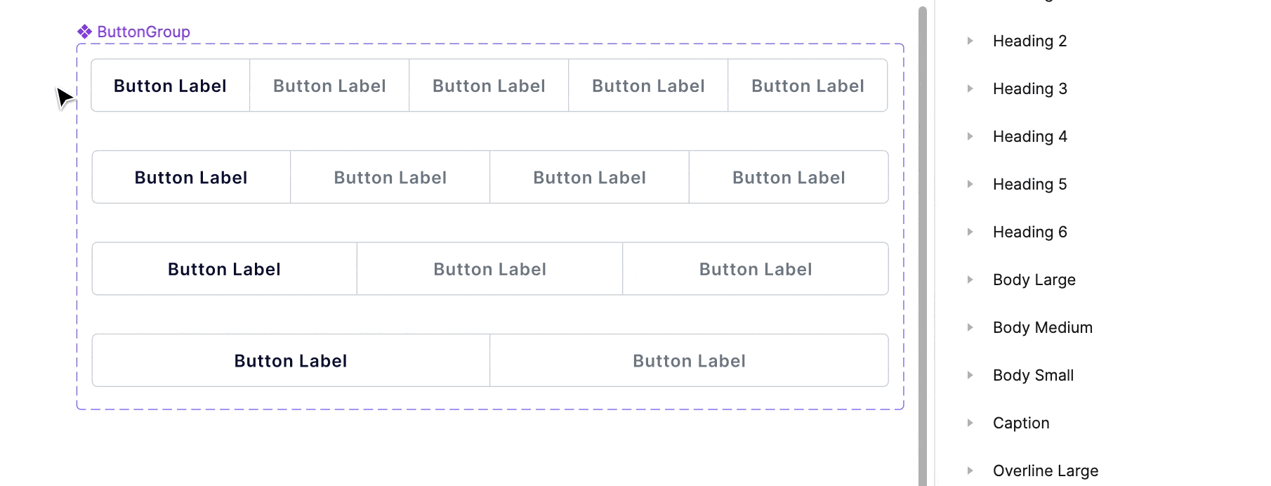
Many components include other components inside. Using the exposed properties of that elements will boost the workflow immediately. This may be useful for components like:
- Button groups
- Tabs
- Menu lists
- Cards
- Modals
- All kinds of complex components
To quickly expose nested instances follow a few simple steps:
- Select the “Create component property” button
- Find “Nested instance” option, and click it
- Select nested items you want to expose
That’s it!
 And here is how you will see nested components properties while setting up the instances:
Simplified instances in practice
This feature is extremely useful for design systems that have specific constraints and require strict guidelines. You may hide all layers that do not have properties. The result will be the following:
- In the layer list, all non-property layers will be collapsed.
- In the right panel of a specific component, its properties will be collapsed (auto layout, fill, and stroke).
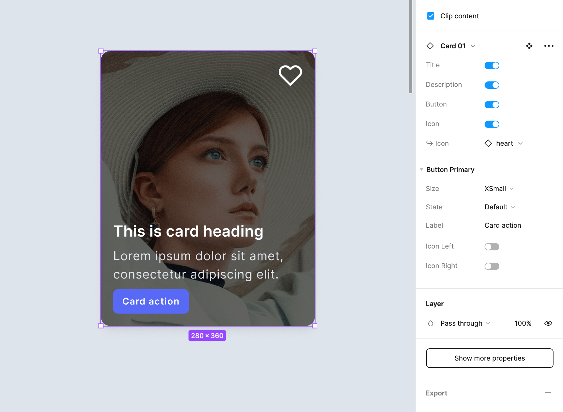
Would you like to try it out? Here is how:
- Select the component (not instance!)
- In the right panel, click the “edit” icon near the component name
- Turn on “Simply all instance.”
Note: Designers can still reveal hidden properties by clicking the “Show more properties” button. But, in this case, it is their conscious decision that they start playing in an area that was not predicted by the component guidelines.
.Base components come back?
The idea of .base components was simple, to have one “main” instance of a component (like a button) that will determine the general look of the variants group. These types of components were private ones.
When the first release of component properties was out, many designers (including me) limited usage of that technique.
Since nested component properties may be exposed, some of us may consider using .base components again. Exposure of nested component properties will make it easier to customize their attributes. However, you may still use the “select similar layers” feature to customize an entire group of variants quickly – so I doubt in massive return of the .base components technique.

Get Free Chapter
15,000+ designers are already subscribed (no spam! Only design tips, tutorials + design resource news).
Join now, get the free chapter of my eBook right to your inbox. With these tactics, you will solve common design issues with ease.
Sign up - Get Free Chapter
To conclude
Updates mentioned in the article are a clear sign that Figma is enabling even more features that will be used for more advanced design systems. Good collaboration is not only about exposing possibilities but also about making clear guidelines – folks in Figma know it!
What do you think of the new updates? Which feature do you like the most?
By the way…
If you start a new project or would like to organize your UI Library in Figma — do not waste your time creating everything from scratch. Feel free to use the Prime — Design System Kit. It helps you design UI with the best Figma techniques — Component Properties, Variants, Auto Layout and more.See Prime in action.
To make it easier there is a gift 🎁 - Use UXMISFIT10 offer code to get 10% Off.

You can also Create User Flows faster in Figma & Sketch — With SQUID you can create User Flows directly in your favorite design tool. You may style them to your project brand within a couple of clicks. Prepare all kind of diagrams in minutes. See how it works.


