
So you are already familiar with creating component variants (if not, see the tutorial), now with Figma Config, we have received a new way to expose component customization for our design systems – component properties.
What are component properties?
The first thing you need to understand is that component properties do not replace variants; they are an additional feature that will allow you to design faster in Figma.
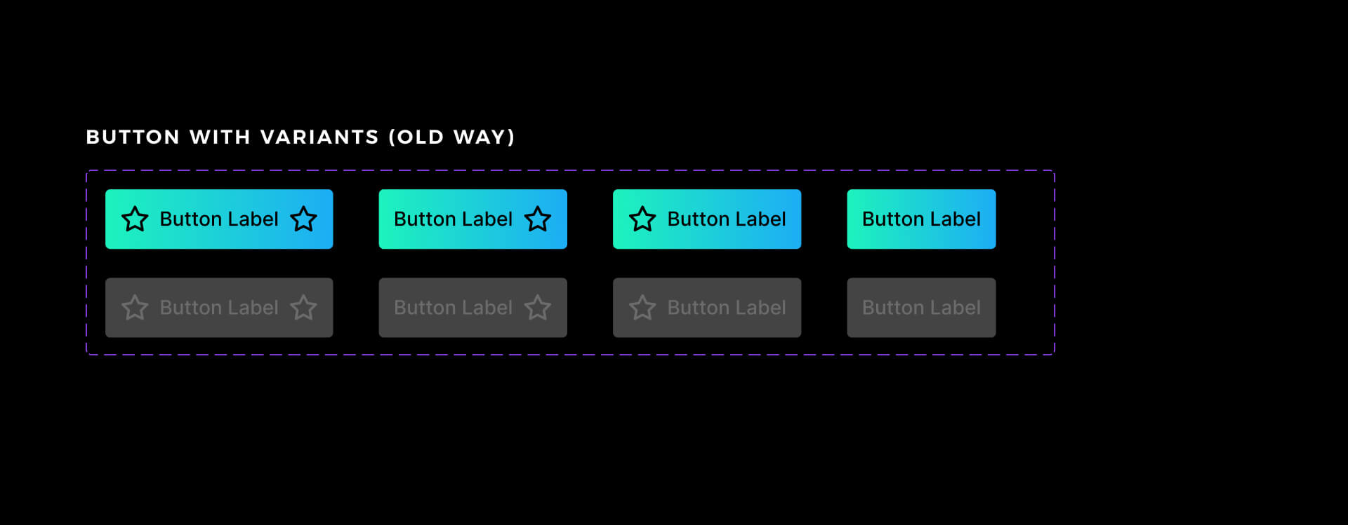
To understand the component property feature, let’s use the example of a button. Imagine the one with the icon on the left, the label, and the icon on the right.
To allow customization of instances with variants, you would have to prepare at least 4 component variants. One with both icons and labels, one without heroes, and two with only one icon on each side.
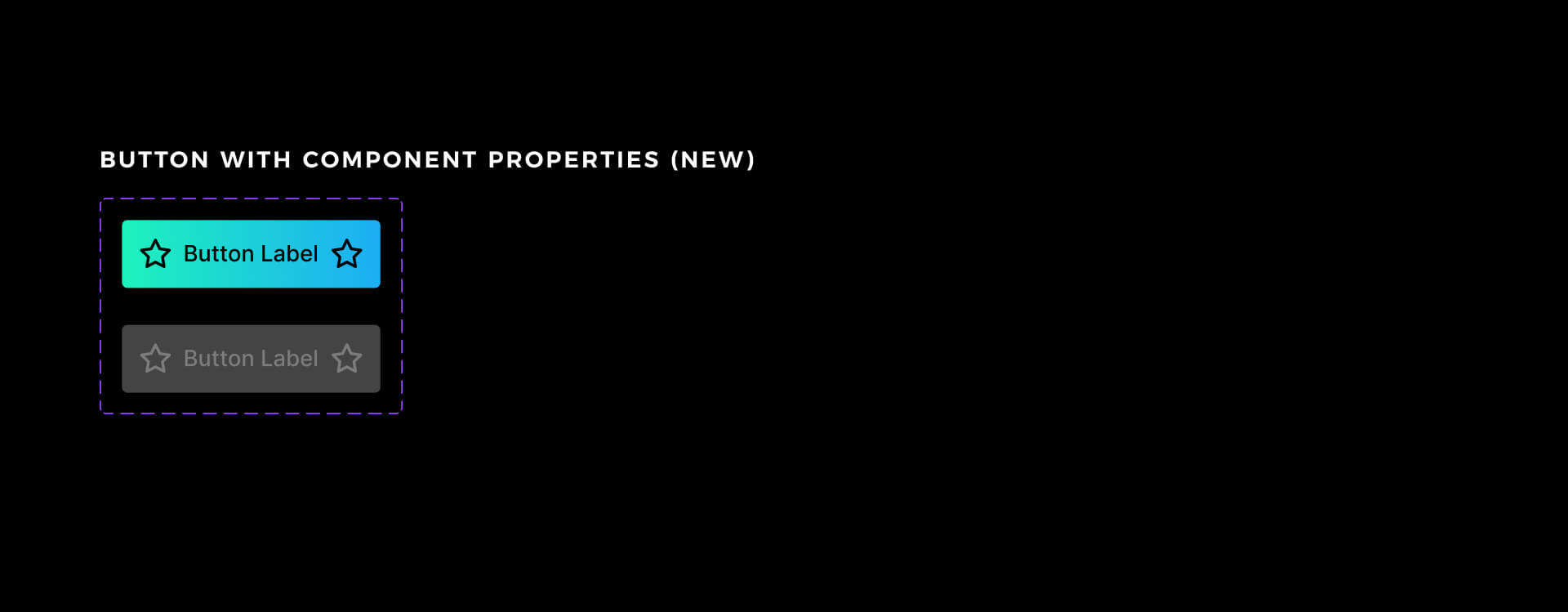
Component properties let you establish all of this in just one component. Sounds like magic!
How to create component properties in Figma
First, you have to create a component with some elements inside. Let’s stick to the example of a button.
Component property may be created by selecting the layer inside of your component. Then go to the right panel in Figma and find a special icon that indicates component property. It’s usually near to Layer section or component name. Press this icon, and you may create your own property.
There are several component properties you may create:
- Boolean – for toggling visibility of the layer
- Instance swap – for swapping the nested component instance
- Text Content – useful if you want to allow text modification from the properties panel.
You have to set the name of the property and its default value.
If you will toggle false value for the boolean property.
In our example:
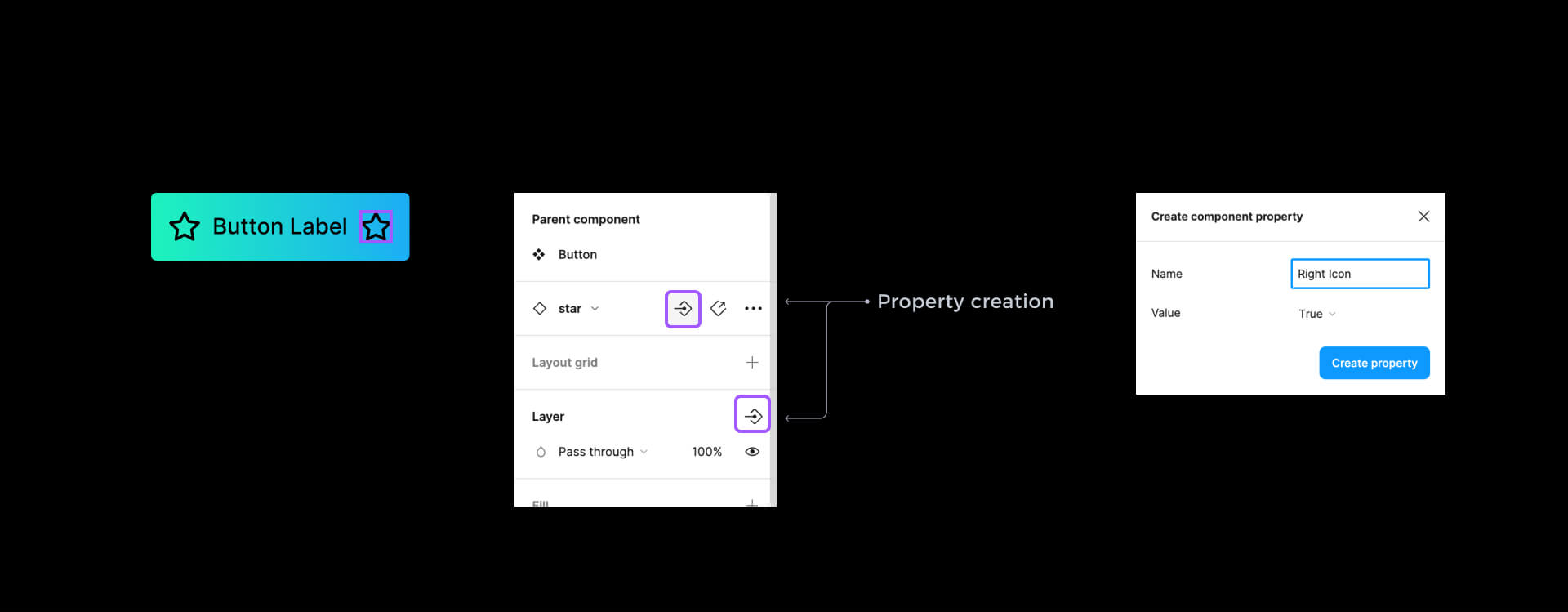
- Select the icon and go to the right panel
- Find the Layer section and press the icon to create a property.
- Name it “Icon Left” and leave the default value to “True.”
- Go to the nested component section in the right panel, and press the property icon.
- Pick the “Icon Left Instance” name and leave the default icon.
Done! You have just configured properties for the left icon. Now you may do the same steps for the right icon. Optionally, select the button label, and find the Content section in the right panel to expose the text property.
If you want to see a quick example, please download the buttons done with the old way variant and new property workflow from Figma Samples demo file.
Interesting trick:
You may connect multiple layers to the same property. This means that when you toggle or modify the property, the changes will affect multiple elements of your component.

Get Free Chapter
15,000+ designers are already subscribed (no spam! Only design tips, tutorials + design resource news).
Join now, get the free chapter of my eBook right to your inbox. With these tactics, you will solve common design issues with ease.
Sign up - Get Free Chapter
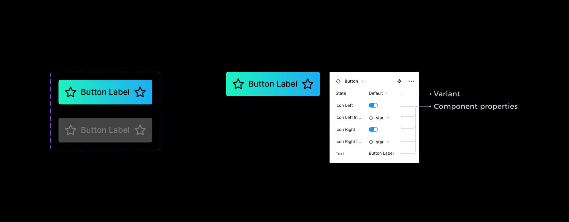
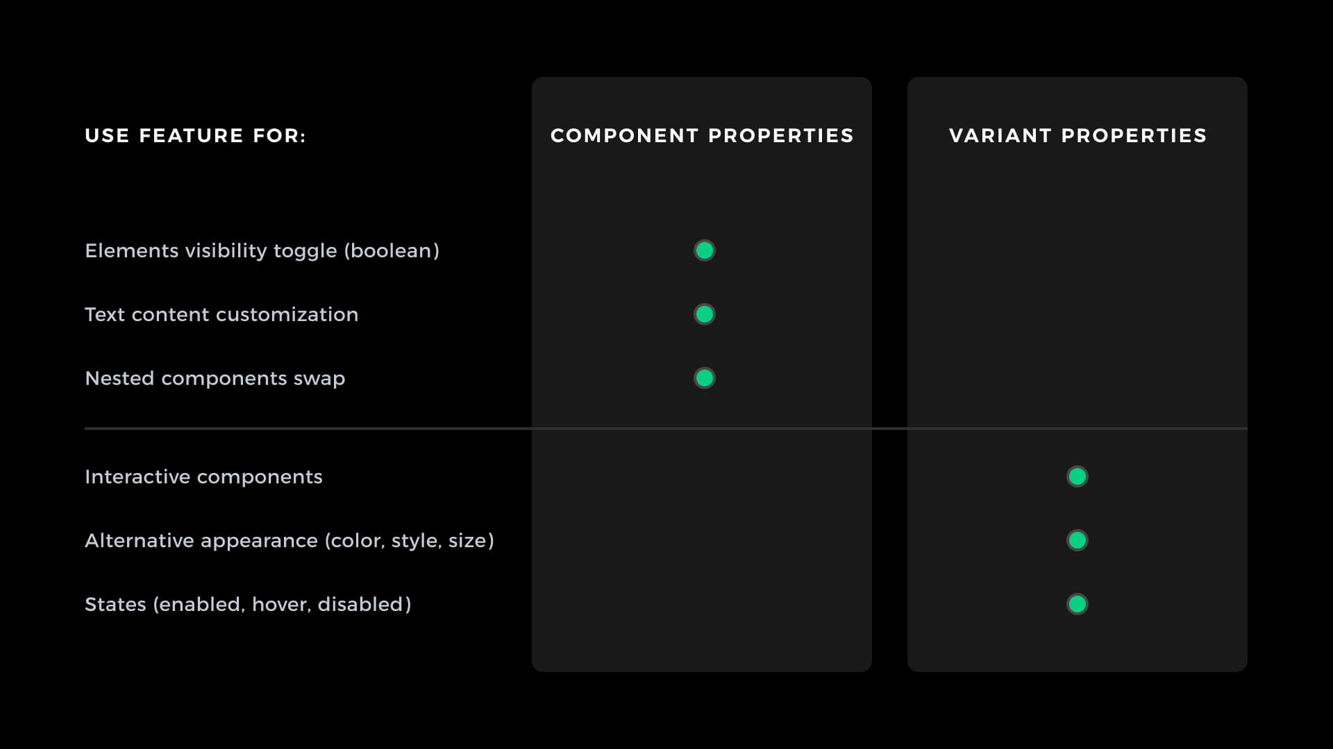
Component properties inside variants
As I mentioned before, properties won’t replace variants. Component properties are an excellent supply for properties variant. These are examples of when to use which technique:
Use variant properties when you:
- want to prepare interactive components
- create the variants that have a different appearance (color, style, size)
- need to have variants with different states (enabled, disabled)
Use component properties when you:
- need to toggle visibility of specific element (boolean operations)
- would like to allow users to swap nested component instances quickly (instance customization)
- want to expose text content modification
To conclude
Component variants are new, easy to use but powerful Figma features. This quick intro allows you to build your own components with properties.
When it comes to more advanced techniques, there is still much to discover because the new workflow gives completely new possibilities. Once figure out new tricks, I will for sure share them on my blog or through the newsletter.
If you wonder when Prime Design System Kit will get its upgrade to component properties – it is coming soon. If you want to follow experiments & updates for components I make follow me on Twitter.
Stay tuned!
By the way…
If you start a new project or would like to organize your UI Library in Figma — do not waste your time creating everything from scratch. Feel free to use the Prime — Design System Kit. It helps you design UI with the best Figma techniques — Component Properties, Variants, Auto Layout and more.See Prime in action.
To make it easier there is a gift 🎁 - Use UXMISFIT10 offer code to get 10% Off.

You can also Create User Flows faster in Figma & Sketch — With SQUID you can create User Flows directly in your favorite design tool. You may style them to your project brand within a couple of clicks. Prepare all kind of diagrams in minutes. See how it works.


