
Glass is more and more popular in digital Design. I already showed how to create attractive elements in Glassmorphic style. Now it is time to go a bit further and see how to use it wisely in UI components!
What is Glassmorphism
It is a visual design trend noticed in late 2020. Glassmorphism is not an entirely new thing because we already have seen UI that use glass material years ago, with Windows Vista.
Nowadays, designers started to use glass wisely in an attractive and usable way. Good examples of UIs that use glass are Apple’s iOS, macOS and Fluent Design System by Microsoft.
Creating Glassmorphic Card
If you would like to create just a single visual element in Glassmorphic style. Feel free to follow 6 simple steps I included in the tutorial – How to Create Glassmorphic Card UI Design.

Glassmorphism UI – Issues
Key questions asked by everyone who would like to create real UI using Glassmorphic elements are – how to ensure good accessibility and how to style elements to set the right visual hierarchy.
If you won’t know how to play with the glass material. You may hurt your users. For good accessibility, you have to test your glass elevation and UI elements to match WCAG 2.0 guidelines with at least an AA contrast ratio.
For establishing a good visual hierarchy, let’s follow these steps:
How to Ensure The Visual Hierarchy?
Let’s take a look at this example. 3 layers with the same glass materials overlapping each other. This initial set does not look so good, but it will help us to create a better visual hierarchy.

These four steps will make huge changes in our perception of the digital glass:
1. Add the subtle shadow
Shadow is almost always the most obvious way to show the hierarchy of the UI elements. Even when the objects with the same color overlap, it clearly shows which element is on top.

2. Differentiate blur
While the classic skeuomorphic interfaces are the song of the past, it is good to inspire from the real world. Look how acrylic or glass materials play with each other.
Elements that are closer to the background usually have a lower blur. The ones that are higher (bigger distance from the background) have got higher blur value.
Now see how it works in the digital world. Looks quite nice, isn’t it?

3. Lower Elevation Opacity & Dim the Content
If you want to make active elements more readable, it is good to make their opacity higher. Try to differentiate blur opacities. The lowest value for background elements. Highest opacity level for the elements that are currently active and are on the top of the hierarchy.
Remember that glassmorphic elements are background sensitive. I didn’t show the specific values because you have to try them out on your own in your project’s environment.
You may also lower contrast or opacity of content inside glass UI elements. Thanks to this highest layer will gain more focus.
See how it looks like in our example:

4. Add borders
If the techniques presented in previous points are not enough, you may always add a border. This may be the subtle white stroke with 20% of opacity. It will clearly communicate the boundaries of the specific UI elements.

If you would like to see how the elements will look in real UI, here is the sample from me:
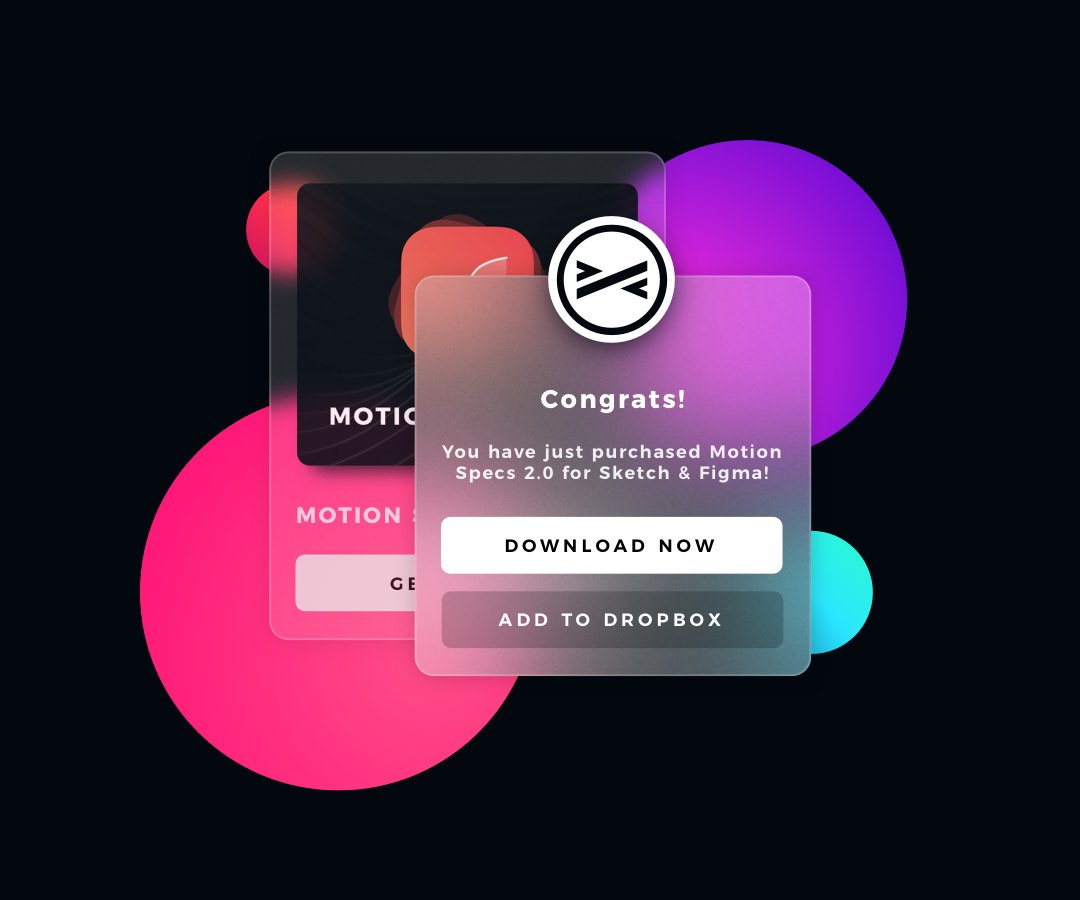
See Glassmorphic Visual Hierarchy live
I have also prepared a short video tutorial that is a step by step demonstration how to achieve above effect. It may be done in a very similar way in Sketch and Figma. Check it out:
The final advice for Glassmorphism
While the style itself is pretty attractive, please do not use it everywhere. If accessibility plays a key role in your project, try to avoid glass elements as the large parts of the UI. Their blur and transparency may lead to some accessibility issues.
Observe how real design systems User Interfaces look like and learn from the. macOS Big Sur includes a lot of examples that are worth following.
Summing up
Now you know how to use Glassmorphic UI elements to look good in your projects. Digital materials have got their own rules, but it is worth it to inspire from nature.
By the way…
If you start a new project or would like to organize your UI Library in Figma — do not waste your time creating everything from scratch. Feel free to use the Prime — Design System Kit. It helps you design UI with the best Figma techniques — Component Properties, Variants, Auto Layout and more.See Prime in action.
To make it easier there is a gift 🎁 - Use UXMISFIT10 offer code to get 10% Off.

You can also Create User Flows faster in Figma & Sketch — With SQUID you can create User Flows directly in your favorite design tool. You may style them to your project brand within a couple of clicks. Prepare all kind of diagrams in minutes. See how it works.


