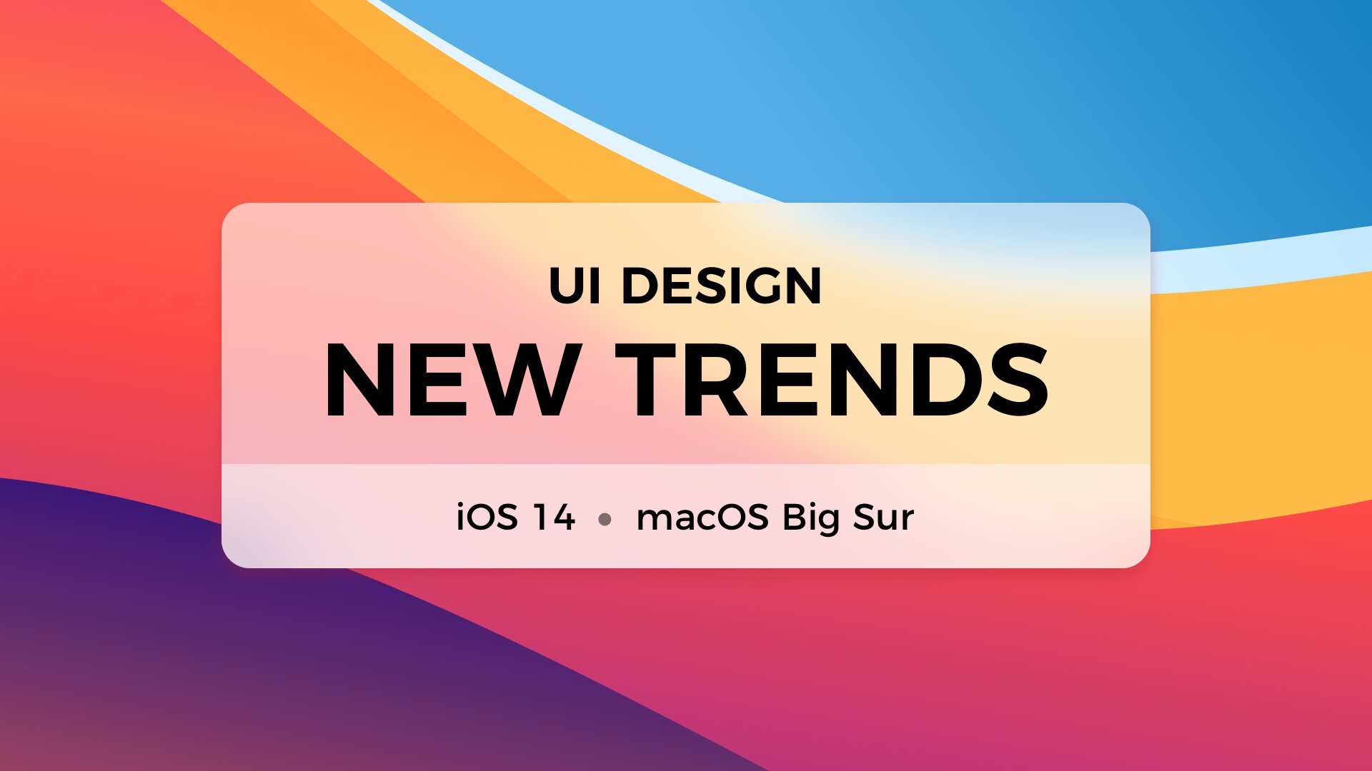
With the introduction of iOS 14 and macOS Big Sur, we are the witness of the next big thing in UI Desing. Changes are not so revolutionary like in iOS 7 years before, but they undoubtedly present the trend UI Designers will follow in the future…
…and it won’t be Neuomorphism. 😉
Flat design is no longer trendy
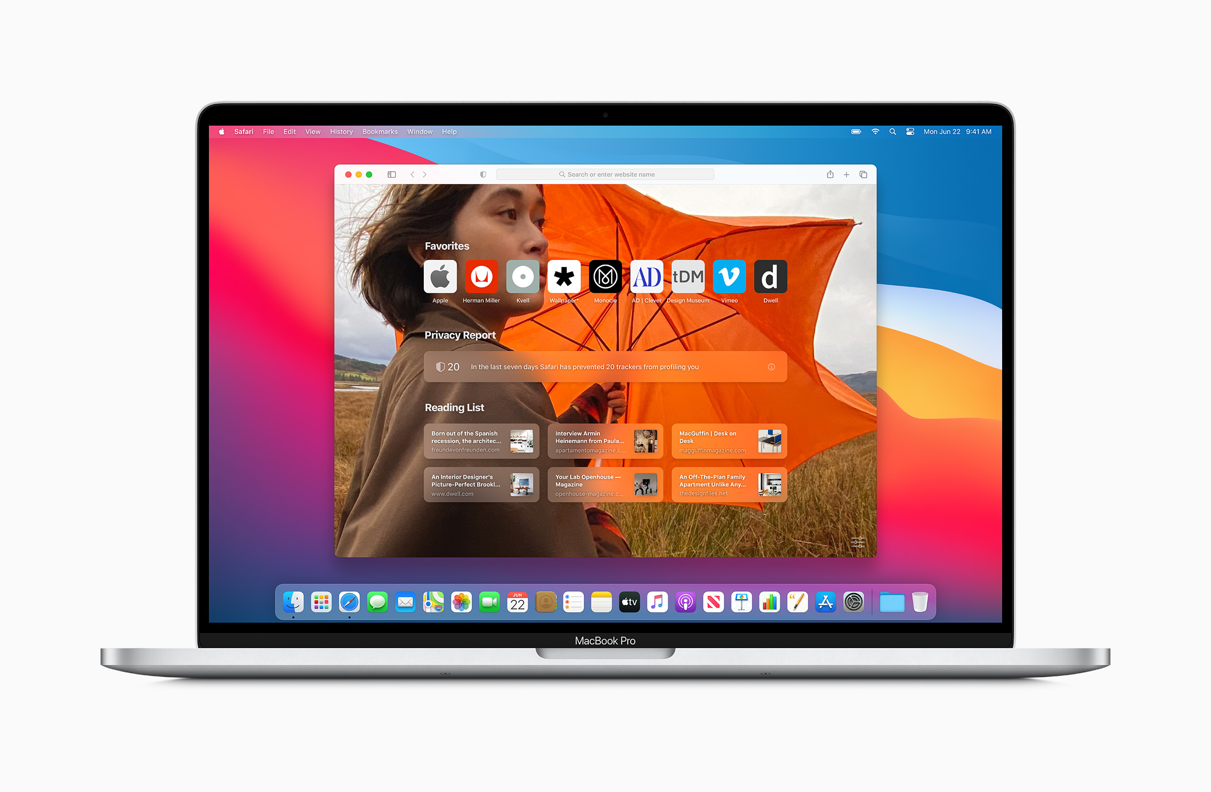
Let’s make it clear – minimalistic does not mean flat. Some people tend to use these terms as one thing. New Apple Operating Systems remain minimalistic, but their appearance gains more shadows, textures, and 3d shapes.
Like Alan Dye, VP Human Interface at Apple said: “Depth, Shading & Translucency are used to create the hierarchy. New materials are rich & vibrant….”
Apple reduces visual complexity and makes the design even more minimalistic. Some elements are flatter, but the feel is the opposite. Both iOS and macOS brings more 3d dimensions to their user experience.
👋 Tip for Designers: Think how minimalism may gain space in your design. Observe how simple effects (shadows, translucency) build visual hierarchy.
New subtle affordances
The human brain needs a hint to recognize the object. We tend to perceive 3d objects as interactive ones. That’s why lots of buttons still have a shadow.
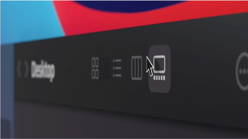
However, motion is also an additional clue. Apple designers know that and the macOS toolbar icons lost their shapes to remove visual complexity. But, when a user drags the cursor around, their background highlights and encourage them to press the action.
The last obvious affordance is color. Apple wants designers to use Tint (or Accent) color to make active elements more visible. This tone should reflect the brand or product color. Thanks to this user immediately build a mental connection between the company and the application.
👋 Tip for Designers: Don’t be afraid of not highlighting all options. Not every button needs to have a shape. It may appear when a user hovers over its surface. Experiment with tints and remove visual complexity where it is possible.
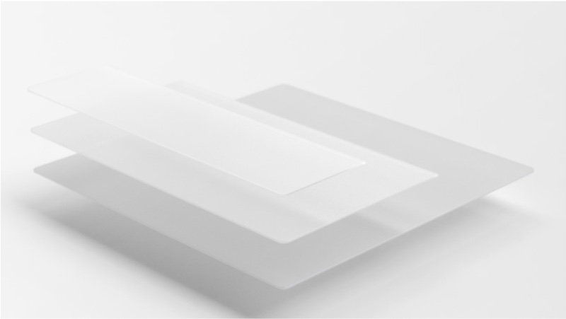
Crafting in digital materials
It has begun with Material Design from Google that showed us the vision of digital paper, then Microsoft introduced Fluent Design with the concept of multiple digital textures. It looks like Apple followed that.
It is a great decision because digital Materials are more pleasant to our minds than raw pixelated squares. They make User Interface more human friendly.
👋 Tip for Designers: Play with the concept of digital material. Use depth, shadows, and translucency to create visual hierarchy. If you are not yet familiar with Material Design or Fluent Design System, read their guidelines to understand the concept.
Subtle effects build the sense of quality
There are tiny details that make a difference. You cannot see all of them from mockups or screenshots, because some of them are motion or sound (yeah, Big Sure introduces dozens of new and enhanced UI sounds).
The thing that is primarily visible to Designers is the next generation of blur effect – called Progressive blur. It is about making the gradient of blur levels instead of hiding it below opacity or shadow.
👋 Tip for Designers: See where and how Progressive Blur is used around the new OS. Think about how it may be applied in your designs. Which design tools may achieve that effect now?
“Depth, Shading & Translucency are used to create the hierarchy.”
– Alan Dye
New Skeumorphism in Icons
In the last years, the macOS style was flattening the app icons and surrounded the symbols with mainly circular shapes. This has changed. Now the majority of icons gained “iOS-like” shape, but it is not flat. It is Skeuomorphic!
Personally, I think that lots of new icons in the macOS look stunning, but some are not designed so well (for example Stock app icon).
👋 Tip for Designers: Explore the gallery of the new icons. See how additional shadows and gradients change the feeling of flat iOS icons that perfectly fits the Big Sur icon style. Consider using 3D shapes for some elements.
Show immediate information with widgets
iOS 14 brings a totally new approach to widgets. They are displayed directly in a Home Screen. These widgets look almost identical on iPad OS and very similar to the new ones on macOS Big Sur.
Apple recommends us to focus the widget on one idea. To display only the information that’s is related to it, nothing more. It is also important to display dynamic information that is changing through time because the widget should not only encourage to open the app.
👋 Tip for Designers: Think which information from your app is the most important to the users. This type of content may be a foundation of a useful widget. Try to experiment with the new dimensions (Small, Medium, and Large) of widgets displayed directly in the Home Screen. Remember, to support Dark Mode!

Holistic approach to the ecosystem
All Apple Systems iOS, iPadOS, macOS even watchOS works as a single ecosystem. They have got the same font, iconography, and almost identical visual styles.
Consistency gives the user a feeling of familiarity and confidence. It builds more trust and a better connection with the brand.
👋 Tip for Designers: If you are creating an omnichannel solution, available to all kinds of devices, observe how Apple apps change through platforms. Where is the consistency maintained? Where are the changes made? What features are added to different platforms? You may also want to read Task Driven Design to know more.
Learn more
The official Human Interface Guidelines are always the best source for deep analysis of the new style and features. Feel free to read them here:
To conclude
Apple introduced lots of new inspiring things. While widgets, clips, and Progressive Blur in iOS 14 bring a lot of fresh experience to the mobile OS – it is the Big Sure that revolutionizes the way we use our macs. Even with its name – did you notice that it is named macOS 11?
Thanks for reading!
By the way…
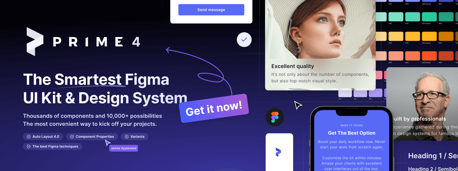
If you start a new project or would like to organize your UI Library in Figma — do not waste your time creating everything from scratch. Feel free to use the Prime — Design System Kit. It helps you design UI with the best Figma techniques — Component Properties, Variants, Auto Layout and more.See Prime in action.
To make it easier there is a gift 🎁 - Use UXMISFIT10 offer code to get 10% Off.
You can also Create User Flows faster in Figma & Sketch — With SQUID you can create User Flows directly in your favorite design tool. You may style them to your project brand within a couple of clicks. Prepare all kind of diagrams in minutes. See how it works.
All images from the article from Apple.com


