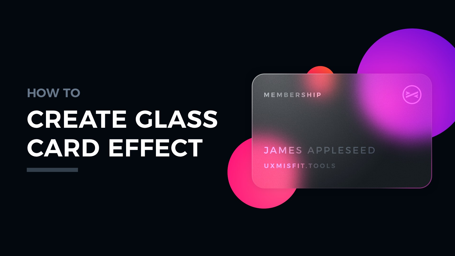
Create modern-looking UI Elements with digital glass in 6 simple steps. There are some trends in design that cannot be ignored. While glass material is not a new thing in UI Design, it was recently discovered again. Some even call the trend “Glassmorphism”.
Let me show you how to create a glass card with this effect. So you may use it in your designs. It’s pretty simple:
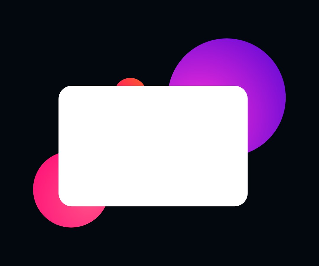
1. Draw a shape
To create a card, you need to create a basic shape first. You may imitate physical credit card proportions. To make it, create a rectangle with the following dimensions: 640×400, plus a 40pt corner radius.
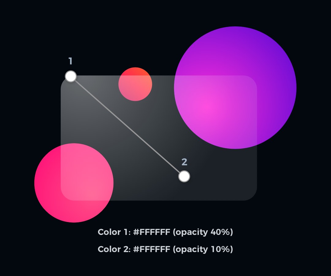
2. Apply Gradient Fill
Now it is time to basic fill. Let’s try to use something more subtle than just a solid color. In the tutorial, we will use a gradient. Both gradient colors will be pure white (#FFFFFF), but they will differ with opacity. Set the first one to 40%, and the second to 10% opacity.
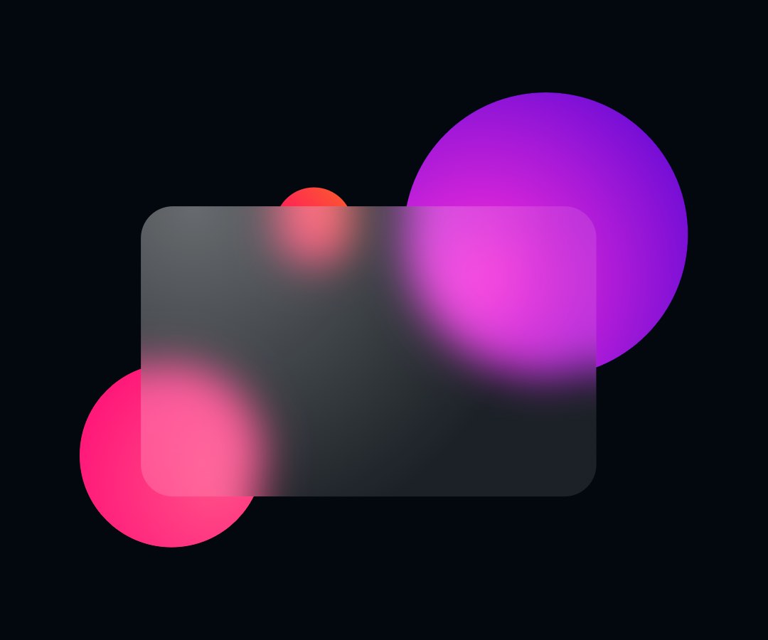
3. Add Background Blur
It is the blur that imitates the glass. Set blur value to around 20 to see how the surface of the material is changing. Obviously, you may play with your settings.
4. Add Border
The elegant border adds additional polish to the element. It also helps to establish visual hierarchy when the glass surfaces overlap.
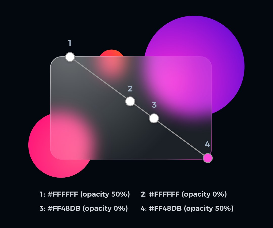
If you want to create the illusion of directional light in your design, you may want to use a gradient for the border. I made my card this way, so it looks even more “physical”.
Settings for card border diagonal gradient:
- Border: 3px
- Color 1: #FFFFFF (opacity 50%)
- Color 2: #FFFFFF (opacity 0%)
- Color 3: #FF48DB (opacity 0%)
- Color 3: #FF48DB (opacity 50%)
This simple set creates a nice illusion of interference with the environment.
5. Apply Shadow
The subtle shadow effect helps to strengthen the visual hierarchy. Thanks to the shadow, it will be much easier to distinguish all layers.
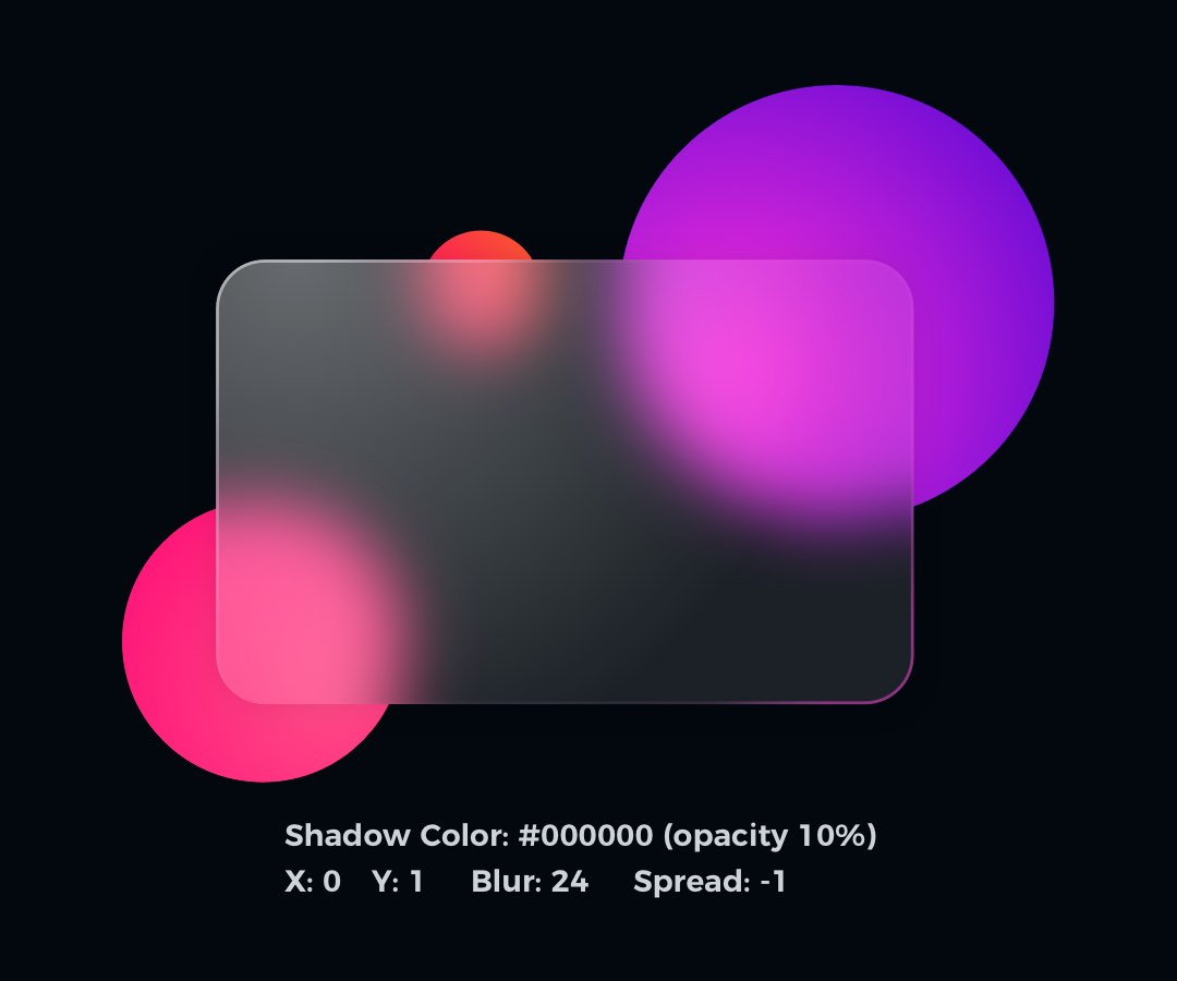
In my example, I used dark color with 24 Blur value, and Spread decreased to -1.
Note: I have made a tutorial for nice looking shadows. One of the mentioned techniques will not work here – the one about creating a shadow with a separate layer. This time you will achieve the best results by adding shadow style property to shape with the glass surface.
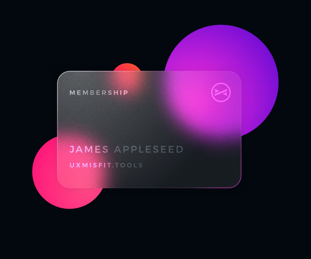
6. Fill with Content
Time to add some content. Fill it with necessary logos & text. To create an illusion of the imprinted layer, fill your content with white color, and decrease the opacity to 50%. You may also play with layer blending – try Overlay to get interesting results.

Extra Tip: Frosty Texture
Your glass card is done. However, you may go even further to add some premium texture to it!
To add an elegant noise, add an image fill with noise. Decrease opacity to 20% and set the blending mode of the fill to Overlay.
See how gorgeous it looks now:
One more thing!
If you prefer to watch UI Design tutorials, I have prepared something for you! Now on my YouTube channel you may see how to make the glass card in Sketch & Figma! Check it out now! Don’t forget to subscribe the channel to see upcoming tutorials.
To conclude
Glass is getting more and more popular. You may not like the trend. However, if your client will ask for it – you have to know how to achieve the best results!
Thanks for reading!
By the way…
If you start a new project or would like to organize your UI Library in Figma — do not waste your time creating everything from scratch. Feel free to use the Prime — Design System Kit. It helps you design UI with the best Figma techniques — Component Properties, Variants, Auto Layout and more.See Prime in action.
To make it easier there is a gift 🎁 - Use UXMISFIT10 offer code to get 10% Off.
You can also Create User Flows faster in Figma & Sketch — With SQUID you can create User Flows directly in your favorite design tool. You may style them to your project brand within a couple of clicks. Prepare all kind of diagrams in minutes. See how it works.


