Ease of use is the key when it comes to efficient workflow. Sketch Team continuously work to improve this aspect of their design tool. Fortunately, there is a huge leap forward since Sketch 64. I have described how to use Tint in Sketch, now in this tutorial, I will show you how to get most of the Components Menu!
First, let’s briefly sum up what new things appeared in Sketch 64:
- Tints — With tints, you can change the colors of the entire group of Symbol immediately. The feature is easy to override and may be ideal for visualization of multiple states of UI elements like icons or tabs. The Tint is available for Symbols and groups under the Style section in the Inspector Panel.
- New Components Menu — The feature we will explain more in the next parts of the article. Components Popup & Menu were the most controversial element of Sketch. They have been changed again – for better! Now, you may use fly-out menus, but you may also quickly search for Styles and Symbols.
- Search — Now Sketch got real Search. It is a pleasure to type a few words and find every Symbol or Style I need!
- Filter/Search Bar moved to the top — Since the feature has become more and more important to designers, it was an obvious decision to change its exposure. Now, when you want to find something in the components panel (on the left side of the window), you may notice that it was moved to the top of the list. It is much more convenient.
- Updated Artboards — Chromebook artboard now covers the Pixel Slate resolution (1333 x 888), Pixelbook is now 1200 x 800.
- New shortcuts — You may now work faster with Symbols thanks to the new shortcuts: “Command + Y” — Create Symbol, “Command + Shift + Y” — Detach Symbol, “Command + Option + Shift + Y” — detach all contents from Symbol.
- Smart Layout efficiency improved — You will notice faster work with files containing lots of Smart Layout Symbols.
If you want to see more details – I have described the whole update in my article on Design+Sketch Medium Publication.
Components Menu – What is it?
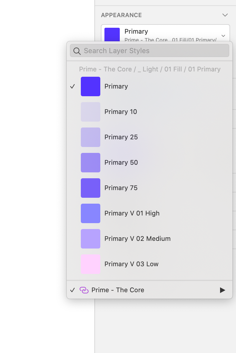
Components Menu appears as PopoverPopover from Inspector Panel (the one on the right side). It may include Layers Styles, Text Styles, or Symbols – it’s content depends on the specific element you interact with. Example: if you selected Text Layers, you might browse or search through Text Styles).
Originally Sketch included Components Menu in the form of fly-out menus. It was a standard for many design tools. Then, the components menu transformed in the form that enabled filtering, but browsing through the list was harder. I have already described how to use efficiently Components Panel & Menu before Sketch 64, most of the tips are still valid.
Now, since Sketch 64, you can do both – dig through levels of fly-out menus and search to find specific components immediately. This connection of the “two worlds” is good for designers. Their usage depends on specific cases; let’s see when to use each method.
Components Menu – when you are new to the specific Sketch file
The most significant disadvantage of previous Components PopoverPopover was following – if you weren’t sure about Styles or Symbols structure, you had to scroll through the very long list to discover elements.
Fortunately, since Sketch 64, you can use the good-old fly-out menu. Digging through menus is useful when you learn new UI Resource or Sketch Library. This wah, you may quickly have a look at the whole structure and build the mental model of a specific structure.
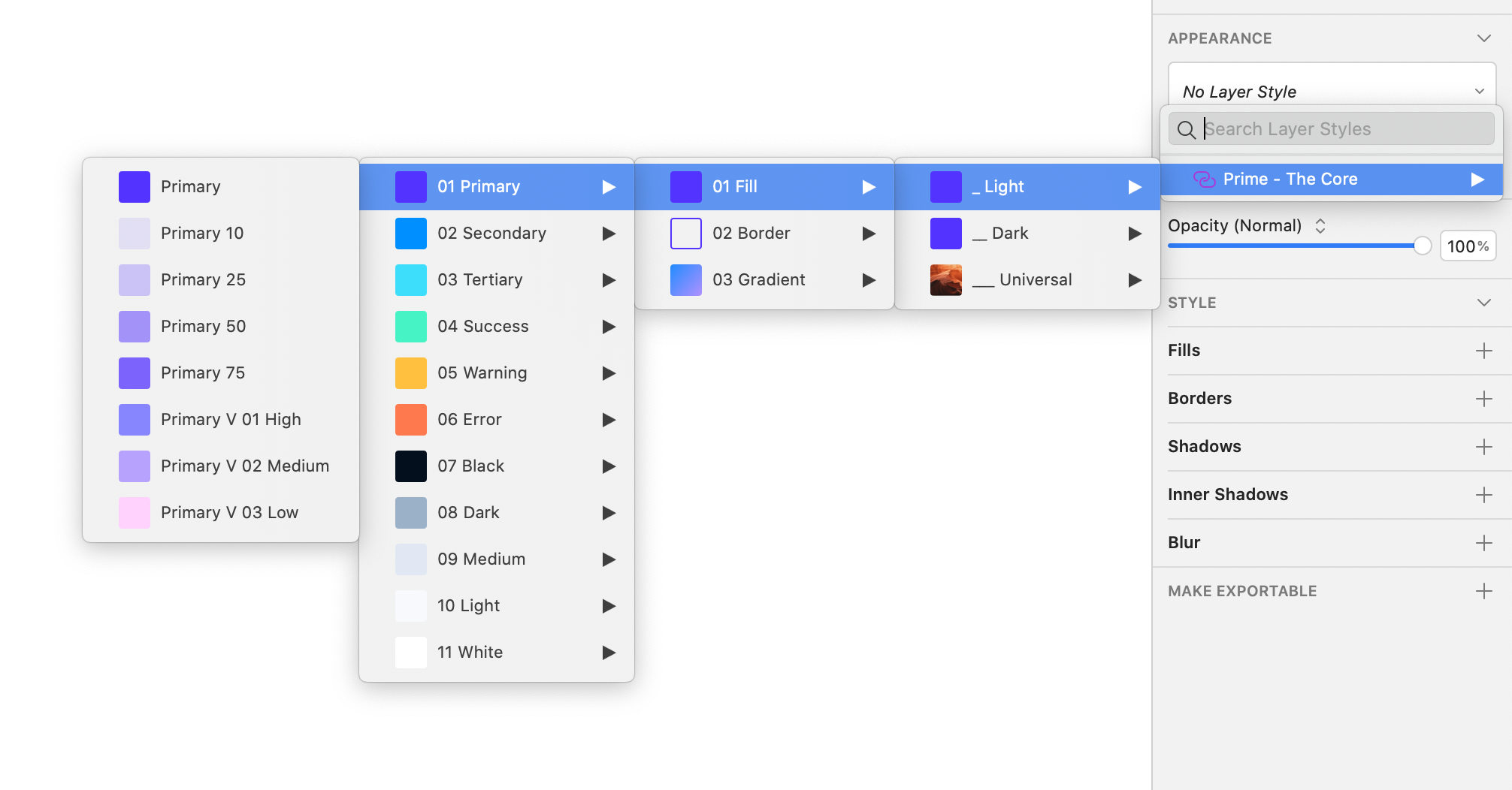
To sum up: if you just started to use Library or UI Kit, spend some time discovering its structure by browsing levels of fly-out menus available in the Components Menu.
If you are familiar with your Sketch Files, move to the next section!
Components Menu – when you know your Libraries well
Searching is the fastest method of accessing specific elements – if you know their name. The search feature in Sketch works marvelously, and it is extremely fast, even for big libraries.
To use Search in Components Menu efficiently, you have to know the overall structure. Well designed libraries are now the must if you want to work efficiently.
It is worth to notice that some Symbols or Styles may have almost identical names when you use multiple Libraries. You should pay attention not only to the big label with a name but also the second line because it includes the full name of the Style or Symbol. Thanks to this, you will be sure that this is the element you were looking for.
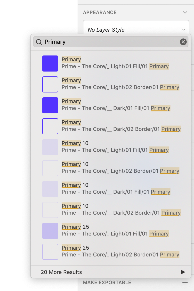
Pro tip: If you know only one name from the specific category, type its name and select it, when you will open Components Menu again, it will show all Styles/Symbols from this category so you can easily switch Component to the one you need.
 To conclude
In my opinion Components Menu introduced in Sketch 64 is totally awesome. It makes workflow easier if you are familiar with the Sketch file and when you learn the new one. It is great that Developers remember these two use cases. What do you think of the Components Menu?
By the way…
All the above samples are made with Prime Design System Kit. I build the library with a consistent structure of Styles and Symbols – thanks to this, it benefits from both usage types of Components Menu. And it is soo fast!
So, if you plan to start a new project soon or you would like to organize your UI Library — do not waste your time creating everything from scratch. Feel free to use the Prime — Design System Kit. It helps you design UI with the best Sketch techniques — Smart Layout, Symbol Overrides and more.
To make it easier there is a gift 🎁 Use UXMISFIT10 offer code to get 10% Off.
 You can also Create User Flows faster in Sketch — With SQUID you can create User Flows directly in Sketch the sketch file with your artboards. Everything may be done within a couple of clicks. See how it works.
Thank you for reading!
