Components Panel and Popover introduced in Sketch 60 changed the way we work with Symbols and Styles. If you would like to optimize your workflow, this tutorial is made for you!
Note: Most of the tips below are still valid in Sketch, byt if you would like to know how to use Popover better since version 64, read How to Use Components Menu since Sketch 64.
Short Introduction to Components Panel & Popover
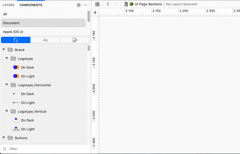
The panel is placed on the left side of Sketch Window. To open it, switch the tab from “Layers” to “Components” at the top of the left panel. The panel itself is divided into 3 tabs — Symbols, Layer Styles, and Text Styles. You can also filter their content with the input at the bottom of the panel.
A few things good to know about panel behavior:
- The old naming convention with “/” was transformed to be presented as folders.
- To use a specific Symbol or Style, you can drag and drop it on canvas.
- You can manage styles lists just like layers (select multiple instances, group, ungroup, etc.). This is very convenient!
- Search is not so universal. It is rather filtering. If you do not know a specific name of Symbol or Style, it may be hard sometimes to find it. Example: If your style name is “Fill/Black” and if you type it into the popover — it will not appear. When you type “Fill” it will show you all fills. When you type “Black” it will show you all styles with this word (Fill, Border, etc.).
The popover appears if you would like to modify Style or a Symbol from the Inspector panel. Its layout is simple (search field + list), but it is quite powerful. A few things good to know:
- The search from Components Popover is fast! If you know the name of Style or Symbol, you will find it much faster than in the previous version of Sketch
- The search mechanism could be better. It is also rather filtering. If you do not know a specific name of Symbol or Style, it may be hard sometimes to find it. Example: If your style name is “Border/White” and if you type it into the popover — it will not appear.
- If your styles or Symbols have got a long naming convention, the new popover will not display their full names. The only way to deal with that is to consider shortening names.
Ok, this was the summary of the appearance and behavior of the features. Let’s move to the practical tips that should boost your workflow, so working with Symbols and Styles will be efficient as never before!
Disclaimer:
All tips below are based on my experience in modifying my projects – mainly Prime Design System Kit, which includes thousands of Styles and hundreds of Symbols. Mentioned optimization will work best with similar naming conventions.
Ultimate Advice
First, change the way of thinking about Styles and Symbols names. Components panel and popover is a shift from “picking the style” from the menu into “finding the style” thanks to the search/filter feature.
In Sketch before version 60, you had to dig through dropdown menus to find style. Now you have to prepare for the searching. And it is much faster method to reach Symbols and Styles! You will see it in time.
Tip 1. In The Beginning, It Was Chaos, Then Came Light and Dark (Themes).
If your Styles or Symbols include dedicated components for Light and Dark Theme, it is good to order them in a predictable way. I use mostly Light Theme, so I wanted elements from this group to be displayed first.
To order groups, I used underscore “_” as a prefix. This is how I ordered the main categories of Styles:
Text Styles:
Light Theme -> _ Light

Dark Theme -> __ Dark
Layer Styles:
Light Theme -> _ Light

Dark Theme -> __ Dark

Universal -> ___ Universal
The number of “_” defines the order in search results. That’s why it is essential to make the group you use most frequently to display at the top.
Why I do not use “01”, “02”, “03”…? I reserved number ordering for Text Styles (their size names), so I am able to find the desired font by typing its name or number – it’s very convenient, and I recommend you to do the same.
Tip 2. Utility Styles and Symbols Naming
We usually do not want to display styles used only to organize the library’s appearance. I decided to put at the end of all folders by giving the prefix symbol of Omega.
Example: "Ω Prime"
Thanks to this, the group always displays at the end of the list. Some Libraries use “x” or “z” to put the folder at the end of the list. However, it will not always work. Using special character will make sure that the folder you want to be at the end of the list will be there always.
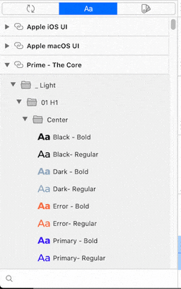
Tip 3. Flatten the Font Naming Hierarchy:
The original Text Style naming convention usually looked like this:
Light Theme/08 Body/Center/Black/Bold

[Theme]/[Order number] [Name]/[Color]/[Weight]
If you wanted to type “Body” in the search field of components panel you would get many folders opened that include just a few styles. You have to flatten the naming convention.
Now, for new Component Panel I recommend following:
_ Light/08 Body/Center/Black - Bold

[Theme]/[Order number] [Name]/[Color] - [Weight]
It sounds like not so big modification, but the benefits are enormous! Thanks to this, you are able to find the desired style quickly. Here is why:
When you want to apply the style to Text Layer, start with the name of size.
Example: In the search/filter field type “Body” and you have the full list of styles with colors and weight grouped with alignment. Finding the right style is very easy.
If you do not remember the exact name of the text style, just type numbers from “01” to “13”. My UI Library fonts are organized by size, so you will also be able to find them quickly.
Now I would like to show you two major cases when this naming convention works well. Let’s focus on the ones that apply to create a new layer and apply the style of the existing one:
Creating Text Layer with Text Style
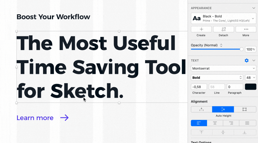
Usually, users start to search by size name, for example: h1, h2, body, subtitle, etc. If you type this short size name, you will get nicely organized results that do not require much effort to choose the one we want. Just select alignment, and the list of colors lead you subconsciously to the right position. Now choose bold or regular. Voila!
Applying the Style to Existing Layer
Ok, if you already have got a layer that requires only modification of style, you usually have to change weight, color, or alignment. If you open popover (from inspector panel), it already shows me weight nearby. If I need to change colors, I already see them on the same list. If I would like to change alignment, I just jump to the next or previous folder. It’s that easy!
 I have tested multiple other naming conventions. After minutes of testing, I have found this one very, very, very fast. Much faster than digging through dropdowns. Cool!
Tip 4. Optimizing Symbols Names:
It is good to remember that if the specific symbol has got alternative states or appearance, you should name the category (folder) as the specific component. This is the key to success.
Example: I have got several symbols referred to as the checkbox. Because I named the category “checkbox,” I can easily identify states (“Normal,” “Selected,” “Disabled,” etc.) in the list I filtered by this name.
How to Optimize Structure and Naming Quickly
When I figured out the naming convention, I want to use it. I was able to make changes to entire libraries within minutes. Some changes were quick to apply in Sketch Components Panel. However, hard tasks were made quickly, thanks to several plugins:
Thanks to these plugins, you will be able to make changes to multiple elements at once.
To conclude
The Components Panel and Popover may be a bit controversial at the beginning, but applying the new way of thinking boosts the workflow in a way that was never possible with dropdown menus. What’s more, I believe that Sketch Team will continue improving its behaviour to make it even more convenient!
The above tips worked well for me, and I hope you also found them useful!
By the way…
If you plan to start a new project soon or to organize your UI Library — do not waste your time creating everything from scratch. Feel free to use the Prime — Design System Kit. It helps you design UI with the best Sketch techniques — Smart Layout, Symbol Overrides and more.
To make it easier there is a gift 🎁 Use UXMISFIT10 offer code to get 10% Off.
 You can also Create User Flows faster in Sketch — With SQUID you can create User Flows directly in Sketch the sketch file with your artboards. Everything may be done within a couple of clicks. See how it works.
Thanks for reading!


