
It is that special time of the year when we start to plan the future goals. Just like every year, let me present you some predictions, based on present observations, on what may be a hot thing in 2023. Thanks to this I hope you will be able to adjust your goals better.
Which predictions worked?
Last year I also wrote down some upcoming trends. Feel free to check 2022 UX/UI Design Trends article for reference. Here is the brief summary of which prediction happened:
- No Code will become a standard – confirmed. I think that we may say that no code has become very popular in 2022, but with recent Framer updates, it was finally much easier to dive into that area. I will write what will happen in 2023 for no code.
- Glassmorphism is a new standard (not the trend anymore) – confirmed, no doubts about that. We see it in operating systems. We see it on mobile and on websites too.
- 90s style – a new trend? – partially confirmed. It didn’t become a significant trend, but one of the popular styles for sure. But some major platforms (like Gumroad or Medium), followed this kind of visual treatment.
- Interactive prototypes – confirmed. In 2022 Figma introduced new features, like spring animations, that allow us to make even more interactive prototypes. If you are looking for more interactive elements, in 2022, Protopie introduced some cool changes and prepared a free plan to make it easier to start prototyping!
A pretty good number of confirmed predictions, isn’t it? Cool, now let’s deduct what will happen next!
What design trends to expect in 2023
Time to imagine what will be a hot trend in 2023. Let’s begin with more tech-related aspects and then dive into visual design.
No-code – battle of titans
Designing for no-code still seems to be fresh, and there is a lot to happen in this area. For 2023 I suppose to be a battleground of two excellent platforms.
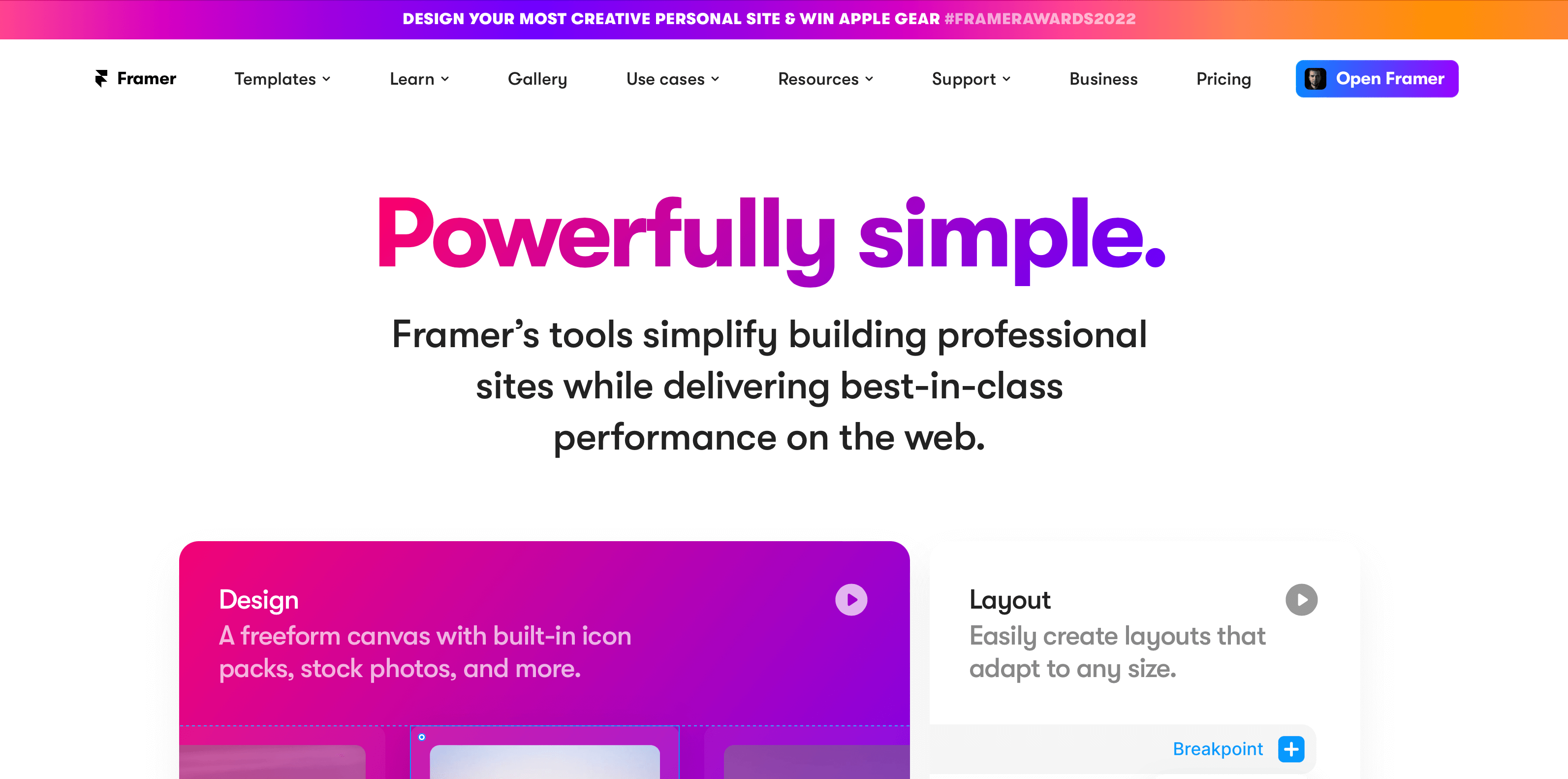
One is already trusted and solid platform – Webflow, and the second is a new rising star – Framer.
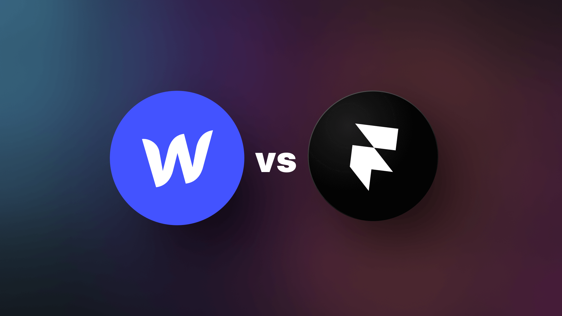
In my opinion, we may expect a lot of exciting new features & improvements of both tools. We may already observe the acceleration of this in a few last weeks.
In recent months, we saw that Framer is introducing more & more enhancements. The team is building the base of attractive elements and tutorials. The tool seems to be intuitive & feels more like a design tool than a web page editor. I also decided to try its possibilities and build a Designer Portfolio Template (featured in Framer Template Gallery).
On the other side, Webflow, during its conference, confirmed that they know what they are doing. They do not fear to drop old fashion naming and structures and are open to fresh ideas. I use Webflow for most of my landing pages and already see those improvements.
What you, as a designer, may do with that? Learn both platforms, and check their possibilities. Webflow is now better for more complex websites, while Framer may be faster for simple ones, like landing pages.
I don’t know which (or if any) tool may win the battle, but I hope that they will coexist & grow rapidly. It is an ideal situation – because competitors fight for our attention, they make their as good as possible.
Virtual Reality – one more time?
source: Apple.com
Last year I mentioned that virtual reality is waiting to reach a mass audience. I hoped that this would happen in 2022, but it was not the time.
Will this situation change in 2023? It depends on the market. As always, an economic crisis slows down innovation, but just after that, we may expect that new tech solutions will skyrocket.
When VR & AR may be accessible to the masses? Well, Facebook Meta is building their meta verse, but the truth is that they do not have much luck in bringing it to a broader audience.
For me, a clear sign of the change in the Virtual Reality market will be a presentation of Apple Glasses. The giant from Cupertino does not have to be the first company to present VR devices, but I am sure that it will be the first that will make it right. We’ve already seen it many times with other device categories, and I believe that this innovative human-centric spirit is still there!
Design for Decentralization
Recently some Twitter users decided to move into a different social network called Mastodon. What’s unique about this solution is its architecture – it is decentralized.
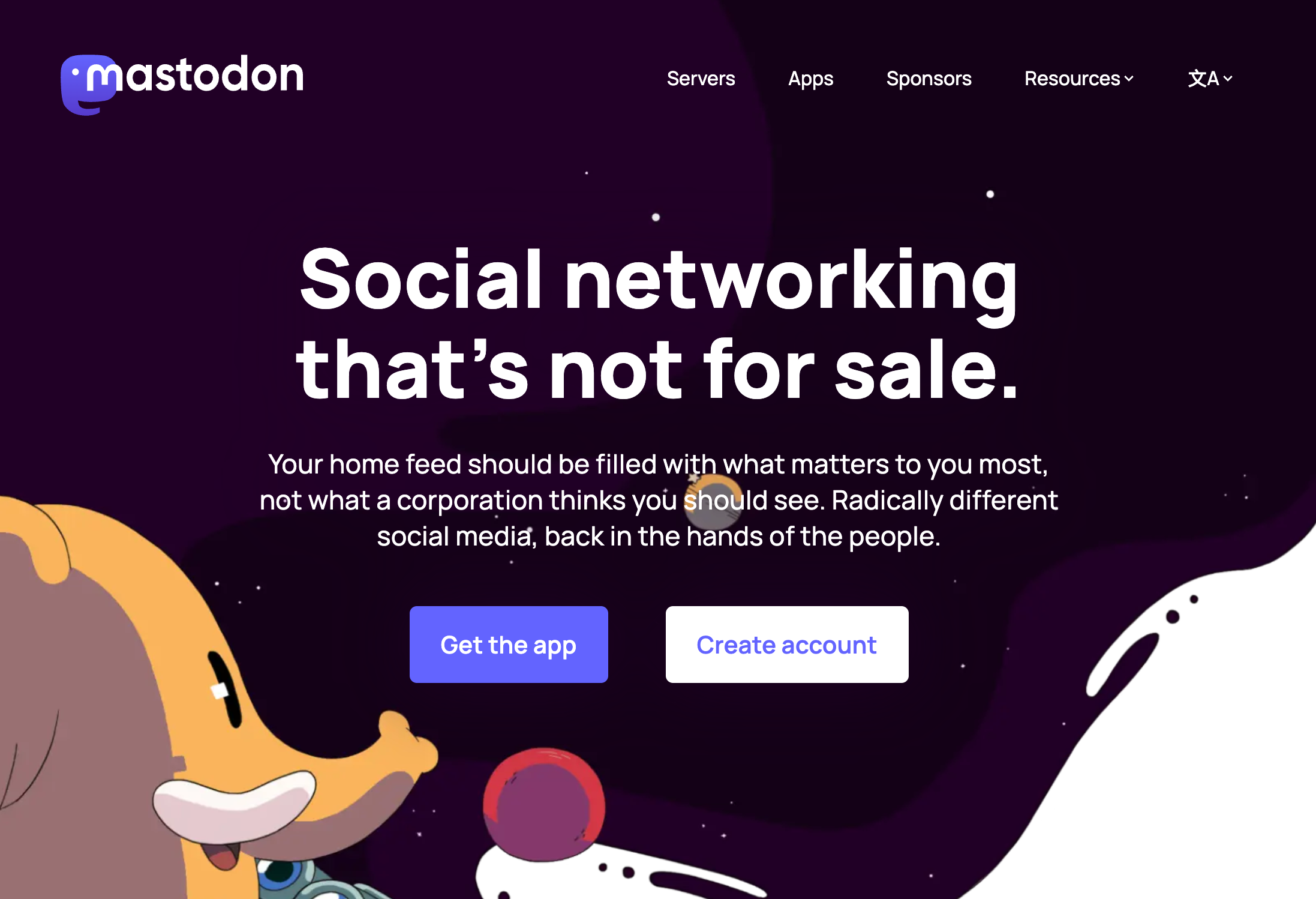
So what are decentralized social media? They are based on blockchain technology and operate on independent servers. They are not in the hands of a corporation. Instead, their users make all the decisions surrounding their operation and networking.
What I also noticed is that many users seem to be confused with the new environment of decentralized platforms. For sure, this is an opportunity to enhance the experience!
Design for video experience
Designers spend decades designing for better readability. People spend most of their time reading digital content. Now it is changing. Due to the rising popularity of video materials, especially within social media, we realize that people read less and less.
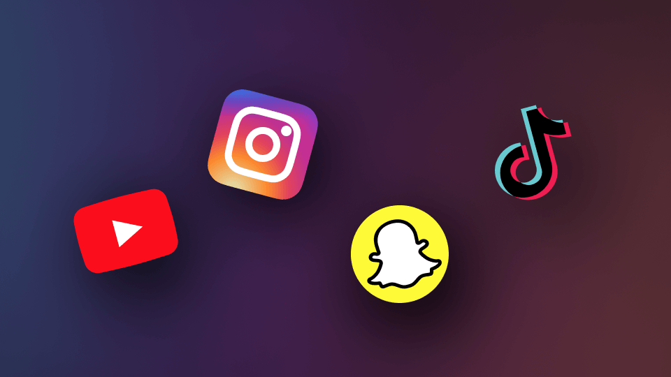
Why do videos win over traditional text or static image content in many cases? They grab attention faster (something is happening there, you hear the sound, etc.). Videos require less effort to consume (you do not have to read, you just watch them).
Additionally, platforms with an endless loop of materials like Instagram reels or TikTok easily addict users to watching short videos.
It’s like the endless scroll pattern for feeds. When you go through our videos switching between content quickly, the brain gets a hit of dopamine each time. This creates a kind of neurological ‘high.’ It’s that thing that keeps you watching the next and next video.
What’s the conclusion for us, designers? While patterns for the information architecture of text are well established, videos still seem to be a ground that has much to discover.
I think that kind of new video platform may be born next year (I believe that there is something more than just copying TikTok patterns). So, in the upcoming year, we might need to invent new, fresh patterns for solutions that serve us videos or even design experiences within that materials.
AI-driven design
In 2022 there was an explosion of AI-related tools & generators (Have you seen beautiful artworks made with Dall-e 2? This is fresh ground, it has a huge potential, and I suppose it will explore in 2023.
I don’t think that AI will replace designers. However, it will become a great ally. It will support us in various tasks. I can imagine that AI-driven solutions will help us with research, benchmarking, or structuring design systems! For now, the existing tools like Magician Design plugin bring more joy to work. Worth to check them out!
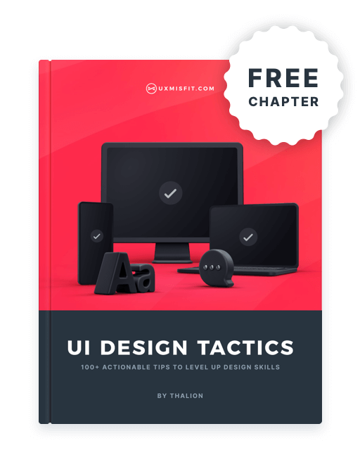
Get Free Chapter
15,000+ designers are already subscribed (no spam! Only design tips, tutorials + design resource news).
Join now, get the free chapter of my eBook right to your inbox. With these tactics, you will solve common design issues with ease.
Sign up - Get Free Chapter
Visual/UI Design Trends in 2023
When I browse new trending designs or no code page templates in Framer, there are a few patterns that for sure will play a significant role in 2023:
Summary Grids – be like Apple again
You might have noticed that every newly introduced product gets its summary slide if you watch recent keynotes.
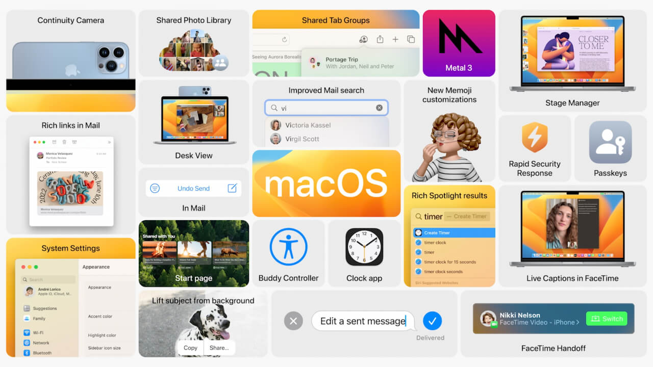
This is a piece of information architecture art connected with delightful visuals. They have been with us on Keynotes since 2020, but now, they have started to inspire designers even more. You may notice already lots of designs using summary grids for their products or features. This new pattern is far more attractive than boring lists of features.
Gradients
A few years ago, gradients seemed to be a bit passe, everyone wanted to have solid minimalistic layouts with beautiful photos, but this has changed. However, modern gradients are much more complex. They share the characterisitc of mesh gradients and glassmorphic blurred layers.
The new gradients will have vivid, unusual tones. Mixing layer blending and overlaying blurred elements helps to achieve surprisingly amazing effects. They may also mimic some 3 effects, like amazing wallpapers for recent macOS releases.
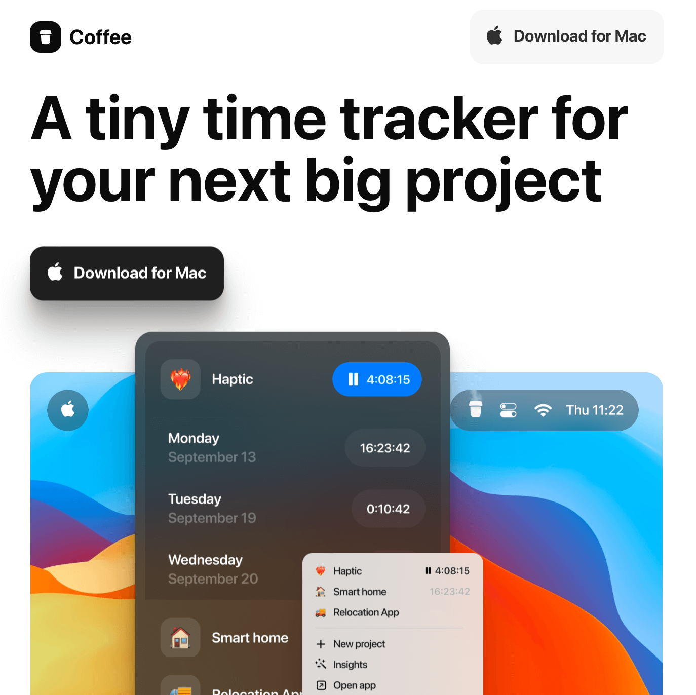
https://trycoffee.co
Modern gradients are much more than just a background. They may be applied as text fill as well.
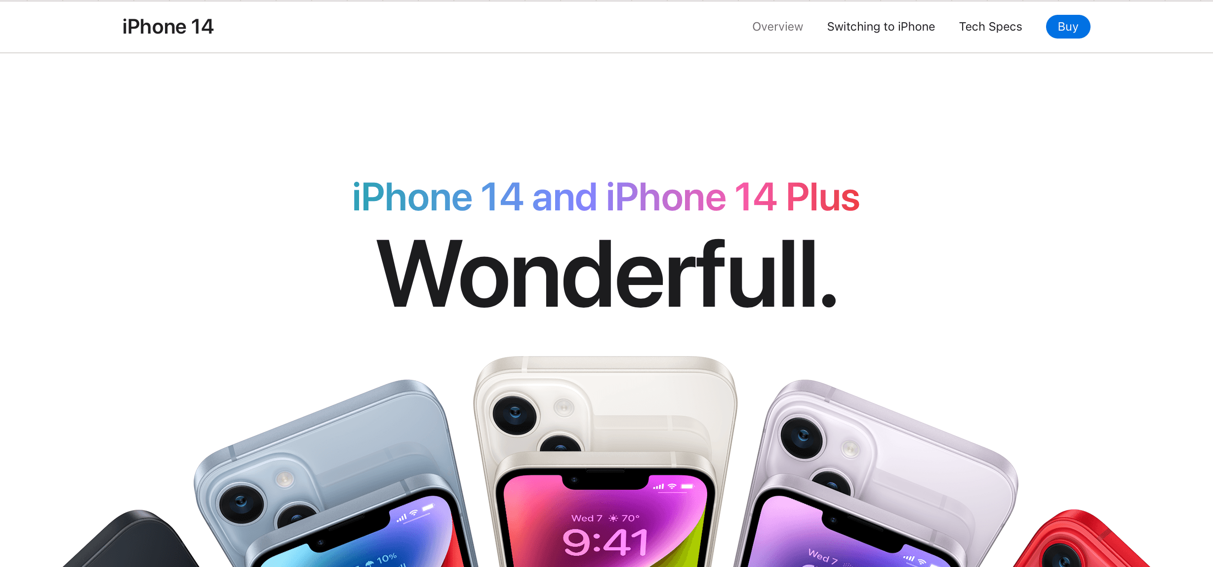
Source Apple.com
Why will they work for us so well? They feel natural. Gradients are everywhere in nature, from the blurred sky, through metallic reflection on cars, to subtle green tone differences on leaves.
What can you do as a designer to follow that trend? Browse your favorite websites or dribbble shots. See how they apply gradients. What colors are used? What shapes do they represent? How do they blend with text content and other elements?
Framer.com with all kind of gradietns
Ultimate simplification
I am not sure if it is connected with the no code trend. But, recently, I noticed that many of the sites created with Framer started to be very minimalistic and bold at the same time in terms of included elements.
The trend characteristics are large interactive areas. Very often, they share a grid-like layout (see Apple Summary Grid trend), and usually, they present tiny amount of text content.
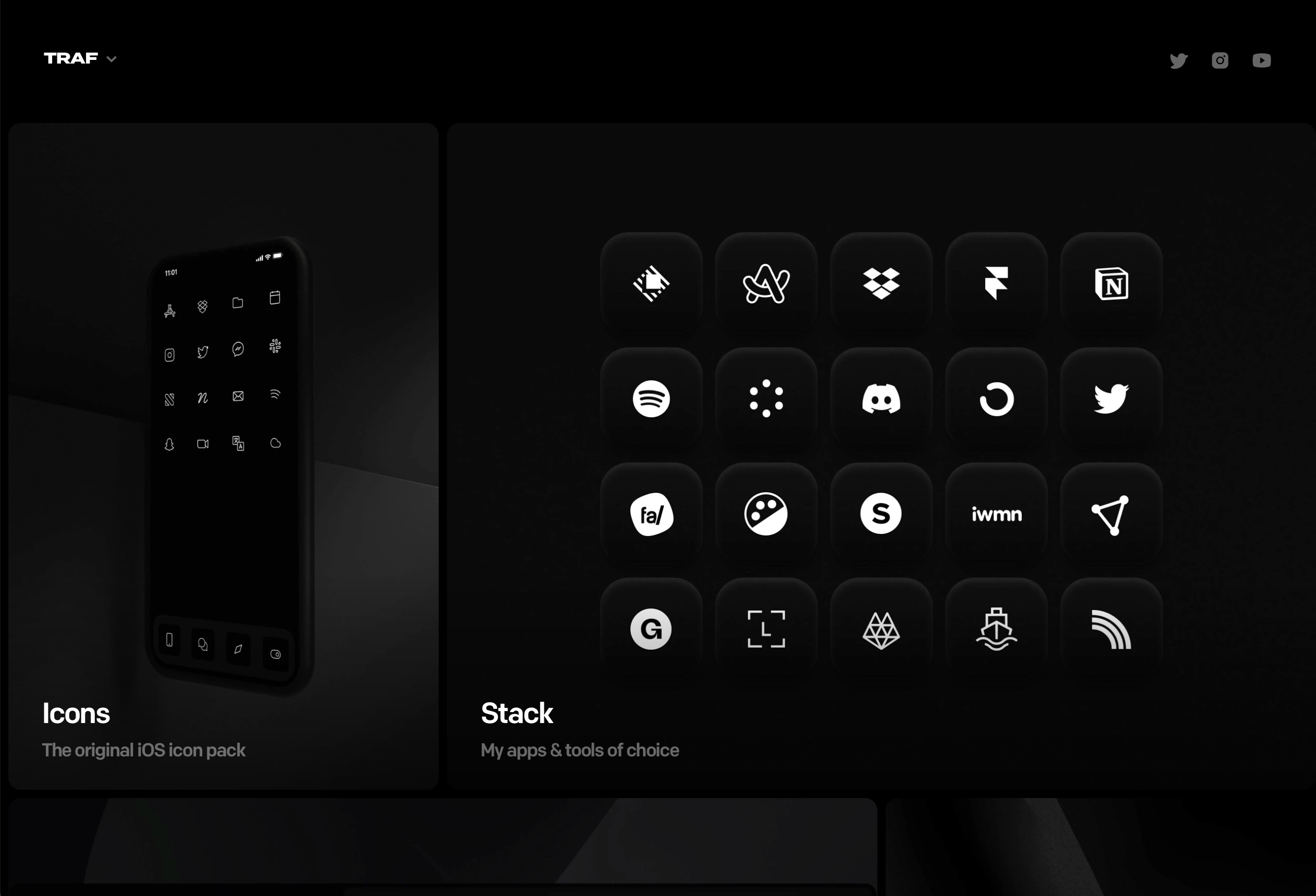
https://tr.af/
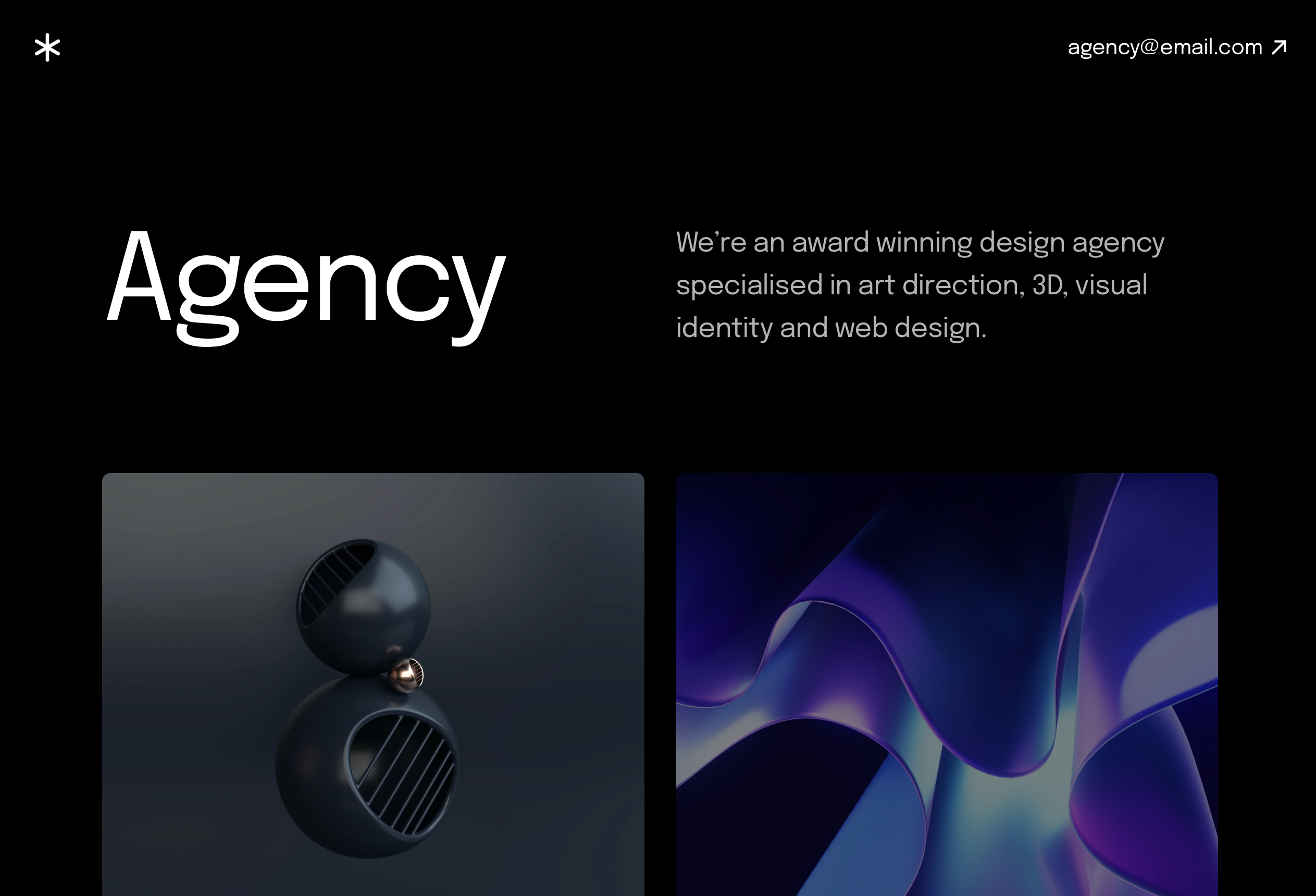
https://agency.framer.website
To prepare for the popularity of that trend. Try to recreate elements of websites with this style, and see how they play together. How authors achieved great results by minimizing text content and maximizing visuals?
Summing up
Let’s be honest. No one can predict the future. However, we may deduct some things based on present findings. I strongly believe that many of these things will have their time soon. It’s good to be prepared!
By the way…
If you start a new project or would like to organize your UI Library in Figma — do not waste your time creating everything from scratch. Feel free to use the Prime — Design System Kit. It helps you design UI with the best Figma techniques — Component Properties, Variants, Auto Layout and more.See Prime in action.
To make it easier there is a gift 🎁 - Use UXMISFIT10 offer code to get 10% Off.
You can also Create User Flows faster in Figma & Sketch — With SQUID you can create User Flows directly in your favorite design tool. You may style them to your project brand within a couple of clicks. Prepare all kind of diagrams in minutes. See how it works.


