If you like to use Components a lot in your design, you will fall in love with Variants. This Figma feature moves the design workflow to a completely different level.
What are Variants
Variants are like Components groups. Their purpose is to gather similar Components and give a designer ability to configure it as one element with a couple of toggles.
Variants will make your Design Systems much more flexible and faster to use. Browsing components is much more comfortable. They reduce the complexity of the Components set.
The best thing is that well-prepared Variants preserve the overrides.
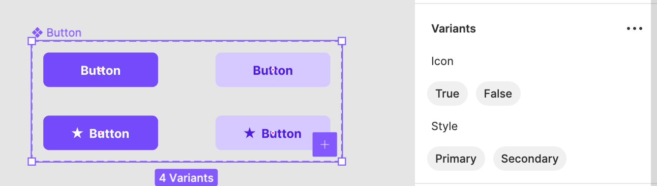
When you use the Variant component, you may configure it (choose other variants) from the section in the panel on the right.
How to make Variants
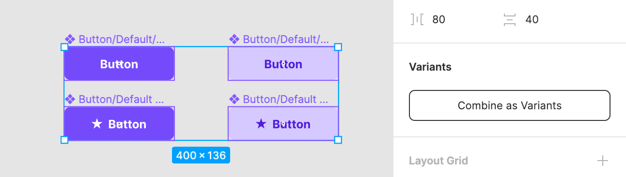
Creating Variants is very simple. Select Group of Components and Click the “Combine as Variants” option from the right pane.
It is important to have the same set of identically named layers inside every Component. Thanks to this, you will be able to switch between every option quickly, and variants will preserve overrides.
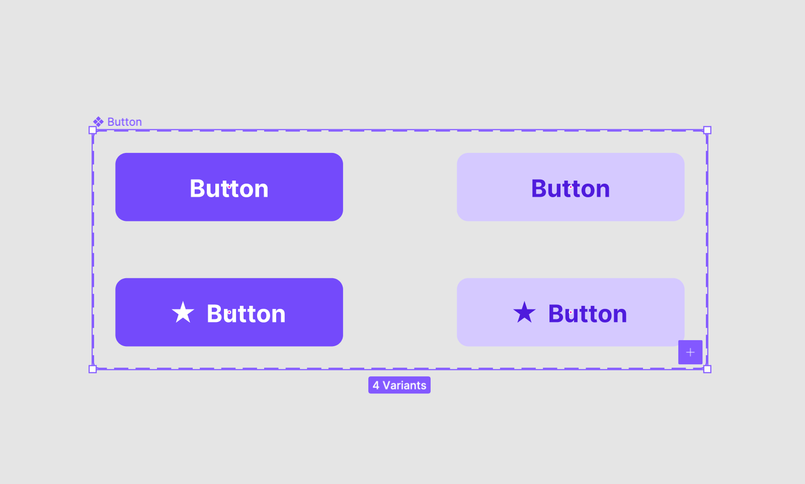
Let’s take a look at the example of well-named components that will work as Variants nicely:
If you have Components named in a following convention (the example from screenshot above):
- Button/Default/Primary
- Button/Default + Icon/Primary
- Button/Default/Secondary
- Button/Default + Icon/Secondary
After making gradients, you will have the ability to configure following this in “Button” Component: Presence of Icon and the Style.
I updated my User Flow Kit to get most of the Variants. This gave me the opportunity to learn a lot about the feature itself. Below I would like to present you with some tips for practical usage.
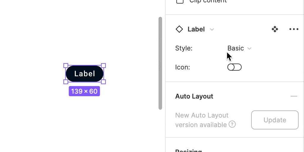
How to Make switch instead of dropdown
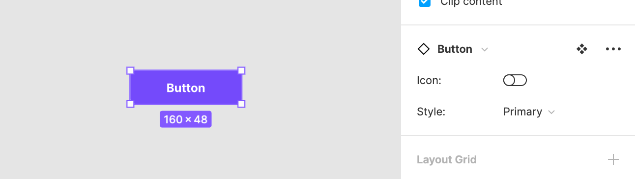
When you browse design resources, you may notice that some variants have switches instead of dropdown selectors. Making a switch is very simple:
- You have to keep only two values in the Variant Property.
- Property values have to be named “Yes, No”, “On, Off” or “True, False”.
So from the example above, we may rename the property to “Icon” and the values “True”, “False”.
 If you have components like this in your project, I strongly recommend to configure it this way.
Practical usage of Variants
Using assets is much faster with Variants. You will notice quickly the element you need, because you do not browse the list of dozens of almost identical options.
Use it for Control States
Use the switch control to make Checkboxes, Switches, and other Selection Controls easy to configure.
When it comes to Button states, they are also useful. Prepare components to have properties like “Default, Hover, Pressed, Disabled,” so you will be able to configure them with Variants.
Use it to change the Style
Name your components to have a style – Primary, Secondary, Neutral, Error, Success, etc. Thanks to this, you will be able to configure them on the fly with the variants.
Differentiate Components size
Not only states of UI Controls may be controlled with Variants. If you have multiple Button sizes in your project, combine them with Variants. You will be able to toggle between Large, Medium or Small size within one Component.
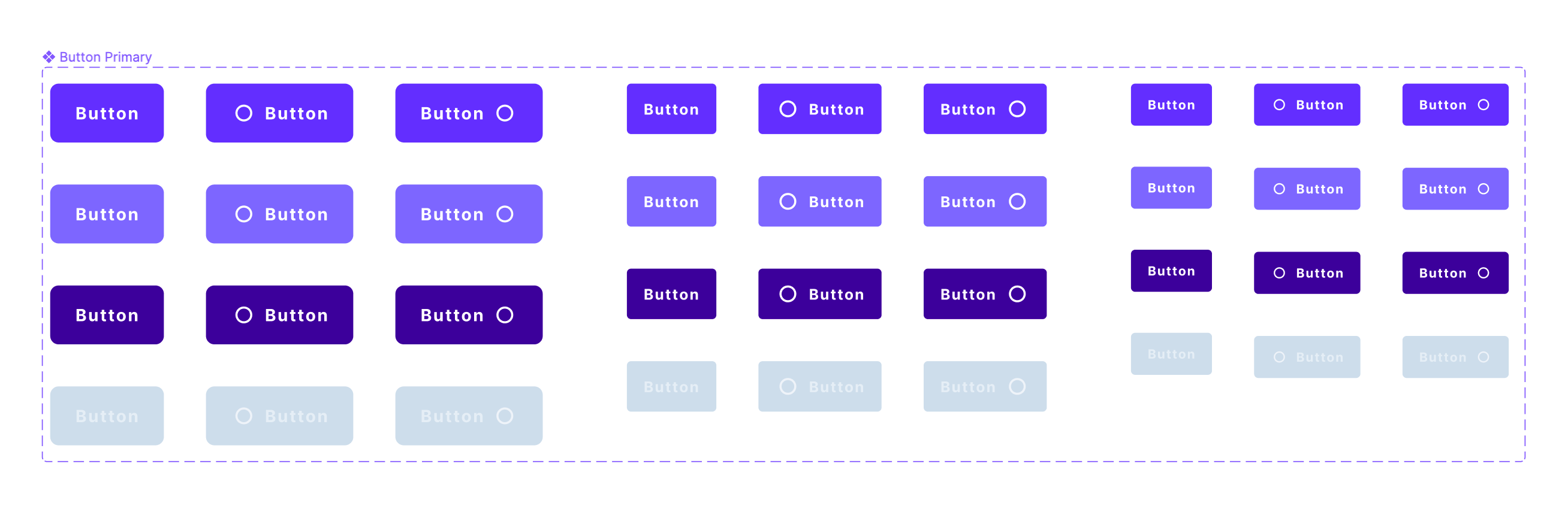
Combine multiple properties
Do not limit yourself to one or two properties in Variants. Think about how you will use your Design System Library. For example, Buttons may have the following properties: Size, Style, State, and Icon.
In the asset panel, you will see just one Component and you may configure it with Variants extremely fast.
What are the limits of Variants
While the feature is very helpful, there are some things that may be improved.
For now, you have to create every permutation of the Component to use it properly as Variant.
It would also be great if the prototypes could get more of the variants feature.
Bonus – Freebie
To make easier start with Variants, I have prepared a small freebie for you. The file includes two UI controls: Button & Switch, they are combined as Variants. Feel free to get it from here:
👉 Get Freebie – Figma Variants Sample
Summing up
Variants are a very flexible feature. They gave us lots of possibilities to scale design systems and speed up the workflow. Do you have other recommendations for using Variants? Let me know in the comments, so others will also learn them!
By the way…
If you start a new project or would like to organize your UI Library in Figma — do not waste your time creating everything from scratch. Feel free to use the Prime — Design System Kit. It helps you design UI with the best Figma techniques — Component Properties, Variants, Auto Layout and more.See Prime in action.
To make it easier there is a gift 🎁 - Use UXMISFIT10 offer code to get 10% Off.

You can also Create User Flows faster in Figma & Sketch — With SQUID you can create User Flows directly in your favorite design tool. You may style them to your project brand within a couple of clicks. Prepare all kind of diagrams in minutes. See how it works.


