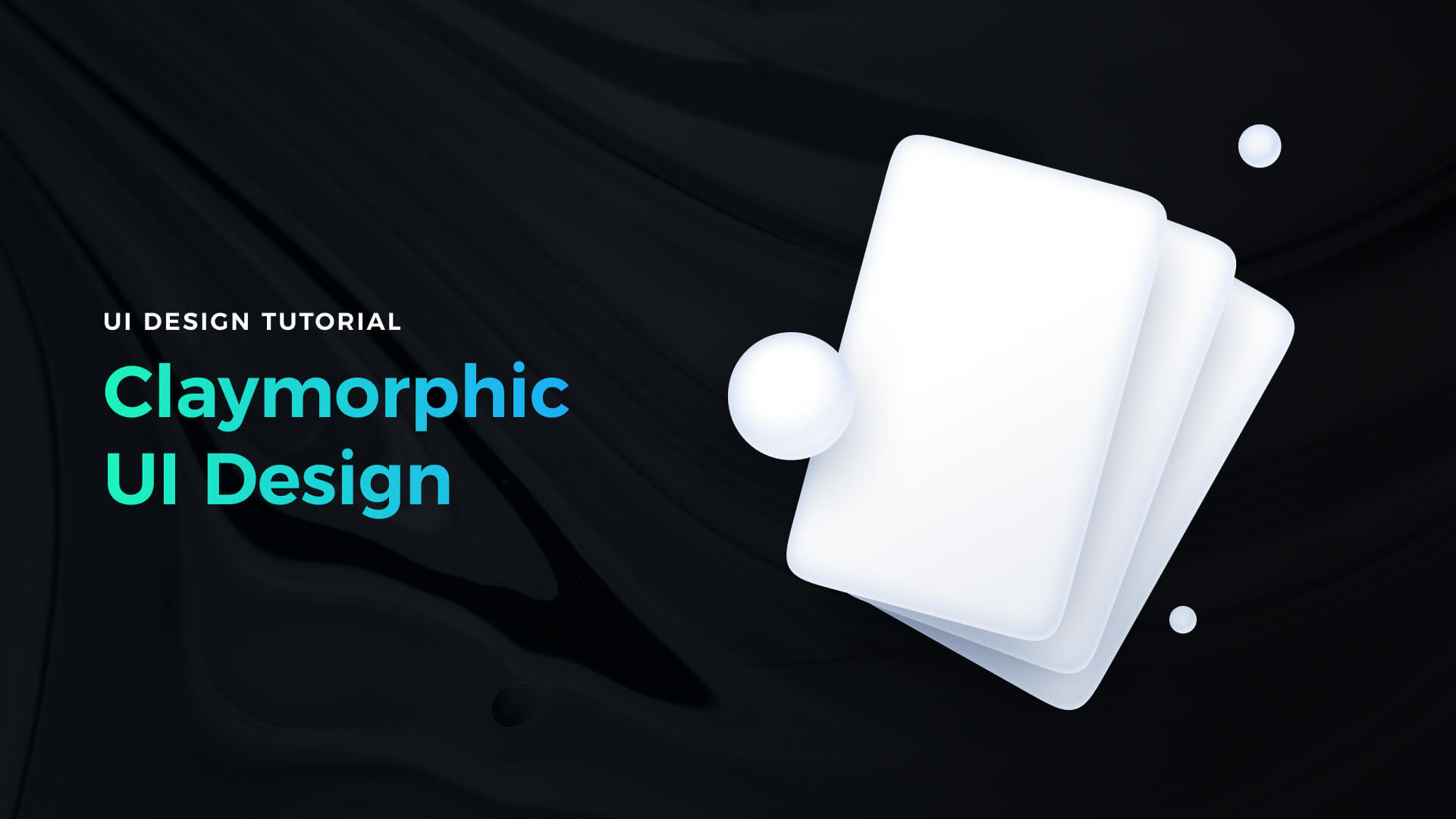
Styles come and go very fast. However, to address the needs of our customers, designers have to be skilled in every modern one. While glassmorphism still feels up to date, there is a trend gaining popularity – Claymorphism. It was noticed by Michal Malewicz and explored by many other designers. In this tutorial, let me explain briefly what is going on with this style and how to achieve the best results.
What is Claymorphism?
While the age of extreme skeuomorphic design is behind us, it is also clear that pure flat design won’t work for many users. People need good affordances – from the real world.
Google figured it out with original Material Design. Their philosophy was based on digital paper. It was the first sign that people still need a connection between digital solutions and things that might be touched in real.
Then came Microsoft with Fluent Design. They revealed not only paper but the whole range of digital materials. A few months later, the hype for glassmorphic design started. Now, this latest trend is literally one of the standards in UI design.
So how to move forward and create something fresh in the eyes of users? The clay is the answer.
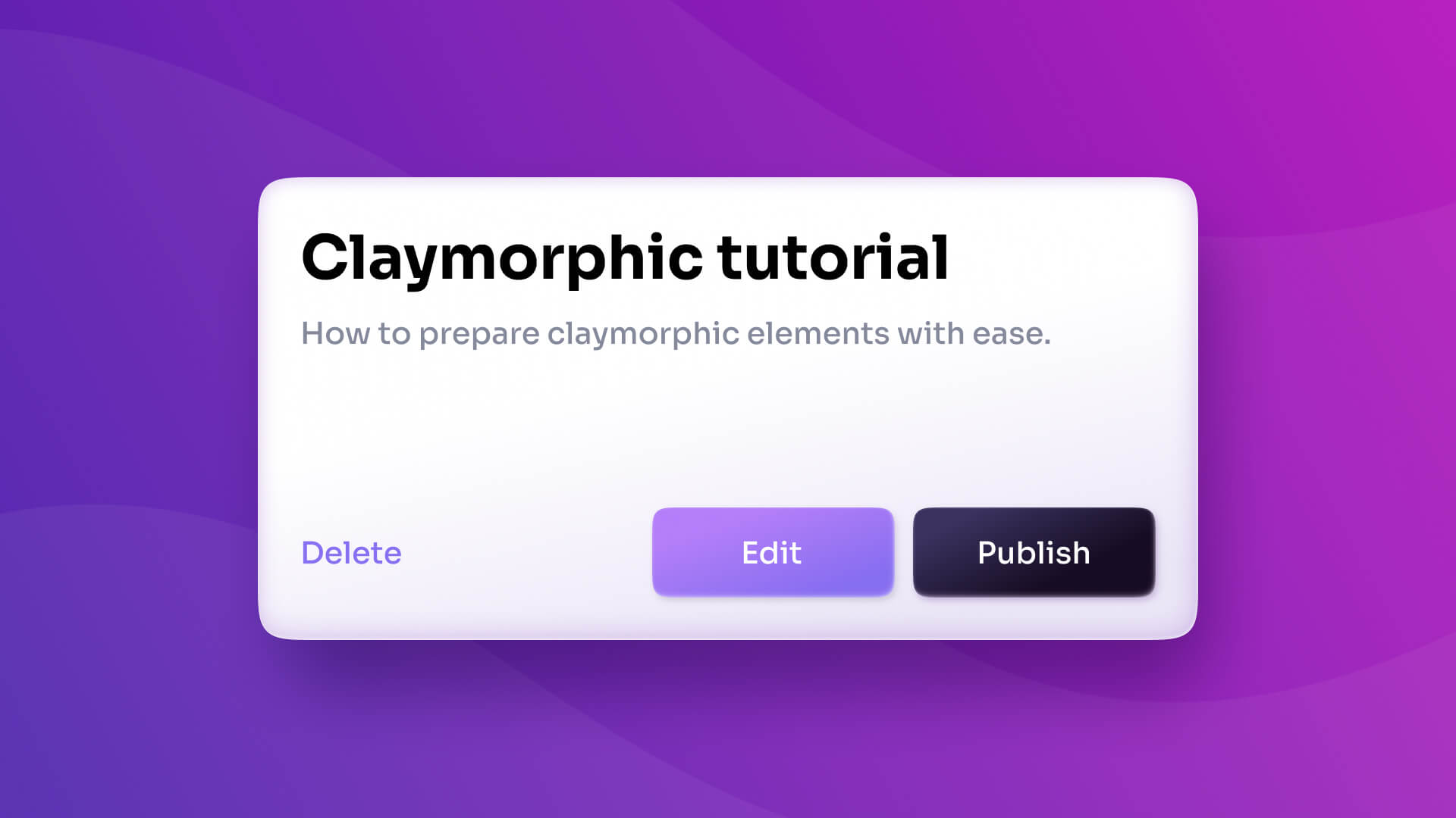
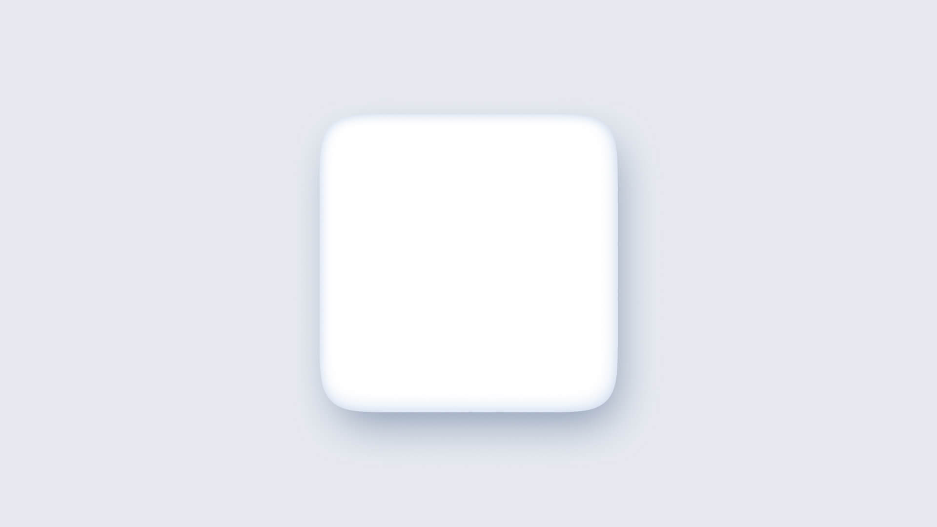
Claymorphic elements mimic 3d with the light cast from the top (or top-left) and drop shadow. UI elements feel oblique – in users’ eyes, much more friendly to interact with. Many claymorphic designs apply the treatment to corner radius from the trend called Squirclemorphism. Squircle is a special shape that embraces a special visual vibe to the elements. The composition of these properties creates the illusion of the 3d elements in 2d space.
Updated Neuomorphism?
While the use of light to build depth in Claymorphism is borrowed from the Neuromorphic style, it is dramatically different from it. Claymorphic elements mimic floating over the background.
What’s more neuomorphic had serious issues with accessibility, especially when it comes to colors. Digital clay elements might be much more colorful and address the needs of colorblind people much better.
[neumorphic vs. clay – view from top and side ]
How to create Claymorphic elements
With these few simple steps, you will learn how to prepare clay elements for your UI designs. For the purpose of the tutorial, I used Figma, but you may recreate it easily using Sketch or Adobe XD.
1. Create a shape – draw an element you want to style. Add radius and make it a squircle. To do that, go to corner radius settings, select the option to set each radius separately & click the overflow menu (3 dots). The modal with corner smoothing settings will appear – that is how you create squircles in Figma.
2. Add subtle shadow – I included step-by-step instructions to create perfect shadows in my book with UI design tips. Let me describe it briefly here. Claymorphic elements need light from the top. So you need to increase the Y values of shadow distance. Optionally, you may experiment with increasing X to change the light source. Increase the blur of the shadow (let it be around 8-24px). If you want, you may add a subtle tint to the grey tone of the shadow to make it more interesting.
3. Add first inner shadow – the first inner shadow will create the illusion of an oblique element. It will be visible around the bottom edges of the element. Decrease Y value (4-8px), add blur (16-32px). If you increased X value for drop shadow, you have to decrease it here – probably the same value, to mimic the light source. Set the color to a subtle, neutral tone (it should have the same tint as drop shadow or the other parts of the UI).

4. Add second inner shadow – second inner shadow will be a subtle one (make it look like the first one with 20-30% opacity). Set blur to 8-16px. Add Y value (around 4-8px). If you added X value to drop shadow at it here too (similar values to mimic the same light source).
Extra touches
While some claymorphism tutorials end with the above 4 steps, I encourage you to add some additional subtle things to create a special 3d feeling.
The first is to increase the 3d effect illusion. To do that, simply change the fill from solid to the subtle gradient. The top part of the gradient should be slightly lighter than the bottom one (to match the lighting). It should be very subtle, but when combined with previous steps strengthen the illusion of 3d element.

Second is light reflection – add third inner shadow make it really small Y (-2px) and X (-2px) set blur value to 4px maximum. Make it white or a very light color and set opacity between 50 or 80%. See how your clay element stands out from the crowd!
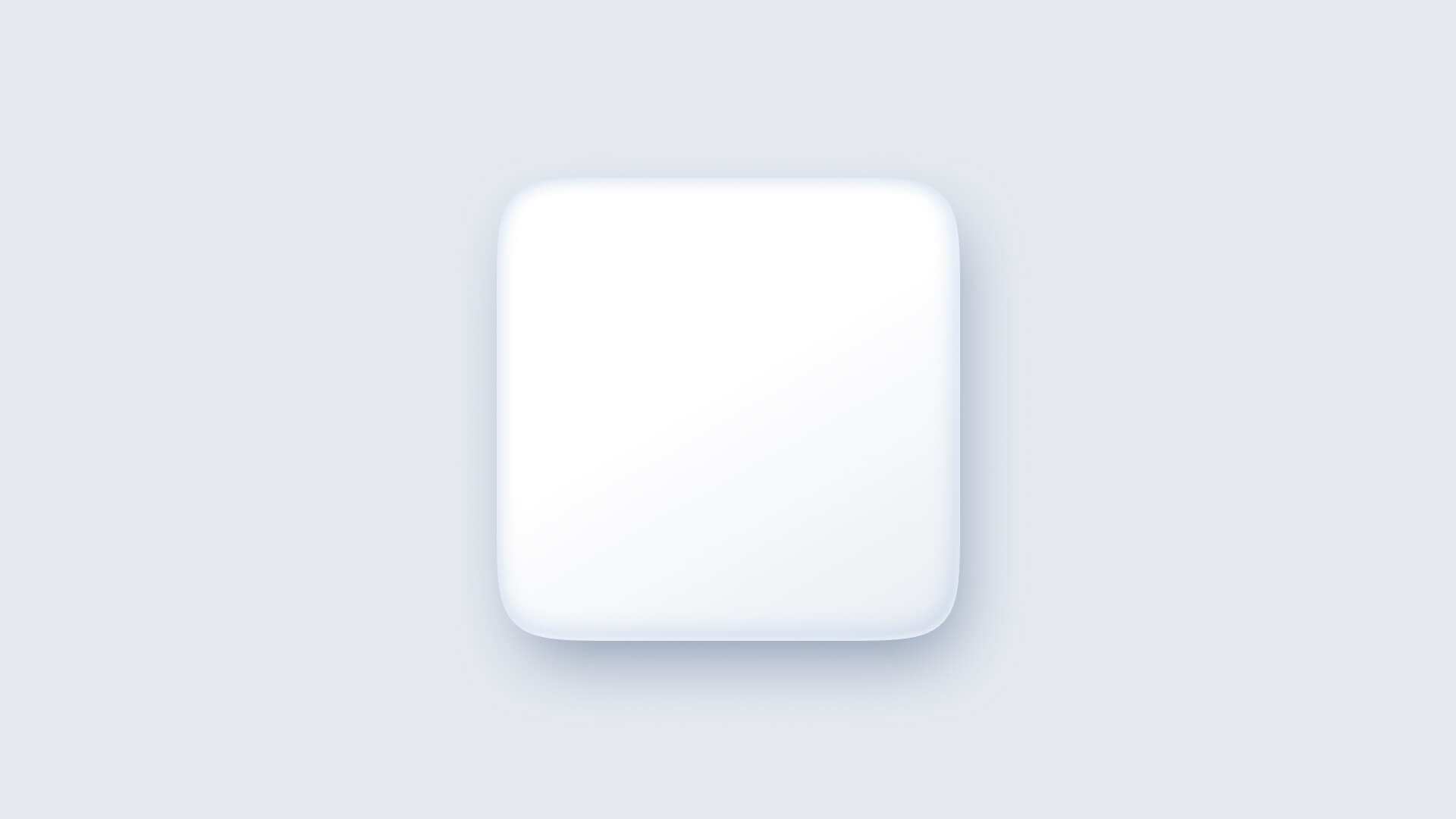
Adapt properties to smaller elements – the above sample properties will work well for medium size UI elements (cards, popups, etc.). For buttons and other not so big elements, reduce the scale of effects proportionally for better results.

Get Free Chapter
15,000+ designers are already subscribed (no spam! Only design tips, tutorials + design resource news).
Join now, get the free chapter of my eBook right to your inbox. With these tactics, you will solve common design issues with ease.
Sign up - Get Free Chapter
Pure or mixed styles?
As I mentioned in the first sections of the article, Microsoft came up with the idea that there may be multiple digital materials used to create User Interfaces.
If you watch their samples, you will notice how these materials play together. You may also experiment with connecting them. For me, the best results are achieved when claymorphism is combined with glass elements. UI feels more sophisticated and gains some fresh feeling.
 What’s more, many creators introduced 3d illustration sets that have some kind of “clay” feeling. Using them in claymorphic designs makes a lot of sense.
Summing up
As you noticed, claymorphism is not an entirely new thing. It is rather a continuation of a digital material trend that Google and Microsoft started a while ago. Thankfully it adapts to look more modern, so the users love it.
Now with the simple tutorial, you may achieve this stunning 3d effect too.
Thanks for reading!
By the way…
If you start a new project or would like to organize your UI Library in Figma — do not waste your time creating everything from scratch. Feel free to use the Prime — Design System Kit. It helps you design UI with the best Figma techniques — Component Properties, Variants, Auto Layout and more.See Prime in action.
To make it easier there is a gift 🎁 - Use UXMISFIT10 offer code to get 10% Off.

You can also Create User Flows faster in Figma & Sketch — With SQUID you can create User Flows directly in your favorite design tool. You may style them to your project brand within a couple of clicks. Prepare all kind of diagrams in minutes. See how it works.


