Creating a design in Figma is one thing. The second one is to make it efficient to use. If you want to work faster with your components and UI library, if you’re going to guide other people using your design system, creating slot components is the technique that will boost your and your team’s workflow.
Slot Components – what are they?
Some call them “default” or “boilerplate” components. Slot Components are basically typical components but structured in a more purposeful way. They include a placeholder inside that you may use to swap it with any other component you need.
Typically slot components are used for elements with dynamic content inside. Let’s mention a few examples:
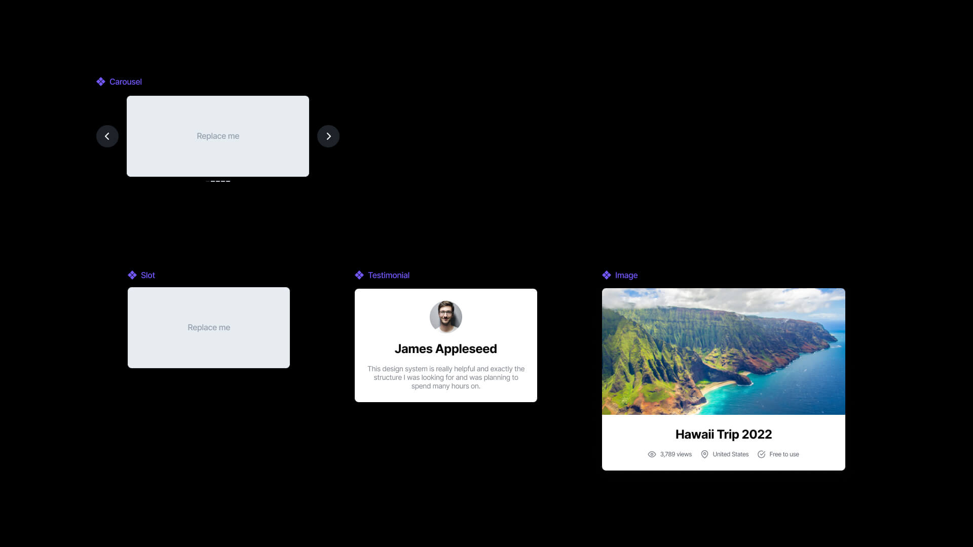
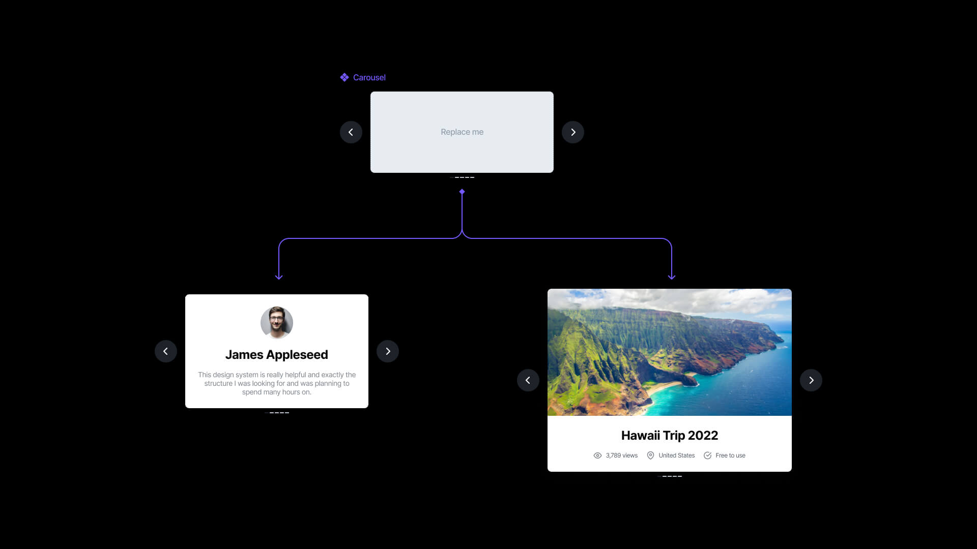
- Carousels – think of it as a set of the following elements page indicator, 2 buttons for navigation, and the content inside. Slot component will include a placeholder that will allow you to change the content inside to another component.
- Modal page – typical modal page includes a frame background, some title, and action to dismiss it or a CTA button. The content inside is dynamic – this might be a placeholder if you decide to make it as a component.
- Device frame – if you want to present your designs within an iPhone or Macbook mockups, prepare their screen elements as slot components, so you will be able to replace them later and export your work with ease.
Why is it worth creating Slot Components?
Slot components are real-time savers. They help to keep design less complex. For example: if you are using components from a library. You may quickly customize it in a way that design systems allow you – without the need to detach instances.
How to Create Slot Components
First, when your plan to create the next component, think for a while if its content may be replaced with another layout, etc.
There is no reason to make everything as slot components. So if you do not find good examples of replaceable content, do not force yourself to make it this way.
The most straightforward way to create Slot components is to follow these steps:
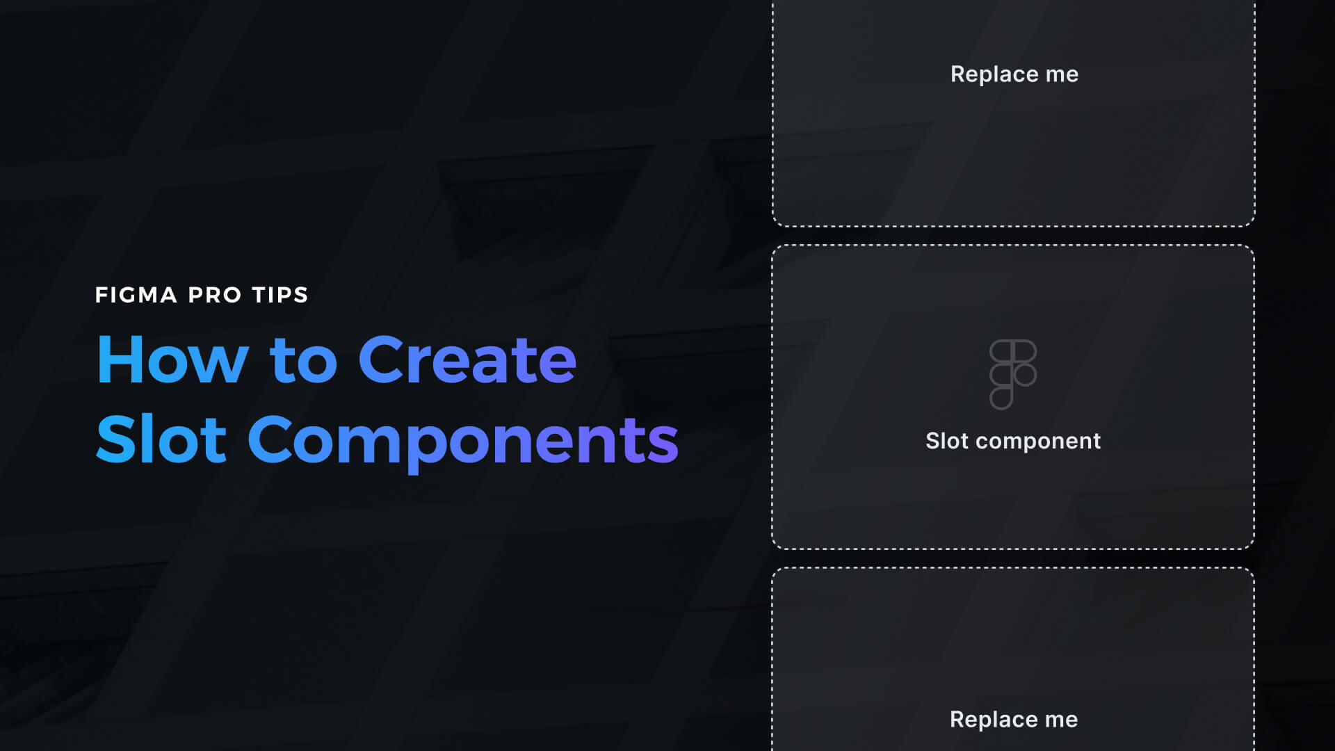
- Create the slot – This will be the placeholder component that will communicate the empty area. It will be replaced with real content – other components. Once you create a component – make the slot look obvious. Change its background to neutral color and add the label “Replace me” or “Placeholder.” Set its constraints to the center. Optionally you may add a dashed stroke.
- Lock all layers inside the slot to prevent anyone from overriding the content or style. To do this, quickly select all elements and hold CMD + Shift + L.
- For documentation purposes, simply enter the description “This is a placeholder component. Swap it with a component that includes real content.” in the Figma’s right pane.
- Go to the main component you are creating (this might be the carousel from the example above) and paste the slot inside.
- If you want to make the slot fit containers size, change the placeholder’s resizing property to fill the container. Obviously, resizing properties depends on the component type you want to create. If you want to have the main component adapting to the content of the slot, keep its resizing property to Hug contents.
- Create the instance of the main component. Change slot component using default Figma component swapper (the section in the right panel if you have slot selected). That’s it. Experiment with the content to see how it works with the main component
Drawbacks of Slot Components
While slots are handy, you have to remember that they might be swapped with every component in your design system. To make sure your team will use them properly, add an extra description.
If you have doubts about creating slots, and your design system has got strict guidelines, you should probably consider using variants instead.
Get Free Chapter
15,000+ designers are already subscribed (no spam! Only design tips, tutorials + design resource news).
Join now, get the free chapter of my eBook right to your inbox. With these tactics, you will solve common design issues with ease.
Sign up - Get Free Chapter
To conclude
Now you know a lot about creating slot components – how to make them, what their benefits are, and when to avoid them.
Slot components technique is a simple but powerful method to add extra flexibility to your design system. If designed well, no one will have a need to detach components.
Do you use slots in your design system libraries? In what cases? Let me know in the comments!
By the way…
If you start a new project or would like to organize your UI Library in Figma — do not waste your time creating everything from scratch. Feel free to use the Prime — Design System Kit. It helps you design UI with the best Figma techniques — Component Properties, Variants, Auto Layout and more.See Prime in action.
To make it easier there is a gift 🎁 - Use UXMISFIT10 offer code to get 10% Off.

You can also Create User Flows faster in Figma & Sketch — With SQUID you can create User Flows directly in your favorite design tool. You may style them to your project brand within a couple of clicks. Prepare all kind of diagrams in minutes. See how it works.


