Time to make some predictions about what to expect from 2022. If you are a designer, these predictions should help you with learning technology and trends before they become a standard.
Let’s prepare for new things!
What will not happen
For the last four or five years, I have read predictions on many blogs. They often repeat themselves through the years. Here are some things that won’t happen in my opinion.
 1. Dark mode will not be a trend
The dark mode has been here with us for a couple of years. If you read that someone expects that this will be “the thing” in the upcoming year… he was probably frozen for at least 3 years.
The dark theme was the trend when major mobile platforms (iOS and Android) implemented them natively in their OS. Now turning your solution into this mode is a standard, not innovation.
2. 3D illustration is not a thing
There are lots of styles for illustrations, but the choice of style is rather a matter of branding. I expected to see more 3D in 2021, thanks to Spline (its a great tool!), but this didn’t happen. There is no, and there won’t be any major trends in this case this year.
3. Design Systems won’t be this year innovation
If you haven’t a chance to create or use a design system in your projects, you are a bit late to the party. Creating styles & components and providing good documentation to them is literally a must nowadays. So, start learning them, because they are commonly used for many years, and this will not change in the future.
2022 UX/UI Design Predictions
Ok, time to make some predictions. Ready? Grab the mug of your favorite coffee, and let’s get started!
Virtual Reality
For the last few years, we have heard that Virtual or Mixed Reality is the future. Now when Facebook changed its name to Meta, and presented a vision of their future – things may turn into a serious trend.
You as a designer should learn more about Virtual Reality and how to create excellent experiences for it. Possibilities differ a lot from nowadays web or mobile app design.
With haptic gloves, prototype introduced by Meta, users will be able to feel digital things!
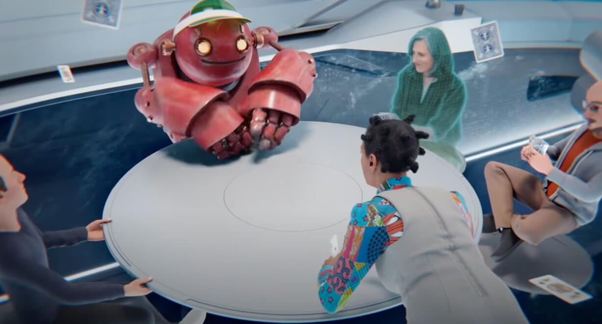
What’s more, there an also rumors that Apple will present their Mixed Reality device soon. We all have heard about Apple Glasses or iGlasses, and some expect to see their release in 2022. Even if Apple will delay the launch of the new category of a device (they have to be careful after Google Glasses fail), Augmented Reality in iOS devices work excellent and it may be adapted to the new purposes.
We as designers should pay more attention to that trend in the future. This may be the biggest thing since mobile revolutionized the way people use apps and connect to each other.
How to do it? First, find companies that want to turn Virtual Reality real – You should see what Meta, Apple, and Google are doing. Then learn the present design guidelines and experiment with tools. I expect a lot to change in the future in this matter (tools will adapt to the new possibilities and devices), but it is good to have foundations of design for Virtual Reality.
No Code will become a standard
No Code is a trend I have observed for a few years. I loved the words spoken by Steve Jobs telling that design is not how it looks like. It is how the solution works. To make my solutions work as intended, I learned a few programming languages (even worked as a developer for a few years). But this is not the way for many designers. Fortunately, more and more solutions are here to help.
The first worth paying attention to if you are a designer is Webflow. With Webflow, you may create all kinds of websites, from landing pages, through blogs and company websites into the stores and more complex platforms. All landing pages I made for my UX/UI resources are built with Webflow, and I am excited to see how the solution evolves.
The power of Webflow is their ease of use. You use the same parameters and features as developers, but visually. This way, you produce real smooth interactions and animations. You have got the power to manipulate almost everything and test how it works.
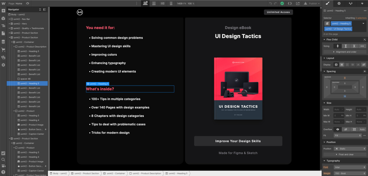
During 2021 No Code Conference lots of new features were announced, clearly showing that the platform is extending possibilities a lot.
This is not just a visual editor of the page’s appearance. You may design entire workflows and connect automation there—truly no-code solution of the future.
Obviously, there are more no-code solutions crafted for different purposes. Here are a few ones:
- Glide – allows building data-driven apps and websites
- Adalo – create real apps with no code
- Bubble – helps to prepare complex web apps without coding
- Voiceflow – prototype and launch chat & voice assistants
As a designer, you should try at least of these tools. You will feel the power of turning your design real, and who knows how your skill set will evolve in the future.
One thing is sure. The future will bring us even more power to no-code tools. It is definitely worth paying a lot of attention to this area.
Web solution that feels more native
The edge between native applications and web ones is fading. I remember the time when if you wanted to have the best possible experience on mobile, you had to develop the only native solution. Now it is not so sure. Lots of web and hybrid solutions presents excellent design and work smoothly.
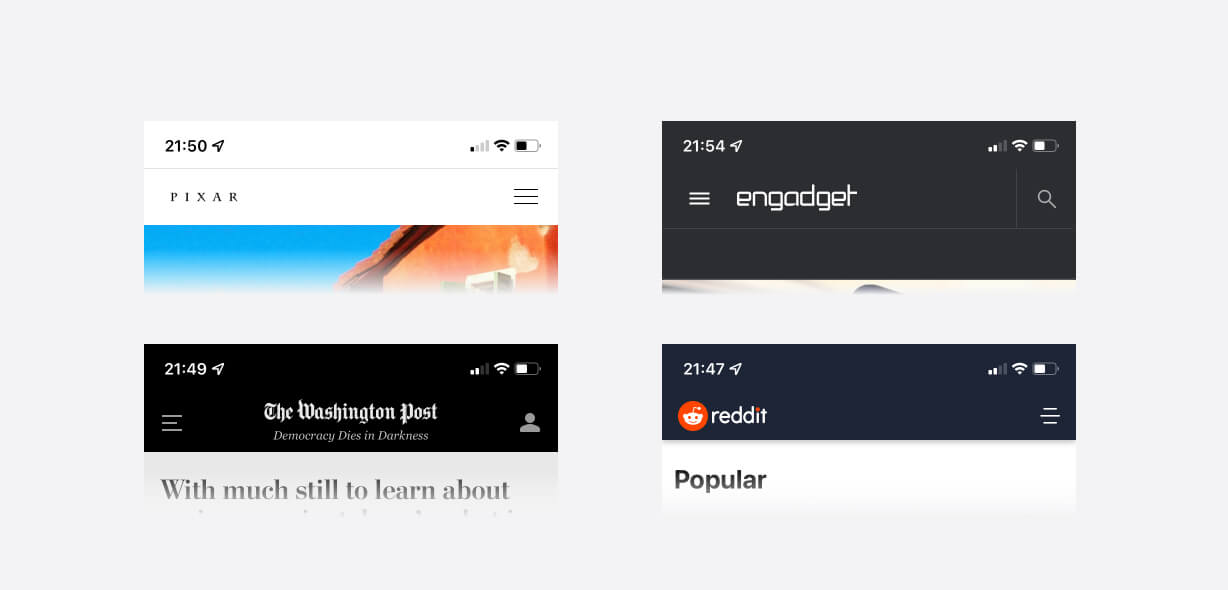
What’s more, when it comes to visual appearance, with a few tricks, you may turn your website to feel more native by coloring the top bar of the browser.
The trick has been available for a few years on Android. With iOS 15, you may achieve something similar on iPhone. The implementation is quite easy – check it out here.
While from the development point of view, it is a minor change, but it has a visible impact on User Experience. The web page feels more like an app.
Interactive prototypes
Some designers may not be ready to go no-code. However, there will be a possibility to imitate the behavior of the solution in a much better way than just clickable mockups.
We have seen it this year with the introduction of Interactive Components in Figma, which is a major design tool right now. This will result in more sophisticated prototypes. If you haven’t chance to see the interactive component go ahead and see this tutorial:
Figma Interactive Components – Tutorial
What are the benefits of this trend for designers? Better understanding how the solution should work. Usability testing should be a bit easier for participants when they see that the buttons click for real.
What’s more, adding animated interactions will also help during design handoff. Developers will be able to see what you imagined even more – they will be able to copy the bezier curve for easing in the implemented solution.
To conclude – in the near future, there will be even more focus on interactive prototypes, clickable mockups will become less popular and less attractive (if we may say that about this type of asset 😉).
Get Free Chapter
15,000+ designers are already subscribed (no spam! Only design tips, tutorials + design resource news).
Join now, get the free chapter of my eBook right to your inbox. With these tactics, you will solve common design issues with ease.
Sign up - Get Free Chapter
Glassmorphism is a new standard (not the trend anymore)
A year ago, I predicted that Glassmorphism would get more and more popular. iOS use it, macOS too, and Windows obviously has got glass material in their UI.
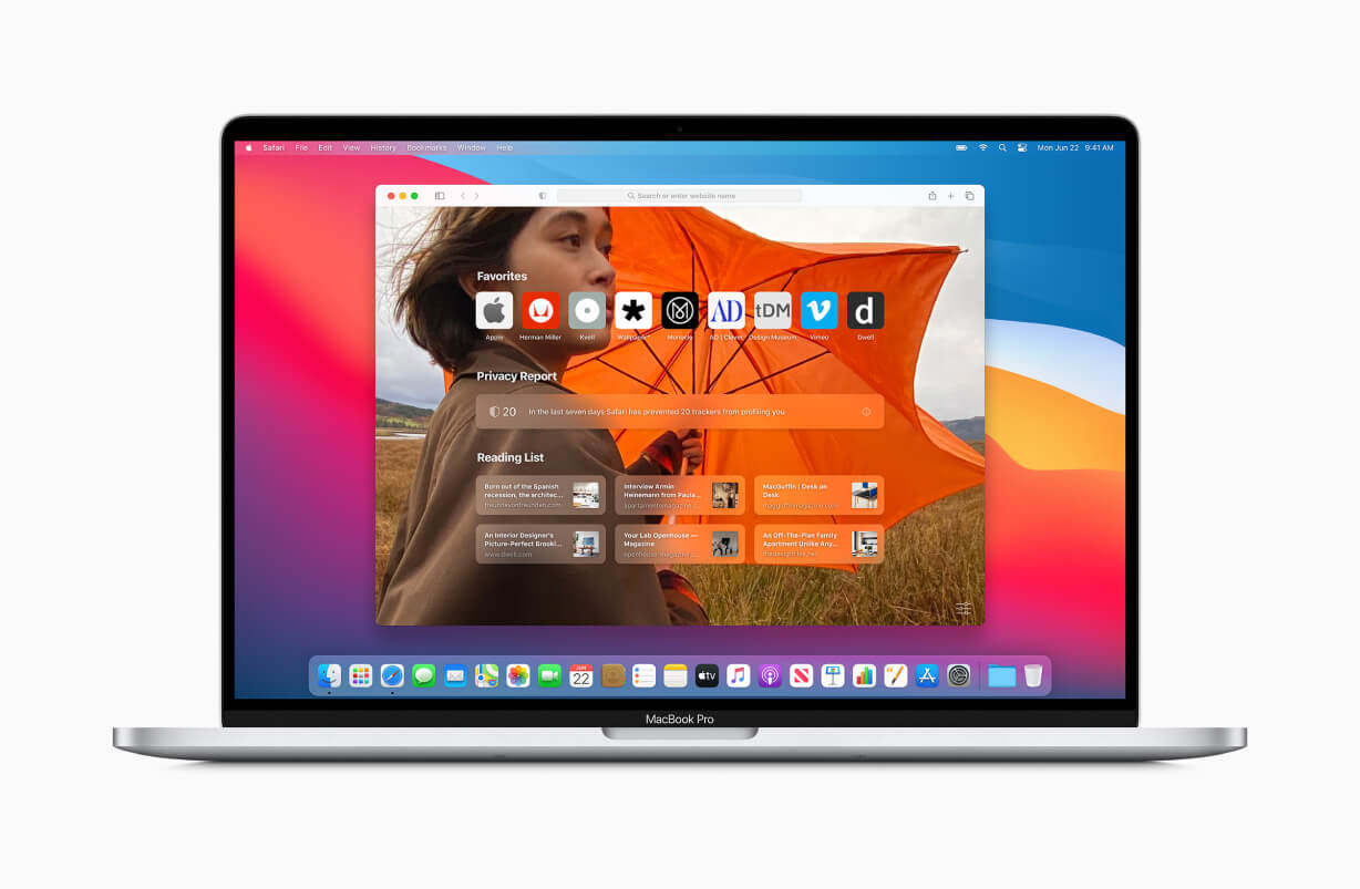
This year’s glass feels like a standard material to use in your design. Users warmly welcome it, and if you use Webflow, you may even create the effect without any effort. 😉
90s style – new trend?
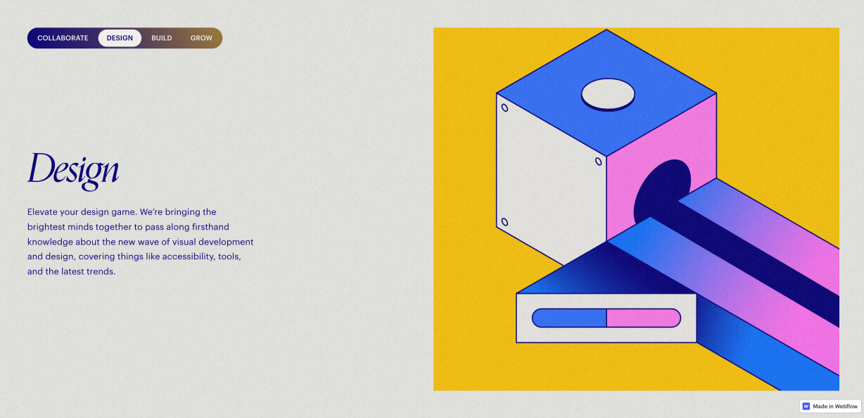
Last two years, we have seen 80s nostalgia in various design aspects. I suppose that this surprising trend will be continued and modified to match some 90s styling.
You may have already seen it in some posters, but also on websites. So pay attention to it, so it may affect your work soon!
To conclude
The design industry is surely the one that is changing quickly. We all have to pay attention to the trends. It is not about making our creations style more attractive to clients but also learning new possibilities.
Do you agree with the predictions mentioned above? What are the trends you expect to see in 2022? Let me know!
Thanks for reading!
By the way…
If you start a new project or would like to organize your UI Library in Figma — do not waste your time creating everything from scratch. Feel free to use the Prime — Design System Kit. It helps you design UI with the best Figma techniques — Component Properties, Variants, Auto Layout and more.See Prime in action.
To make it easier there is a gift 🎁 - Use UXMISFIT10 offer code to get 10% Off.
You can also Create User Flows faster in Figma & Sketch — With SQUID you can create User Flows directly in your favorite design tool. You may style them to your project brand within a couple of clicks. Prepare all kind of diagrams in minutes. See how it works.
