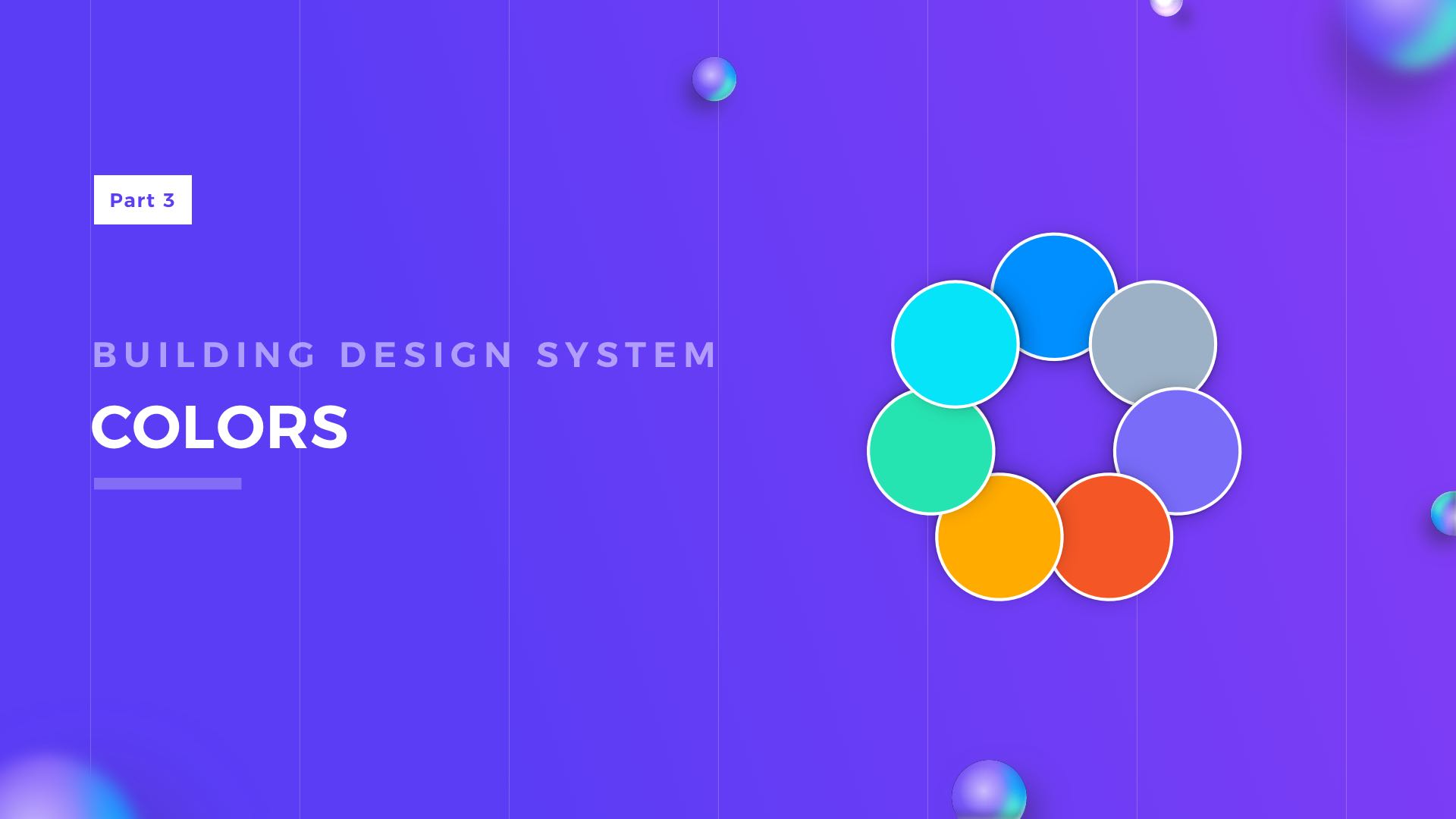
Creating Your Design System from scratch is never done overnight. You already prepared for building your UI Library by reading how others do it, seeing some samples & picking the right tool? Now you are ready to open Figma or Sketch and start to play… with Colors!
This is the series of articles helping you to create your own Design System UI Library, previous parts:
Colors are the most important (next to Typography), when it comes to creating a Design System. Your Graphical User Interface may not have icons, panels, pictures, but it surely contains some colors & text. That’s why picking the right set of tones is very important.
Naming Convention
Picking the right naming convention is the first thing you should do. It should be done before defining colors and the number of tones. Why? Here is the explanation.
Color names in the Design System should reflect their purpose. That is why your colors have to be named like: Primary, Secondary or Tertiary instead of Red, Purple, Blue. This will give you more flexibility, and even if your project goes through rebranding, the color names will stay the same in the UI Library. Prepare the following names:
- Primary – usually the main brand color
- Secondary – may be optional)
- Tertiary – may be optional)
- Success – for the accomplished goals and other successful operations
- Warning – use it when you have to warn a user
- Error – as the name suggests, elements displaying Error should use this color
- Neutral – for all kinds of grayish elements
- White & Black– white & black are always these pure colors that never changes.
Ok, so you have your base colors. But to ensure good flexibility and accessibility, your colors have to include more than one tone. You have to create tints & shades.
For these variations, I recommend following naming convention:
For base (default) color use name “500”, for lighter tones use “400”, “300”, “200” and “100”. For shades use bigger numbers like “600”, “700” and so on.
You will end up with following convention:
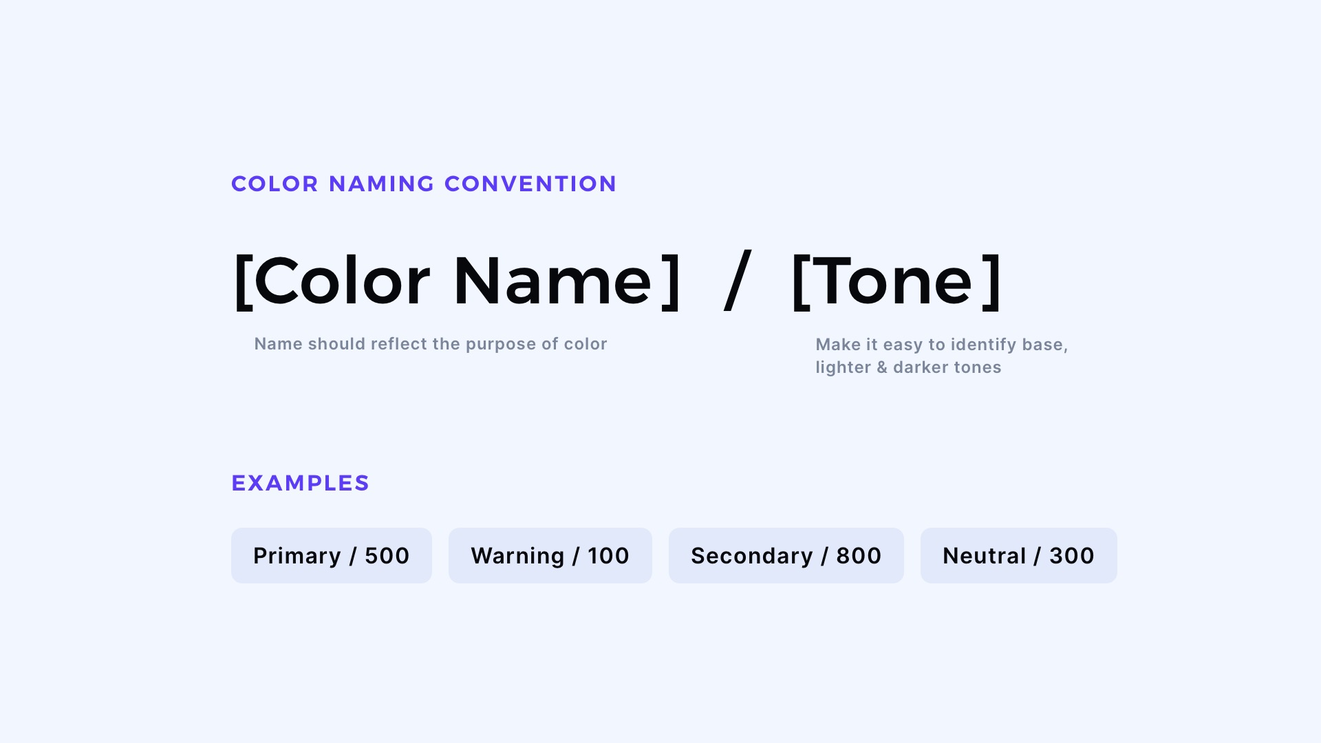
[Color name] / [Tone]
Examples of names:
- Primary/500
- Success/100
- Warning/300
- Secondary/600
- Neutral/700
Why should you consider picking these numbers as color tone names? Naming tones by numbers is simple, easily understandable & you may expand it in the future easily.
Imagine if you would have to name your color “Secondary light lighter lighter” – this would be hard to manage! 😉
When you design in Figma or Sketch, I recommend adding “/” after the color name. Thanks to this, your tones will be gathered under one group.

Design Faster in Figma and Sketch
Never start Your work from scratch. Use the Kit that already have 1500+ components with well structured styles, variants & auto layout.
Use Prime Design System Kit to boost your workflow. Create for Web, Mobile, and Desktop. You may use it as the entire UI Library for Design System or just create Landing Page for your next Client. Perfect for those who want to save time while creating UI designs and learn best practices of Figma and Sketch at the same time.
How many tones of colors Design System need?
Actually, there is no straightforward answer. Some tiny projects for the landing page may need only 1 (base) tone. Some may require only 3 tones. However, to have good comfort of designing solution I recommend you to have at least 5 colors, one as a base, two as lighter tones and two for shades.
However, if you would like to have a very flexible design system strive for 8 or 9 tones for every color. Just like I did in my design system that I use to kick off every new project quickly.
How to set the right tone for the color
Many designers struggle with this task. If you would like to know my own technique that allows me to create an attractive looking palette, here is the short answer:
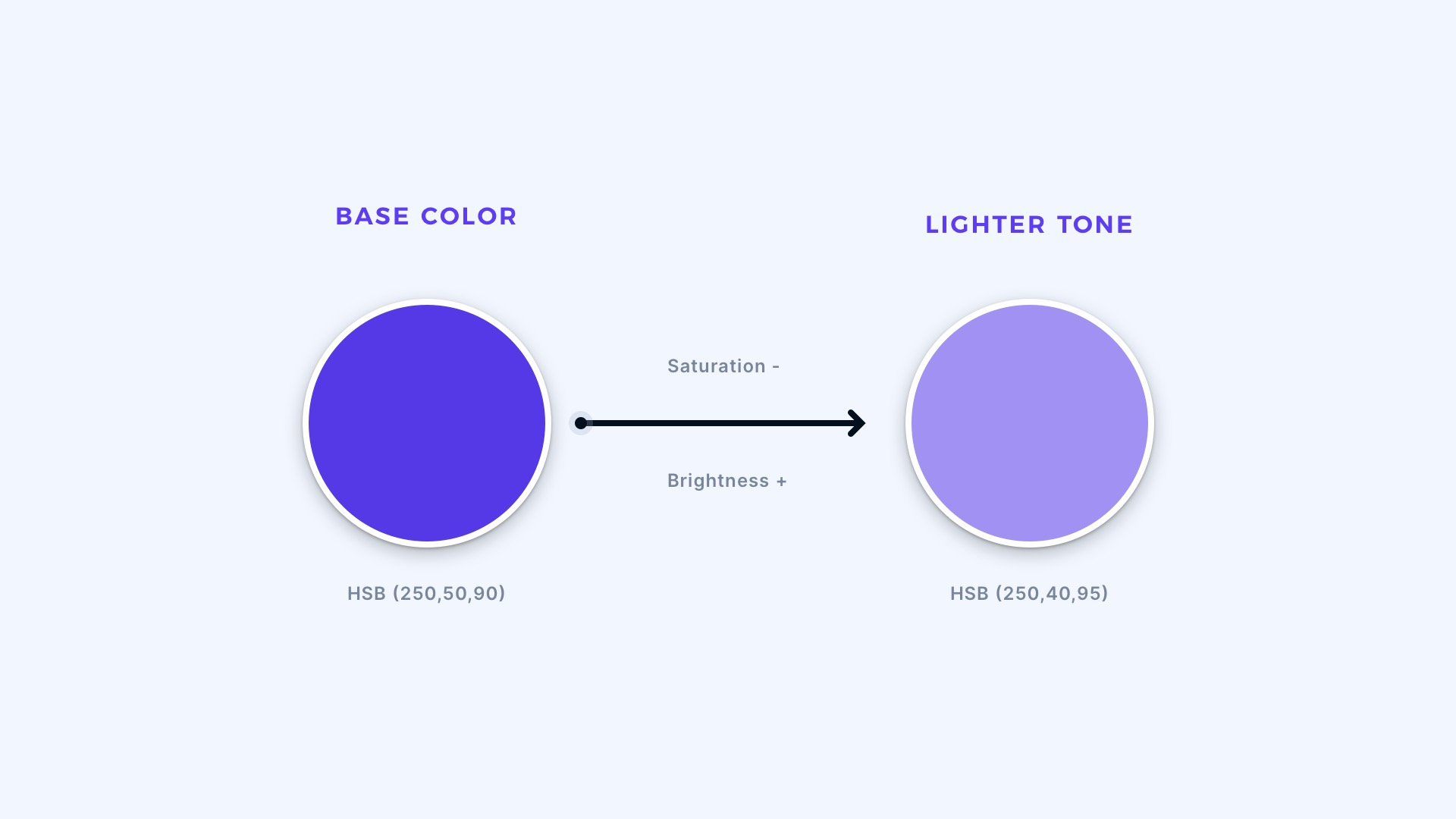
I switch my design tool color picker to HSB. Then I take the base color (for example: “Primary/500”). If I want to make the lighter color, I increase B value and decrease S (which stands for Saturation).
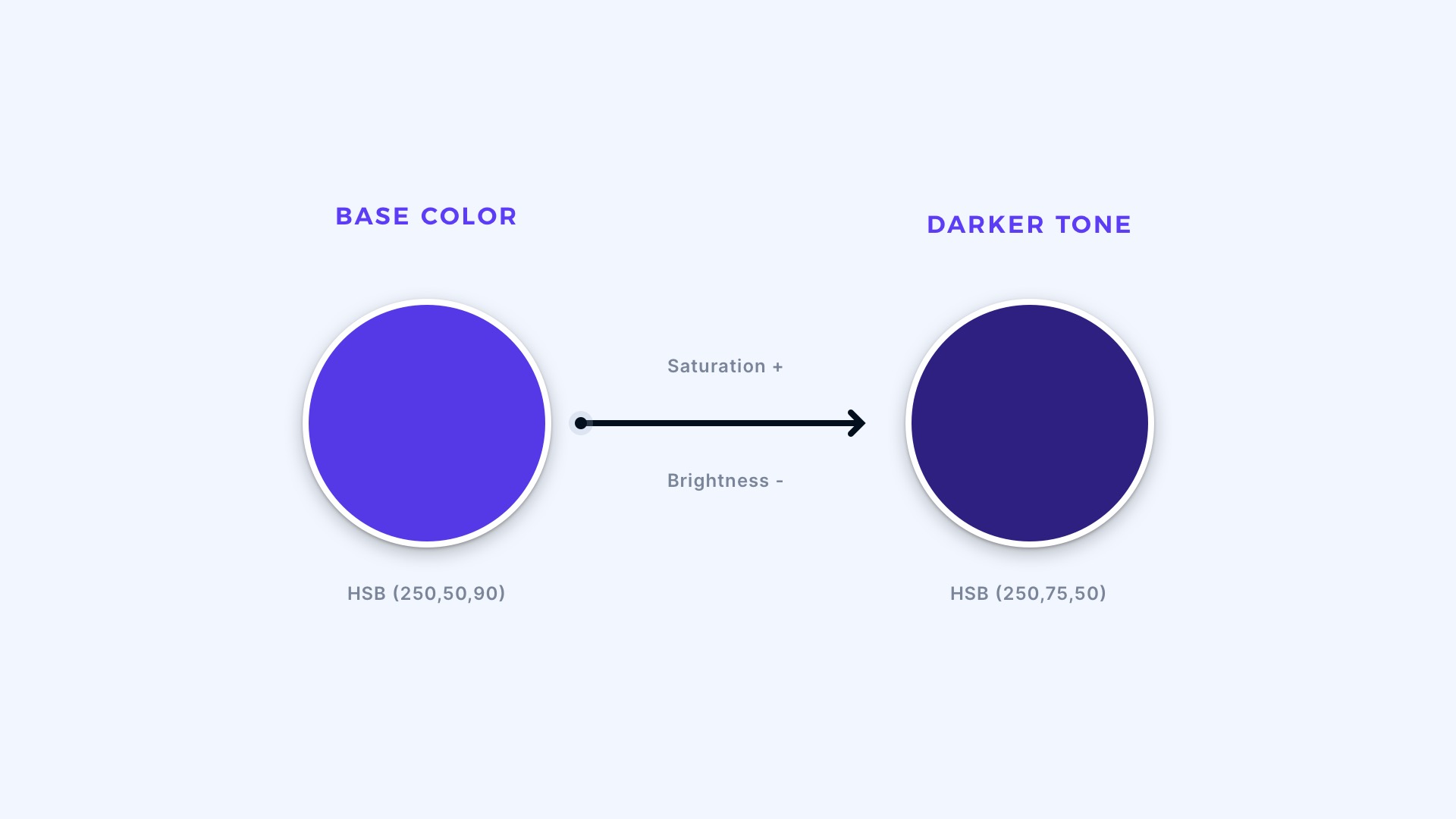
For shades, I use the same technique, but the direction is opposite. B (Brightness) goes lower, and S is increased. More saturated dark tones look much better.
Obviously, I add some little tweaks to it, especially in H (Hue) value. For example, I want to make darker tones of purple more blueish, so the Hue goes a little in that direction with every darker tone. This technique creates nice looking gradient across the tones.
I added lots of tips on colors in my practical guide.
Do you need more colors?
As mentioned above, colors & tones are the absolute minimum for the Design System.
If your project will include badges for social media or sell products on eCommerce platforms, you may need to include also the color of their brands in your Design System to keep them consistent across your Library.
There are lots of modern gradients around the web in multiple designs. They also may be included in the Design System. When it comes to the naming of your gradients, you may be more creative and choose names like “Mint Forrest” or “Warm Sunshine”. Names like this will be better to remember than just 2 or 3 Hex codes that create the mood of the specific gradient.
Are you in a rush?
If you do not have time to play with separate tones, you may use one of the generators like Tint & Shade Generator. The final results are always good. However, for a truly excellent color palette, it is always good to adjust it on your own.
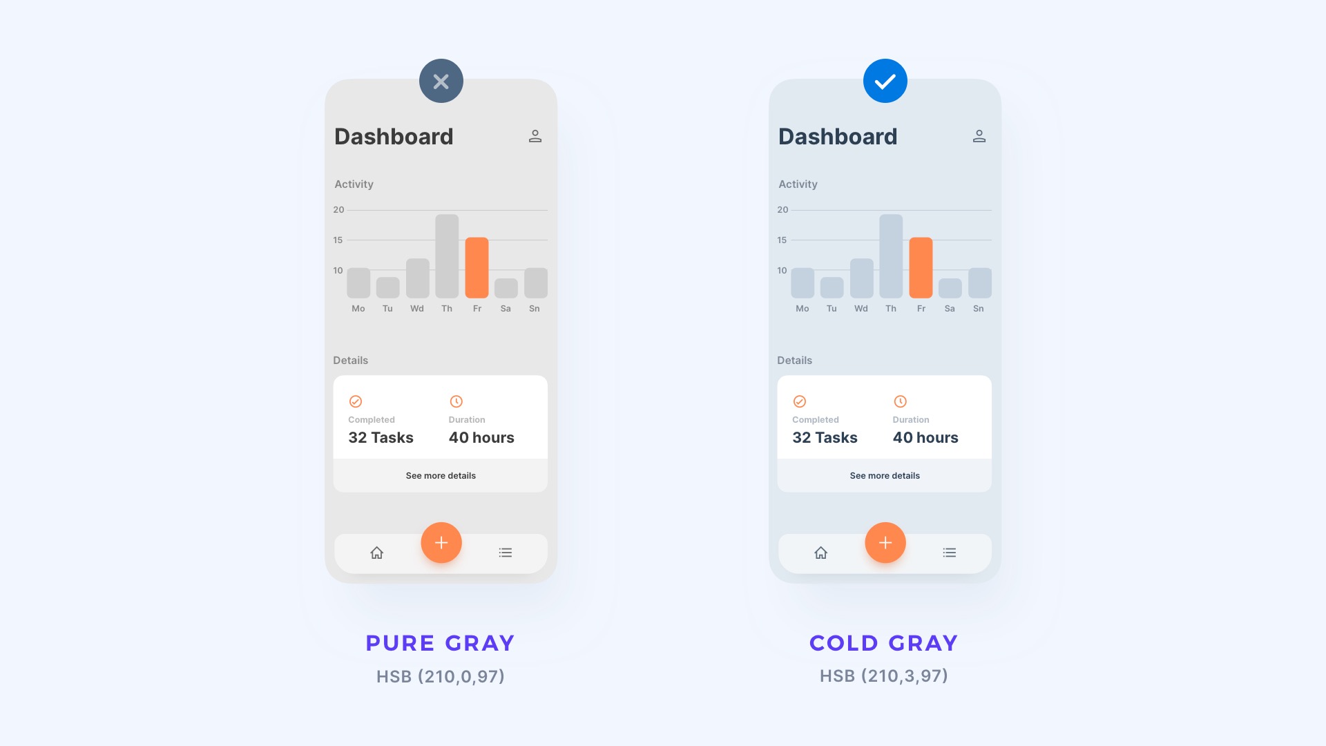
Neutrals – the most important ones
Your design may not include blue color, may not even include green, but it will surely include neutral colors. When It comes to black & white, I like to keep them as pure tones. However, grays are a bit different…
If you want to create gray tones, I recommend you experiment with adding some color to gray, a little bit of blue may give outstanding results. Try to avoid pure gray colors! They rarely occur in nature.

Get Free Chapter
15,000+ designers are already subscribed (no spam! Only design tips, tutorials + design resource news).
Join now, get the free chapter of my eBook right to your inbox. With these tactics, you will solve common design issues with ease.
Sign up - Get Free Chapter
To sum it up
The first thing to do when you start creating Design Systems UI Library is to set proper colors that establish a foundation of shared styles. When it comes to the naming convention – think of the purpose of the specific color and plan for lots of additional tones.
You should also pay more attention to grays. These neutrals are more important than you may think!
I hope you found these tips useful!
By the way…
If you start a new project or would like to organize your UI Library in Figma — do not waste your time creating everything from scratch. Feel free to use the Prime — Design System Kit. It helps you design UI with the best Figma techniques — Component Properties, Variants, Auto Layout and more.See Prime in action.
To make it easier there is a gift 🎁 - Use UXMISFIT10 offer code to get 10% Off.

You can also Create User Flows faster in Figma & Sketch — With SQUID you can create User Flows directly in your favorite design tool. You may style them to your project brand within a couple of clicks. Prepare all kind of diagrams in minutes. See how it works.


