Practical Tips & Tricks.
Colors have got a significant impact on how digital products are perceived by users. If you have become acquainted with Gestalt Principles and their influence on User Interface, you may now focus on bringing more life to them with colors.
The story contains a complete guide of usage colors in UI design. You will find here also links to the tools that will help you find inspiration for tones of your next UI.
Benefits of using right Colors in UI
Colors are not only used to make UI more attractive, they have got various benefits for users and business.
- Colors improves UX – thanks to the right color palette content may be more comfortable to read. The particular areas and objects gain more meaning, and they are easier to focus on.
- Colors strengthen brand personality – the usage of colors may build a better connection with companies or product brand. Thanks to this, UI gains trust, and users feel that they are in the right place.
- Colors helps to accomplish goals – They may help creators and users to communicate in the right way. If you would like to warn someone in the app, you will use the right color (often red). Thanks to this user will immediately understand that it is a message worth reading. In the other hand, the green color of the button may encourage the user to purchase a particular product, because it suggests that this may be a safe process.
Color Models in Digital Design
It is good to know a little bit of theory before we will jump right into more practical tips.
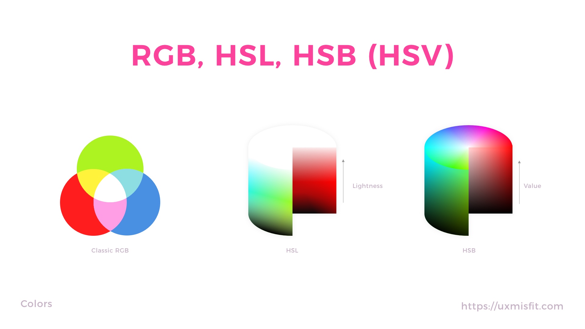
These are the most popular color models for digital design:
- RGB
- HSL
- HSV/HSB
RGB – (Red, Green, Blue) is the additive color model. This means that red, green, and blue light are added together in various ways to reproduce a broad set of colors.
HSL – (Hue, Saturation, Lightness) the alternative representation of the RGB model. In HSL colors of each hue are placed in a radial slice, around a central axis of neutral colors which ranges from black at the bottom to white at the top.
HSV/HSB – (Hue, Saturation, Value or Brightness) – this color scheme is often mistaken with HSL, but it is a different and alternative representation of RGB model. Like in HSL, HSV colors of each hue are placed in a radial slice, around a central axis of neutral colors which ranges from 0% value at the bottom to the 100% at the top.
Colors Schemes – Making UI feel more natural
Monocolor apps feel dull. This is why the usage of the right color palettes is essential to make the app more attractive.
Some colors look better with another. This is why color schemes were created. They help designers to find the right hue for the remaining ones. There are following color schemes:
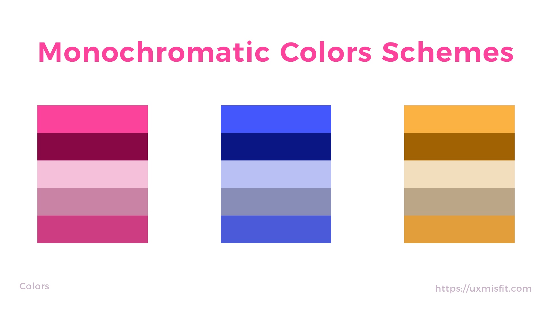
- Monochromatic
- Analogous
- Complementary
- Triadic
- Split Complementary
- Square
- Rectangle
Below I will describe 4 the most popular ones, for more feel free to read Color Theory for Designers: How To Create Your Own Color Schemes.
Monochromatic – schemes are created from the different tones, tints, and shades within the same hue. If you are going to use them in the app, be careful – UI may not look so interesting
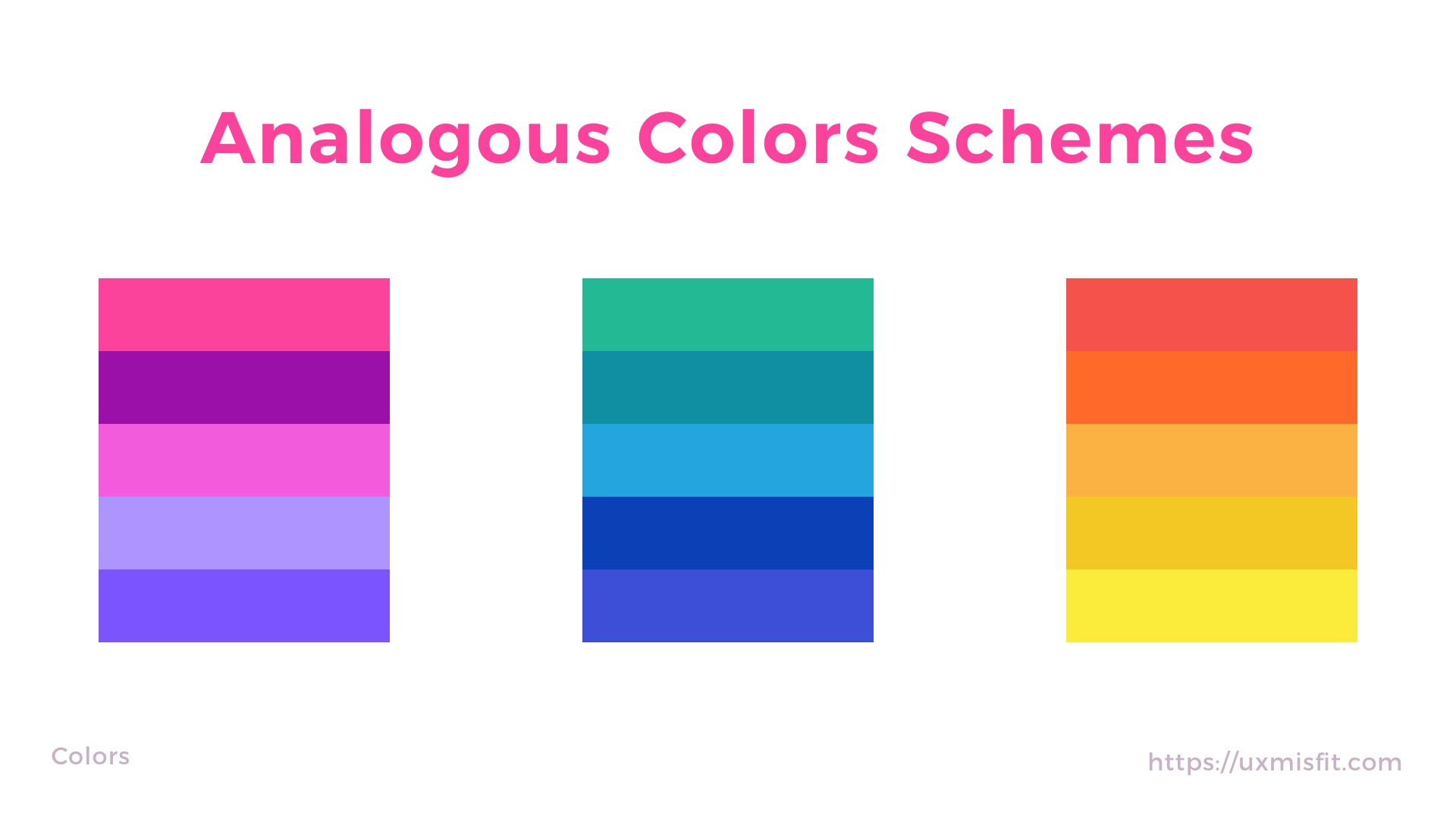
 Analogous – 3 colors that are next to each other creates analogous color scheme. It is easy to create it, and it feels more attractive than monochromatic scheme.
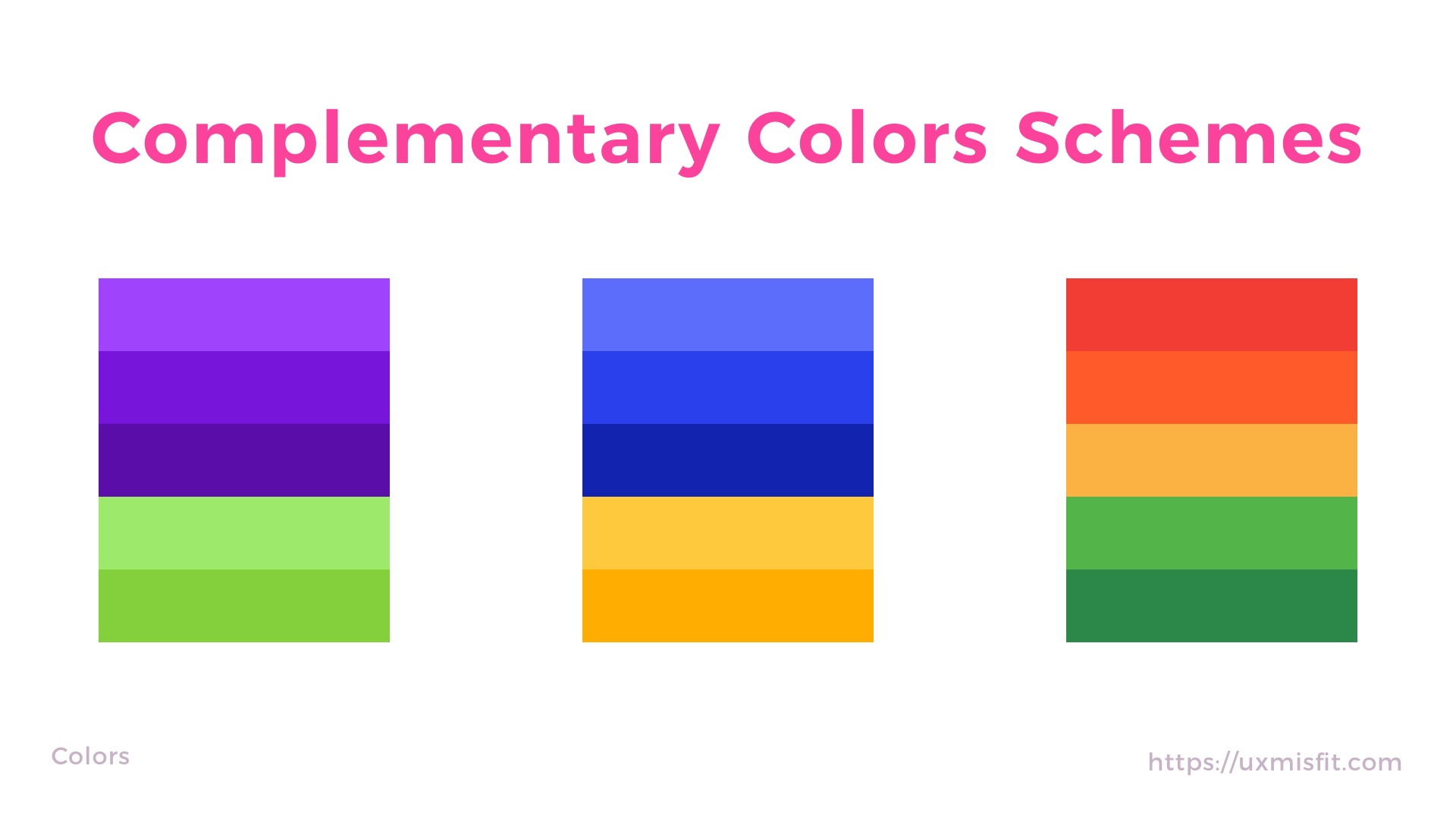
 Complementary – the scheme is created when you combine 2 colors from opposite sides of the color wheel. They may also include tints and shades of these colors.
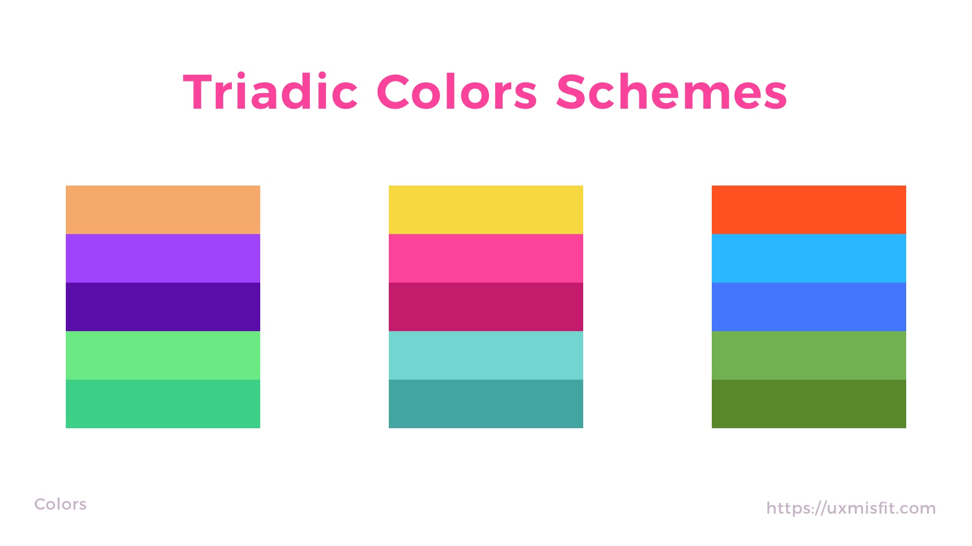
 Triadic – color scheme made from 3 hues equally spaced around the color wheel. It is difficult to achieve a good result, but they can make the design more appealing.
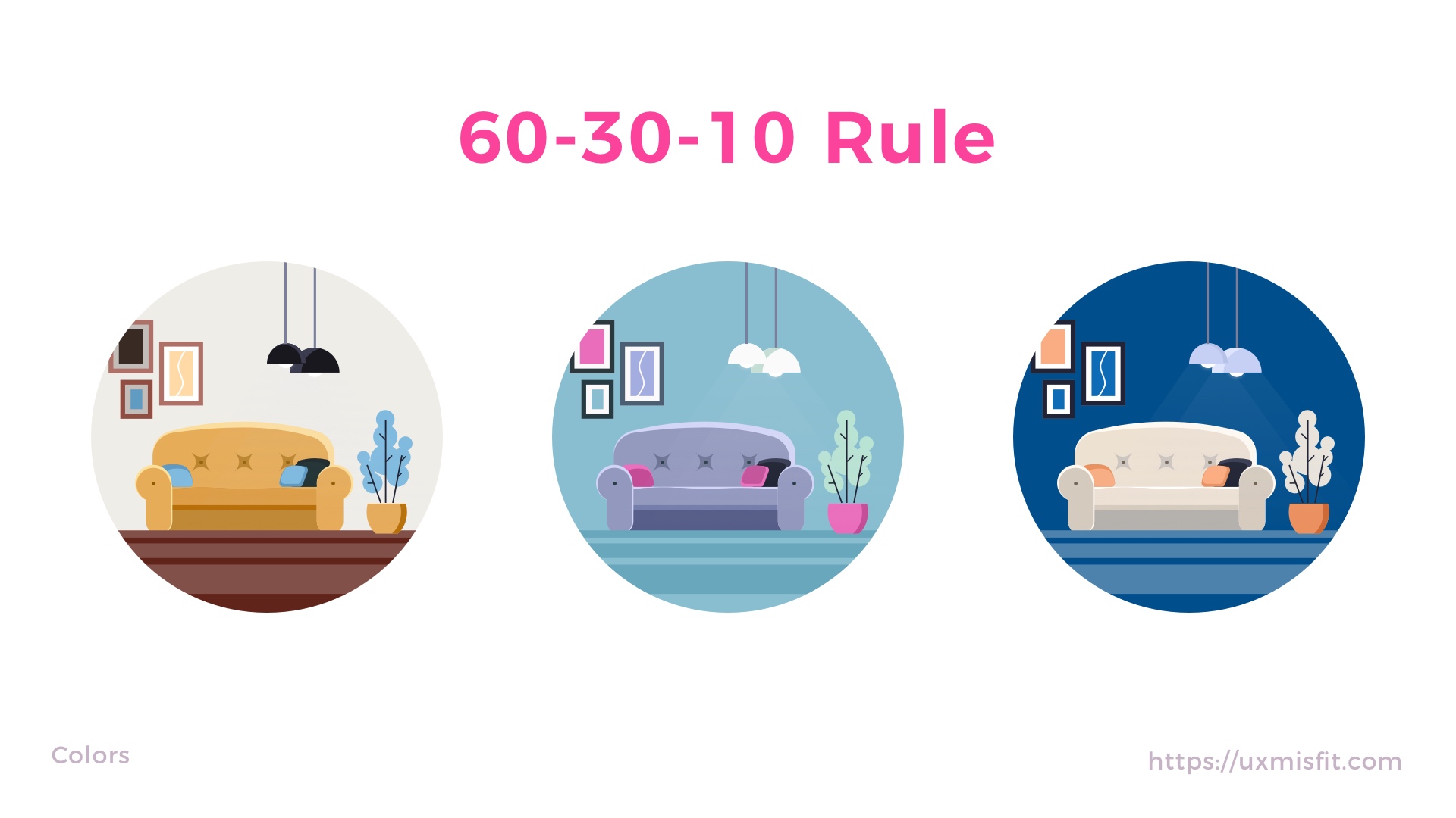
The Magical 60–30–10 Rule – The way we feel the right balance
60-30-10 Rule is a well-known and timeless decorating principle in the interior design industry. It is very simple and efficient. The rule is used to find the right balance in colors scheme.
60% + 30% + 10% is the proportion between the used colors:
- 60% – the amount that should belong to the primary color
- 30% – the area for the secondary one
- 10% – the rest of the room belongs to the accent color
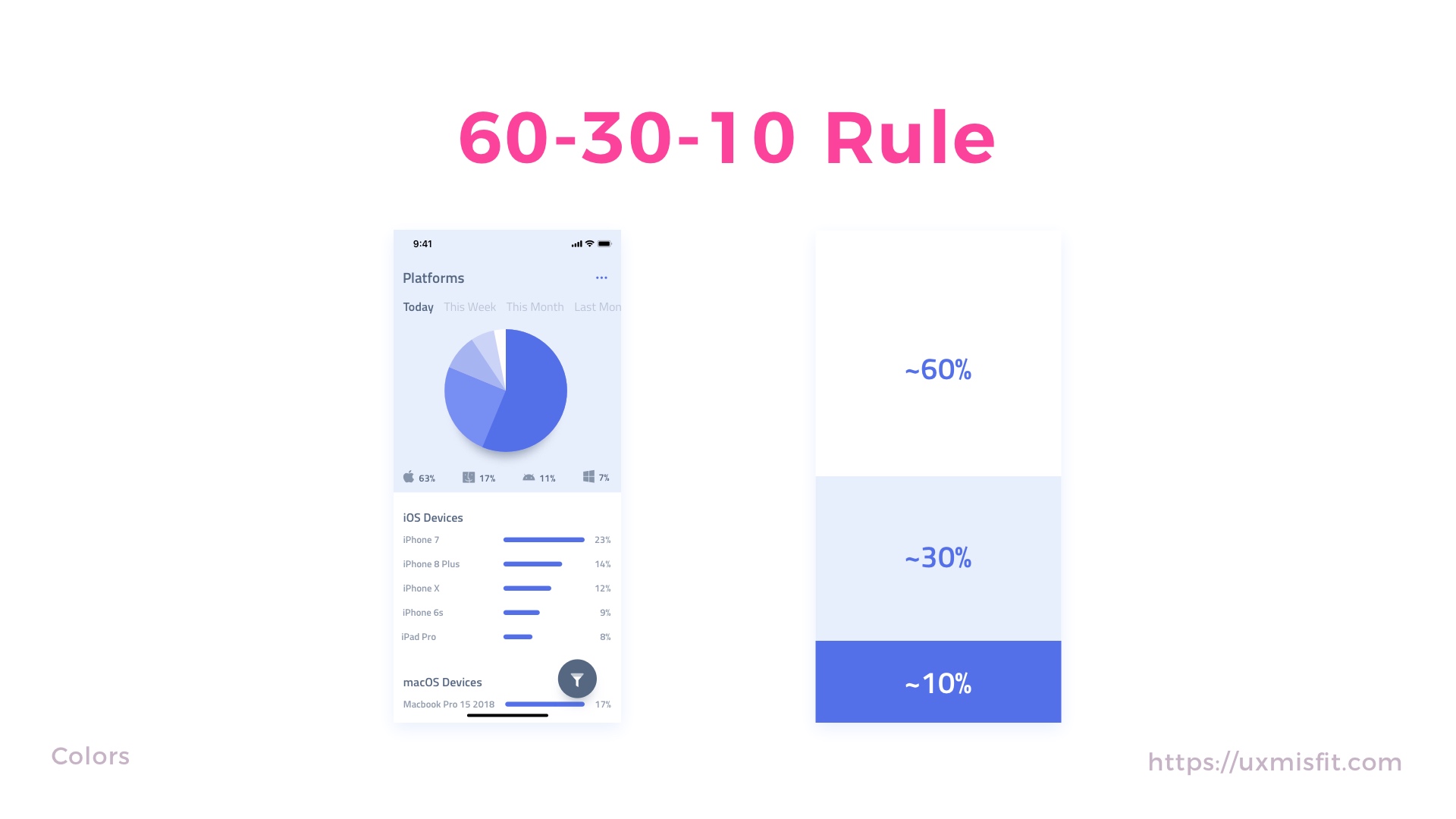
 60-30-10 Rule – How It Is Used in UI Design?
While the principle has got its origin in interior design, you may apply it successfully in a digital one. Think of the app or page as or the room for the content and apply the rule to bring more balance to your designs.

Design Faster in Figma and Sketch
Never start Your work from scratch. Use the Kit that already have 1500+ components with well structured styles, variants & auto layout.
Use Prime Design System Kit to boost your workflow. Create for Web, Mobile, and Desktop. You may use it as the entire UI Library for Design System or just create Landing Page for your next Client. Perfect for those who want to save time while creating UI designs and learn best practices of Figma and Sketch at the same time.
Grey color is not grey – Not obvious, but wins in the eyes of users
If you are like me, you seek inspiration in various places. Look at the architecture, we use a lot of grey tones nowadays, but it fits perfectly to modern architecture. I also noticed that more and more cars are grey, but they look very attractive. How it is possible that these neutral tones add even more life to the objects? The secret is subtle but very important…
Good grey is not pure grey – if you will add a little color to the neutral tone the magic happens.
Grey scale – How It Is Used in UI Design?
When you think of using grey color in your app, pure gray may not feel so attractive. To make your UI look better, try to add a little hue and saturation to the natural tones. Thanks to this, users will perceive neutral tones as more natural to their eyes.
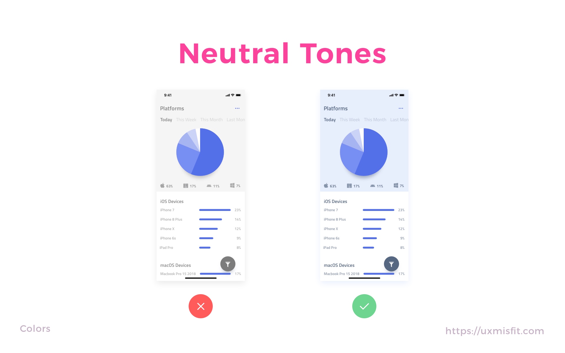 The usage of not 100% grey colors is vital for our eyes. It makes everything look more natural. Even Apple started to applied “Truetone” so the displays of iPhones, iPads, and MacBooks adjust to the lighting temperature to feel more natural.
Color tones – Tiny trick making UI more attractive
In this section, I will show you how to make color tones of your UI to feel more vivid and appealing.
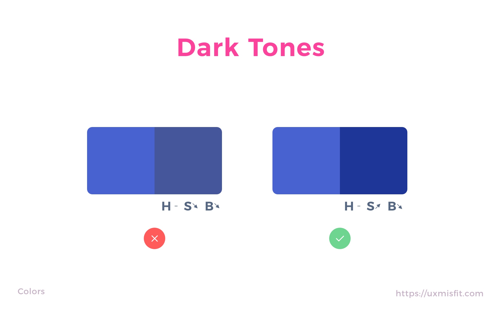
First, let’s understand how to build different color variants.
If you observe how real-world colors interact with each other, you will notice that shades and tints are not just variations of brightness. Lots of shades have also got more saturated hue than primary color. In the other hand, enlighten area are brighter but are less saturated. If you want your design to feel more natural, you should also follow this observation.
Creating Darker Color Variant
- Pick one color of your project’s brand
- Switch Sketch app color picker to HSB mode.
- Lower the B (Brightness from HSB) to the level that suits the darker variant
- To make it fill more appealing, add the value of S (Saturation from HSB).
- Voila!
 Creating Lighter Color Variant
- Pick one color of your project’s brand
- Switch Sketch app color picker to HSB mode.
- Add value to the B (Brightness from HSB) to the level that suits the lighter tone.
- To make it fill more natural decrease value of S (Saturation from HSB).
- Voila!
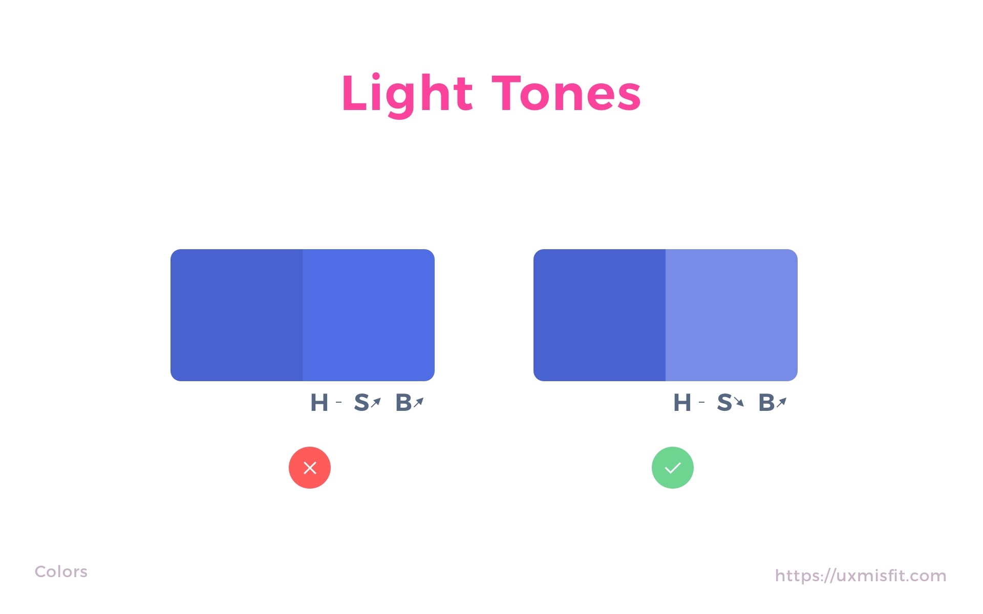 Thanks to this your color variants will look good in the palette.
If you want to achieve an even better effect, you can study this framework of making color variants Color in UI Design: A Practical Framework
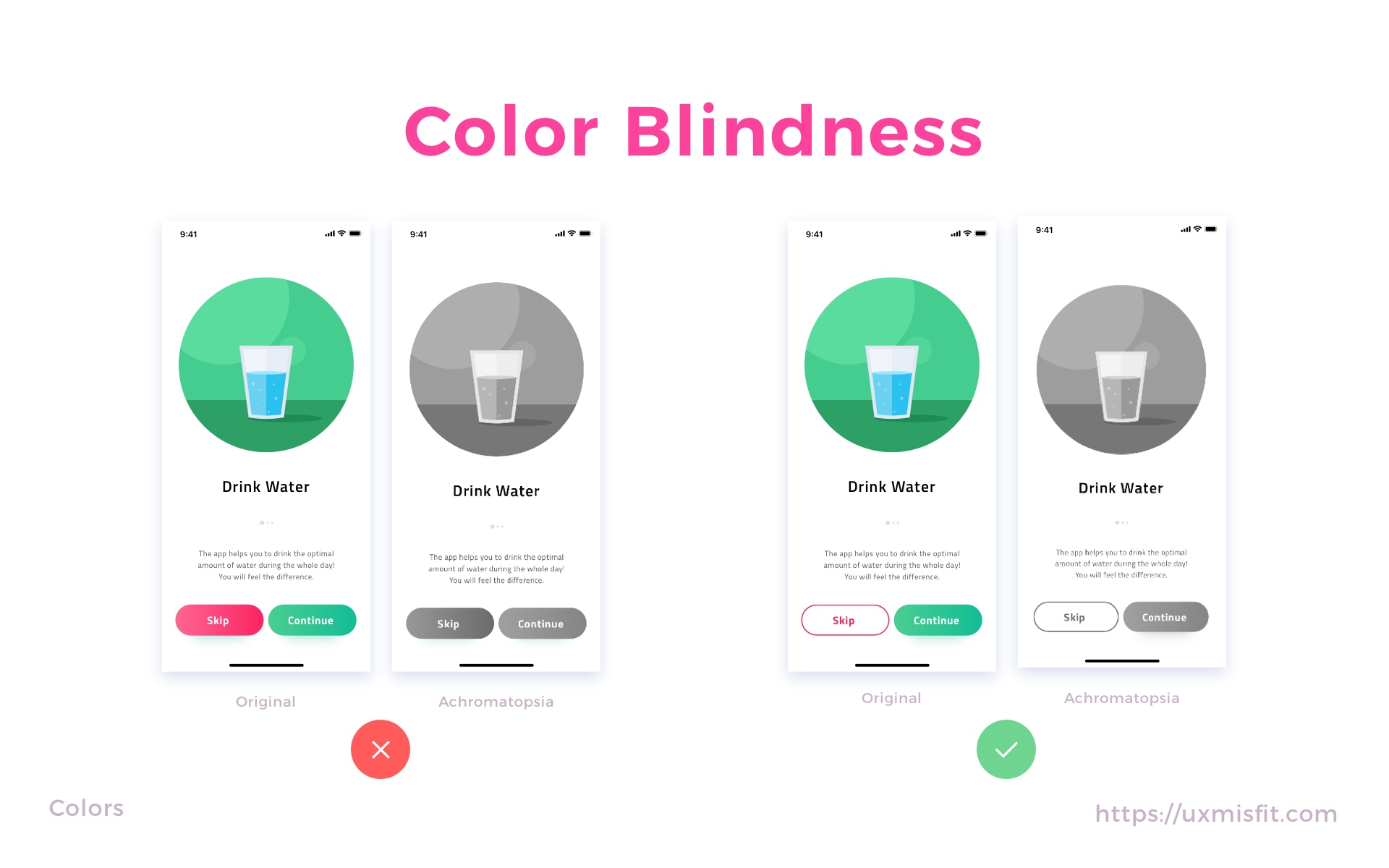
Color Accessibility – Design for all users
It is important to remember people who perceive colors in a different way than most of us. Color plays a huge role in our perception. In the article Design Apps That Do Not SUX. Accessibility on Mobile. I described several aspects that are essential for designing accessible mobile apps.
To make your web or mobile solution fully accessible, you should be acknowledged with WCAG 2.0 Guidelines. Lots of points remind us of proper color usage.
If you design UI for a specific platform like iOS or Android, you should follow their guidelines for accessibility of visual design:
If you design in Sketch or Adobe XD, I recommend using Stark plugin. It allows you to check contrast and simulate colorblindness.
 Color Meaning & Culture Context
Colors have got a significant impact on how we perceive a solution. The right tones have got their meaning in every culture. They also have a connection with our emotions.
Here are basic colors and their relation to emotions and meaning:
- White – fresh, clean, modernity, purity
- Gray – neutral, something subtle
- Black – mystery, power, luxury, evil
- Red – power, action, confidence, love
- Blue – safety, calm, comfort, trustworthy,
- Green – fresh, nature,
- Yellow – warning, risk, happy,
- Orange – energy, happiness,
The meaning of color may vary depending on the culture you live in. If you would like to study differences, feel free to read more.
It is important to know the meaning while you design for a specific market. This will help your UI gain more meaning and avoid mistakes.
Tools
These are sample tools that may help you build the right color palette for you UI Designs:
Find inspiration for your color palette
To build a good UI palette, it is important to find inspiration. These sites will help you with almost every color palette:
To conclude
We often use color tones intuitively. I hope that this article will help you choose the next palette more consciously. Thanks to this, users will feel the difference and increasing the quality of the designed solution.
By the way…
If you start a new project or would like to organize your UI Library in Figma — do not waste your time creating everything from scratch. Feel free to use the Prime — Design System Kit. It helps you design UI with the best Figma techniques — Component Properties, Variants, Auto Layout and more.See Prime in action.
To make it easier there is a gift 🎁 - Use UXMISFIT10 offer code to get 10% Off.

You can also Create User Flows faster in Figma & Sketch — With SQUID you can create User Flows directly in your favorite design tool. You may style them to your project brand within a couple of clicks. Prepare all kind of diagrams in minutes. See how it works.


