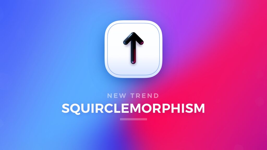
The style is already here! Have you noticed it?
Recent years where rich in a new UI design Styles. Starting with simple flat design, material, neuomorphism, and glassmorphism. While I am not such an excellent trend hunter as Mike Malewicz, I am sure that I have found something… Let’s dive into the world of squircles!
Squircle? What is it?
It is not a rounded rectangle, not a circle. The shape is unique and subtle but makes a huge difference. It was first noticed in digital design when iOS 7 arrived. App Icons were masked with squircle. Since then, designers felt in love with the shape.
If you would like to discover some math behind the shape, feel free to see the description from Wikipedia or the research done by Figma Engineer.
Rise of Squirclemorphism
Initially, the squircle shape was used to recreate iOS App Icons. As I mentioned, the difference between standard rounded rectangle and squircle was subtle but noticeable. We always want to strive to make our designs look modern, so we wanted to have App Icons masked with this new shape.
Then designers realized that it might be used for other elements. Some of us started to use it in card corners, others made elegant icons. This was just a beginning…
The ubiquity of the squircle shapes lead me to name these trends – say hello to Squirclemorphism! What is interesting the style itself is only about using squircle shape. It may be connected with neuomorphic or glassmorphic elements.
You may notice it on Instagram
Initially, I noticed that squircles are more and more popular on Instagram because the feed is full of new creations. In Dribbble I usually search for specific elements or categories, and it was harder to notice the new rising trend.
You may see it on Dribbble
I love to browse designs on Dribbble to inspire myself and search for some styles or compositions. Type squircle in Dribbble search, and you will see hundreds of results.
As you may surely notice, the majority of designs are made only to showcase the skills of their creators. They are not used in real apps.
Squircles in Figma
By default making, rounded corners are about pointing the proper radius. But this will make only rounded rectangle shapes, not squircles.
To achieve our special shape, you have to add “Corner Smoothing” to the corner radius. To Activate smoothing, you have to press the corner radius icon to display detailed radius settings for every corner. Then under the overflow menu icon with 3 dots, you will find the “Corner Smoothing” option. Click on it, and you will see a popup with a slider.
If you want to achieve the iOS-like effect, slide to about 60%, to maximize effect, use 100%. It is that simple!
Squircles in Sketch
Making squircles in Sketch is even easier. When you have your layer with a rounded rectangle shape, all you have to do is to go to the Inspector panel (the one on the right) and select the dropdown “Radius (Round Corners”). Change the option to “Smooth Corners.” Your Squircle is now ready!
To conclude
There are many trends that have risen in recent months. Squirclemoprhism has started with a small element – iOS7 App Icons. Now it is used to almost all elements that have rounded corners. Obviously, not all squircles are good in real applications, but the trend is surely inspiring.
What do you think of the Squirclemorphism? Are you using shapes with smoothed corners?
By the way…
If you start a new project or would like to organize your UI Library in Figma — do not waste your time creating everything from scratch. Feel free to use the Prime — Design System Kit. It helps you design UI with the best Figma techniques — Component Properties, Variants, Auto Layout and more.See Prime in action.
To make it easier there is a gift 🎁 - Use UXMISFIT10 offer code to get 10% Off.
You can also Create User Flows faster in Figma & Sketch — With SQUID you can create User Flows directly in your favorite design tool. You may style them to your project brand within a couple of clicks. Prepare all kind of diagrams in minutes. See how it works.
