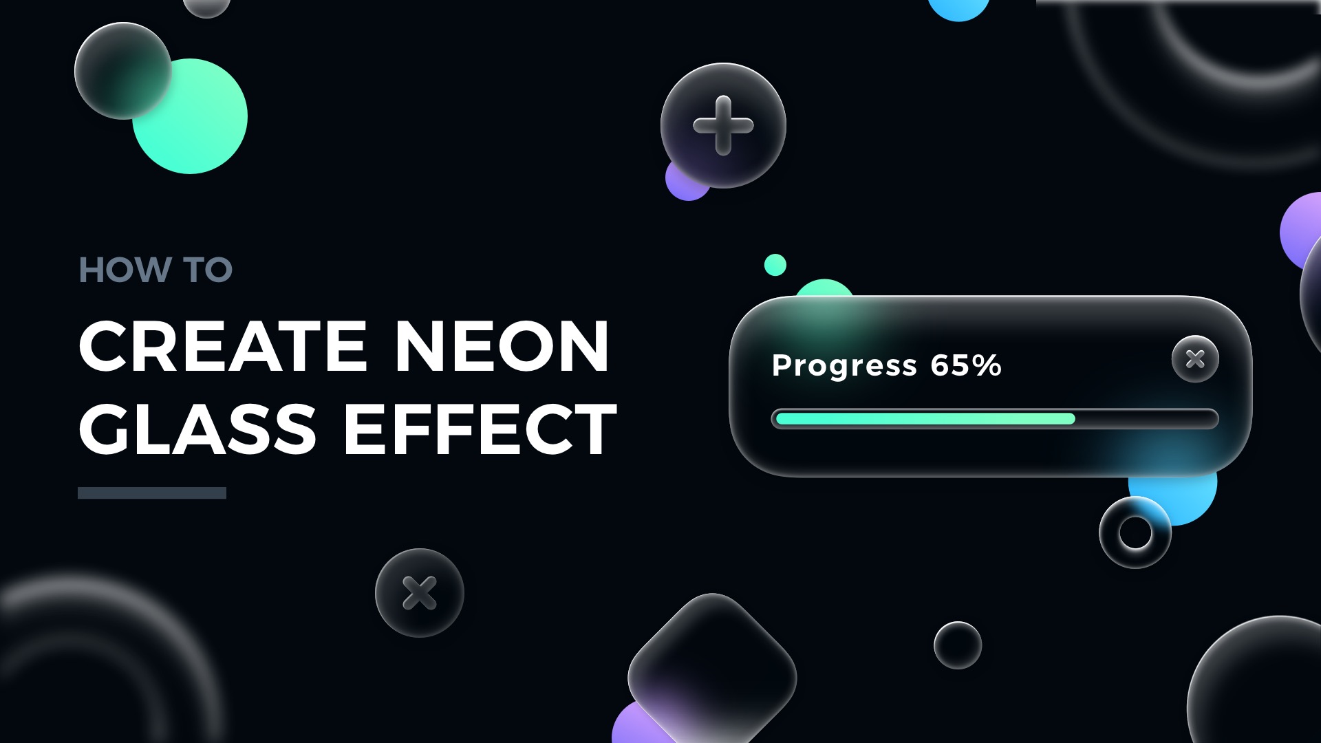
Glassmorphism is a trend that is almost everywhere in modern digital products. Glass has become one of the favorite digital materials. You may quickly learn how to create attractive glassmorphic elements. The style is even included in UI Design Starter Kit. Maybe it is time to try something fresh & familiar at the same time?
In this tutorial, I would like to show you how to prepare Neon Glass Effect, which may be the perfect style for your future project!
Grab the mug of your favorite coffee… or tea, and let’s shape some glass!
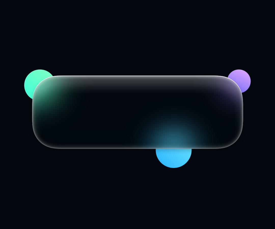
Basically, the whole neon glass effect is all about setting proper inner shadows and the background blur. What is important you have to pay attention to the background. The effect looks best on dark backgrounds with subtle patterns & some abstract elements.
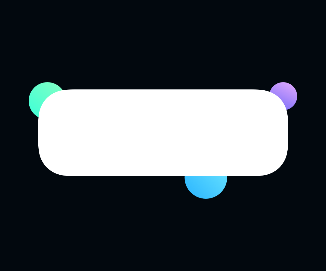
1. Draw a Shape
Create a simple rounded rectangle or an oval from the example below. You will be able to copy & paste the effect later to other layers.
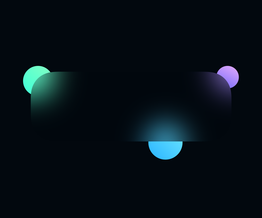
2. Add Background Blur
Without the blur, we cannot say about the glass effect. This effect defines the whole style. Set background blur value to around 40 to see how the surface of the material is changing. Naturally., you always may play with your own settings.
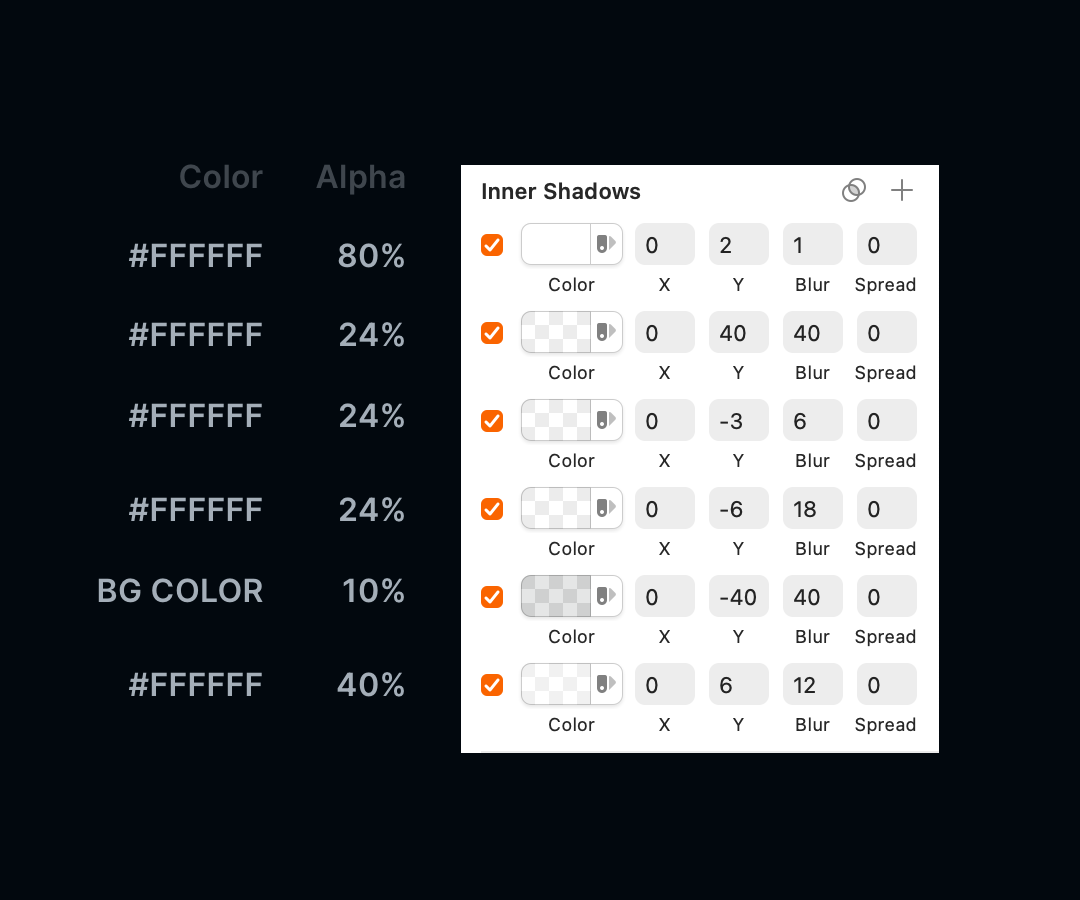
3. Apply the Inner shadows
The Neon Glass effect is built by series of Inner Shadows. The order of effects is also important. Start with the white one & 40% of opacity, Y=6, and Blur=12. Then add a dark one (black or in the color of the background), opacity 10% or 20%, Y=-40, Blur=40. Now add another white Inner shadow with Y=-6 Blur=18. Add also white one with 24% of opacity and Y=40 and Blur=40. Finally, the last one that imitates light reflections:
White with opacity 80%, Y=2, Blur=1.

All options may vary a bit. Always look at your shape, if it looks right, it is done, but some tweaks may be needed. See the Inner Shadows list from the example below:
4. Apply Drop Shadow
Subtle drop shadow helps to establish a better hierarchy. In this example, I used black color with 20% of opacity and blurred with the value of 20.
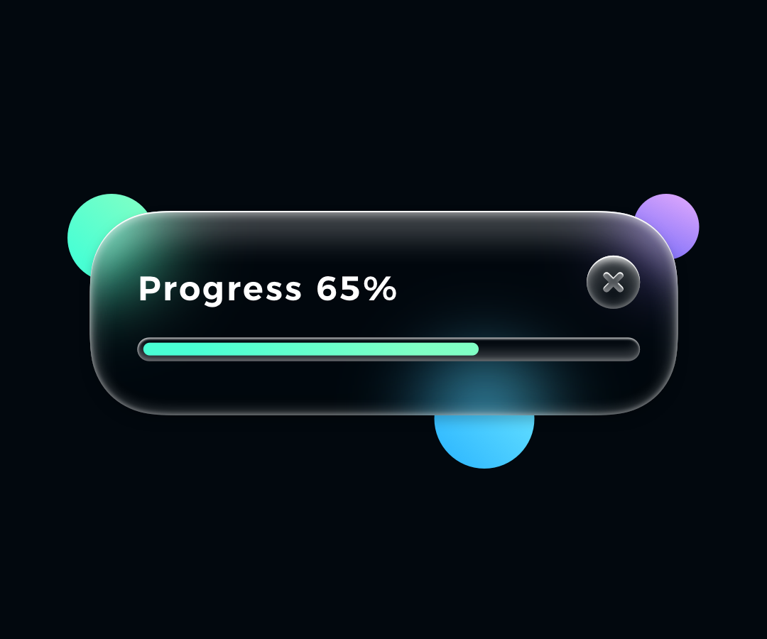
5. Add Content
Test your layer with text content, icons, and other elements. Be sure to match WCAG 2.0 guidelines when it comes to contrast. As I mentioned before Neon Glass effect works best with dark backgrounds, that’s why other elements should have rather light colors.
One more thing!
If you prefer to watch UI Design tutorials, I have prepared something for you! Now on my YouTube channel, you may see how to make the neon glass card in Figma and Sketch! Check it out now! Don’t forget to subscribe to the channel to see upcoming tutorials:
Summing up
The Neon Glass effect is quite simple to achieve if you know what kind of Inner Shadows to apply. I hope you found the tutorial useful. Can’t wait to see your UI elements done with this style! Feel free to tag me on Instagram or send me your works to get feedback!
By the way…
If you start a new project or would like to organize your UI Library in Figma — do not waste your time creating everything from scratch. Feel free to use the Prime — Design System Kit. It helps you design UI with the best Figma techniques — Component Properties, Variants, Auto Layout and more.See Prime in action.
To make it easier there is a gift 🎁 - Use UXMISFIT10 offer code to get 10% Off.

You can also Create User Flows faster in Figma & Sketch — With SQUID you can create User Flows directly in your favorite design tool. You may style them to your project brand within a couple of clicks. Prepare all kind of diagrams in minutes. See how it works.


