Pen & Paper – they were here before Sketch, Photoshop, or any other digital design tool. Through centuries people leave their thoughts & ideas thanks to them.
They are here when Figma or Sketch battle is going on.
We can also be sure that Pen & Paper will be here even after people will drop using Personal Computers or Smartphones.
Why?
This is how we think. We unleash our ideas quickly when we make raw sketches. No other tools are able to replace Pen & Paper.
“The hand is the window on to the mind.”
— Immanuel Kant
There are lots of useful articles about why writing and drawing by hand give you much better results.
- Forget the computer — here’s why you should write and design by hand
- UI Sketching – How to Make It Right and Why You Should Do This in All Projects
- The Messy Art Of UX Sketching
Advantages of Sketching in UX/UI Design
- Enormous Speed – none of the digital tools will give to the same ease when it comes to idea visualization
- Unleashes Creativity – the brain is working in a different way than when you use computer
- Good for Low Fidelity – try to recreate your simple drawing in the digital tool, it took more time, and low fidelity results are not so impressive
- Great for raw presentations (even as photo – clients often do not understand wireframes, but sketches are obvious to them)
- The best portability – Pen & Paper are also more convenient that iPad to have them always with you.
- Perfect for Brainstorming – sharing ideas with sketches is one of the most efficient ways of communicating thoughts
Disadvantages of Sketching in UX/UI Design
- Sketches have to be reproduced in digital form in further steps
- Poor for high fidelity work – sketches cannot be directly turned into final designs of web or mobile apps.
- No automatic backup – They cannot be saved directly in the cloud 😉
Why Sketching is The Most Powerful Tool
First thing you have to know is that drawing is actively exercising your brain. It is much more active than in the case when you are pushing pixels. Painting something awakes our imagination and unleashes creativity. These two things are crucial for the design industry.
You cannot achieve the same thing using a keyboard and mouse. Placing rounded rectangles in different colors on the digital canvas makes the brain less active.
Tips for Sketching UX/UI Design
1. Use Pen
Do not use a pencil. When you use a pen, the magic happens. There is no way to go back. You have to move forward and leave the line you have drawn as it.
If you are like me and you always try to make things perfect, you could waste time trying to ease line and draw it again until it is ideal. UX Sketching has to be fast. This is why the visualization should not have too many details.
2. Use Templates
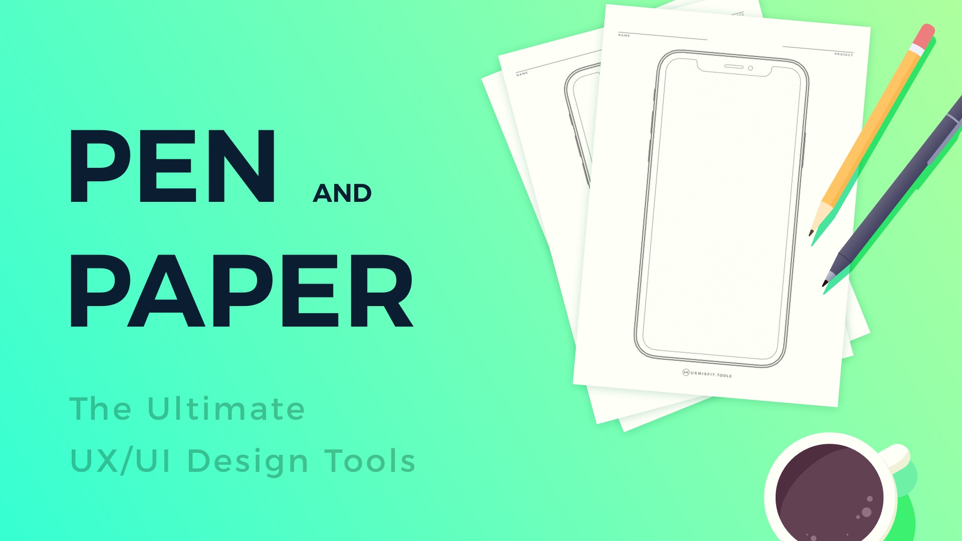
Designing UI or Icon on a blank paper sheet is good. However, if you would like to speed up your work and get some helpful constraints, you should use printable templates. I have prepared UX/UI Sketch sheets for web, mobile, wearables, app icons, and other UX related stuff. You can grab them as part of UX Misfit Tools
3. Do Not Use Too Many Colors
Majority of your sketches should be black & white or in grayscale. You can use some color accents to highlight interactive elements like buttons.
4. Sketch quickly
Do not waste time for making sketch too detailed. It is about idea visualization, not an art. This is why, during brainstorming workshops, it is recommended to use bold marker pens. With this type of tool, you cannot draw tiny details.
5. Make Backup
I mentioned before that paper sketches do not save automatically in the cloud. But, it does not mean we cannot make their backup! It is good to create a digital copy of them. A few shots made with your phone will be perfect.
To conclude
Before you jump to the next creative task, consider drawing or writing by hand. Make raw sketches and plan the work you will continue in digital tools. Thanks to this you will see that your efficiency will increase and result with get better.
By the way…
When you finish drawing ideas, you have to make them digital. Do not waste time to recreate them from scratch. Use powerful UI Kit or Template for Sketch:
If you plan to use Sketch for the design of mobile and web UI or you would like to use it to create UX deliverables like User Flows quickly, these are tools for you:
❤️Prime Design System Kit for Sketch – Create Web and Mobile UI Designs within minutes . Starting UI Design from scratch is boring. I wondered how to skip this part of work to focus on more exciting tasks. Prime Design System Kit is the resource that lets you customize all essential UI elements quickly and jump right into the most engaging parts of the design process. What is more, it includes Charts, Device Templates, and Illustration Kit to speed up specific pieces of work. Thanks to Prime you create Web or Mobile design within minutes. See Prime in action.
❤️SQUID User Flows Template for Sketch – Make User Flows faster. With SQUID you can create User Flows directly in Sketch with your artboards. Everything may be done within a couple of clicks. See how it works.
❤️App Icon Template for Sketch – finding the right app icon template to quickly design the right asset may be hard. This collection of high-quality is a solution that will enable you to prepare and generate all needed assets for major platforms.
❤️❤️❤️❤️❤️ Would you like to try all of them?
Feel free to check them out in Ultimate Access.
Ultimate Access lets you get Prime, SQUID, App Icons, and more UX/UI Design resources for Sketch with affordable price. What is more, Ultimate Access members also get all updates and upcoming resources from UX Misfit Tools.
Get Ultimate Access to UX Misfit Tools for Sketch now.
Thanks for reading!
