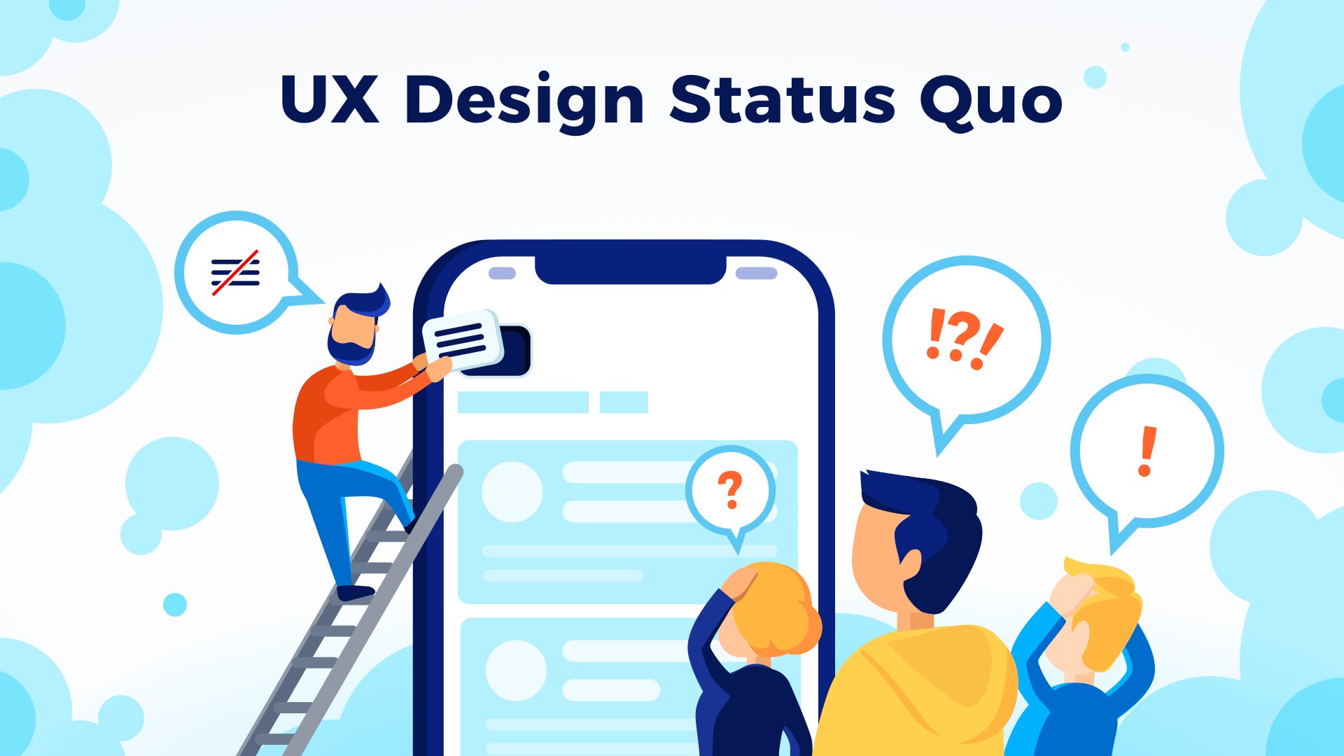
We all love to learn and follow the rules of our UX Design Industry. They give us safety and comfort that our solution will be good enough to be loved by users. However, it may be a way to create the next boring app that no one would like to launch.
At Mobile Central Europe 2018 I had an opportunity to speak about Questioning The UX Design Status Quo. Today I will dive deeper into the topic.
Why is it important to question the Status Quo?
Today’s leaders in the tech industry like Google, Apple, Facebook or Microsoft create trends and construct patterns that are introduced to UX Design Community. As I mentioned earlier following this leaders gives us safety and comfort. We hope to participate in a small part of their success. But, this also results in the situation when their failure becomes also our.
Following influencial companies will not work if you would like to make something more, something that will redefine the technology and push the human race forward. Making everything like the others will not let you achieve this goal.
How to question the Status Quo?
Making something different that other does not make it automatically better. First, you have to learn the rules, guidelines, and patterns. If you will not do this, you will be just an ignorant that tries to reinvent the wheel again.
This simple lessons will show you the way of thinking differently to create something better:
Lesson 1 – Do not follow the pattern blindly
Do you remember sidebar menu introduced on a large scale by facebook? We all used this pattern. We thought that it was a huge thing because great company hiring the most talented people is implementing this type of menu in their app. But, the truth was different. The side menu was probably not validated enough by designers. There are many different patterns to implement primary navigation. Fortunately, designers from Facebook realized their mistakes and now they changed the app so the all major features are available to reach through bottom tab bar.
If you are in a mobile industry for a while you may remember the time before Material Design was introduced. Official Android Design Guidelines said that app creators should not use bottom tab bars. It said that it is iOS specific and may be accidentally pressed because the system buttons are also placed at the bottom of the screen. Yes, this was an official information! However, just a few years Google introduced Material Design Bottom Navigation pattern. This UI element is almost the same as tab bars known for years on the iOS platform.
The other interesting UI pattern is Floating Action Button (FAB). I have written the article FAB – Why Material Design’s Iconic Element is the next Hamburger Menu that revealed some issues of this element. Fortunately with Material Design Update Google has solved major issue with „Extended Floating Action Bar” pattern.
What can we learn from this? First, like Luke Wroblewski always says: “Obvious always wins”. Second, even most complete UI Guideline will fail if it is not natural for the users. Third, even the big companies make mistakes, but they learn and improve their guidelines – and we should also.

Design Faster in Figma and Sketch
Never start Your work from scratch. Use the Kit that already have 1500+ components with well structured styles, variants & auto layout.
Use Prime Design System Kit to boost your workflow. Create for Web, Mobile, and Desktop. You may use it as the entire UI Library for Design System or just create Landing Page for your next Client. Perfect for those who want to save time while creating UI designs and learn best practices of Figma and Sketch at the same time.
Lesson 2 – Rethink your workflow
If I could ask you a few years ago what tools do you use, you probably would answer that you use only Adobe software. But, now Creative Cloud is only one of many great tools for designers. We can use Sketch, InVision, Flinto, Framer, Figma, Origami Studio and many other apps to design digital solutions.
They are not only replacements of Adobe apps, they change the way we work. Most of them are created especially for designers focused on apps. Thanks to them our workflow is more efficient.
If you would like to redefine technology to be more convenient for people, you have to use different tools that will open your mind to different opportunities.
Next, have you ever thought that design thinking may ruin innovation? How is possible? I was the witness to many situations were the workshops ended with a solution that in the eyes of the participant was a brilliant and original idea. But after validation, we realized that there are five or more similar solutions already shipped.
The reason for this is surprisingly simple – group thinking. We tend to think that people with authorities like managers, senior designers or experienced engineers have better ideas than ours and we follow them.
It is important to remember that every idea may be valuable. Being conscious of this type of group thinking may save your design thinking workshop results.
Finally, let’s talk about Agile. Nowadays more and more teams work in Scrum. However, have you ever realized that this methodology may ruin your personal efficiency?
Productivity experts, that recommends techniques like Getting Things Done says that our most efficient time is between 9:00 AM and 11:00 AM. These few hours should be spent on our most difficult tasks to accomplish because our mind is still fresh and have the strength to focus on work.
Now, the Daily Scrum meeting is usually organized in the morning. This 15 minute causes serious loose of focus. We have to listen and remember what our team members have done and what they will do. Our mind is distracted and it is very hard to return to the task with the same attitude. Just add some spontaneous meeting and you may forget about productivity for a whole day.
Lesson 3 – Stay Open-minded
When you will gain knowledge and experience, you will be tempted to follow the things you already know and ignore some fresh ideas. This is the moment to realize that it is a real problem that may ruin your career.
I am sure that you have heard about Platypus. This unique animal lives in Australia. However, when the species was discovered lots of noble scientists did not believe that this could be a real creature. They have thought that it is a fake thing. We know that they were wrong.
This is why you should be tolerant to even weird ideas. For example: what if someone will tell you that “Skeuomorphic design will return”? You will probably think that this person is insane! But, if you will think about that you will realize that some designers, even this popular are tired of flat design and search for something different.

Finally, do not afraid to Think Big. This is the core tip of questioning Status Quo. If you would like to redefine the industry you should not focus on making next photo editor app. I love the following quote from Steve Jobs that perfectly shows thinking big should not be limited to a small group of people:
“Everything around you that you call life was made up by people that were no smarter than you and you can change it, you can influence it, you can build your own things that other people can use.”
Summing up
We all know and admire Apple. It is one of the biggest companies in the industry with a portfolio of amazing products. But, in their time they were challenges of IBM Status Quo.
Questioning Status Quo is a difficult path, but it may lead to amazing results. The biggest success may be achieved only by going to a place where no one was before.
Finding own patterns, rethinking the way you work and staying open-minded to the fresh ideas are the fundamental elements of challenges.
I know that learning and challenging rules of UX Design industry may be time-consuming, but it is worth do it.
Time is a very precious asset for us – Designers. This is why beside writing UX articles I build time-saving design tools to make you a better and more efficient Designer.
Create User Flows faster in Sketch – With SQUID you can create User Flows directly in Sketch the sketch file with your artboards. Everything may be done within a couple of clicks. See how it works..
Create Web or Mobile Designs within minutes – Starting UI Design from scratch is boring. I wondered, how to skip this part of work to focus on more interesting tasks. Prime Design System Kit is the resource that lets you customize all essential UI elements quickly and jump right into the most engaging parts of the design process. What is more, it includes Charts, Device Templates, and Illustration Kit to speed up specific pieces of work. Thanks to Prime you create Web or Mobile design within minutes. See Prime in action.
Subscribe UXMisfit.com (and get some discounts)
Follow me on Medium
Follow me on Twitter
