Material Design, greatly announced in 2014, introduced many interesting patterns for UI design. Visual framework from Google solved some issues and standardized a lot of elements for mobile and web applications. It is a great tool, but it is not free from mistakes.
Floating Action Button is one of the iconic parts of the Material Design. It even seems to be a symbol of modern mobile apps for Android and indeed it looks pretty on the smartphone screen, but is it good for the application’s User Experience?
FAB – usage and behavior
Google recommends to use it as a manifestation of primary action in the solution. Button has a circular shape and it is floating above the rest of the UI. There should be only one FAB per screen, to represent the most common action of the app. When tapped it animates to expand the functionality. The icon inside may be also animated for interactions. Full specification is written here.
Google’s intention was good
Promoting the most common action in a convenient and appealing visually way is a brilliant idea. Putting it in the bottom right area of the screen sounds considered when it comes to present the app on the bigger smartphone. It is easy to reach, clearly communicate it’s function and instantly accessible for the user.
In the perfect situation Floating Button is a good pattern. That makes users life easier. But the reality is very different. This element may be a pain point for the fresh users who learn how to use your solution. Let’s explain why.
Why FAB design it failed
It looks like that FAB will share the fate of Hamburger Menu. At first the menu pattern was loved for it’s simplicity and visual form with potential to prepare surprisingly delightful microinteractions. Few years later it was criticized as a non intuitive solution that does not engages users in the app. It is very possible that the same situation will happen with the FAB.
The main issues of the Floating Action Button:
- Promoting primary action that may be not used so often – Google’s intention is to promote the most important action of the app, but what if this action is not needed by users to be displayed in a such prominent place (on the top of the whole UI). Let’s take the example of the Inbox or Gmail app. FABs of these ones promotes creating a new message, but how many times you used it? On mobile, people usually want to browse the list of received messages and accidentally write a response for a mail. Starting to create a fresh message on a smartphone is not frequent.
- FAB may cause distraction – The previous point of showed that Floating Action Button may not be needed to display if the app functionality beneath the button is not used often. Additionally, the strong visual form and color of the button attracts the eye and do not let to focus on content while using the app.
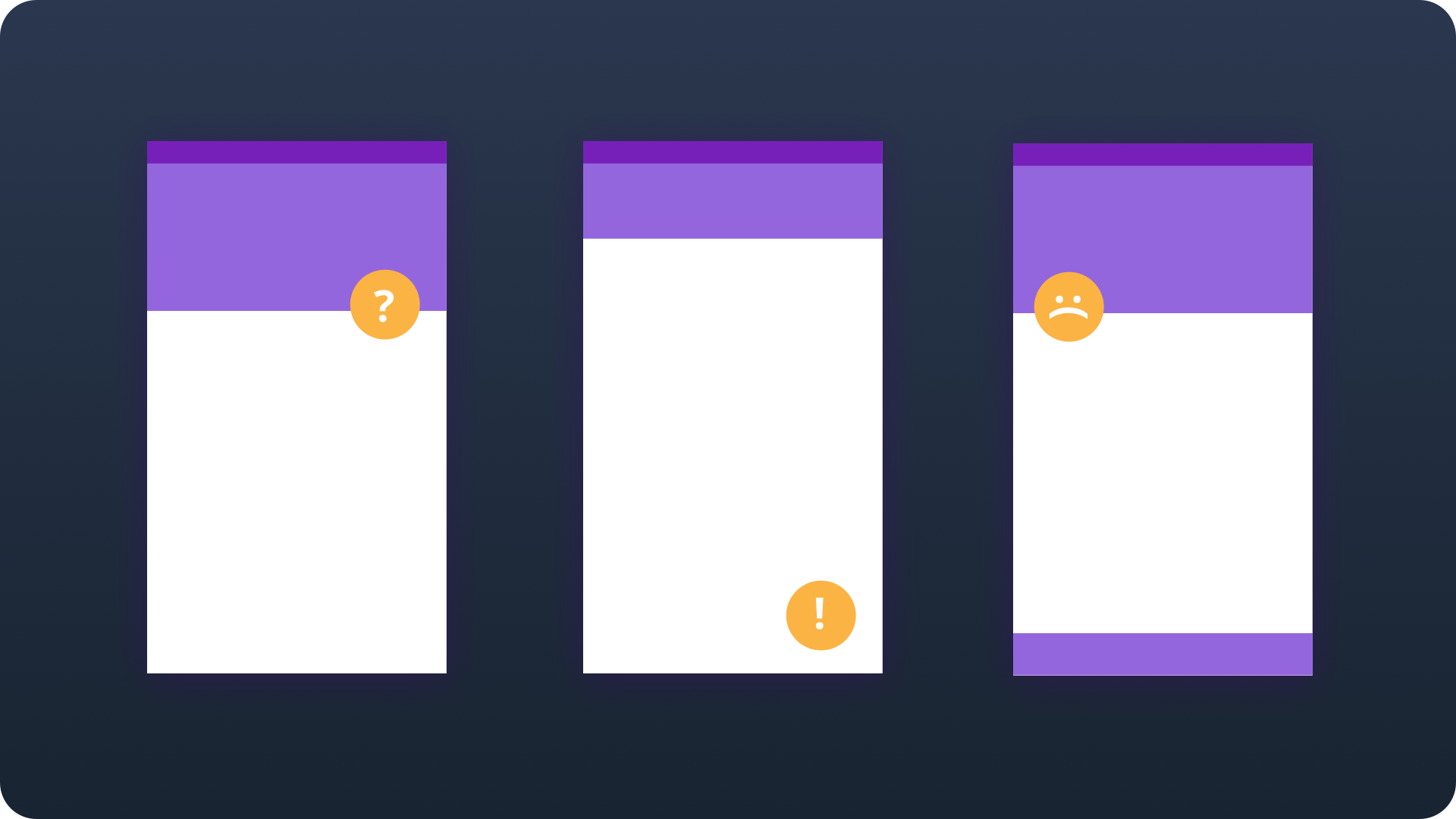
- Button blocks the content – Presenting the element on the top of the whole User Interfaces will always cover something beneath. Google is aware of this situation and recommends to be careful. If FAB hides not so important data or buttons it is no a huge problem, but what if you plan to display something worth noticing? Off course, there are some workarounds, like hiding the FAB when users scrolls down the list, but it does not solves issue completely.
- The symbol may be not understandable – Every icon without description is a risk. It looks beautifully on the screen, but it may not be functional. To reveal the functionality user has to tap the FAB. As the researches show, tapping the object is a decision and takes more effort in our minds, so it may be problematic for some users. They may be scary that they will do something they not intended to do.
Summing up
Material Design is the visual framework that unified the approach to mobile and web design. It is surely a great thing, but Google should not rest on it’s laurels and work constantly to improve it. Floating Action Button look really nice but it may ruin the app’s experience very easily. It is worth to mention that even Google informs to be careful while designing app with FAB: “Not every screen needs a floating action button. A floating action button represents the primary action in an application.” In the end, in most cases we should find the way to present the primary action in a better way. What is your opinion in this matter? If you are a fan of Material Design check out the best free UI design resources here.


