During the Apple event, we’ve seen the new lineups of the Apple Watch, AirPods, and iPhone.
In general, except for one interesting thing – there were no major changes for UX/UI designers – most of them were already announced during WWDC 2022. However, if you would like to know some interesting details, grab the mug of your favorite coffee and enjoy the below summary!
Apple Watch Series 8
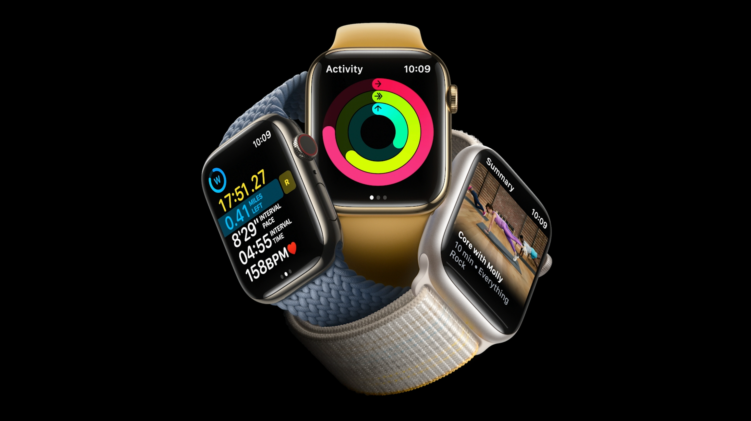
New Apple Watch brings a few new features that impact the user experience. The list of worth-knowing updates:
- Temperature sensor – it helps to monitor temperature fluctuations and inform you of what is happening with your body.
- Crash detection – Apple Watch will automatically initiate an emergency call once it detects a car crash accident.
- Low Power Mode – over 36 hours of battery life. It limits several features to extend the working time of the device.
Source apple.com
What does the new Apple Watch means for designers?
The device’s appearance didn’t change since the last generation. The screen size and proportions stay the same. This means that you do not have to adapt your designs to the new lineup.
Apple Watch Ultra
The new device will bring some confusion to the Apple naming convention (it’s “Ultra,” not “Pro”!). It is dedicated to people using the device in an extreme environment.
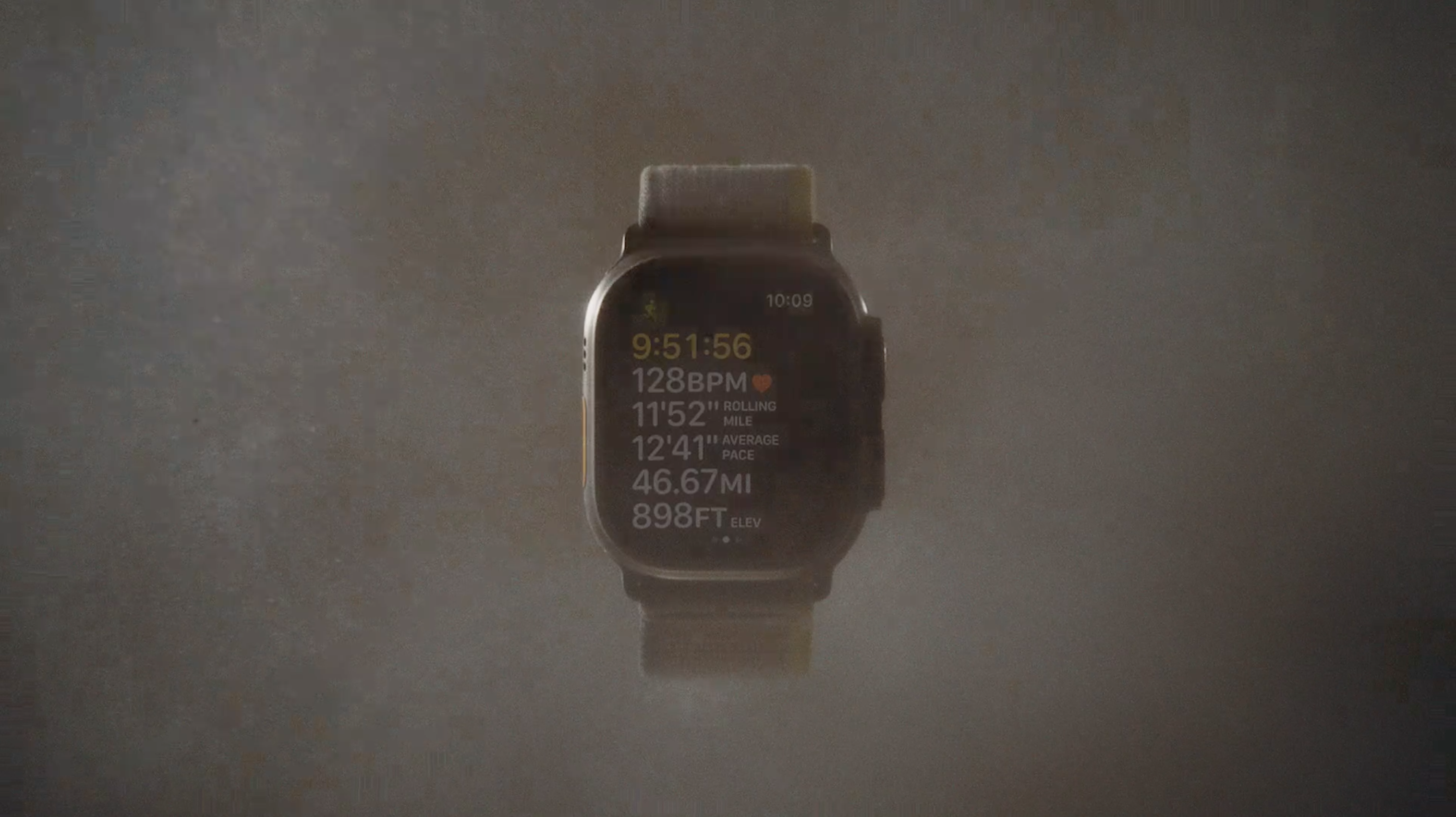
If you think of major changes except for materials & design, the one worth mentioning is the “Action button.” It changes a bit the way users interact with the device.
What does “Ultra” means for designers?
If you design apps for explorers, wanderers, athletes, divers, and other brave people, it is the device you should get to adapt your solution to Apple Watch Ultra.
“Action button,” a new physical toggle, is customizable and should be available for apps to initiate the primary action of the app without the need to touch the screen (which is impossible underwater), so adapting the experience might be worth checking.
There are also some pro apps worth checking. Especially new compasses and the ones that use improved GPS tracking.
Source apple.com
New AirPods Pro
The new headphones are basically an improvement of the previous generation. For us designers, there is nothing we should focus on when it comes to our app designs…
Get Free Chapter
15,000+ designers are already subscribed (no spam! Only design tips, tutorials + design resource news).
Join now, get the free chapter of my eBook right to your inbox. With these tactics, you will solve common design issues with ease.
Sign up - Get Free Chapter
iPhone 14
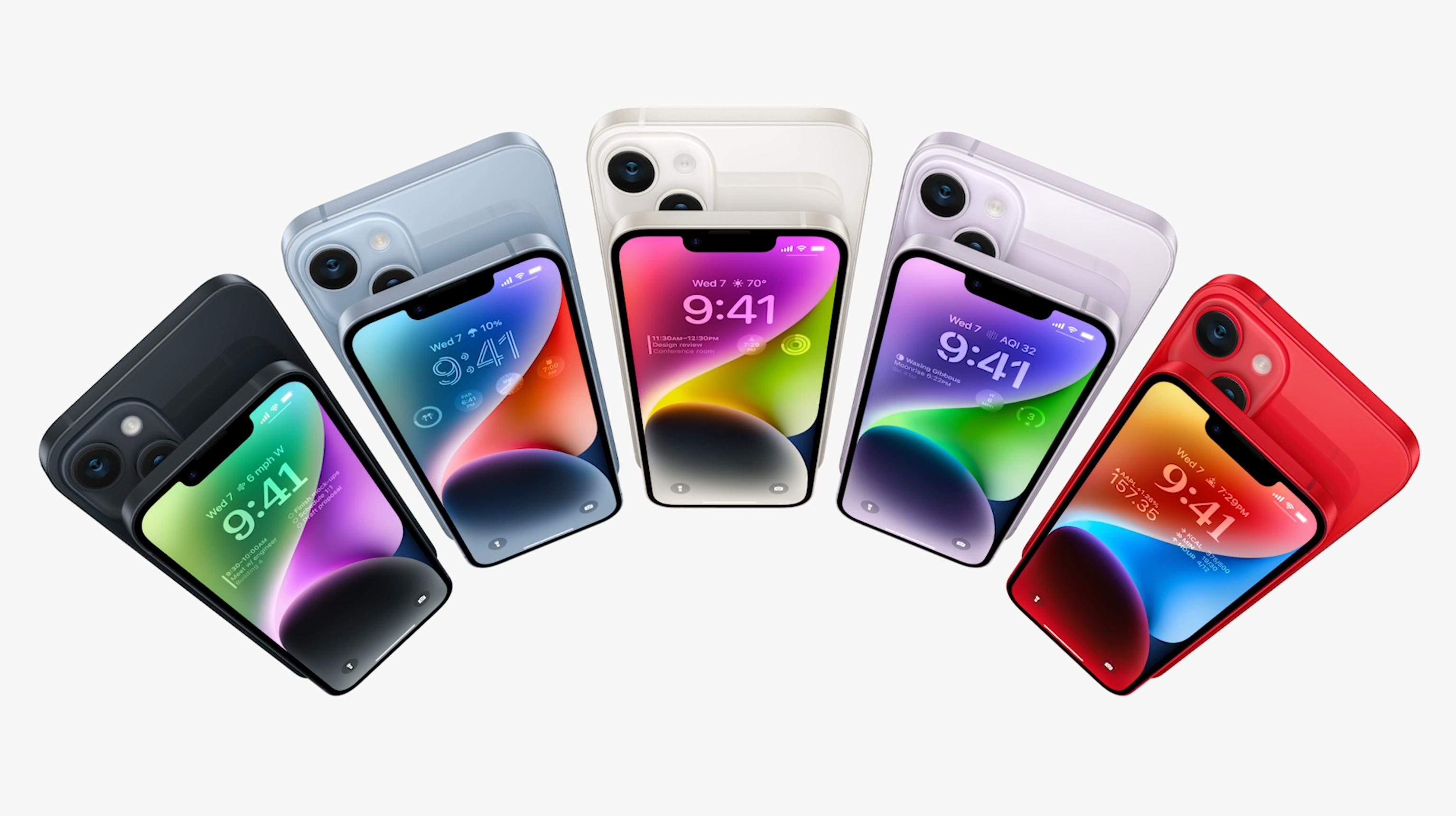
The basic lineup got a new bigger version – the iPhone 14 Plus. It’s the same as its older Pro brother.
The new devices are faster and more powerful, they got impressive cameras and better battery life, but what’s most important – they still have a “good old” notch… if you feel dissappointed, wait for the Pro devices.
What does iPhone 14 means for designers?
There were no visual changes made to the basic lineup. For sure, there is a lot we may do with the new iOS 16 – this was already mentioned during WWDC 2022. Now you will have the opportunity to give your users access to the new widgets on the lock screen and prompt them with live activities.
Source apple.com
iPhone 14 Pro – Big news, How does it impact designs?
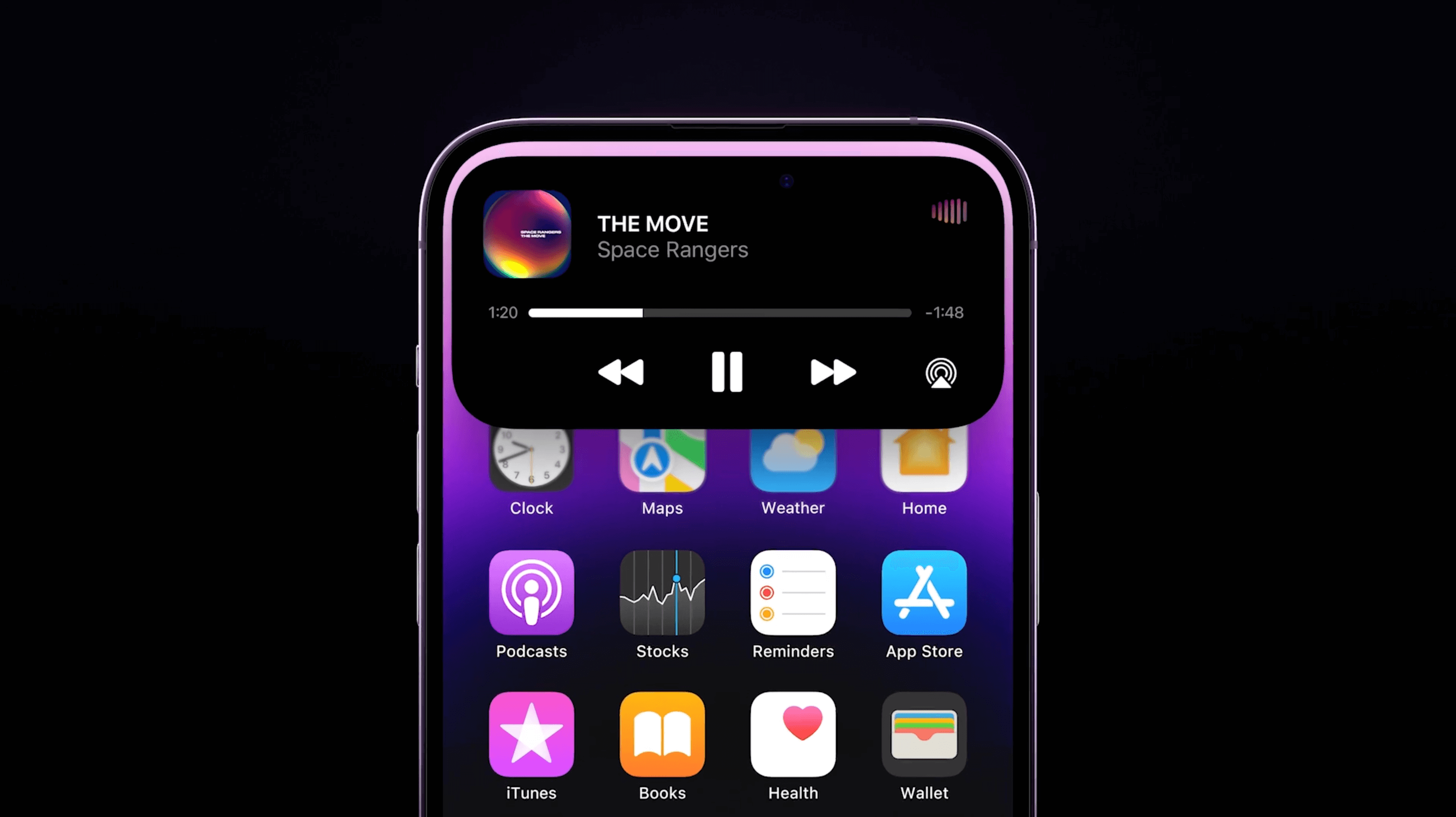
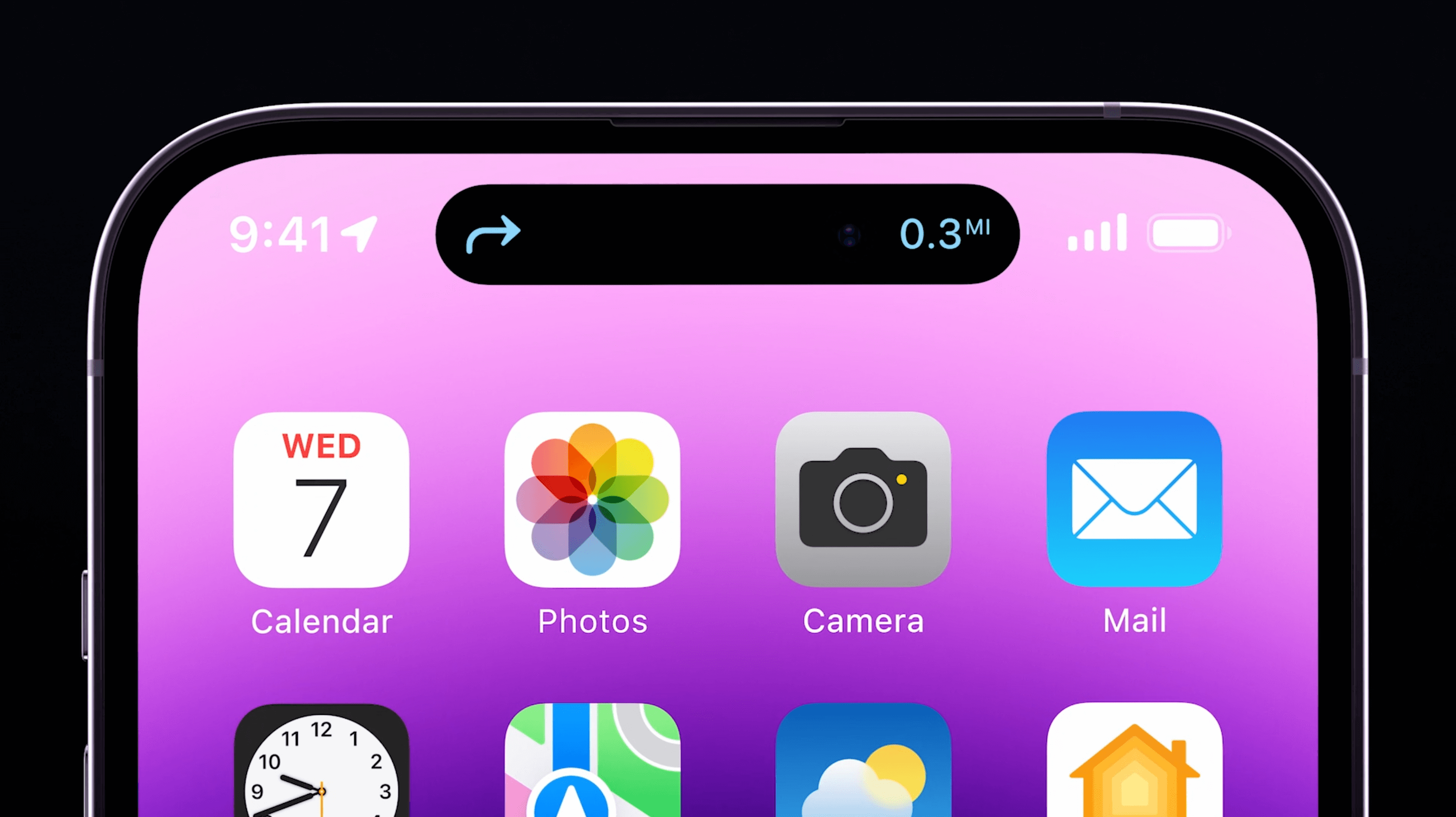
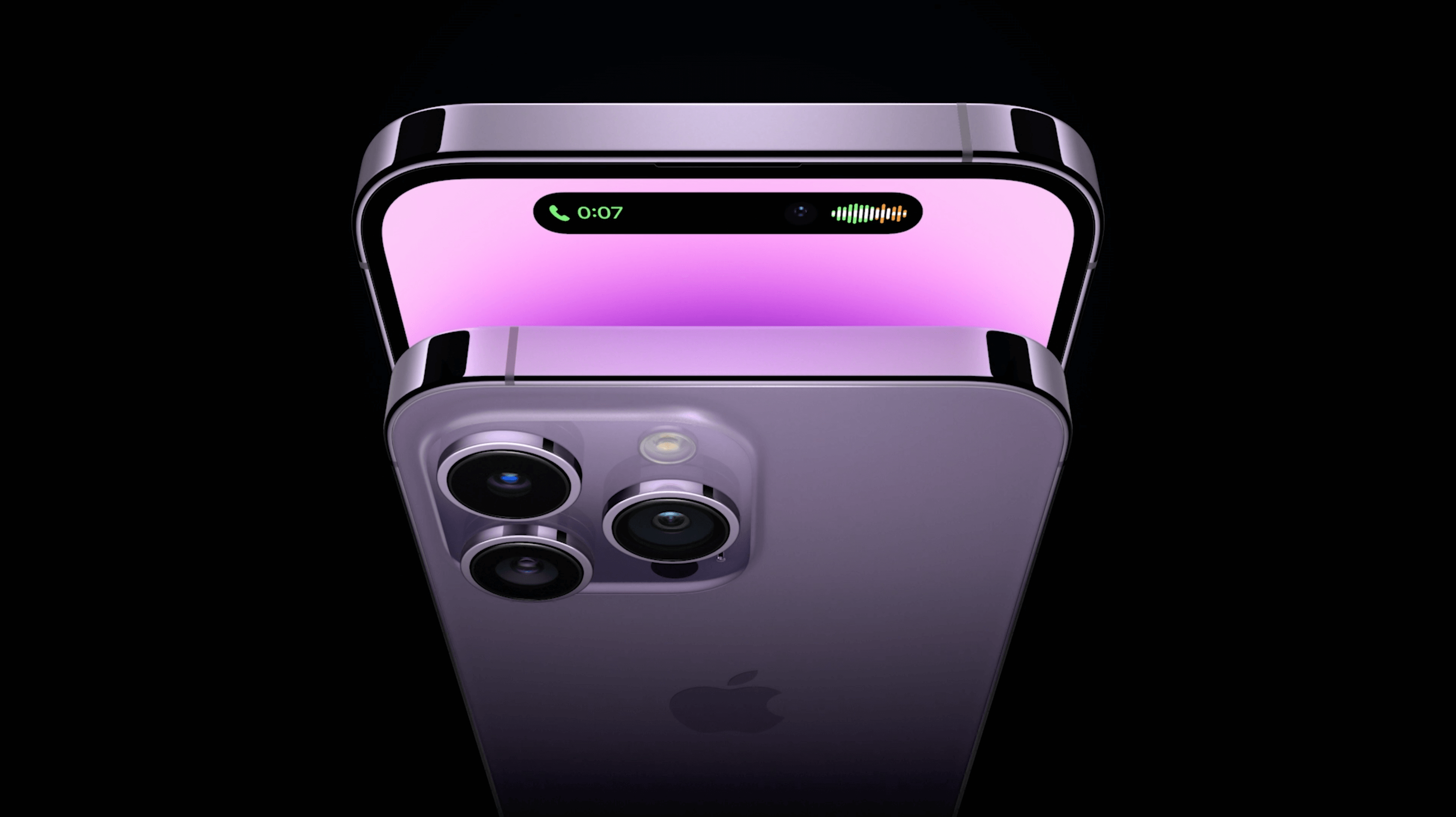
Notch! It’s gone. Say hello to the… “top bar”?… well, Apple is calling it “Dynamic island”. It’s definitely the new biggest news of the event.
It looks like Apple “found” the way to provide notifications & controls without the distraction of the user focused on a specific task… and they are masking the hole in the screen needed for face ID sensors and camera. I must admit that it is quite an elegant solution.
Notifications look modern. They are interactive and change their size and appearance smoothly with fancy animations. I am really curious if we, third-party designers & engineers, can customize it in a similar way that Apple presents their built-in features.
Take a look at a few ways that new notch… sorry, Dynamic Island is adapting to the contextual experience:
Source apple.com
Source apple.com
Source apple.com
Besides all other improvements (better battery, screen, incredible cameras, powerful chips), iPhone 14 Pro also introduces always-on-display. Nice addition!
To conclude
Now you are familiar with most of the essential updates and products announced during the events. I believe you will find lots of creative and useful ways to bring some of them to the solutions you design.
I am especially curious about what ideas you have to get most of the new “Dynamic Island” available in the iPhone 14 Pro lineup – feel free to share your ideas!
Thanks for reading!
By the way…
If you start a new project or would like to organize your UI Library in Figma — do not waste your time creating everything from scratch. Feel free to use the Prime — Design System Kit. It helps you design UI with the best Figma techniques — Component Properties, Variants, Auto Layout and more.See Prime in action.
To make it easier there is a gift 🎁 - Use UXMISFIT10 offer code to get 10% Off.
You can also Create User Flows faster in Figma & Sketch — With SQUID you can create User Flows directly in your favorite design tool. You may style them to your project brand within a couple of clicks. Prepare all kind of diagrams in minutes. See how it works.
