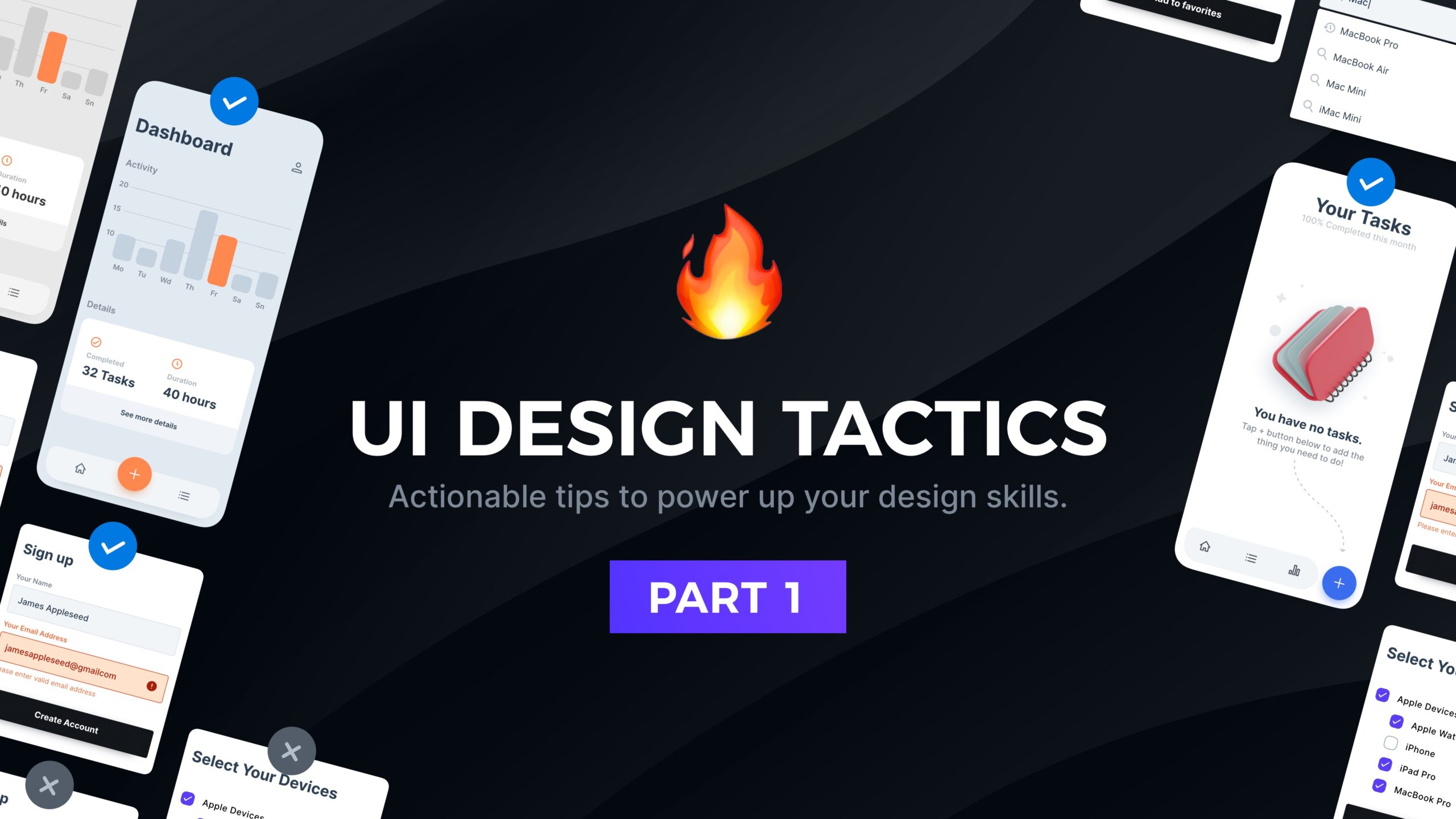
Actionable tips to power up your design skills
Have you ever wondered why your designs do not look like the top-quality designs made by top UI Design Freelancers? Well, there are tiny details that distinguish average UI Designers from the best ones. With these series of tips, I will share with you over a decade of my tricks in making UI Design one step ahead of your competitors.
Do not forget to join the newsletter, so you will be notified about the next fresh portion of UI Design Tactics.
First, I would like you to turn on your creative brain and try to figure out on your own which UI design is better. Feel free to leave your thoughts in the comments!
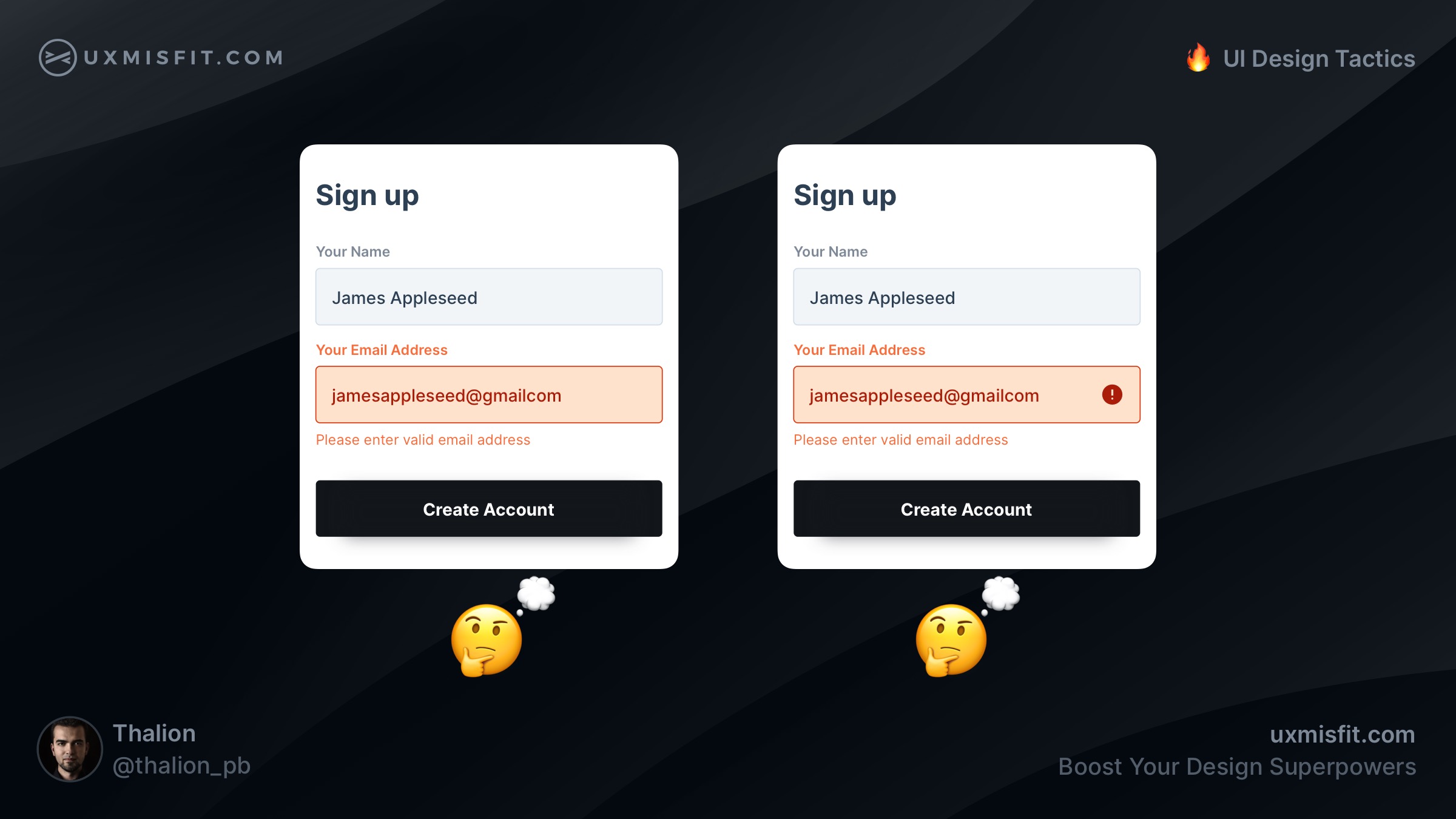
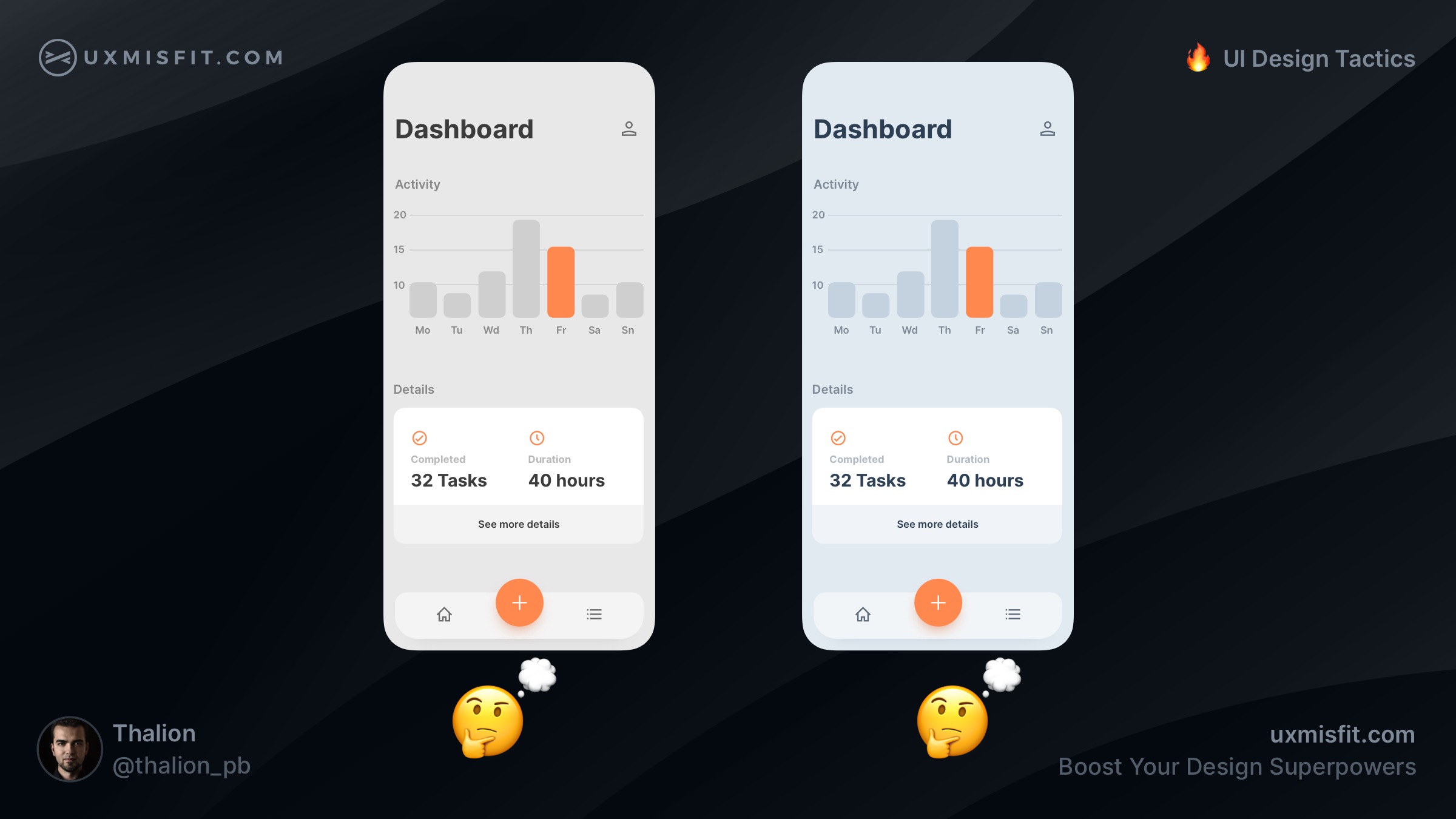
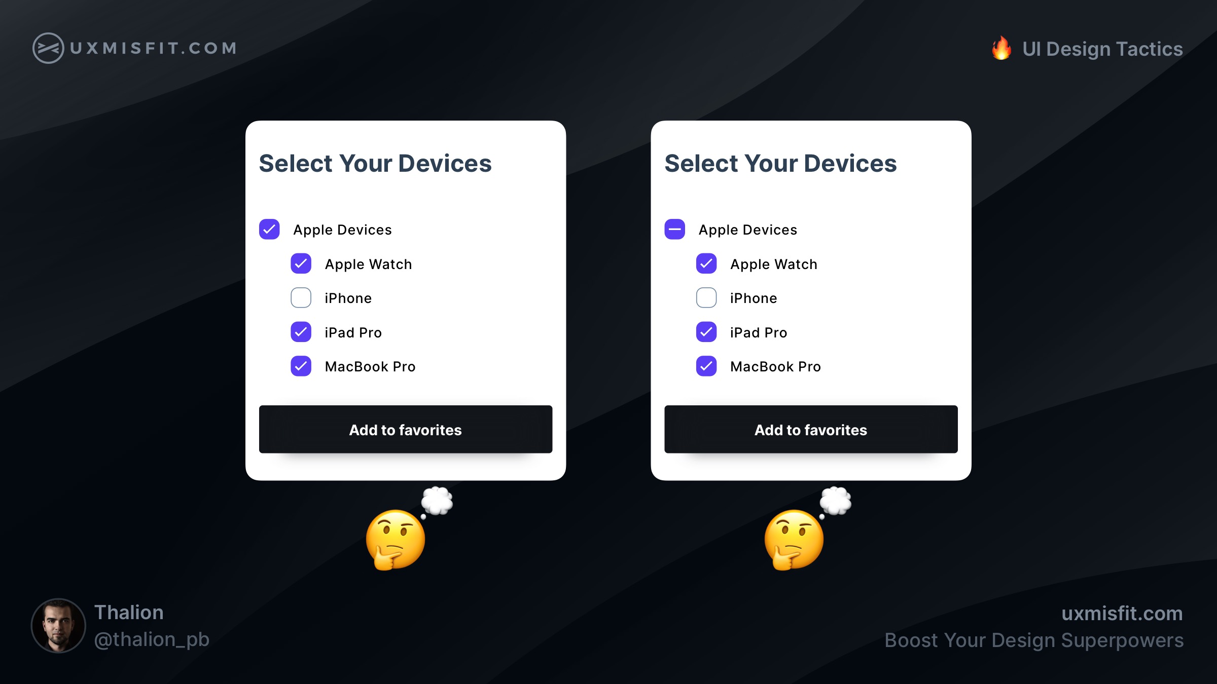
Are you ready to see the answers with an explanation of the above mockups? If yes, scroll down. If you are not sure, take your time. If you want to learn something truly (not only read & forget), take your time to analyze the content.
Ok, let’s move to the 🔥 UI Design Tactics!
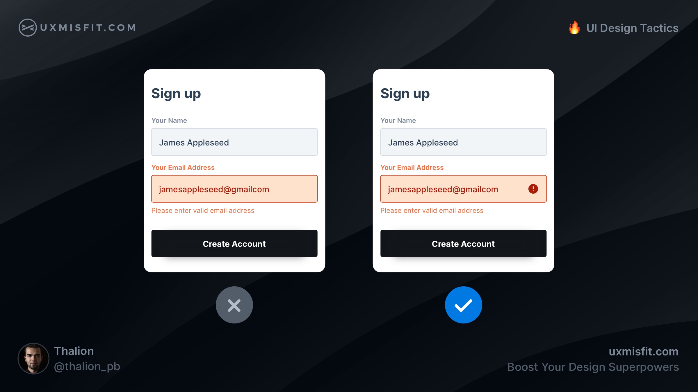
Add an icon for error state inputs
Additional icon with error symbol helps recognize the placement of the issue faster. Not everyone sees the world like you. There are color blind people, that may not see the red tone of the error. That is why additional clue is so essential.
To ensure that your design meets accessibility guidelines, use solutions like Stark (works with Figma, Sketch, and Adobe XD), which helps you validate UI for color blindness.
As you may see, while color seems to be a strong clue for the specific state, in some cases, it may not be enough. Think of all groups of your users!
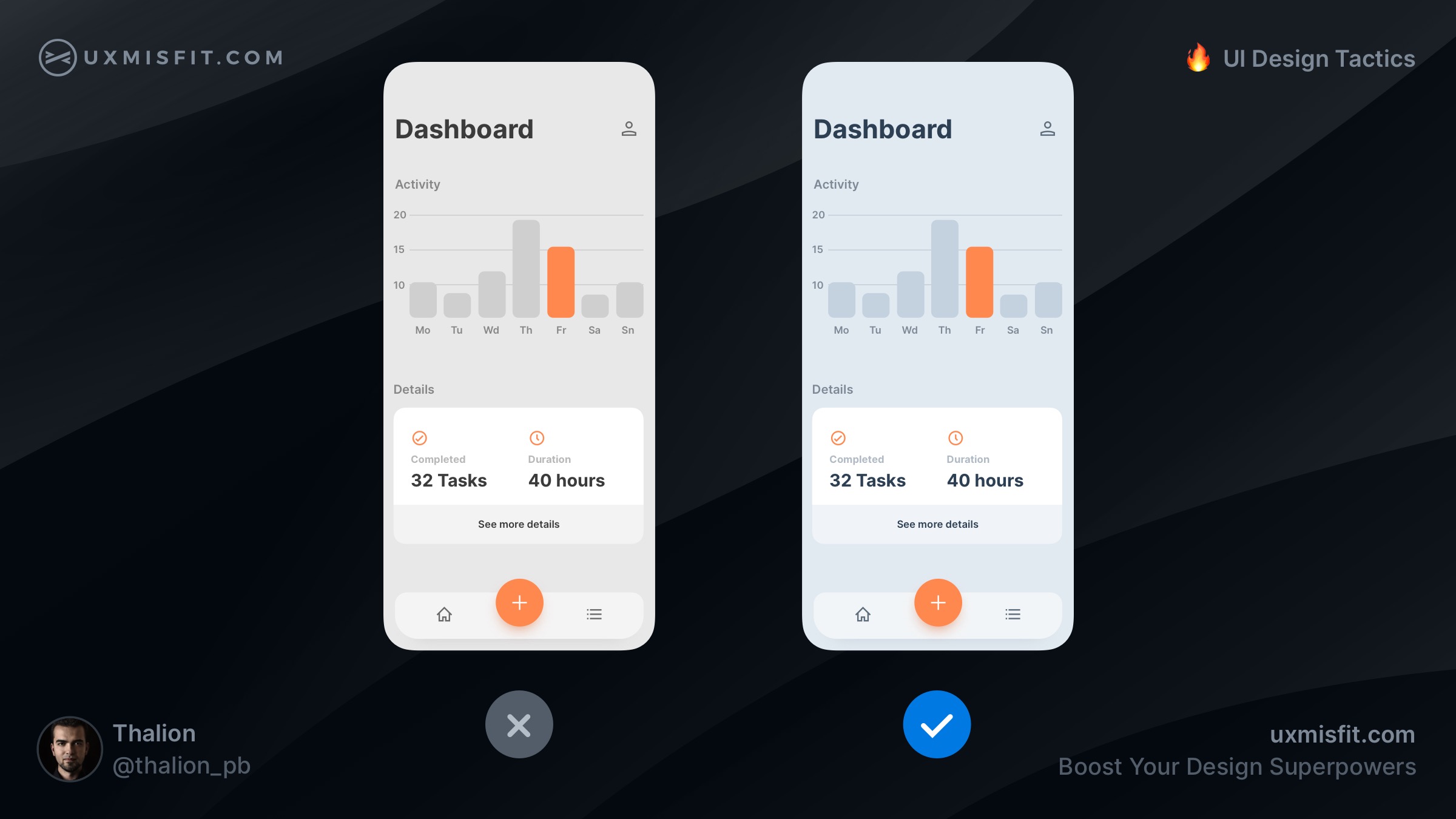
Add a little dose of color to gray
The mockup on the left has got a pure grey color.
HSB (211, 0, 95), the one on the right, has got blueish
gray tone HSB (211, 6, 95).
The second, blue-gray color, is more natural to our eyes. The pure gray color is hard to meet in nature. Make your grays a bit colder or warmer, but never neutral. Thanks to this, your design will simply look better!
The interesting fact is that while I shared this tactic with the community, the overall feedback was divided! About 80% of designers agreed that neutrals should be colder or warmer. However, there were still around 20% of us that have an opinion that 100% gray is fine, or even better. What’s your opinion?
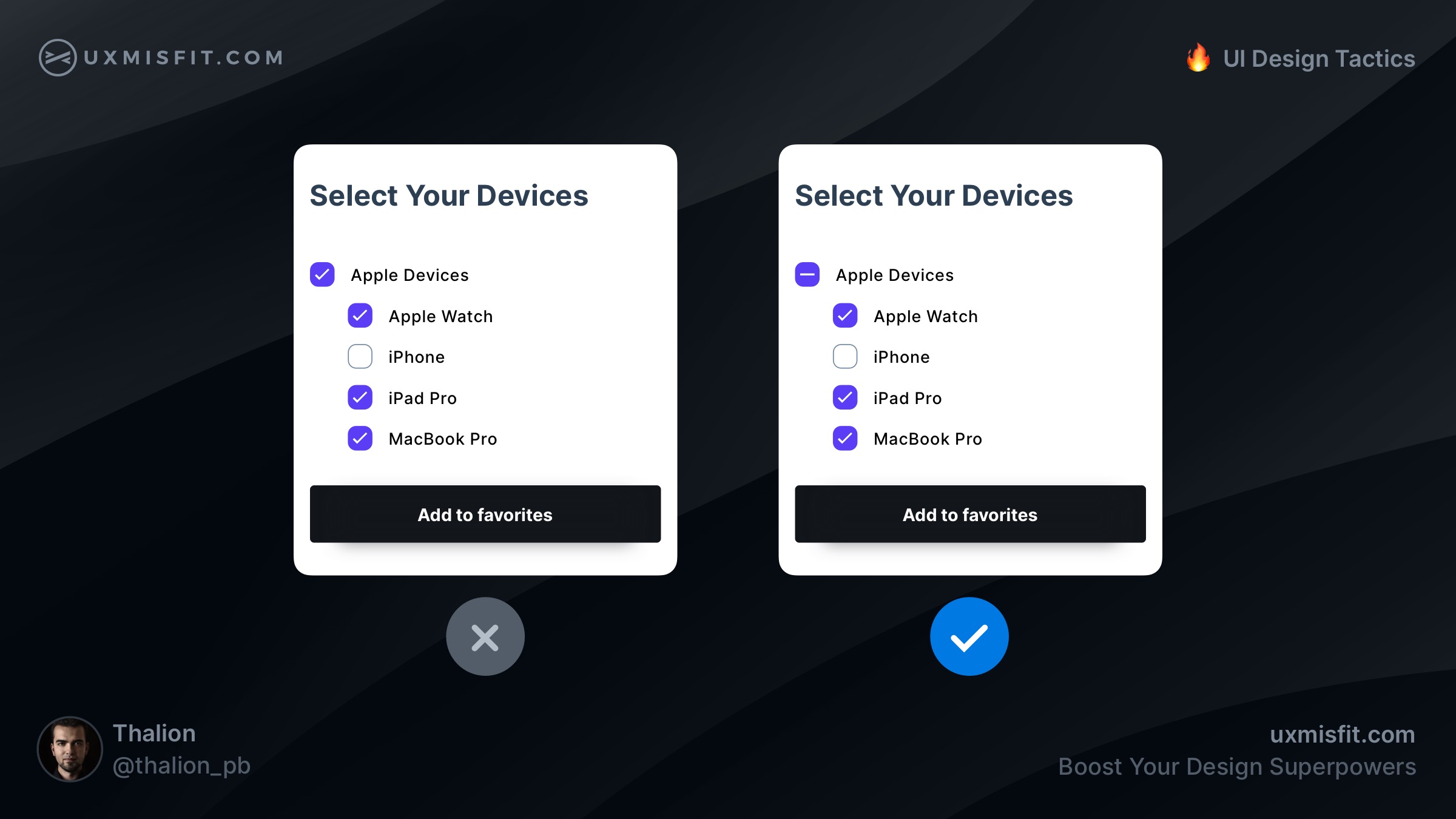
Use indeterminate state for checkboxes
If you have groups in your checkbox lists, use indeterminate state if not every sub-item is selected. This clearly informs the user about the correct state of the list.
When you left the group’s main checkbox as marked, users will think that all options inside are selected.

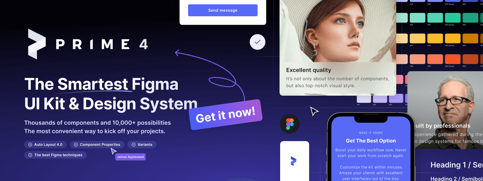
Design Faster in Figma and Sketch
Never start Your work from scratch. Use the Kit that already have 1500+ components with well structured styles, variants & auto layout.
Use Prime Design System Kit to boost your workflow. Create for Web, Mobile, and Desktop. You may use it as the entire UI Library for Design System or just create Landing Page for your next Client. Perfect for those who want to save time while creating UI designs and learn best practices of Figma and Sketch at the same time.
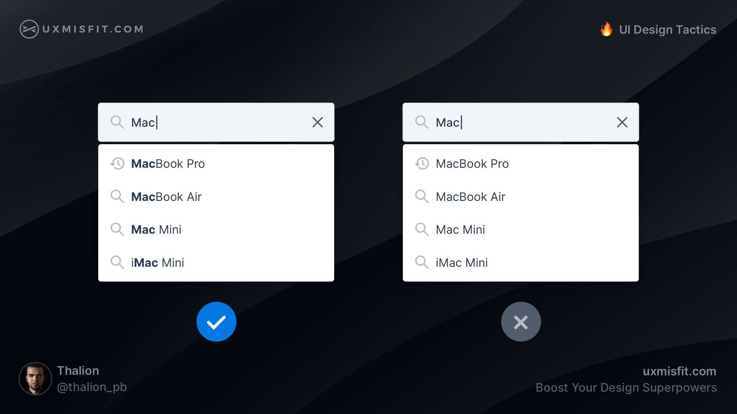
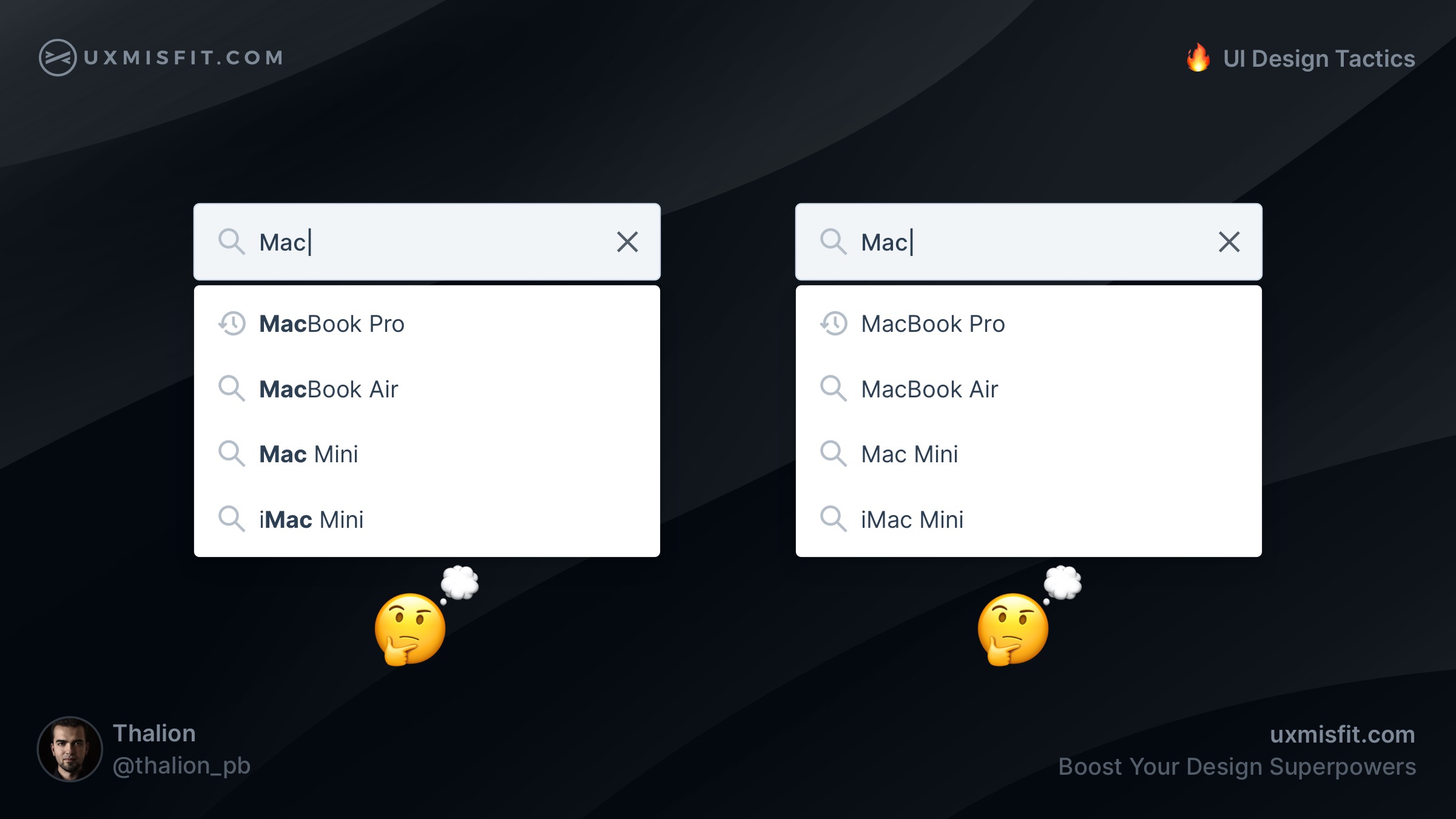
Highlight matching words
Users love to search, and they want to make it conveniently! When the search suggestions highlight the words the user typed in the field, the user can recognize the remaining parts of the hint quickly.
If you would leave words as is, it will take much more effort to recognize suggested positions.
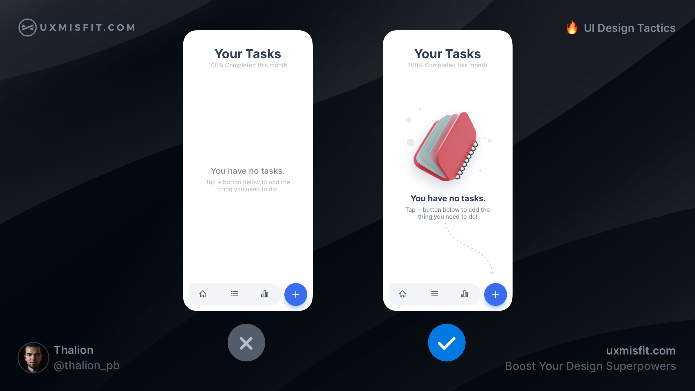
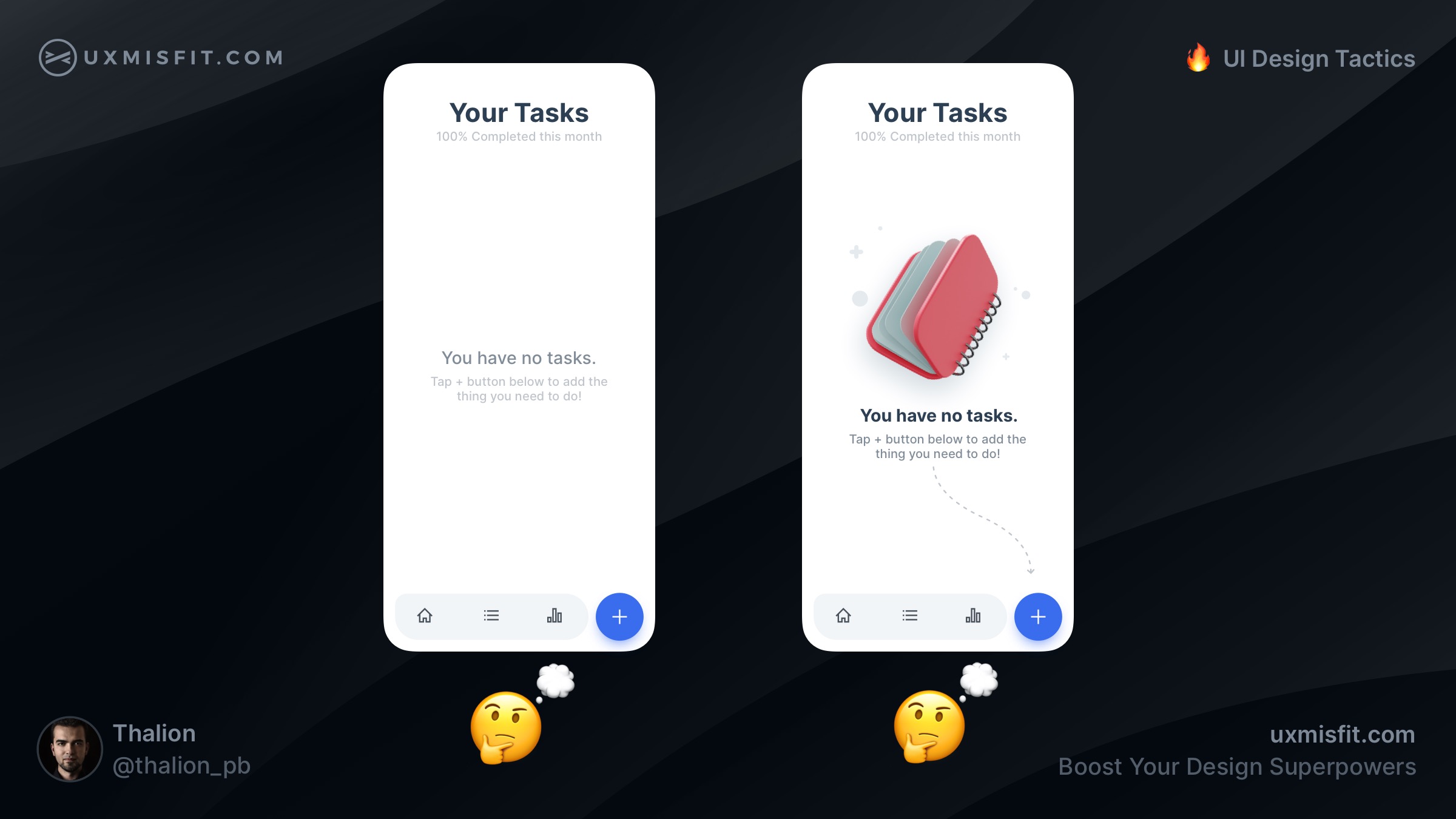
Add illustration to the empty state
Empty states do not have to be empty! When you add some
friendly element, like illustration, the screen will feel more comfortable to users.
If you want to make your empty state even better – you may suggest the next step the user should take. Always try to guide your users to help them accomplish their goals.
By the way, if you are looking for a nice set of illustrations for your project, feel free to discover Blush.design. If you get Prime Design Starter Kit, you will get even 20% off for the Blush.design Pro plan now!
Looking for more UI Design Tactics?
If you want to get tips like this daily. Feel free to follow my Twitter thread or profile on Instagram, where I share tactics every workday!
Get Free Chapter
15,000+ designers are already subscribed (no spam! Only design tips, tutorials + design resource news).
Join now, get the free chapter of my eBook right to your inbox. With these tactics, you will solve common design issues with ease.
Sign up - Get Free Chapter
Wrapping up
These are just 5 from many UI Design Tactics to come. These actionable UI Design Tips will help you move your skills to the next level. You will design more confident & spent less time trying to figure out which detail is better.
Do not forget to sign up for the newsletter to get more soon!
By the way…
If you start a new project or would like to organize your UI Library in Figma — do not waste your time creating everything from scratch. Feel free to use the Prime — Design System Kit. It helps you design UI with the best Figma techniques — Component Properties, Variants, Auto Layout and more.See Prime in action.
To make it easier there is a gift 🎁 - Use UXMISFIT10 offer code to get 10% Off.
You can also Create User Flows faster in Figma & Sketch — With SQUID you can create User Flows directly in your favorite design tool. You may style them to your project brand within a couple of clicks. Prepare all kind of diagrams in minutes. See how it works.


