
Prime for Figma is a real time-saver to your design work. To get most of it and boost your workflow, follow these simple instructions & tips.
This is a tutorial for the Figma Version of the Kit. If you are Sketch user, follow the instructions for the Prime for Sketch.
What is Prime?
Prime for Figma is a large UI Design Starter Kit. You may think of it as a set of 7 or 8 libraries with different Components. Below you will find a brief description of each section:
- Core – Base elements include Layer & Text Style, Color Variables, Basic Shapes, Spacing Values, and Icon set. Other elements use the Styles from this section.
- UI Elements – The section with User Interface Elements. You will find here the collection of simple components, buttons, inputs, or checkboxes.
- UI Components – Here, you will find more complex components like modals, cards, navigation bars, etc.
- Platforms – The section with Components for mobile native application design. Elements are made for iOS and Android platforms.
- UI Templates – The section includes a collection of Web page sections & mobile pages. Ready-to-use templates may be instantly used to build an entire website or an app.
- Devices – Collection of the vector device mockups. The library includes the newest models of iPhone, Apple Watch & MacBook Pros.
- Charts – Sample charts made in all major types of data visualization. Ready to use as placeholders for your projects.
- Illustration Kit – Collection of configurable elements for illustrations known from the first release of Prime.
You may get Prime 3.0 right from the official website.
1. Before You Get Started With Prime
When you download the Kit, please follow the instructions included in the Read Me file. It includes the following steps to configure your environment before you start work with Prime.
These are those 3 things to do to start work with Prime:
- Before you open Figma file with Prime, install the following fonts:
Inter is the most important font. It is used for all universal components across libraries. Inter & Roboto are web fonts, so they should be available in Figma by default. SF Pro & Roboto are used only for native mobile components.
SF Pro had to be installed on your computer. Follow these steps to install local fonts in Figma.
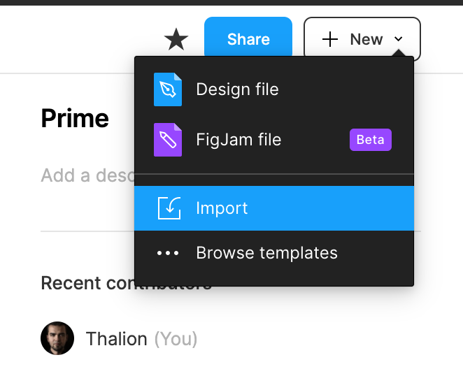
- Import “Prime 3.0.fig” File to Figma.
If you double click on the document, it may not open in Figma by default. All local files have to be imported to work with this tool. To do it, follow these instructions:
- Open Figma app
- Go to your Home page (click the home button in the top left corner).
- Click the “+ New” button, the dropdown will appear
- Choose the “Import” option
- Pick the “Prime 3.0.fig” and upload.
Thanks to this, the file will be imported to your workspace, and you will be ready to go! Remember that the local file will be untouched even when you edit the Kit in your library. If you want to save it locally, you have to choose “File -> Save as .fig”.
That’s it!
2. Getting Started with Prime
Ok, you have set up the Kit, and you got it in your workspace. Now it is time to get started with Prime configuration for your project!
The whole project kick-off (color & typography configuration) will take you only minutes, and as a result, you got a professionally configured base of styles to use in your project!
Configure Color, Effects & Text Styles
To modify Color Styles, go to the “01.01 Colors” Page. Alternatively, you may use the Right Panel of Figma to View & Manage the Styles. The benefit of the specially prepared page is that you see how specific tones interact with each other.
Editing color is quite simple and works just as other kits in Figma:
- Select the Color you want to edit
- Find the style in the panel on the right,
- If you use the list view in Style picker, you will see the “edit” icon. If you use grid view, you have to make right-click on the style and choose “edit”
- Pick the new color
- That’s it!
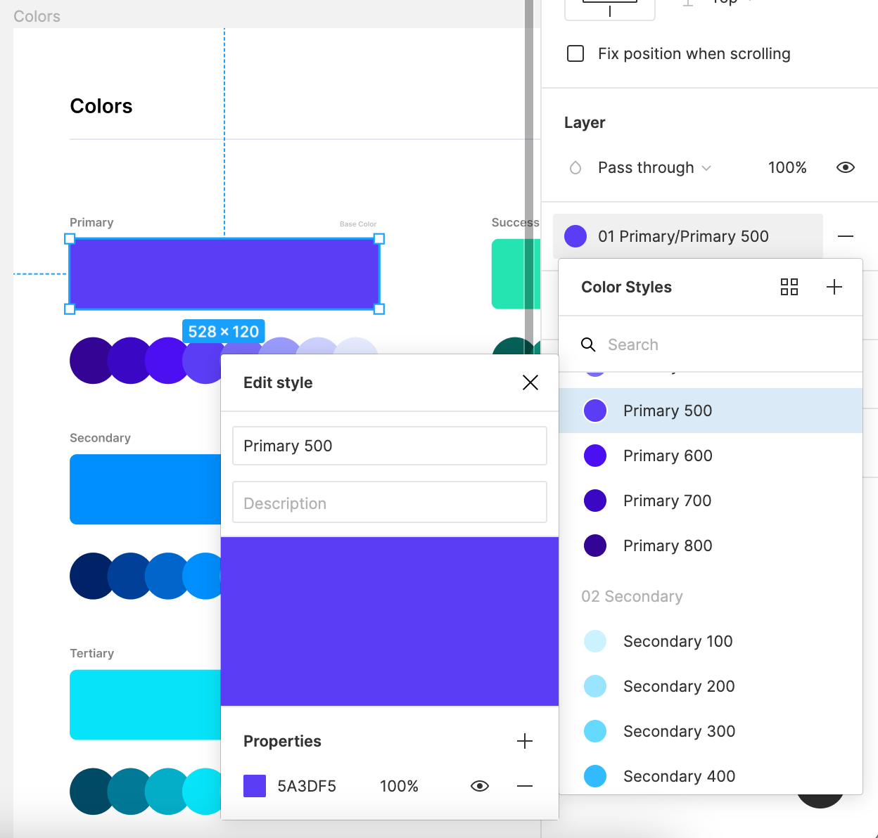
Exactly the same process applies to other styles like Effects or Text Styles.
Use Prime’s Components
Prime is a comprehensive set of UI Elements & Components.
All Component Category has got their own page (Buttons, Forms, Alerts, etc.). So you may easily extend them with your own UI Controls.
Please pay attention to the naming category, I have gathered components this way, so you are able to find every component within a couple of seconds.
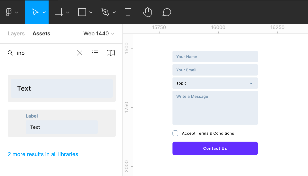
To find them, quickly use the “Assets” tab from the left panel. In the search field, type the name of the component and drag it to your design.
Remember that majority of UI Elements are built as Variants. This means that you may configure them in the right panel to choose their different appearance, state, selection, etc.
Adding Prime as Library
The library includes all UI elements that may be used in your Web or Mobile projects. If you want to use it as UI Library for your design system, simply add it as Figma Library.
To do it, follow these simple steps:
- Switch the left panels’ tab to “Assets.”
- Click the “Book” icon
- The button with the book opens the modal page with libraries. You may also publish the currently selected file as a library. Click the button “Publish”.
Now you will be able to add a description to the published elements and select Styles or Components to publish (or make all of them live).
Remember to activate your library after publication (turn the switch toggle on).
Note: If you are a user of the Free Figma plan, you may publish just the Styles of your library.
Summing up
Prime 3.0 for Figma, just like its Sketch version, helps you design faster with ready-to-use Styles, Components, and even UI Templates built with best design tool practices.
This quick start guide covers just topics that help you start using it. You may create all kinds of digital products with it.
If you have any questions feel free to send me a message.


