
iOS 14 and macOS Big Sur continue to develop a visual style where nicely designed blur plays a huge role in establishing hierarchy. This is why it is good to know how to make nice looking blurs in your designers.
These tips will show you how to make them in just a few steps:
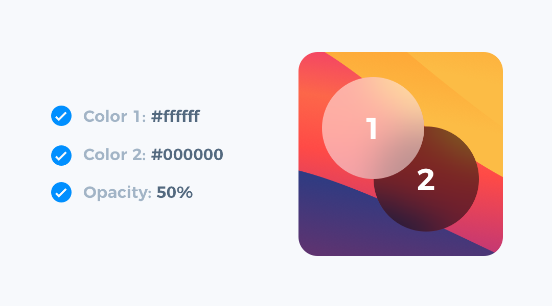
1. Elevate with neutral colors
For the blurred background of your UI, use white or black, sometimes consider using tones of grey. These neutral colors are the best choice for layers with background blur. If you use vivid tones, the blur will look strange and may not fit the background below your UI.
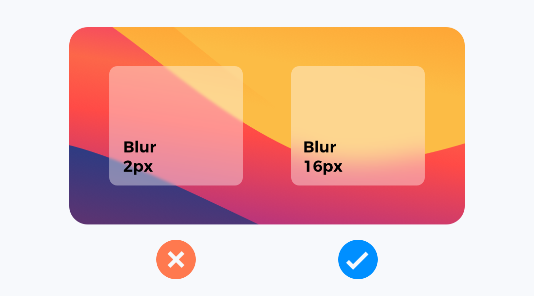
2. Blur to make content readable
Applying a trendy visual style does not let us sacrifice usability. If you will blur background with only a little value. The content of the card will not look good.
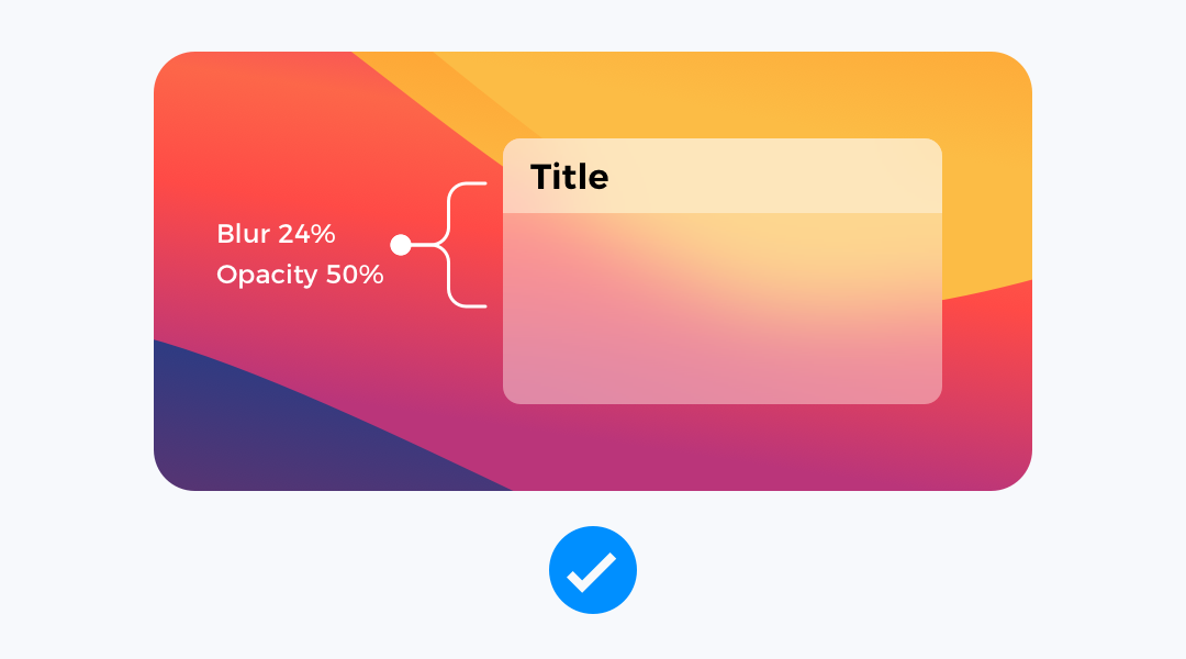
Experiment with values that help to establish good contrast between background and text content. I often use 16-24px blurs.
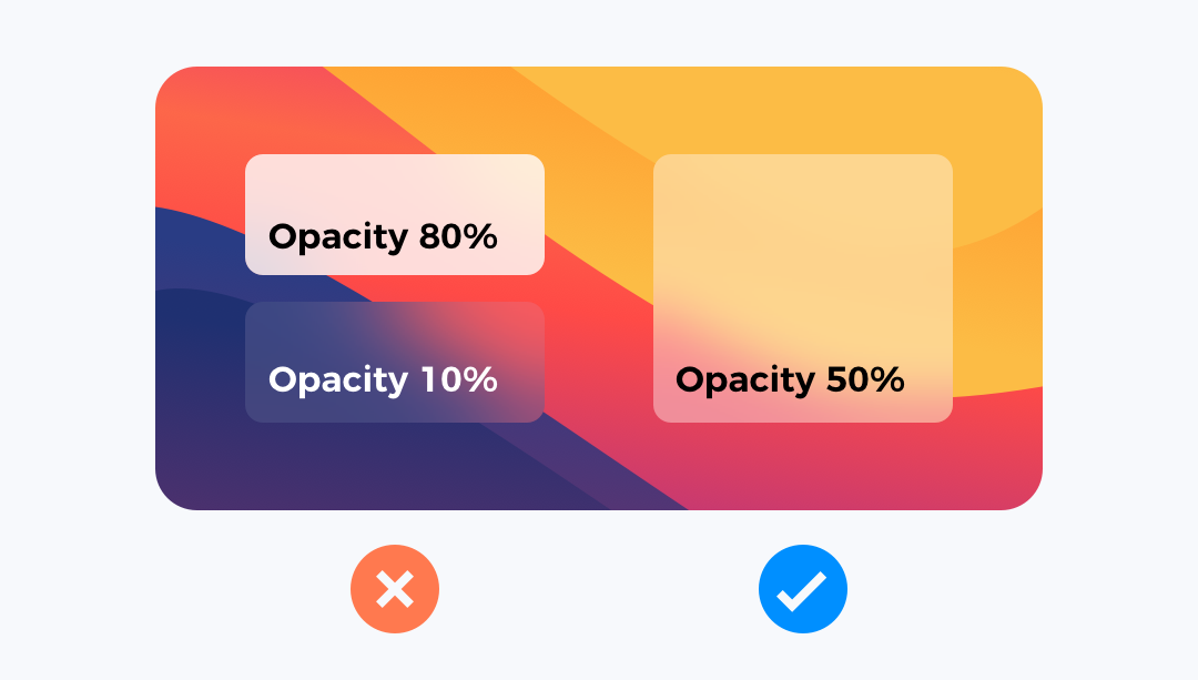
3. Adjust opacity to blur
Blurred backgrounds to look good have to be translucent. Too much opacity of layer makes the blur effect invisible. Too low opacity blends the blurred layer with the background. For me, the safe choice is around 30-60%.
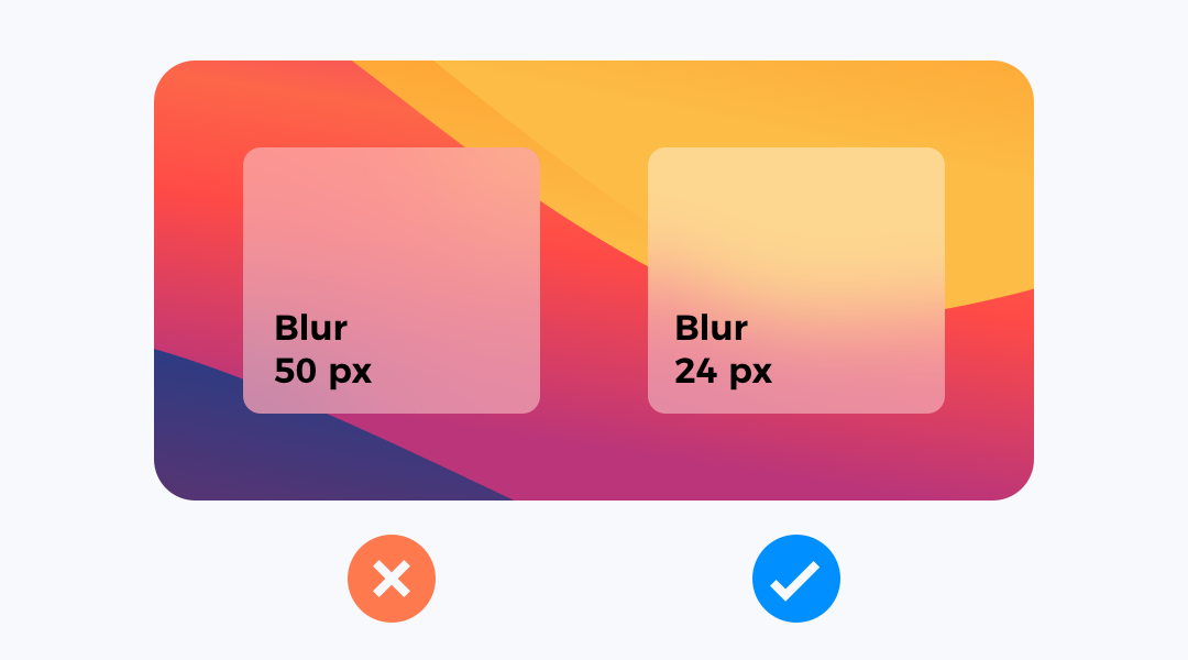
4. Don’t use too much blur
Blurred background requires a good balance. It is not only about opacity, but also the value of blur itself.
If you blur the layer too much, the effect of nice gradients in the background will disappear.
5. Elevate layers with the same settings
This is a trick I use in my projects. To build a visual hierarchy in blurred and translucent UI components, I use the same style for headers, sections or cards.
If your blurred panel or card has grouped elements or a bar, try to elevate with the same layer style. It gives nice results.
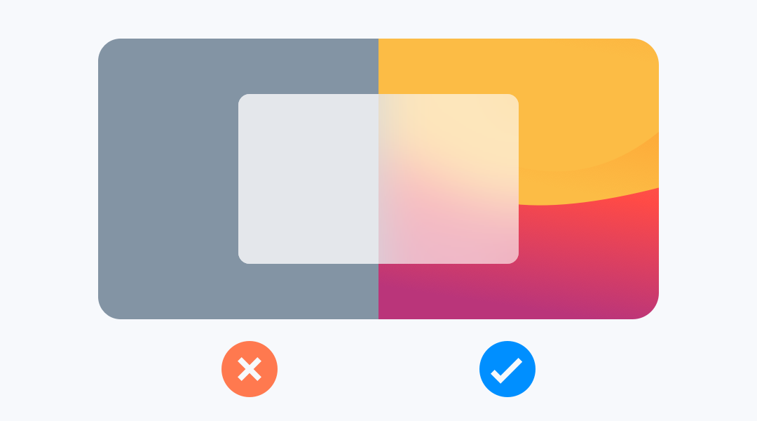
6. Use it with the right backgrounds
Applying a good background is extremely important. Avoid blurs when the background is solid. Use it on images or gradients, so it will give a nice sense of depth for your design.
To conclude
This simple tutorial showed you how to make an attractive blurred background in your designs. If you have your own tricks, feel free to share them in the comments!
By the way…
If you start a new project or would like to organize your UI Library in Figma — do not waste your time creating everything from scratch. Feel free to use the Prime — Design System Kit. It helps you design UI with the best Figma techniques — Component Properties, Variants, Auto Layout and more.See Prime in action.
To make it easier there is a gift 🎁 - Use UXMISFIT10 offer code to get 10% Off.

You can also Create User Flows faster in Figma & Sketch — With SQUID you can create User Flows directly in your favorite design tool. You may style them to your project brand within a couple of clicks. Prepare all kind of diagrams in minutes. See how it works.


