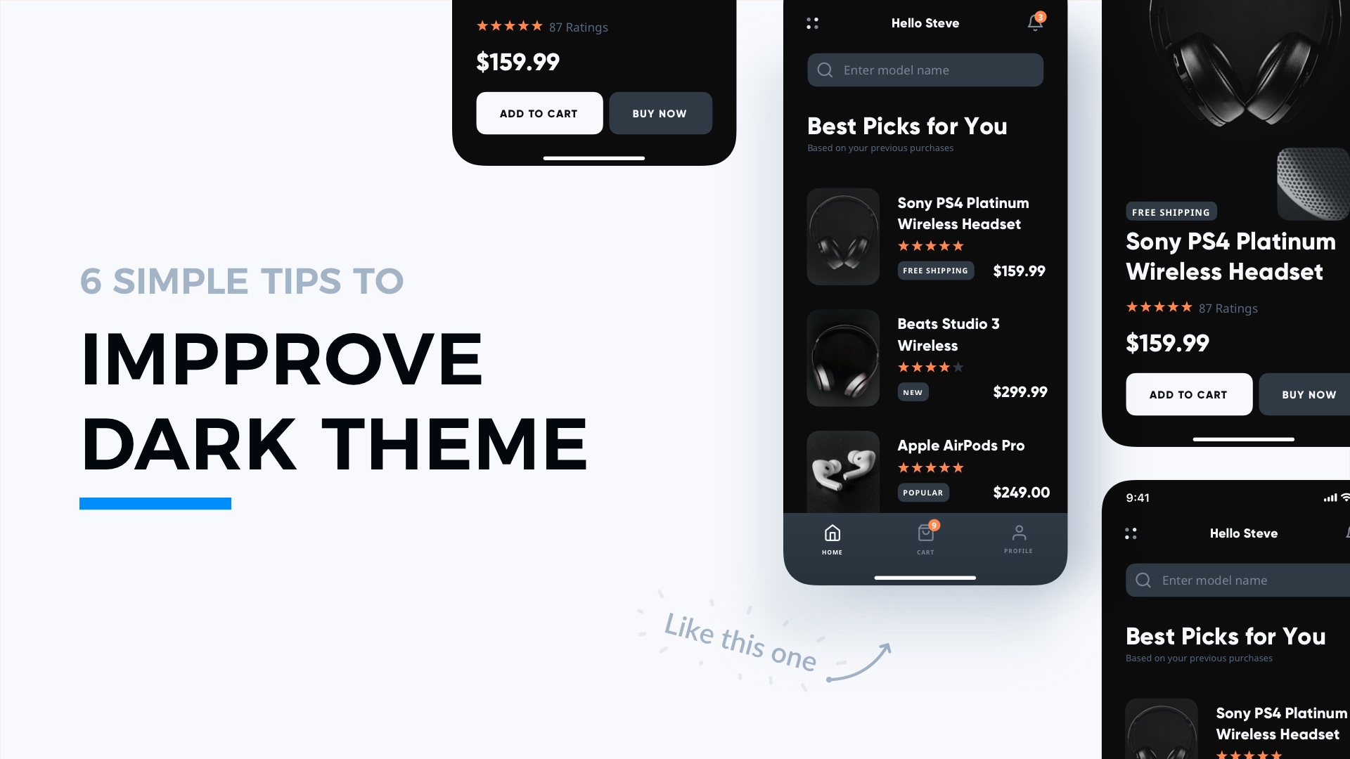
Dark Theme has become a standard when it comes to web and mobile design. With this short tutorial, I will show you how to make better dark mode in your apps with only 6 handy tips.
1. Follow Platform Guidelines
All major platforms from Apple and Google include guidelines for Dark Theme. Adjusting your solution to their principles will ensure that it will fit to the ecosystem.
You may Apple and Google guidelines here:
2. Use Less Saturated Colors
Vivid colors in Dark Theme UI does not look good. They are less readable, so I recommend avoiding them. Prepare alternative, the less saturated color palette for Dark Mode. It will look much better!
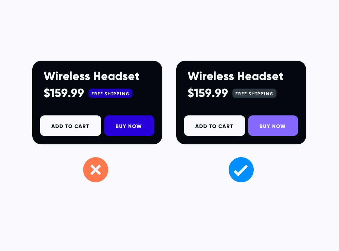
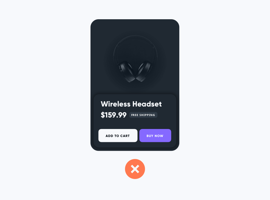
3. Avoid Shadows
Shadows help us to see a visual hierarchy. However, they do not work in the Dark Theme. Even if your background is not 100% black, the shadow will look odd. There are much better ways to highlight visual hierarchy. You will see it in the next paragraph.
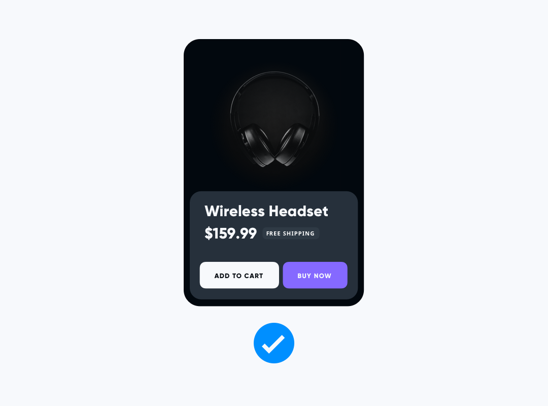
4. Use Elevation Color for Visual Hierarchy
Elevation colors are the key to successful visual hierarchy in the Dark Theme. The brightness of elevation builds a sense of depth. The technique is very simple and extremely effective.
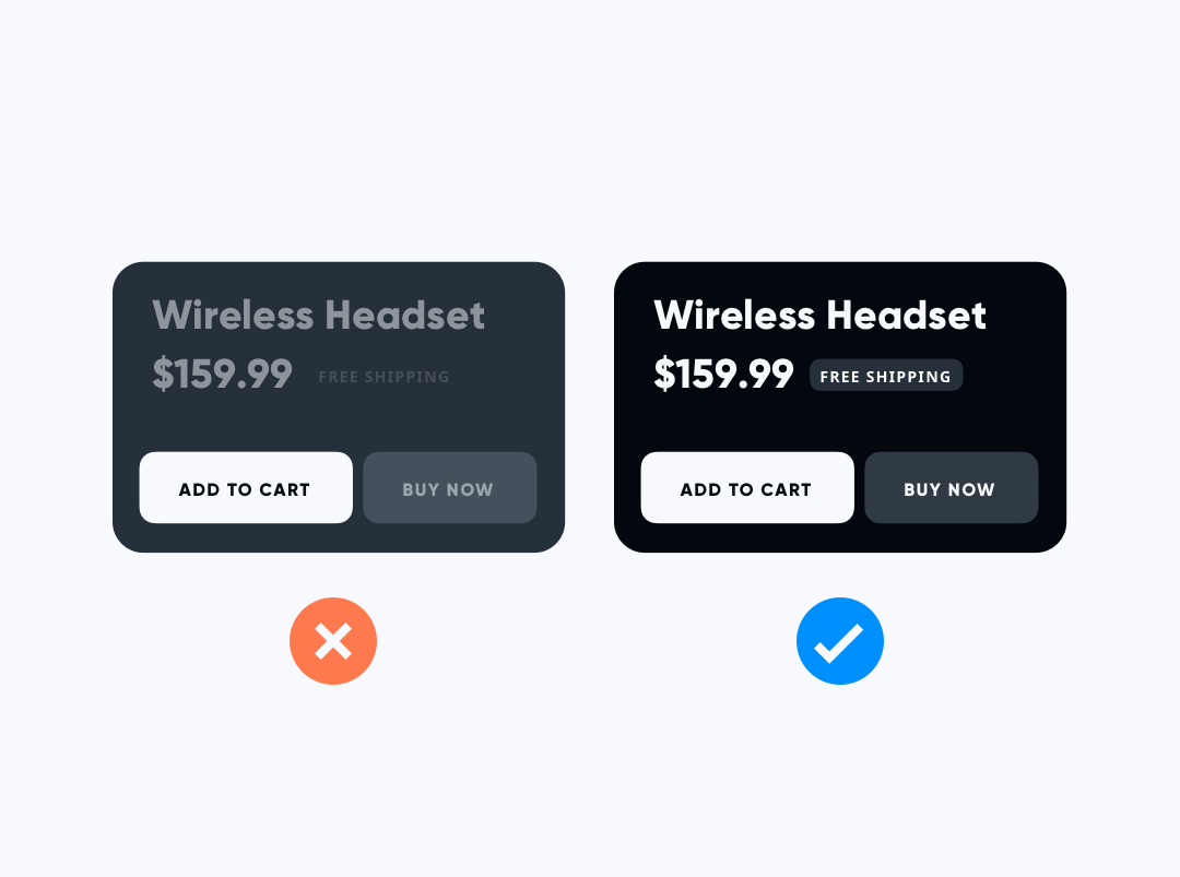
5. Check Contrast
Dark Theme needs the right contrast validation. Check content for accessibility purposes. Text with low contrast is almost invisible and ruins usability.
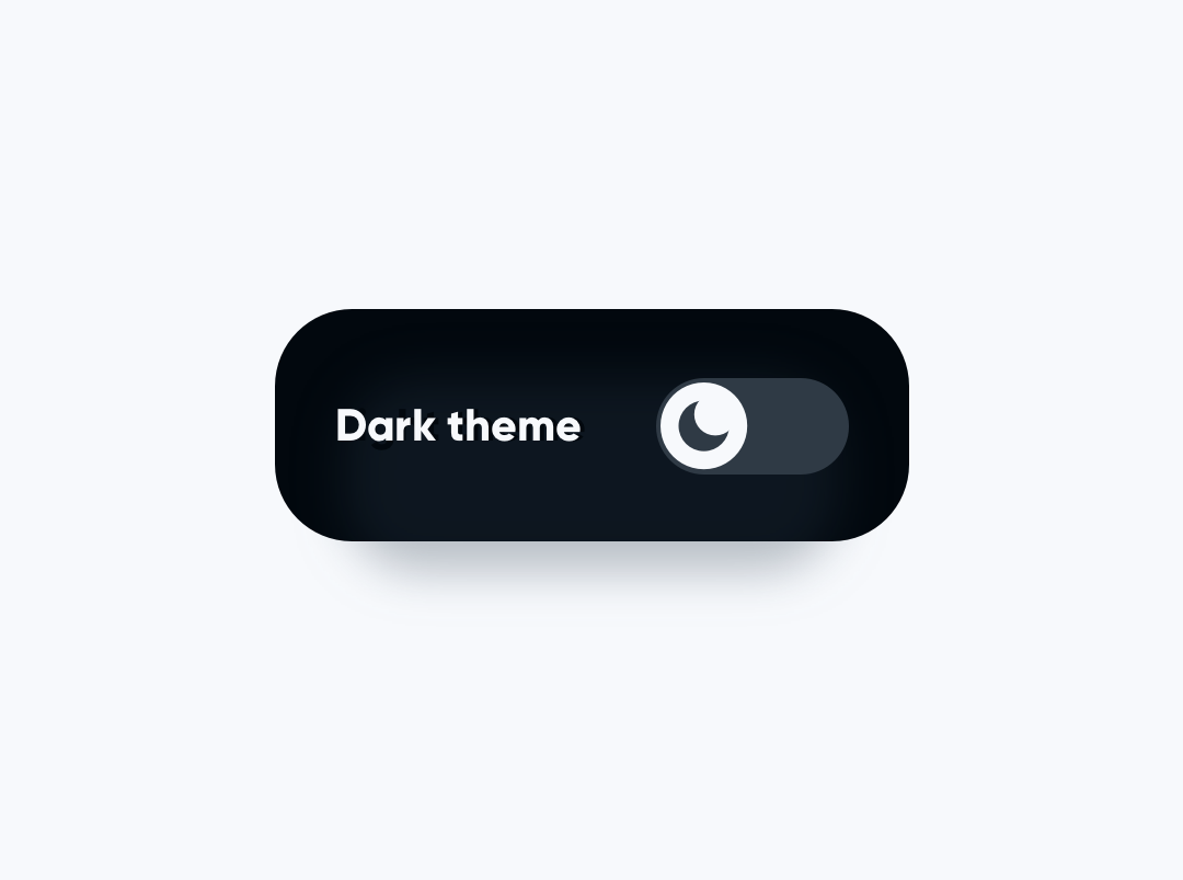
6. Make It a Setting
Some users still prefer to have only light mode in the app. Make your solution flexible and let experienced users decide.
To conclude
With these 6 simple tips, the Dark Theme of your application will become much better. If you would like to know more about adopting digital products to dark mode – I have prepared a more comprehensive guide earlier: UI Design in Practice – Dark Mode .
By the way
If you make diagrams or User Flows, you should check 🐙 SQUID - User Flow Kit used by thousands of designers. It just got a major update. 💪 It allows you to create diagrams within minutes and to style them with your project brand! See it in action.What's more, there is an offer 🎁 for you - Subscribe to UX Misfit Newsletter and get 15% off for SQUID!

If you start a new project and you need UI Library with Styles and Components for Design Systems - you have to check 🔥 Prime Design System Kit. It is a UI Design Starter Kit that helps to save time. See how Prime works.
Thanks for reading!


