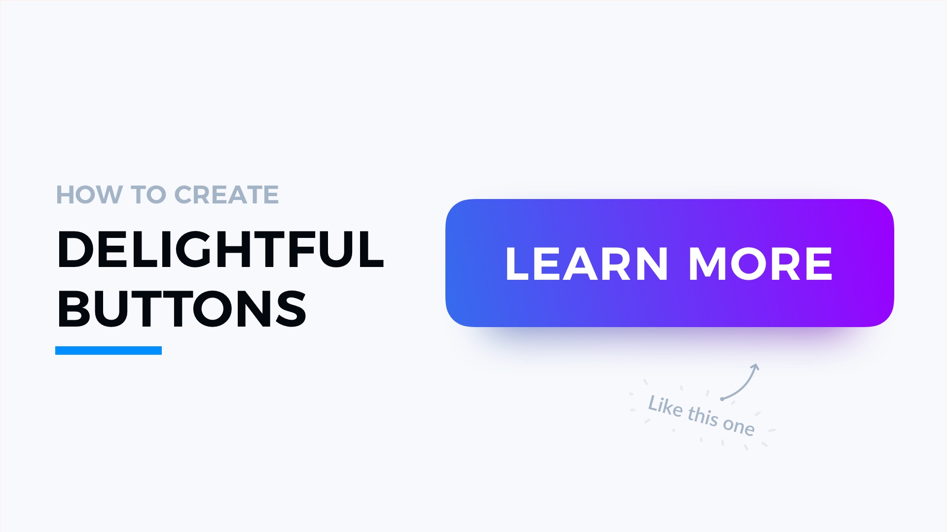
There is no modern interactive UI without buttons. They are an essential part of every digital solution. Learn how to improve the style of your buttons and delight users with perfect style.
This is the next tutorial from the series of quick tips that enhances your design. Read the first part.
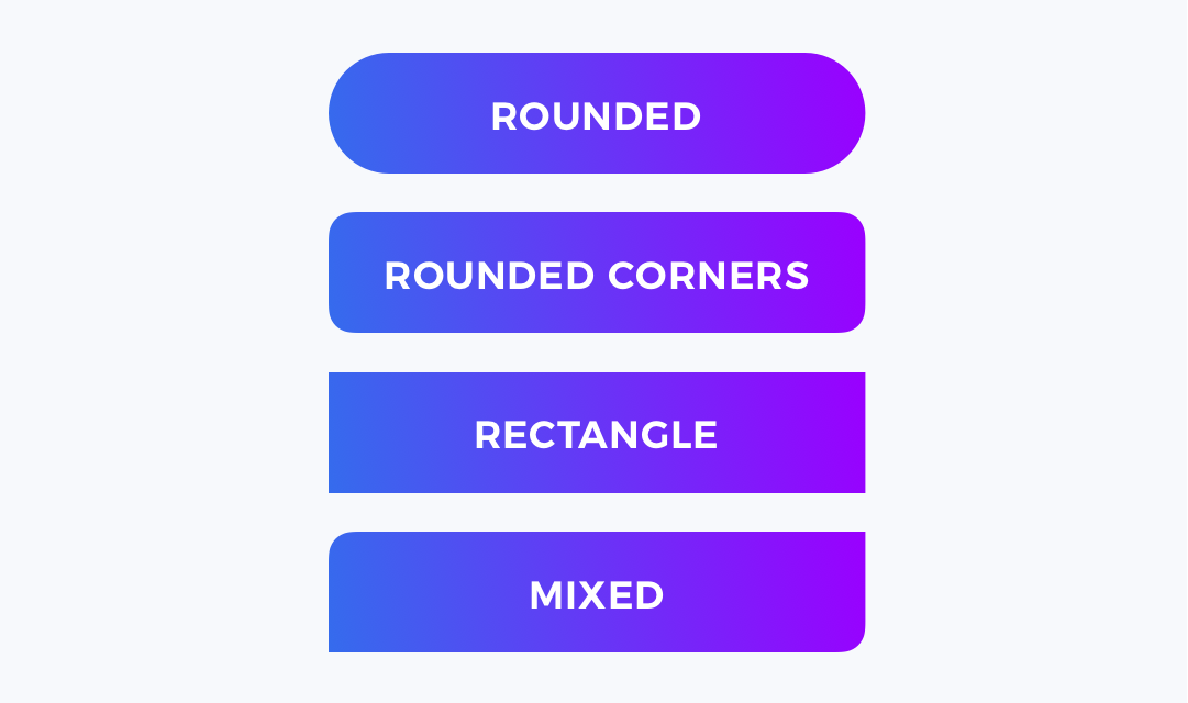
1. Choose a Shape
Buttons may be filled ones or just ghost buttons with stroke, but choosing the shape is the first step to create a better button. This may be a sharp rectangle or rounded one. It may be circular or mixed with some fancy unique shape.
It is important to establish one that will fit to the project style.
2. Pick a Color
Often main buttons get the Primary color of a brand. However, remember that buttons have to indicate their purpose, so choosing the color may depend on the context.
Always perform small research with users if you have any doubts on picking the right tone.

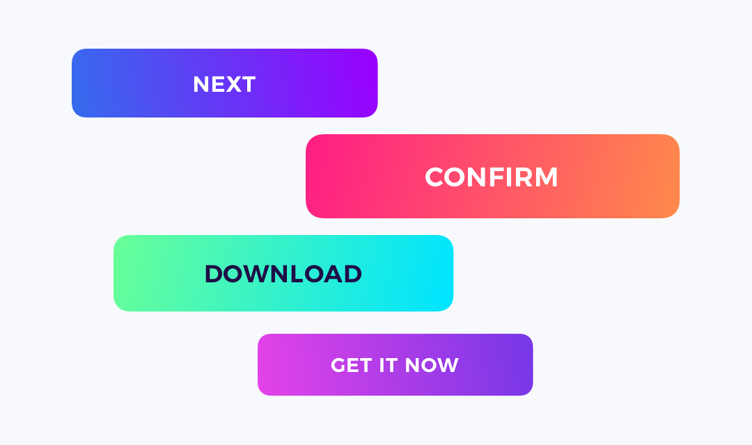
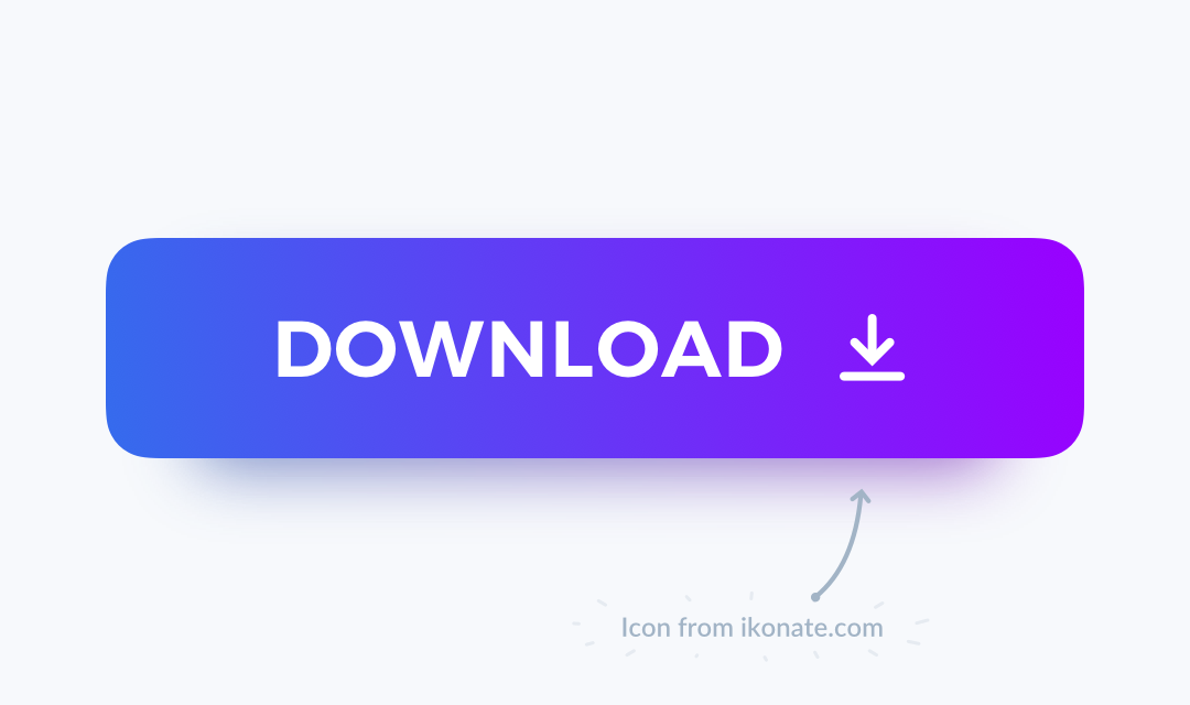
3. Apply Vivid Gradient
If the project brand allows that, consider applying a nice looking gradient. Thanks to this, the buttons look very modern. Gradients make buttons pop!
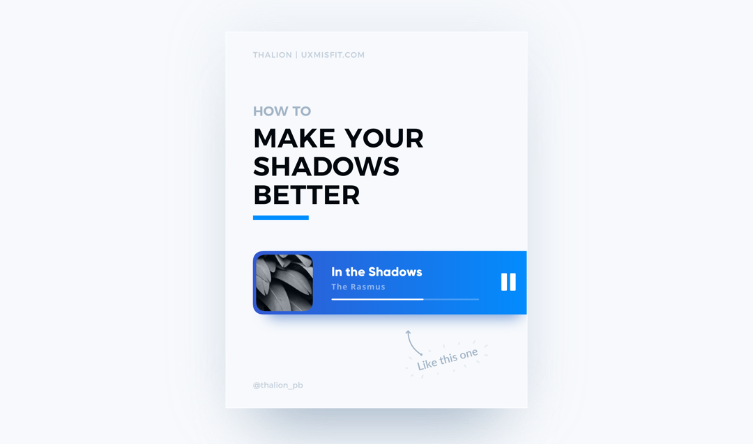
4. Add Shadow
Shadows always guarantee better affordance. Thanks to them, every UI element feels more natural as an interactive object. To learn about creating perfect shadows in UI Design read the tutorial.
5. Include Icon
While icons are optional, they help to recognize the action which is performed by a button. Think how many times simple “x” or “+” was the fastest way to recognize button’s purpose.
Always use simple symbols. The label nearby the icon is a must so users will be able to confirm their assumptions.
6. Add Motion
Add hover and press states to the button and animate it. The user’s mind demands immediate feedback on the action they performed. Playful motion design may create moments of delight.

That’s all folks!
This 6 quick and easy to apply steps will move the style of your buttons to the next level. When you apply the simple tricks, repeat and adjust them to your projects, you will notice how the quality of your work enhances.
If you found the tutorial useful, share it to let your friends know how to make their UI better!
By the way
If you make diagrams or User Flows, you should check 🐙 SQUID – User Flow Kit used by thousands of designers. It just got a major update.💪 It allows you to create diagrams within minutes and to style them with your project brand! See it in action.
What’s more, there is an 🎁 offer for you – Subscribe to UX Misfit Newsletter and get 15% off for SQUID!

If you start a new project and you need 🧰 UI Library with Styles and Components for Design Systems – you have to check Prime Design System Kit. It is a UI Design Starter Kit that helps to save time. See how Prime works.


