Practical Tips & Tricks.
Your app may not have icons, photos, or multiple color palettes. One thing digital solutions cannot exist without is text content. It is a text that makes the solution understandable. Some say that 90% of design is typography.
Usage of the right typography may significantly improve the User Experience of the solution. Thanks to the right setup, users will be able to consume content easier and engage more.
Ok, enough of introduction. Grab the mug of your favorite coffee, and let’s check how to improve typography in your UI Designs.
Theory
Before tons of practical samples, let’s begin with a little theory. I promise to keep it concise!
What is Typography?
Typography is the technique and art of arranging type to make written language readable, legible and appealing when displayed or printed.
Font vs. Typeface
We all use font and typeface terms as synonyms. However, their meaning is different.
The font is a visual representation of text character introduced in one specific typeface, size, and weight. For example, “Helvetica Regular” is a font.
The typeface is a style of type design. It contains a complete scope of characters. This means all sizes and weights. For example “Helvetica” (includes “Helvetica Regular,” “Helvetica Light,” “Helvetica Bold”)
This means that typeface is a collection that gathers many fonts.
Naming in Typography
Typography has got a rich naming convention. It is good to learn about samples. This is why the image presented below demonstrates all of the necessary names needed to understand the discipline:

Now let’s describe the essential terms briefly:
x-height – the height of a typical lowercase letter “x.” They are a vast majority of characters we read — larger proportions between uppercase and lowercase results in better legibility.
Baseline – the invisible line that defines the bottom of the character body.
Meanline – similar to baseline, but this defines the invisible line that marks the top of the character body.
Counter – the area of a character enclosed (entirely or partially) by the form of the character.
Serif – the small line attached to the end of a larger stroke in character.
Weight – the measurement of how thick type character is.
Kerning – the spacing between two neighboring letters.
Tracking – the spacing between two individual blocks of texts. Tracking is also known as letter spacing.
Leading – also known as Line-Spacing, the distance between two baselines.
Line-Length – total number of characters (or words) in a line.
Typography Tips for Better UI Design
Let’s move to the practical part. I have organized tips into several categories. First will help you enhance readability, second content scanning, and the final one is dedicated to a mobile-specific design.
Tips for Better Readability and Legibility
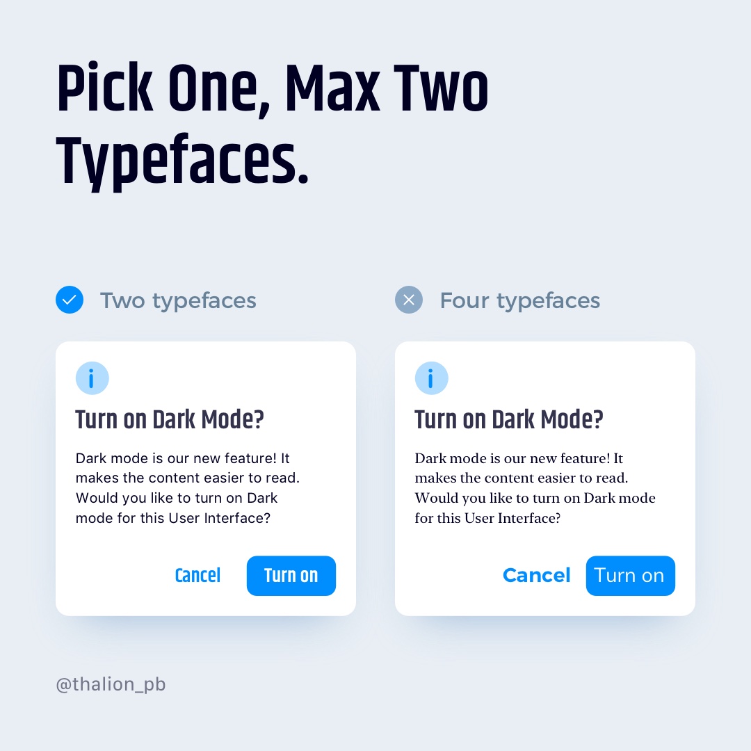
Pick one, max two Typefaces.
Most of UI Design for Web and Mobile use only one typeface. Thanks to this, users will be able to read the content more comfortable without distracting themselves while recognizing different characters look in various typefaces. You may consider adding alternative typeface for headings and titles. Thanks to this, you will gain an interesting visual hierarchy. Remember about good font pairing. You may find good sources for font pairings at the end of the article.
Use two, max three weights.
Lots of fonts contain 8 or even more weights from “Ultrathin” to “Heavy Black.” However, applying them to your design will make it chaotic. Pick two or three of them and use them with purpose. Example: Bold for Titles, Regular for Body, Medium for Buttons – that’s enough.
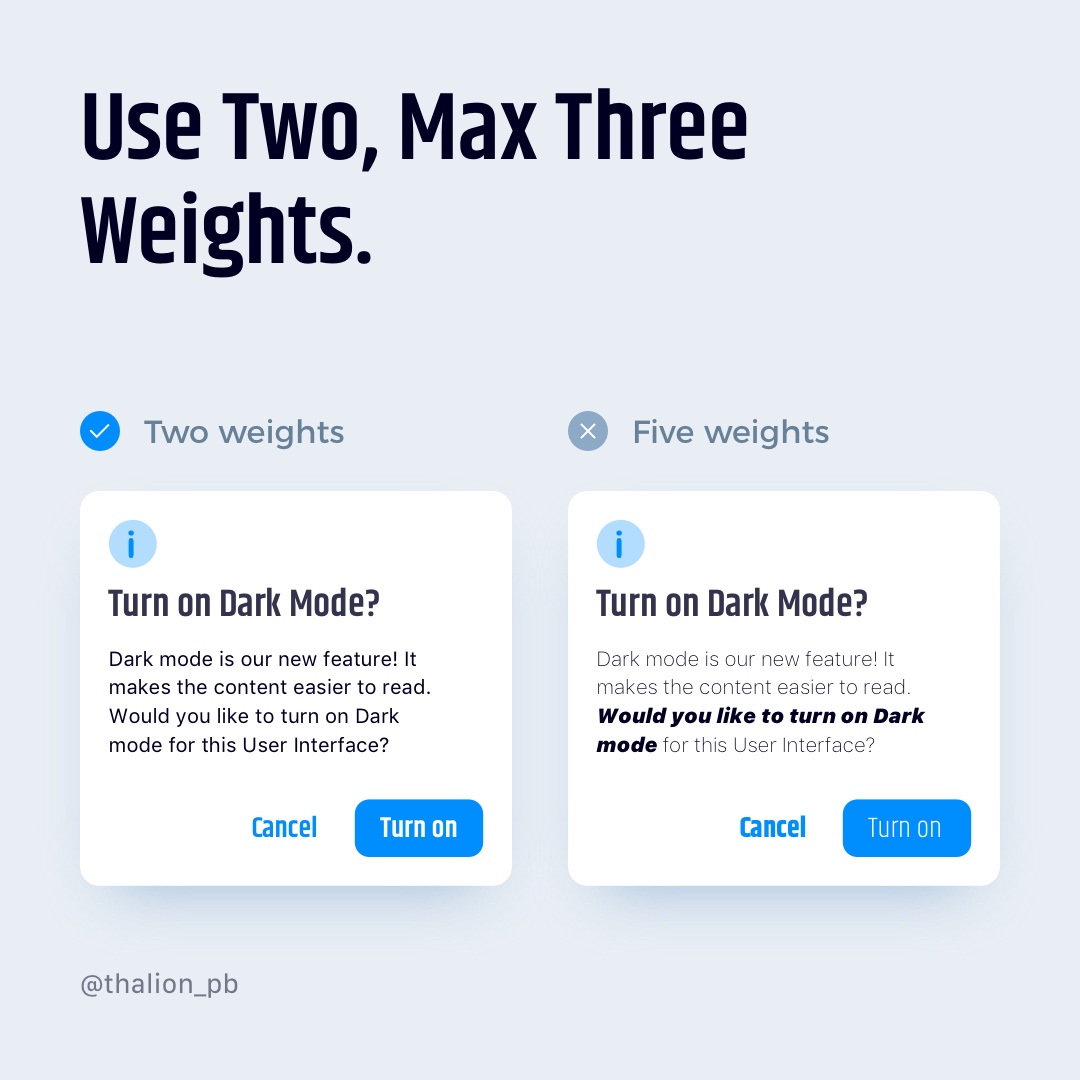
Avoid Black and Ultralight weights.
While these weights may look stylish, they are hard to read. Avoid using them if you want to make your content readable.

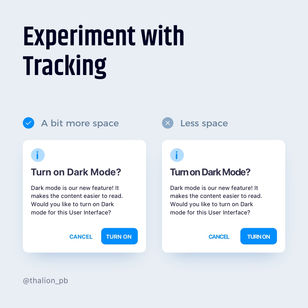
Hard to read? Experiment with tracking
If the content becomes hard to read before you will decide to change the font, try to increase or decrease tracking.
If you use Upper case letters in your UI components, try to increase tracking a bit – they will gain better readability.
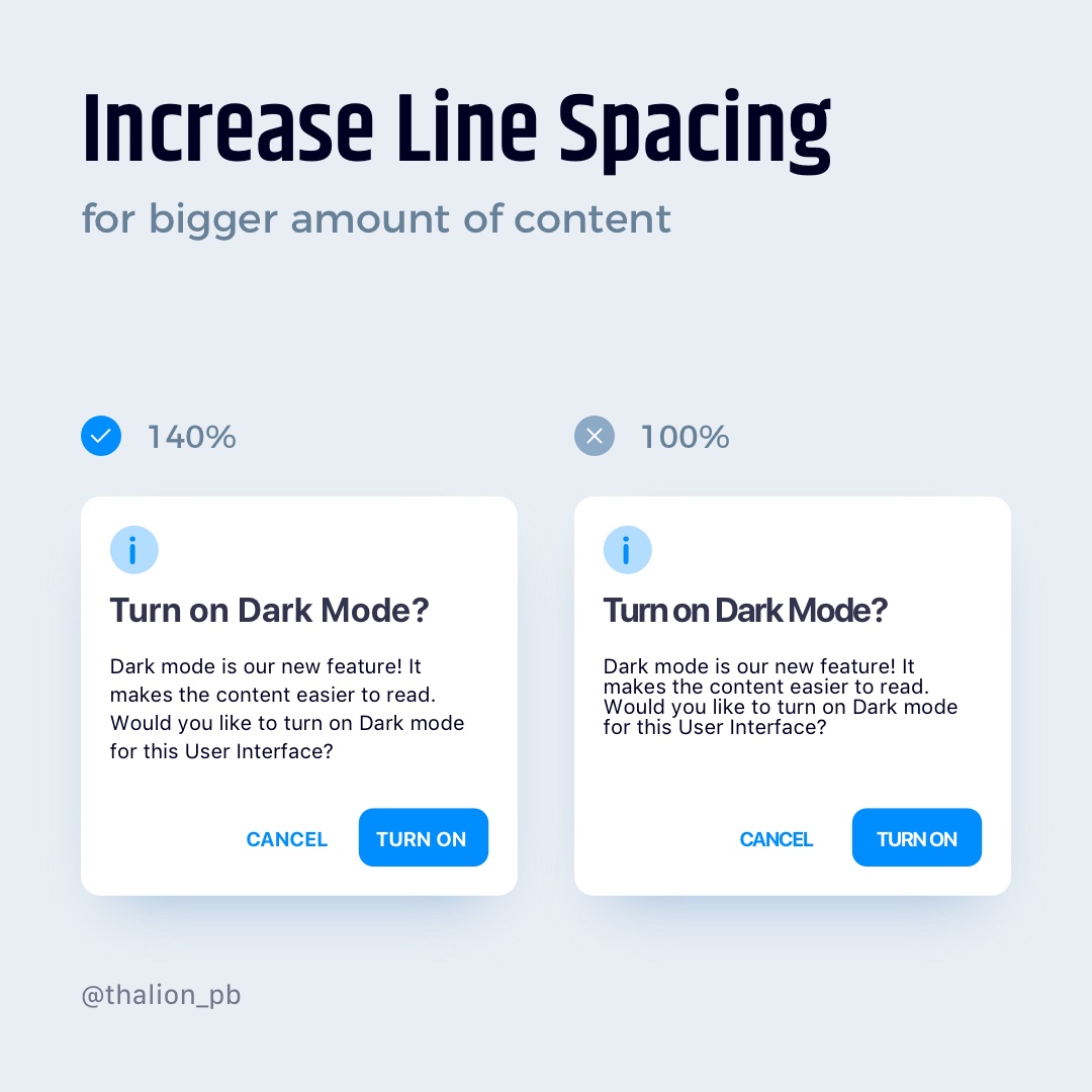
Increase Line Spacing for a larger amount of content
Blocks of text having a line-height set to 140%-180% of font size have got excellent readability. Some say that perfect line-height should have 160%. Thanks to this human eye recognize individual lines of text much easier.
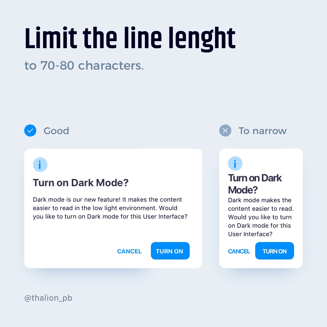
Limit the line length to 70-80 characters.
If you use longer text lines, they will confuse the eye. Shorter lines will make content hard to read – the user will have to jump through lines quickly.
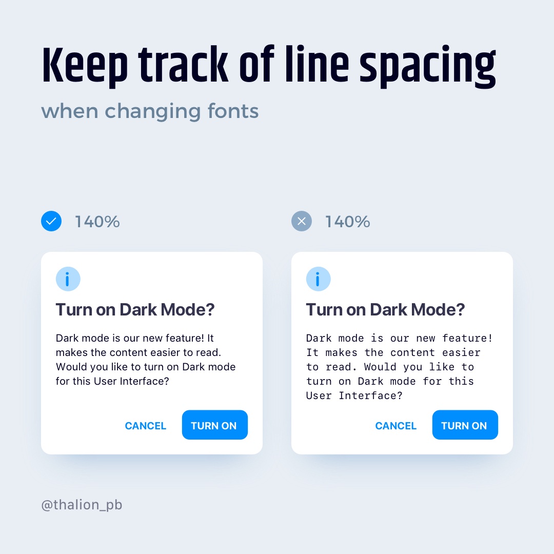
Keep track of line spacing when changing fonts
Different fonts and typefaces may be harder to read within the same line spacing. Remember to check how everything looks together after updating one.
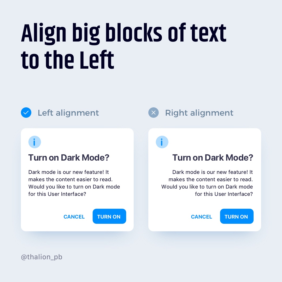
Align big blocks of text to the Left
Left alignment of text is the most comfortable one to read (with the exception of languages that are read from right to left).
You may use center alignment to differentiate some portions of content, like quotes or shorter content blocks. You should always avoid using the right alignment in bigger parts of the content.
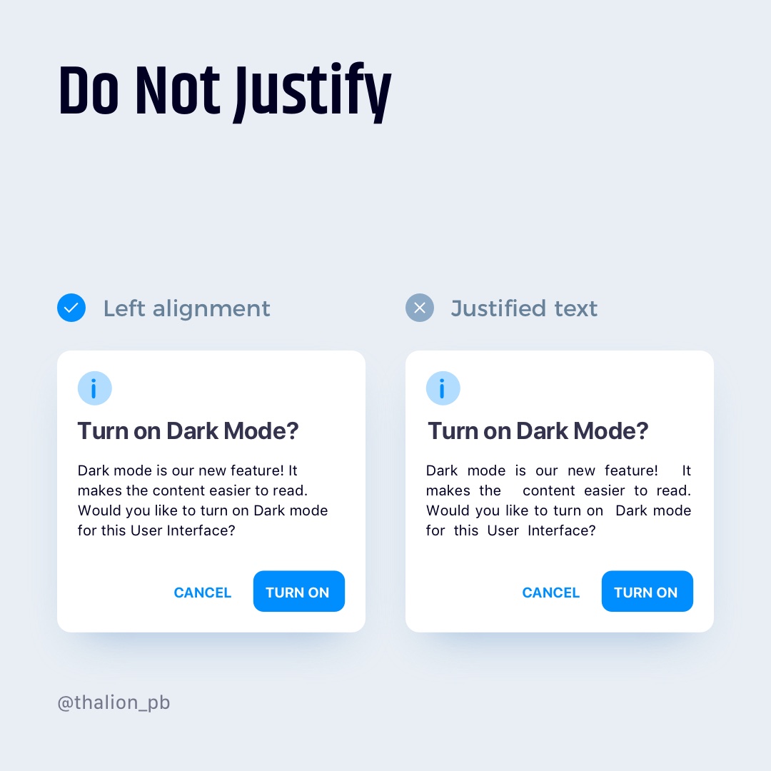
Do Not Justify
Justified block of text may look more attractive
as a whole thing, but if you would like to read it, the different spacing between the words will show the bad side of this type of alignment.
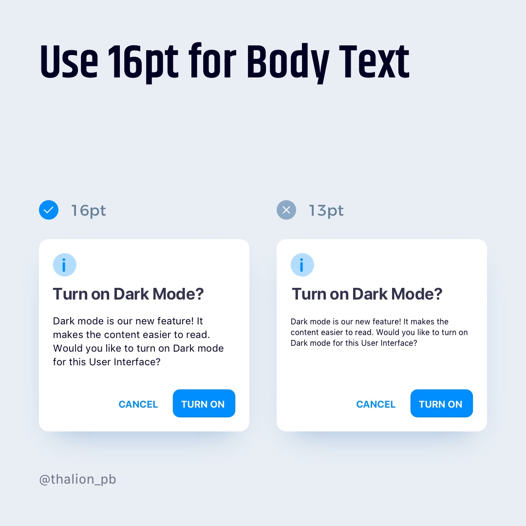
Use 16pt for Body Text
This size of the font is comfortable to read for the majority of people. Sure, you may consider 17 or 18 points, but decreasing the size of the Body to be lower than 16 points will make the text less comfortable to read.
Addition tip: Compare your custom typeface x-height to the system fonts. Its visual size should be similar to the system font’s x-height to be readable for most of the users.

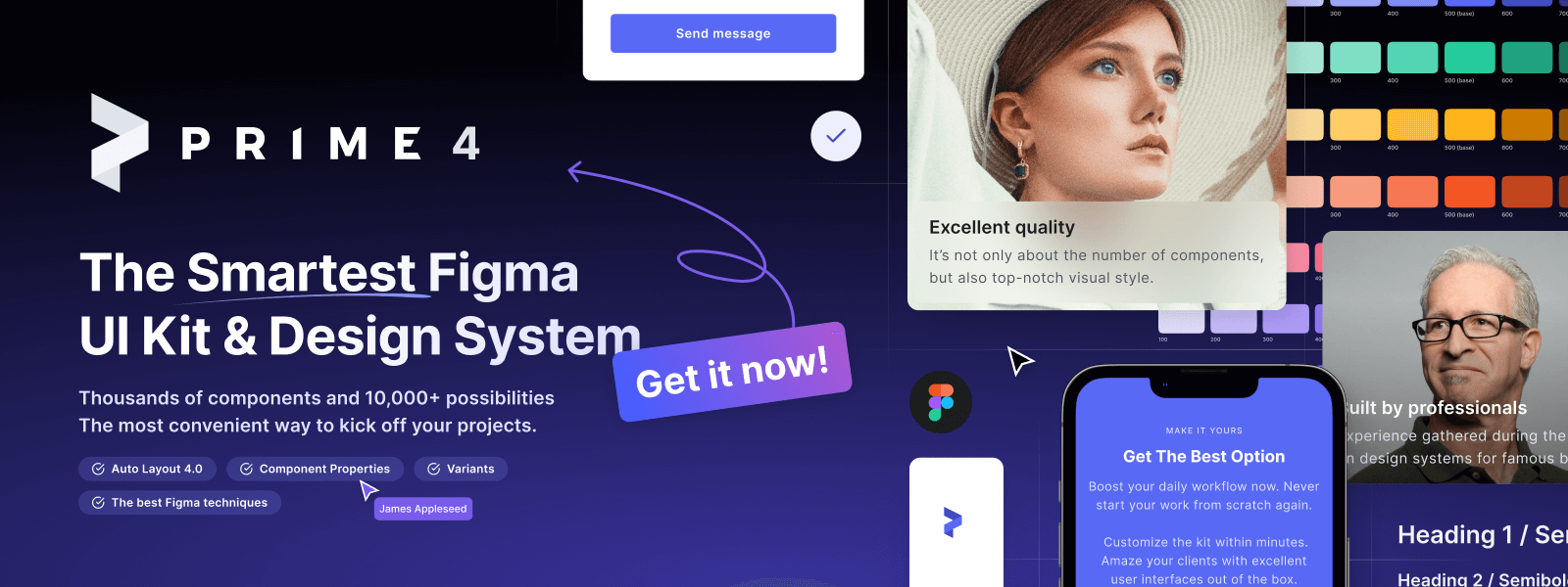
Design Faster in Figma and Sketch
Never start Your work from scratch. Use the Kit that already have 1500+ components with well structured styles, variants & auto layout.
Use Prime Design System Kit to boost your workflow. Create for Web, Mobile, and Desktop. You may use it as the entire UI Library for Design System or just create Landing Page for your next Client. Perfect for those who want to save time while creating UI designs and learn best practices of Figma and Sketch at the same time.
Tips for Better Content Scanning
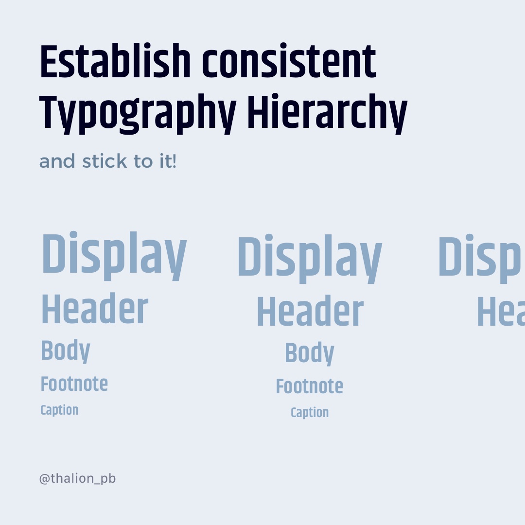
Establish Consistent Typography Hierarchy
Build the Design System or at least a Style Guide with a Typography Hierarchy and stick to it.
Users will get familiar with Title, Subtitle, Body, or Caption appearance and will be able to scan text better if you apply hierarchy consequently.
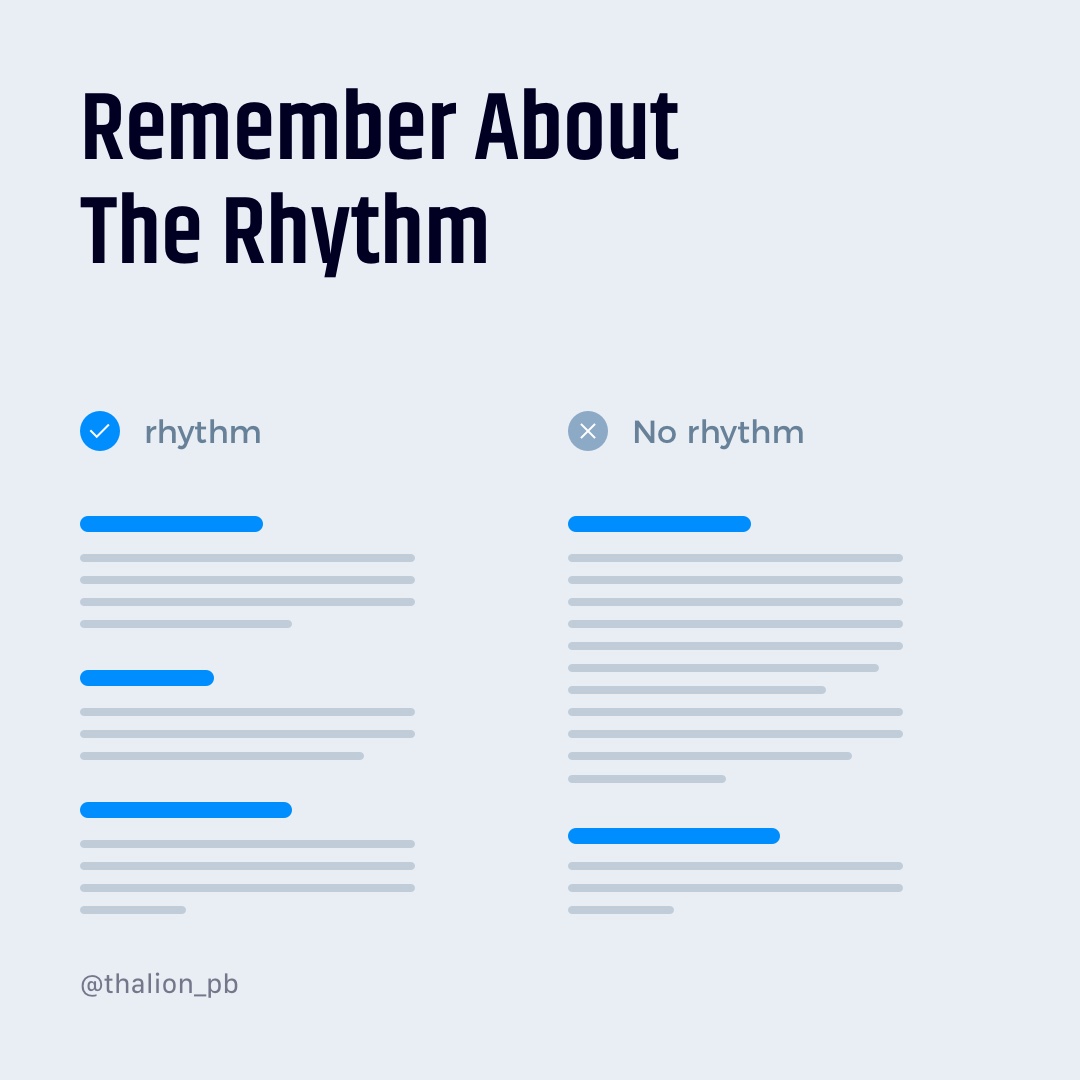
Remember About The Rhythm
Keep the paragraphs of content in similar sizes. Users like the predictable layout of text. Avoid making one big paragraph and four small. Separate bigger ones to make content cleaner.
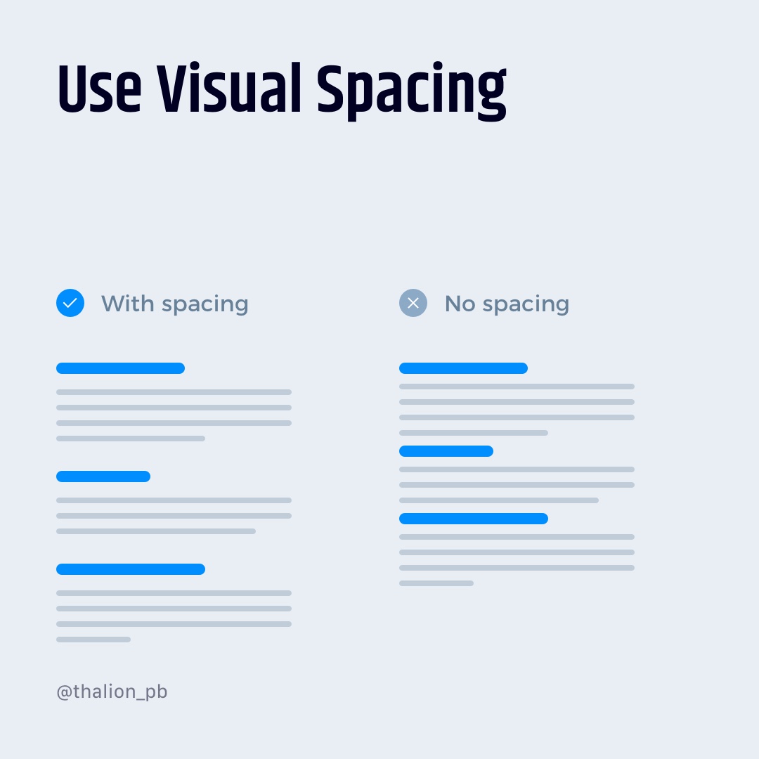
Use Visual Spacing
The best method to enhance content clarity if to give larger white space to the specific blocks and sections.
If you would like to use something else, use line separators or pack the pieces of content to the cards. But remember, it is much easier to scan the content with the right white space applied than the list of cards.
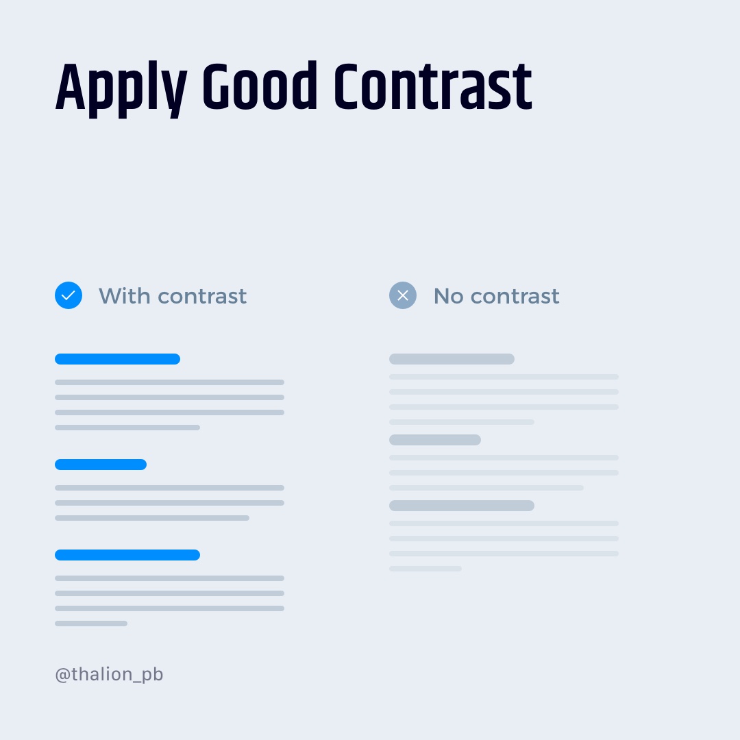
Apply Good Contrast
Subtle colors are always tempting and look stylish. However, you have to remember about good readability and clarity. Applying the right contrast will make the content more friendly to everyone. Here are official guidelines
You may check the contrast of background and foreground with these tools:
- Accessible colors
- Contrast checker
- WCAG Contrast Color Checker – Chrome plugin
- Stark for Sketch, XD and Figma
Tips for Better Mobile Typography
Using system fonts is safe
If you build the native solution and you use system fonts (iOS, macOS – San Francisco, Android – Roboto, Windows – Segoe UI), you may be sure that the app will look good in all cases.
If you would like to use a custom font, remember to check if it supports different characters used in languages that app may use — text how it renders on particular devices, etc.
Do not use less than 12px font size
Good readability on mobile is crucial. We use our devices in different environments and in various cases. Typography scaling having 16px for Body is comfortable, but sometimes it is good to use something smaller. Do not use less than 12px as font size, because it may make UI unreadable.
Exception: Sometimes, tab bars (bottom navigation) uses less than 12px text as the label. When users learn to recognize specific icons, they do not have to read labels anymore.
Learn the typography scale of the specific platform
Knowing the behavior and rules of typography on a platform will help you make the app more readable and enjoyable for all users.
Here are guidelines for major platforms:
Tools & Resources
There are several tools and resources that help us to get most of typograghy much more efficiently. I would like to recommend you following ones:
- Type scale
- Google Fonts
- Font Pairing
- What Font
- Accessible colors
- Contrast checker
- WCAG Contrast Color Checker – Chrome plugin
- Stark for Sketch, XD and Figma
- Archetype
Summing up
Typography is an essential part of UI Design. It is also one of the most challenging ones. These tips will help you enhance your designs with simple tactics that may be applied everywhere.
By the way…
If you start a new project or would like to organize your UI Library in Figma — do not waste your time creating everything from scratch. Feel free to use the Prime — Design System Kit. It helps you design UI with the best Figma techniques — Component Properties, Variants, Auto Layout and more.See Prime in action.
To make it easier there is a gift 🎁 - Use UXMISFIT10 offer code to get 10% Off.
You can also Create User Flows faster in Figma & Sketch — With SQUID you can create User Flows directly in your favorite design tool. You may style them to your project brand within a couple of clicks. Prepare all kind of diagrams in minutes. See how it works.
Thanks for reading!


