Thanks to the Smart Layout feature introduced in Sketch 58, Symbols have become even more powerful elements of our workflow.
If you would like to master this feature, I have prepared a special tutorial for you. We will begin with little detail about Smart Layout, and right after a few words about the theory, we will jump into practical examples that will make your work more efficient.
In the tutorial, we will create the following elements with Smart Layout:
- Basic Button
- Button with Smart Content
- Dropdown Menu
- Card
- Modal Popup
I will also share with you my tips when to use and when to avoid Smart Layout.
At the end of the article , you will find a link to download Sketch file with all examples presented in the tutorial!
Grab the mug of your favorite coffee, and let’s begin!
What is Smart Layout?
Smart Layout was introduced in Sketch 58. This feature makes Symbols much more powerful. Thanks to Smart Layout, you may set a direction of Symbol or nested symbols (and groups) within that Symbol.
Thanks to this, when you modify content thanks to the overrides, specific Symbol’s instance will resize and adapt automatically (no more manual resizing!).
Where to find Smart Layout feature in Sketch?
Since Sketch 58, when you create a Symbol, you will see the popup with the ability to setup Layout. You can set it now, or make it later because the option is also available in the inspector panel (on the right side of Sketch Window).


Smart Layout gives you the following options to set the Layout:
- No Layout — The default option. A symbol will not include Layout and will behave like in previous versions of Sketch.
Horizontal Layout
- Left to Right — Overrides will resize elements from the left to the right side of the Symbol.
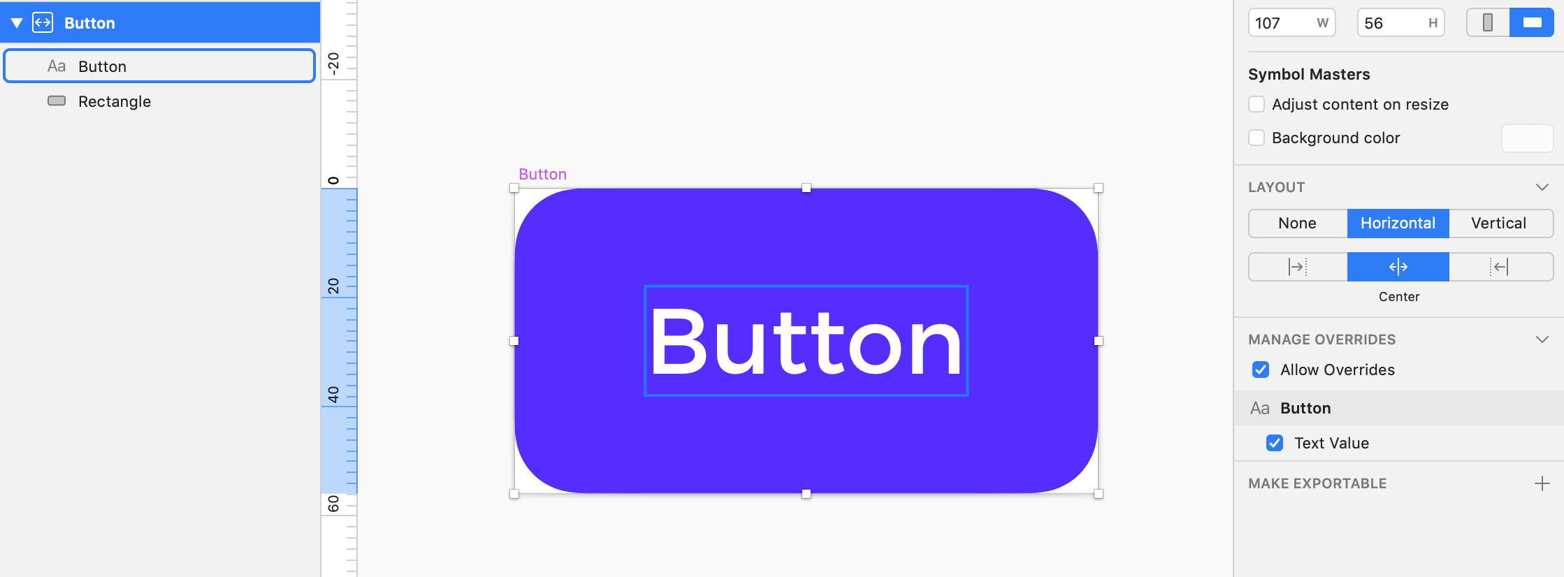
- Horizontally Center — This will resize Symbol’s elements from the center of the Symbol.
- Right to Left — Overrides will resize elements from the right to the left side of the Symbol.
Vertical Layout
- Top to Bottom — Overrides will resize elements from the top to the bottom of the Symbol.
- Vertically Center — Symbol instance will resize elements from the vertical center of the Symbol.
- Bottom to Top — This will resize Symbol’s elements from the bottom to the top of the Symbol.
I know that theory is not the favorite thing you would like to read, that’s why We will now jump to the practical part. Let’s start with something essential – Buttons!
Button + Smart Layout
The first component we will make will behave like this:
 The button will stretch horizontally when the text content is updated. While it sounds basic, it is a handy thing during UI Design Process. I have implemented this type of buttons in Prime my Design System and use them every day.
Button Setup
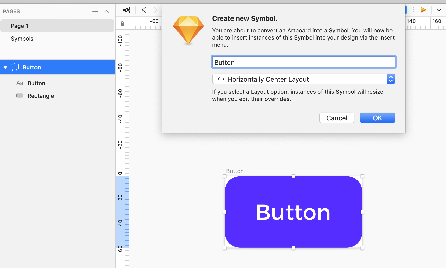
Let’s create an artboard with Rectangle and Text Layer. Remember – space between Text Layer and Artboard will be the Smart Button’s padding. So let’s make it big enough (in my sample, it is 24px from the left and right edge). Now click “Create Symbol” and in Layout Menu select “Horizontally Center Layout”.
 That’s it! Our button is ready to be used.
Pro Tip: Make sure that Text Layer Alignment is set to “Auto-Width,” without these options Text will not stretch Button with Smart Layout.
Button with Smart Content + Smart Layout
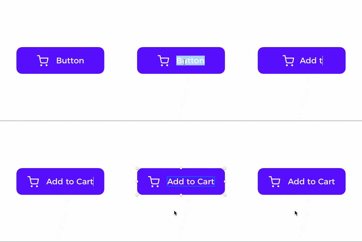
Sometimes buttons have to stretch to fill all width of the page or card. However, content inside them (icon + text ) may use Smart Layout to make our life easier. Let’s see how to achieve this:
 Button with Smart Content Setup
Let’s make an artboard with Rectangle and Group that includes an Icon and Text Layer. Now click “Create Symbol” and in Layout Menu select “No Layout” – yes, this one will not include Layout in to stretch entire content automatically.
Here is my setup:
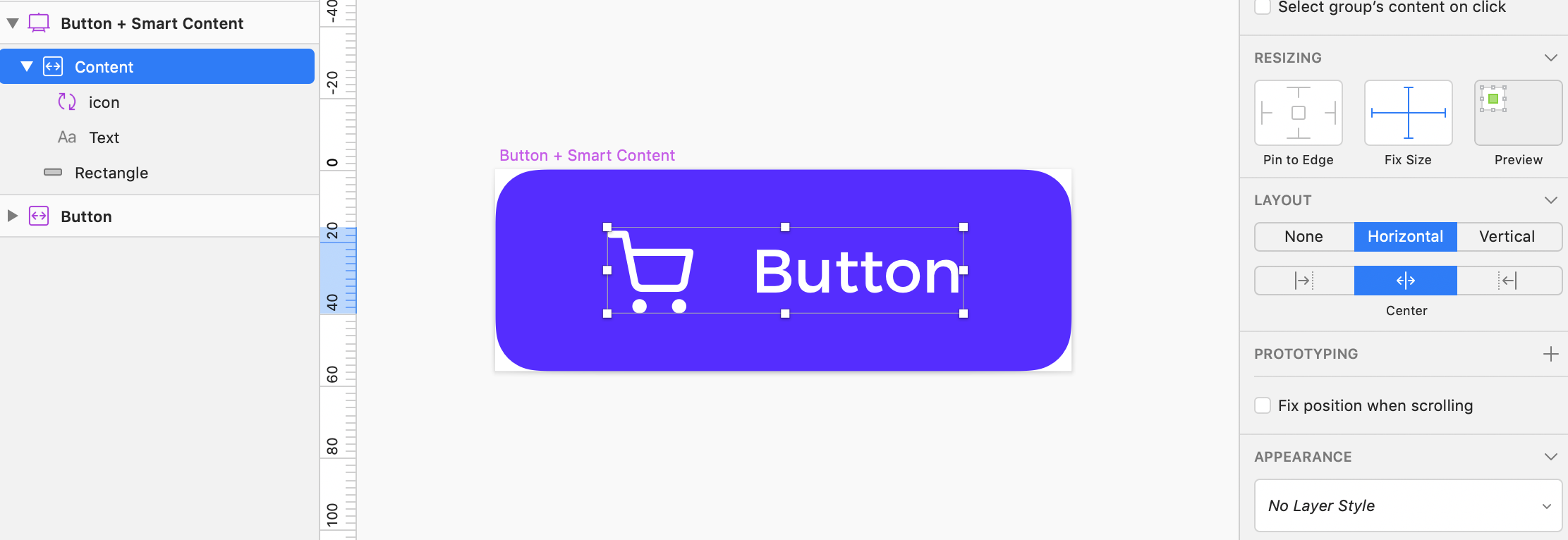
 OK, now inside Symbols artboard, select the group that includes icon and text. In the inspector, panel, make it “Fix Size” and choose Layout “Horizontal – Center Layout” option.
Select the icon and also make it “Fix Size.” Remember that Text Layer Alignment should be set to “Auto-Width.”
 OK, now you have got two types of Symbol button that includes Smart Layout. Let’s more to more complex components!
Dropdown Menu + Smart Layout
Many designers recommend to avoid dropdowns, but they are still here and useful in some cases! Let’s make them “Smart” 😉
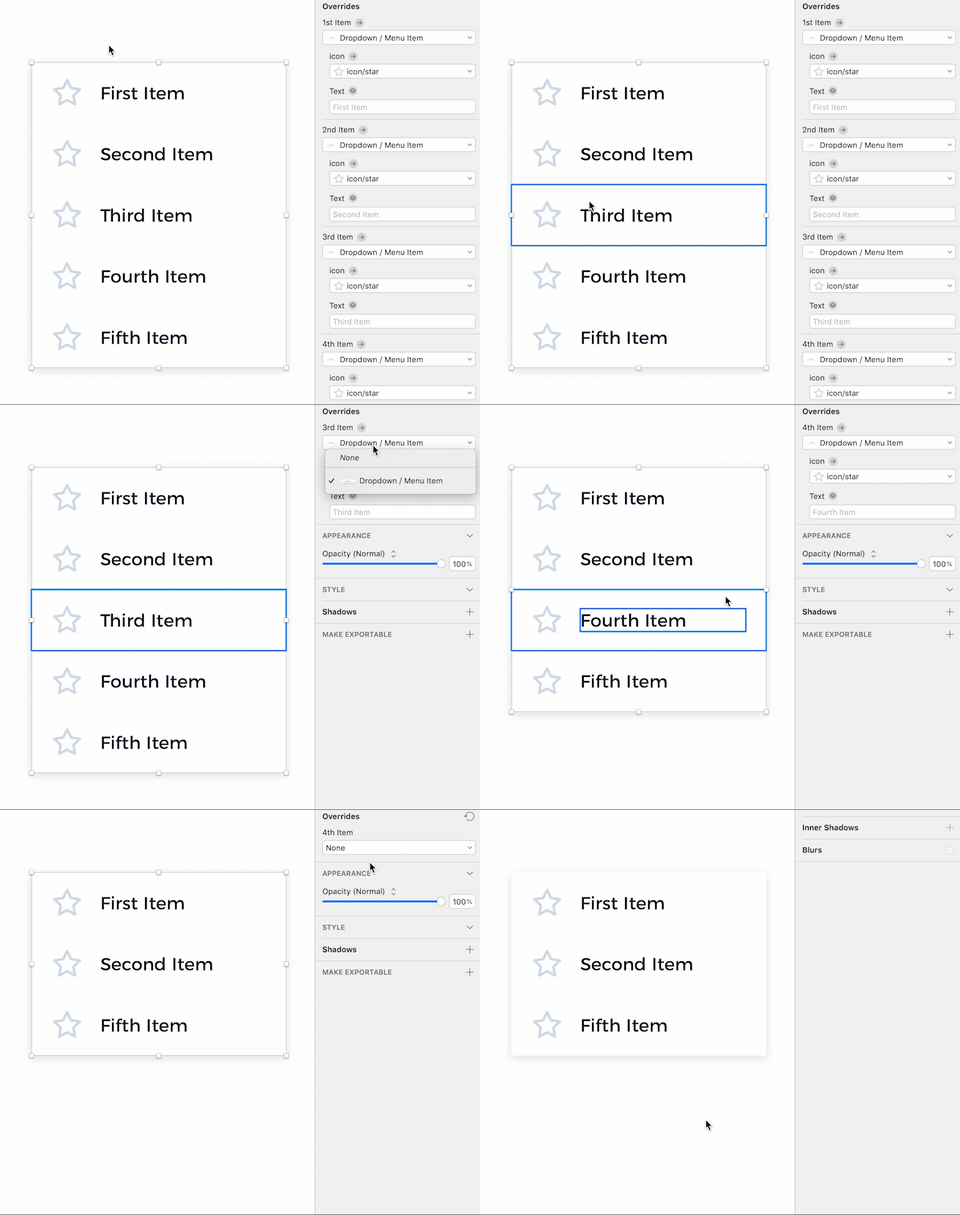
Sketch’s Smart Layout feature has got the ability to adapt to the presence of Symbols. This means that if the instance of Symbol will hide nested Symbol in Overrides, it will stretch to fit the new size.
Now, let’s make a dropdown that includes several items and adapts if we hide a few of them.
Dropdown Menu Setup
First, let’s create a Symbol of the menu item for the dropdown menu. This one also benefits from Smart Layout. Take a lot at the setup:
 The overall architecture is the same as in the previous button Symbol, but Smart Layout of content Group is set to “Left to Right” Thanks to this, if you decide to hide the icon, the text content will adapt.
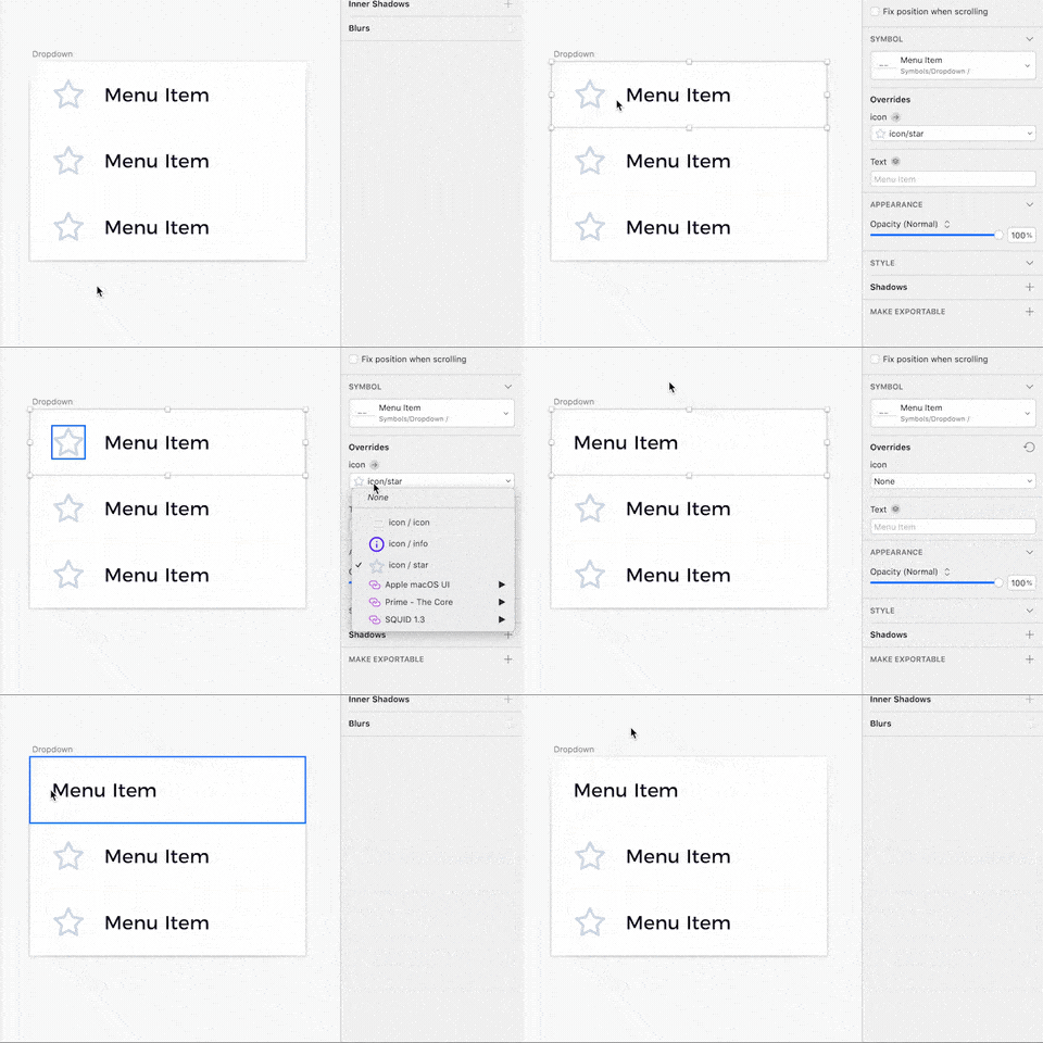
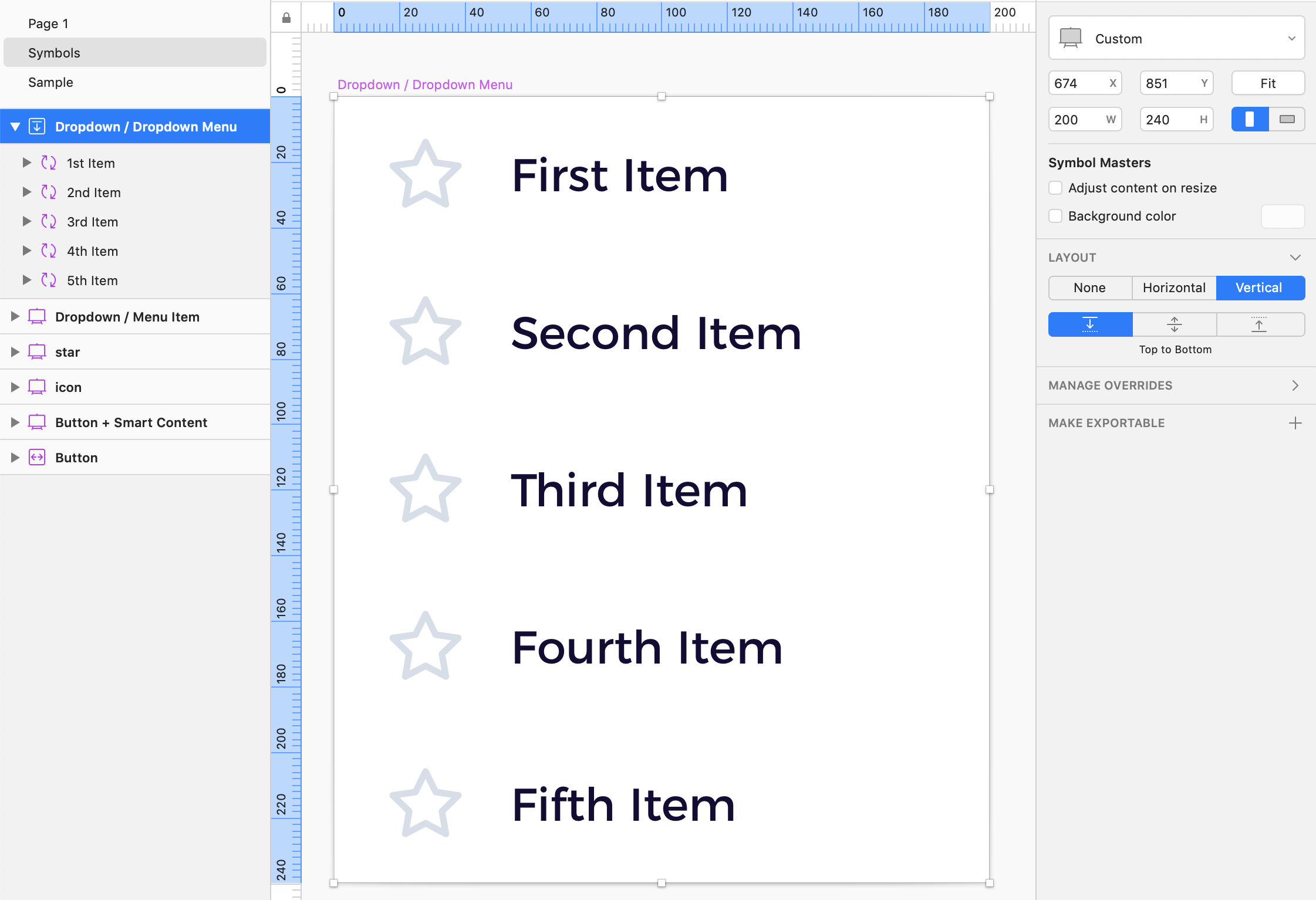
Now we are ready to make the Dropdown Menu Symbol. Let’s set it’s layout to “Vertical – Top to Bottom” and nest 5 Menu Item Symbols we created a while ago.
That’s it! Now you can hide menu items, and the height of the dropdown menu will adapt!
Now, let’s more to even more complex components!
Card + Smart Layout
Cards are quite popular nowadays. They are elegant UI element that combines an image with a text description. Let’s make their Symbols use Smart Layout to boost our workflow.
Here is the Card Symbol we are going to make:
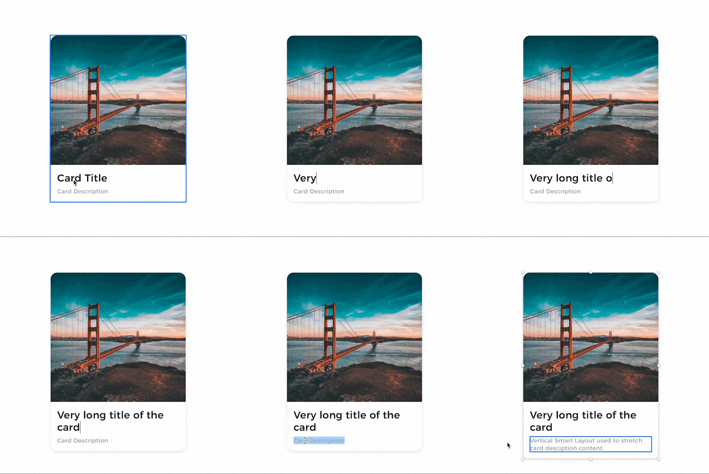 Card Setup
This Card uses a Vertical Layout with the “Top to Bottom” option. Thanks to this, Text Content will take as much space as needed. It is important to set Text Layers Alignment to “Auto Height” in the inspector panel. Thanks to this, they will fill the entire Card width and adapt the height to current content.
Take a look at the setup:
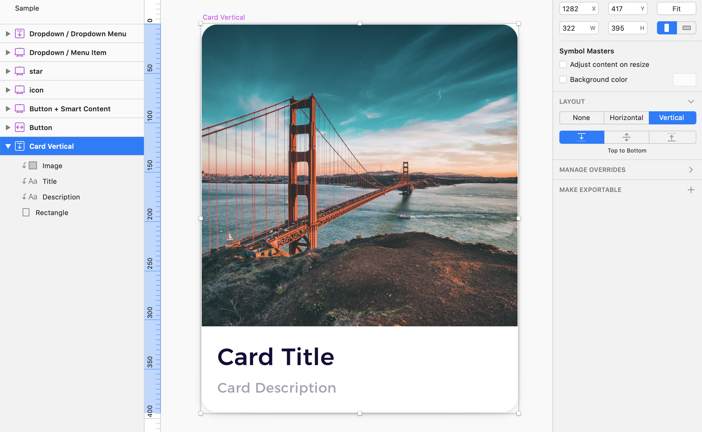
Note: This vertically oriented card may be still stretched manually in the horizontal axis and still use Smart Layout for Text Content!
Modal Popup + Smart Layout
We may love or have modals. Because of some regulations, the web is full of them. However, we can still make them more elegant or… smart!
We will prepare modal that behaves like this:
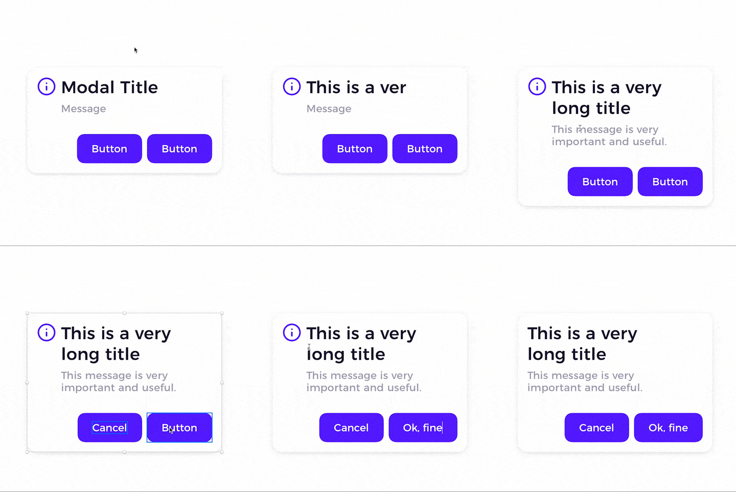 This will be the most complex component in the tutorial. We will combine elements and knowledge gathered from previous elements.
First, let’s add Vertical Layout Top to Bottom to the Symbol. Inside of the Symbol, we have to place all elements and group them so they will be able to stretch in the desired way.
- Set Text Layers Alignment to “Auto Height”
- Group Text Layers (Modal Title and Message) and set Group’s Layout to Vertical Top to Bottom
- Group the Text Content Group with the Icon, and let’s make its layout Horizontal Left to Right.
- Group Buttons (Symbols from the first exercise) and set the group’s layout to Horizontal Right to Left.
The full setup should look like this:
 This UI component uses various techniques, and thanks to this are very adaptable.
Tips for Smart Layout
I used Smart Layout a lot within my Design System Library and other projects. I would like to share with you some of my tips based on experience:
- Smart Layout is great, but not in all cases. Sometimes it is better to have an alternative old fashioned version of Symbol. Example: Sometimes, buttons have to stretch to fill all width of the page or card. If you have only “Smart” Buttons in your set, updating content will annoy you because you will lose your setup. It is good to prepare the Symbol version with Smart Layout and without it.
- Text content does not stretch? Play with Text Alignment! Lots of designers had trouble with applying Smart Layout to their Symbols, because sometimes Text Alignment options may block the stretching ability.
- Use Resizing Options – They are still relevant and may even enhance the behavior of Smart Layout components.
Get All Samples from Tutorial
If you would like to see all the examples in real life. Feel free to download the Sketch file with all Smart Symbols mentioned in the tutorial:
👉 GET ALL SAMPLES
Summing up
With this tutorial, you got the knowledge to create all kinds of Symbols with Smart Layout – even complex ones. I hope you found this useful. If you know designers who may need additional tips to Sketch Smart Layout, please share the tutorial with them!
By the way…
If you plan to start a new project soon or to organize your UI Library — do not waste your time creating everything from scratch. Feel free to use the Prime — Design System Kit. It helps you design UI with the best Sketch techniques — Smart Layout, Symbol Overrides and more.
To make it easier there is a gift 🎁 Use UXMISFIT10 offer code to get 10% Off.
 You can also Create User Flows faster in Sketch — With SQUID you can create User Flows directly in Sketch the sketch file with your artboards. Everything may be done within a couple of clicks. See how it works.
Thanks for reading!
