
Practical Tips & Tricks.
Our mind is marvelous. We always try to discover the meaning and the sense of the particular object or phenomenon.
Do you remember when you saw the shape of a rabbit when your hands cast a shadow? Or, did you saw faces in the weirdly formed barks of trees? I am sure that at least once when you looked at clouds, you wondered why some of them look like horses running through the sky. This is the result of the way our brain process information.
But why this happens? This is where Gestalt Principles helps us. Rules explain to us how we perceive the world.
We feel most of the principles intuitively. However, knowledge about the theory is essential. In this story, we will also focus on practical samples that will help you create designs with better confidence. You will be sure that users perception will be the same as you intended to be.
Short Introduction to Gestalt Principles
I know that this may sound not so interesting, but it is always good to see the background of a particular topic. I will help it as short as possible.
Gestalt is a German word. It means “shape” or “form. The group of psychologists formed it in the early XX century. Fathers of the theory are Max Wertheimer, Kurt Koffka and Wolfgang Kohler. Gestalt psychologists were interested in looking at the mind behavior. Principles describe the way we perceive the world.
The key fundamental rules of gestalt systems are emergence, reification, multistability, and invariance.
Emergence
Our minds tend to see simple, strong objects faster than the detailed ones. We tend to see elements in the general form first.
 Reification
We are able to see or deduct the whole object even if there are missing element or it is incomplete.
 Multistability
There is always more than one way we can perceive a particular object. However, our mind always decides one point of view to be dominant after a while.
 Invariance
The human brain creates a simplified projection of the particular object in mind. Thanks to this we can recognize thing independently of its size changes, rotation or other transformations.
 OK, enough theory. Let’s jump to the explanation of the Principles in the context of UI Design!
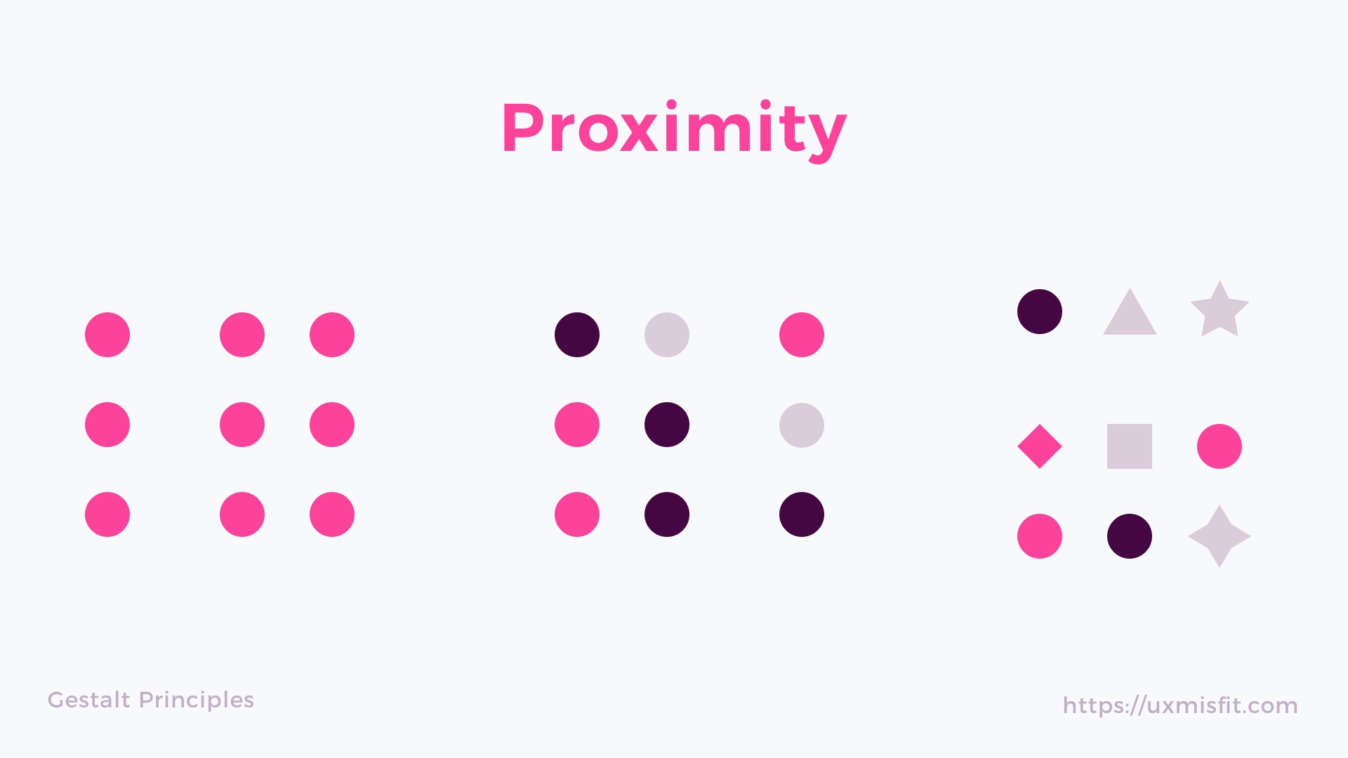
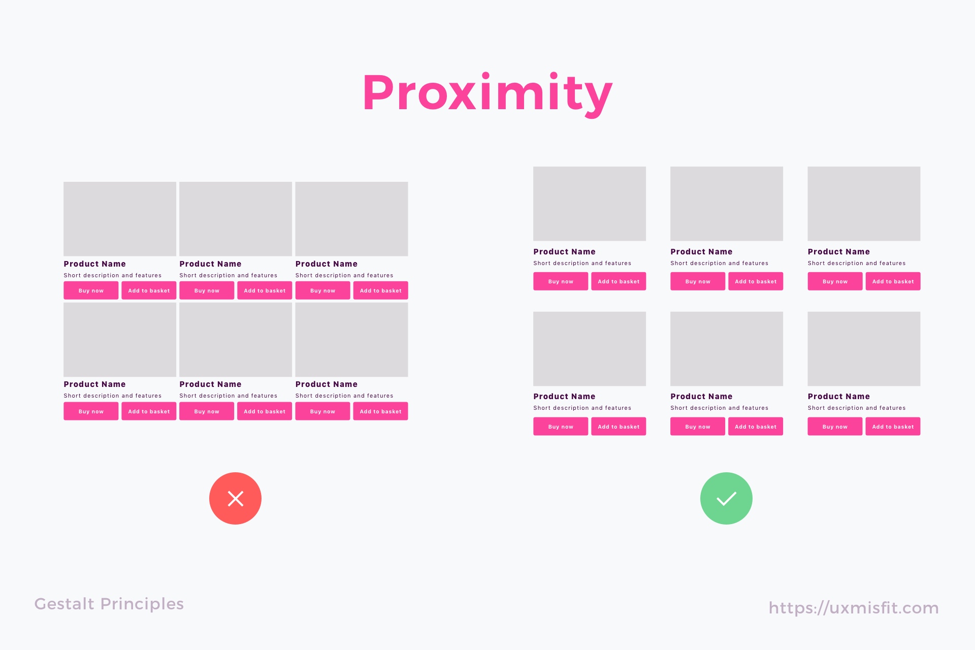
Proximity Principle
The principle of proximity tells we perceive elements that are close to each other appear to be related. Even if there are more objects, the ones that are closer seems to be more correlative than elements that are placed farther.
Our brain perceives these sets of closely placed elements as groups. Proximity is so essential to our perception that it is stronger than other features like shape or color.
Proximity Principle – How It Is Used in UI Design?
Thanks to the usage of proximity designers create content more comfortable to perceive by users. The pages are more scannable. This applies not only to the UI controls like buttons or inputs but also to the written content and typography of the solution.
Proximity may be used to group content and action controls that are related to each other. It is also bonded with White space that plays an essential role in the principle. It boosts the relations between elements and strengthens the designer’s intention. Thanks to this user have no doubt what will happen if they trigger the action. In the end, users are able to scan content faster and accomplish their goals much more efficiently.
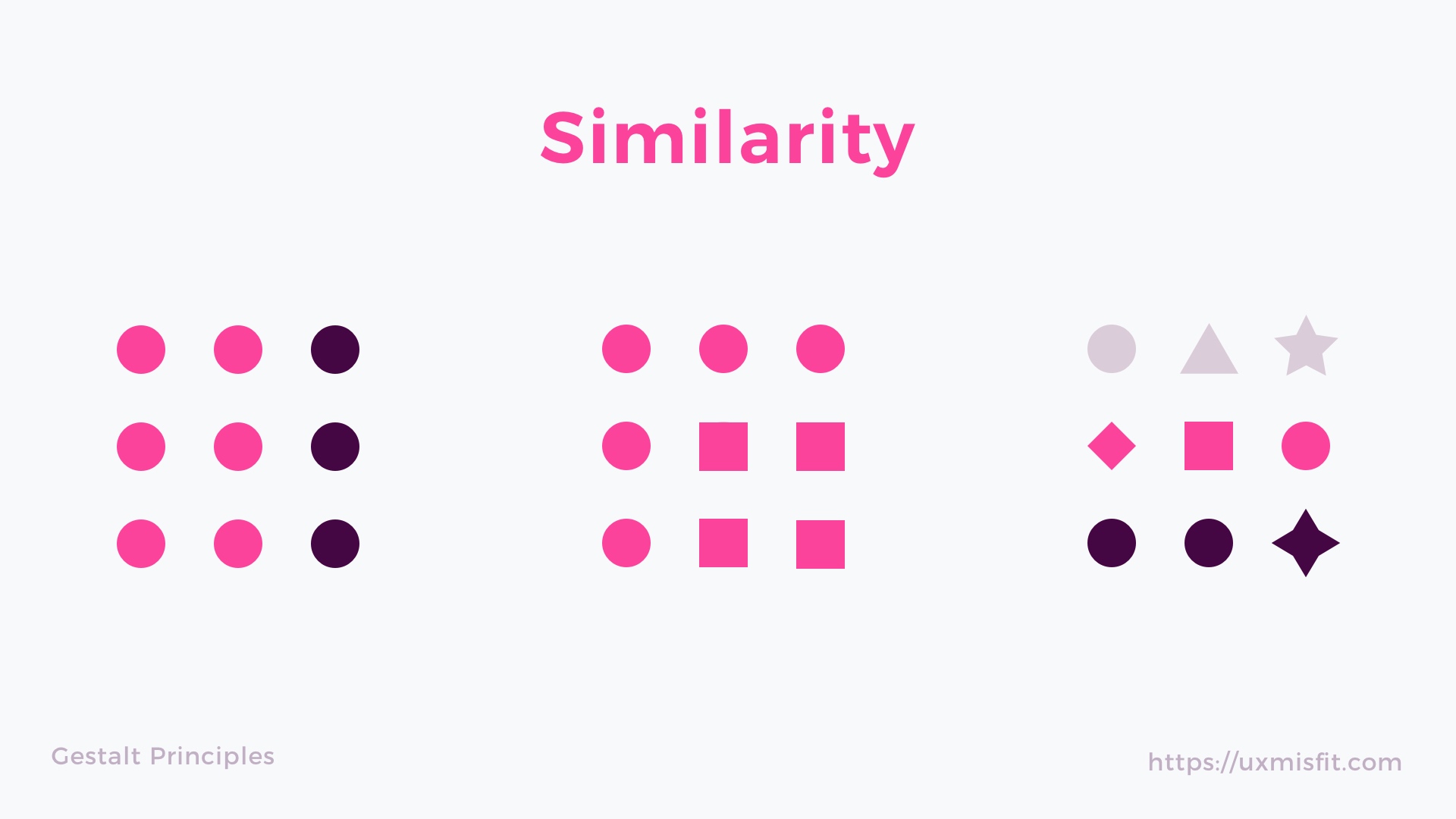
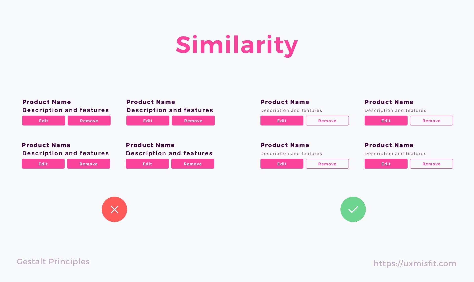
Similarity Principle
Elements that have similar visual appearance seems to be more related or grouped than the ones not sharing the same attributes.
The main characteristics that boost the impression of similarity are size, shape, and color. The similarity is not so weaker that proximity but is also a powerful law of human perception.
Similarity Principle – How It Is Used in UI Design?
While 3 mentioned attributes perfectly apply to the UI Design, there are also additional, not so atomic properties, that may strengthen the similarity: typography, iconography, shadow, texture, etc.
When users notice similar element in the UI, they categorize them as particular patterns. Thanks to this they quickly recognize the meaning of specific UI controls. This is why it is so crucial for the primary buttons to look the same on every page.
In the group of “similar” elements, We tend to see objects with the similarity of colors first, then size and in the end shape.
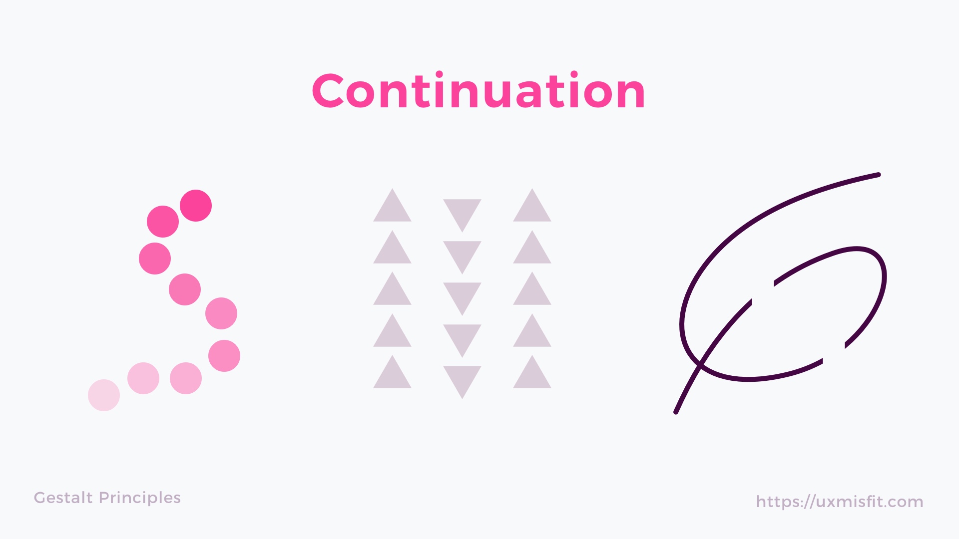
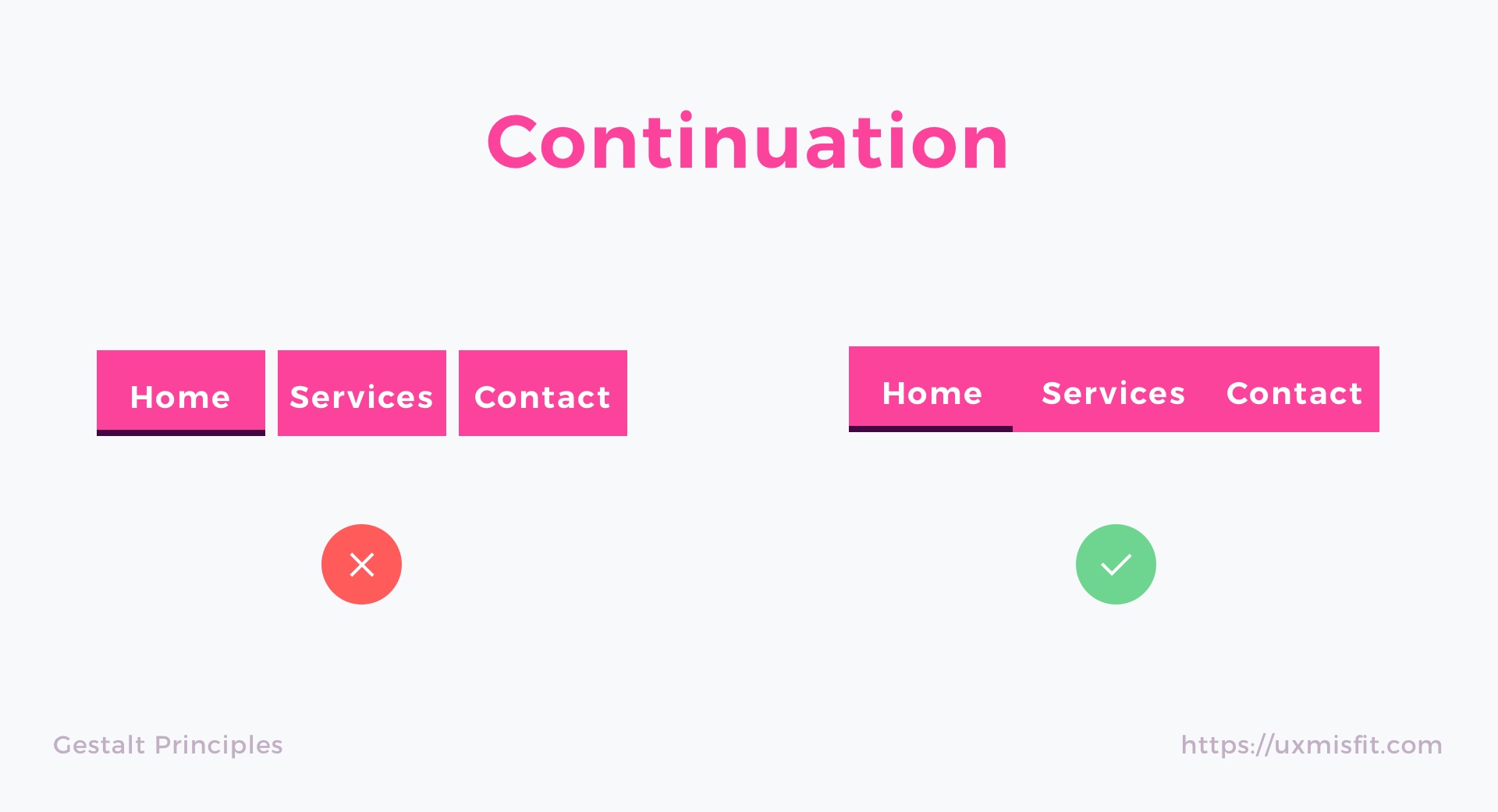
Continuation Principle
When the eye is guided to move from one object to another, we speak about the law of continuity. Our perception tends to see object arranged in lines or curves as more related or grouped.
Continuation Principle – How It Is Used in UI Design?
When you see groups of elements, like photo gallery sliders, tabs or even simple lists, you may now notice they are using continuation. The objects are placed nearby, and they guide eyes to jump from the one to the next.
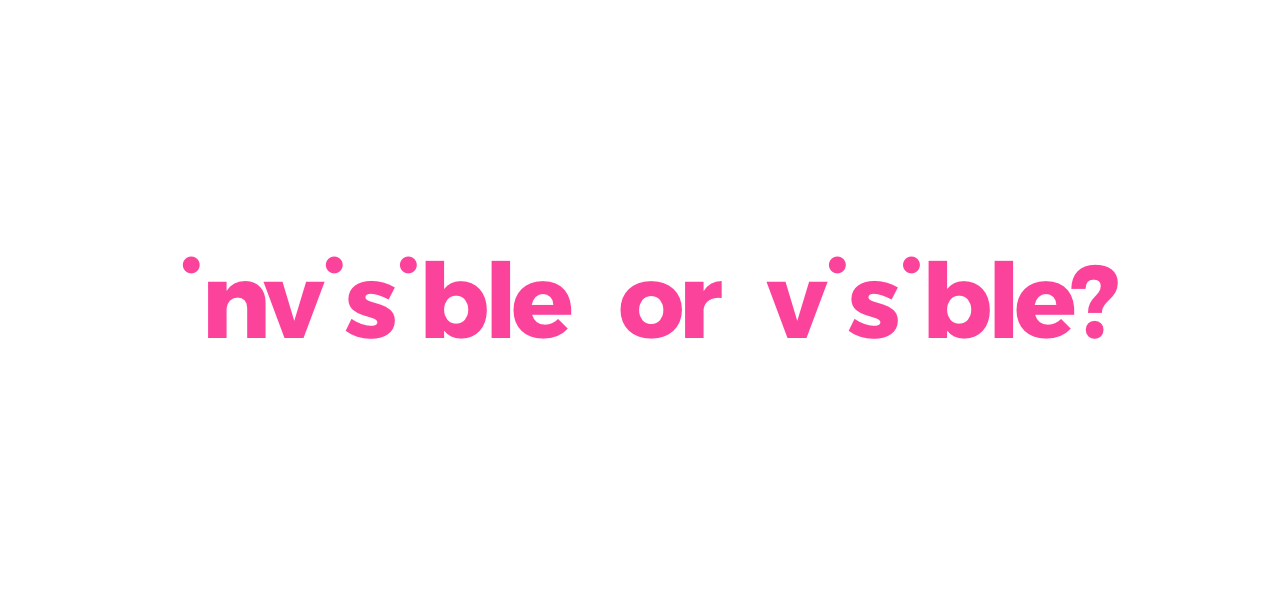
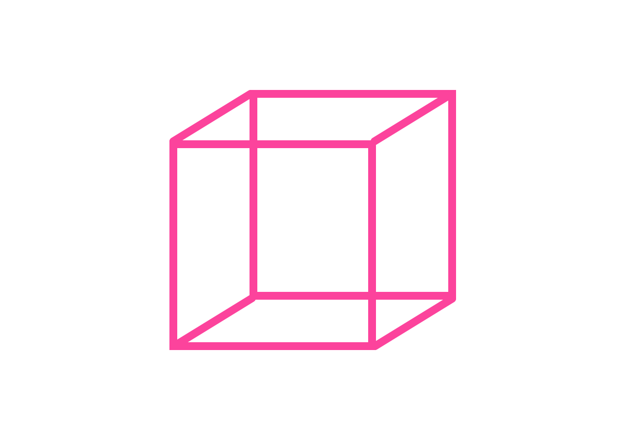
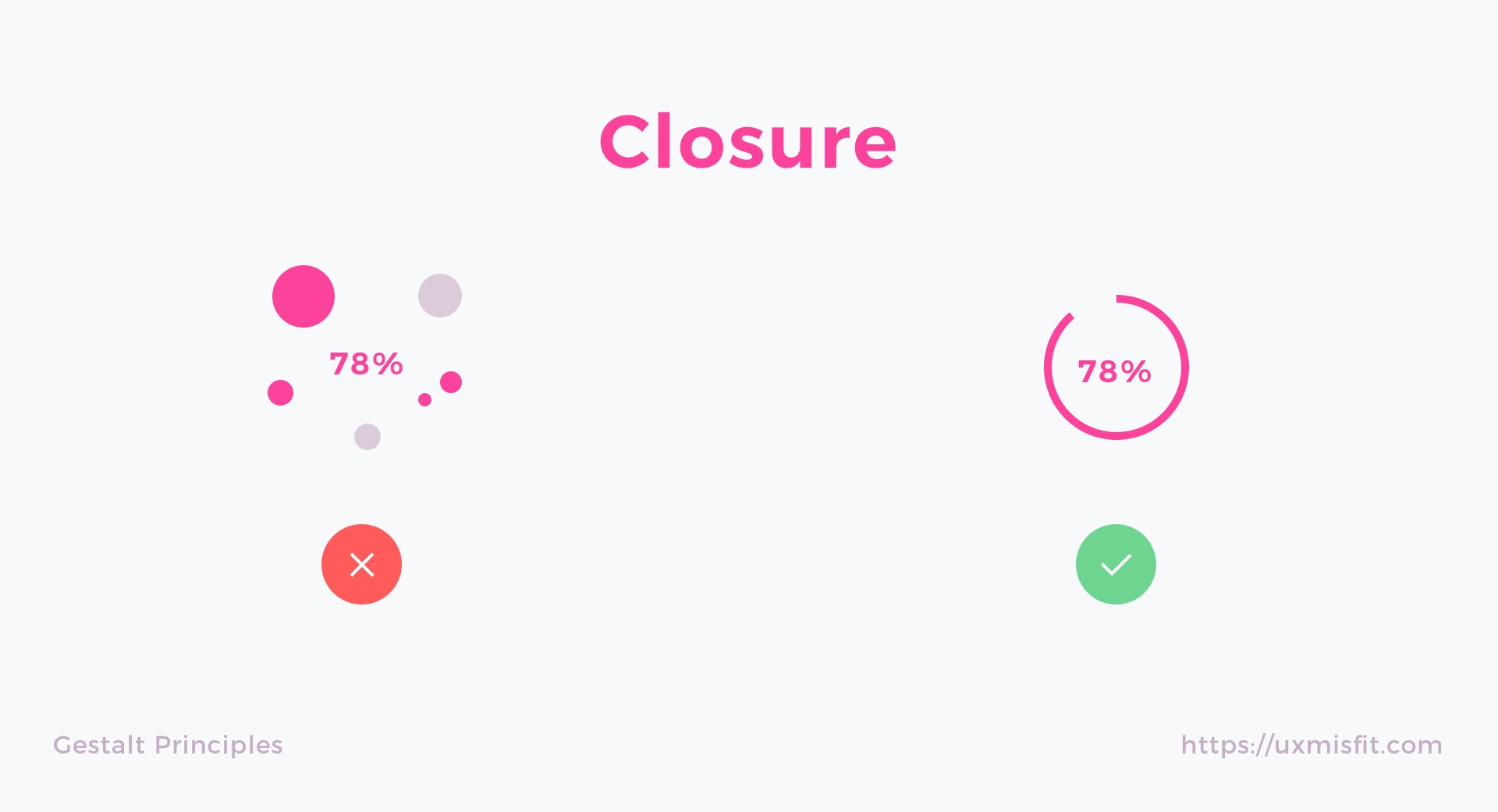
Closure Principle
Objects are often perceived as a whole thing, even when they are incomplete. Our mind quickly fills the gaps and helps us to find the meaning and intention of a particular thing.

Closure Principle – How It Is Used in UI Design?
Every time when you see a loading indicator, a progress bar or sliders – the law of closure was used to make the solution more understandable to the user. The other usage of closure is negative space. We see it in logos and iconography. It makes the design more readable or even enjoyable.
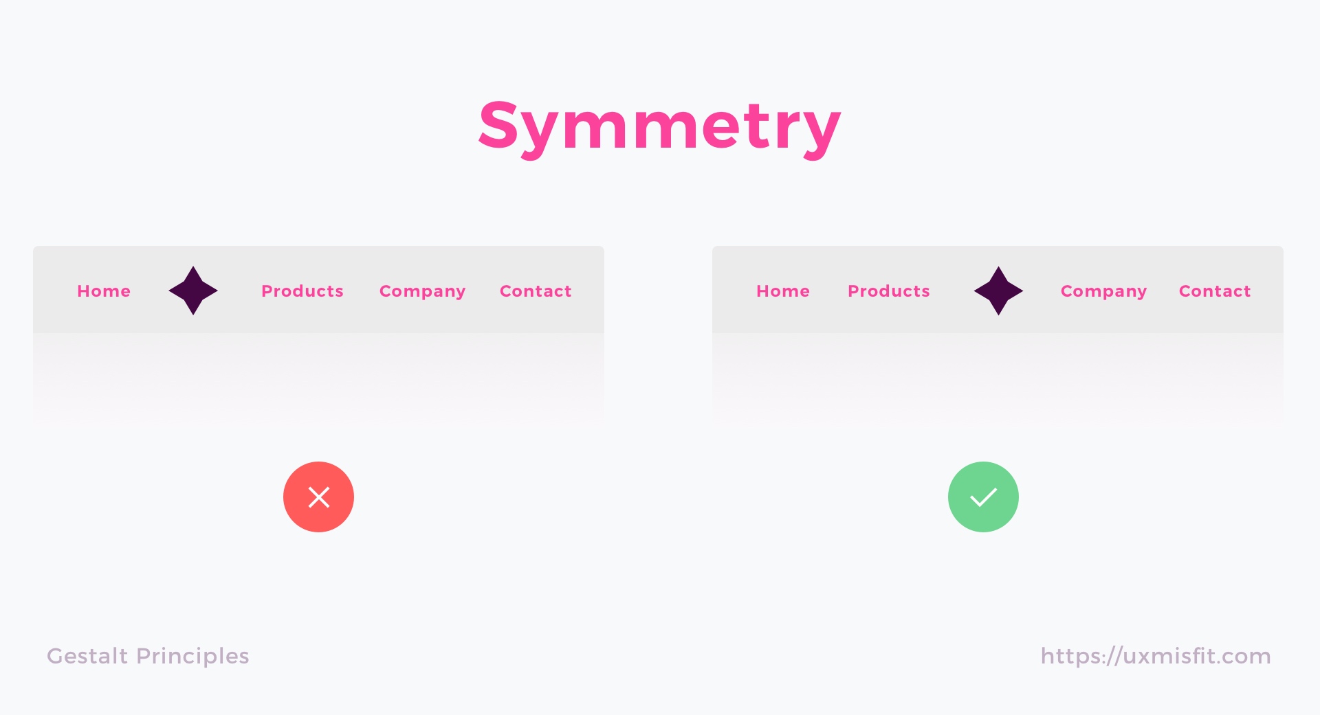
Symmetry Principle
Our mind perceives symmetrical objects as parts of the same group. They create an impression of stability and order.

Symmetry Principle – How It Is Used in UI Design?
UI Elements that are symmetrical to each other helps to scan the content and recognize patterns. Symmetry allows users to focus on what is essential. Symmetrical navigation menus tend to be perceived as more stable. The principle is excellent to use when you design galleries or banners.
In the other hand, some asymmetry in design can make it more exciting and dynamic.
Common Fate Principle
When the elements tend to move in the same direction we perceive them as part of the same group.
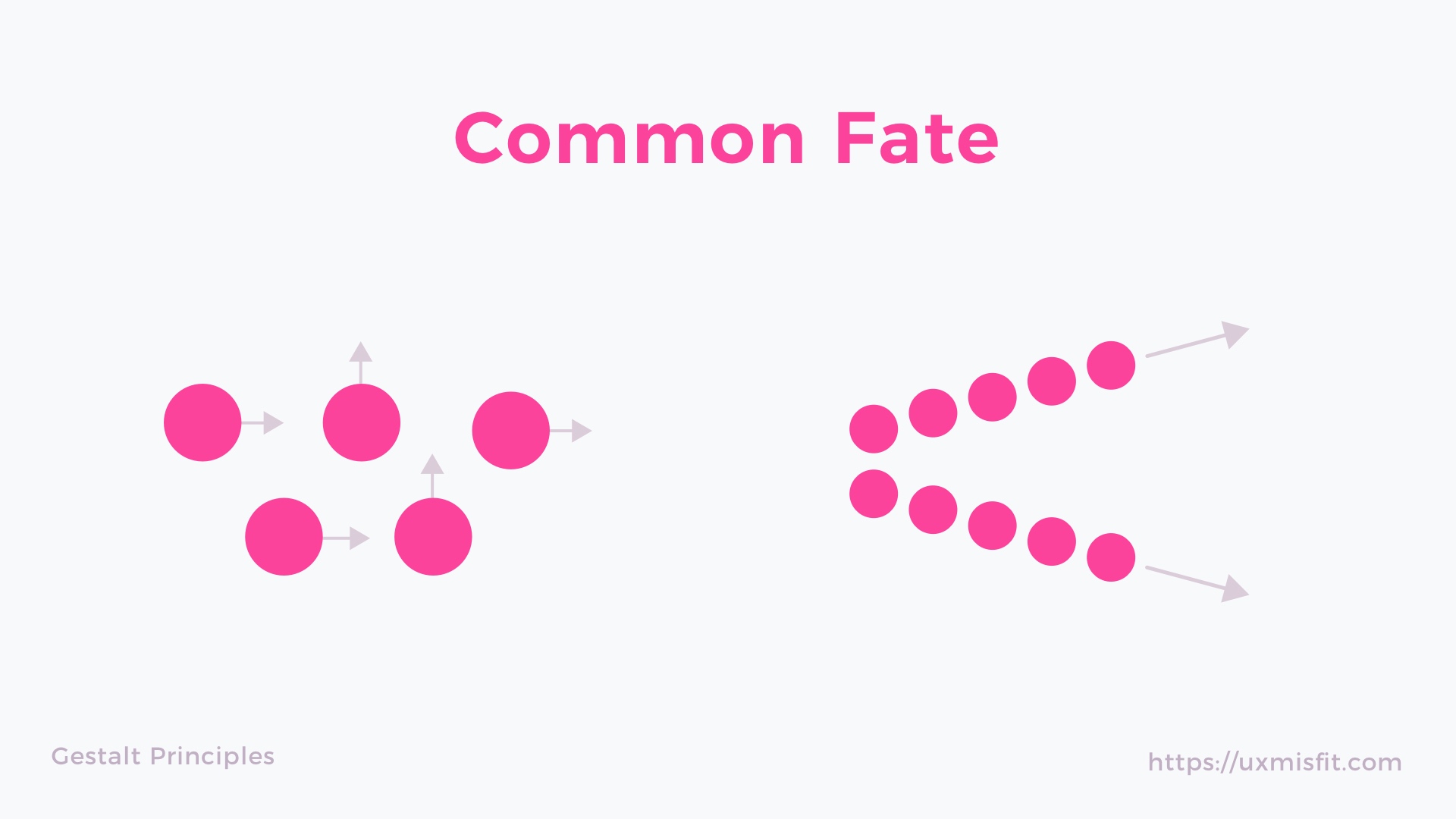
Common Fate Principle – How It Is Used in UI Design?
This principle is fundamental in motion design. Every meaningful animation uses common fate to guide users eye in the right way. This helps to connect content with triggered action.
Common Fate also applies to the elements like nested menus, dropdown or accordions, that shows how the menu element will behave clearly.
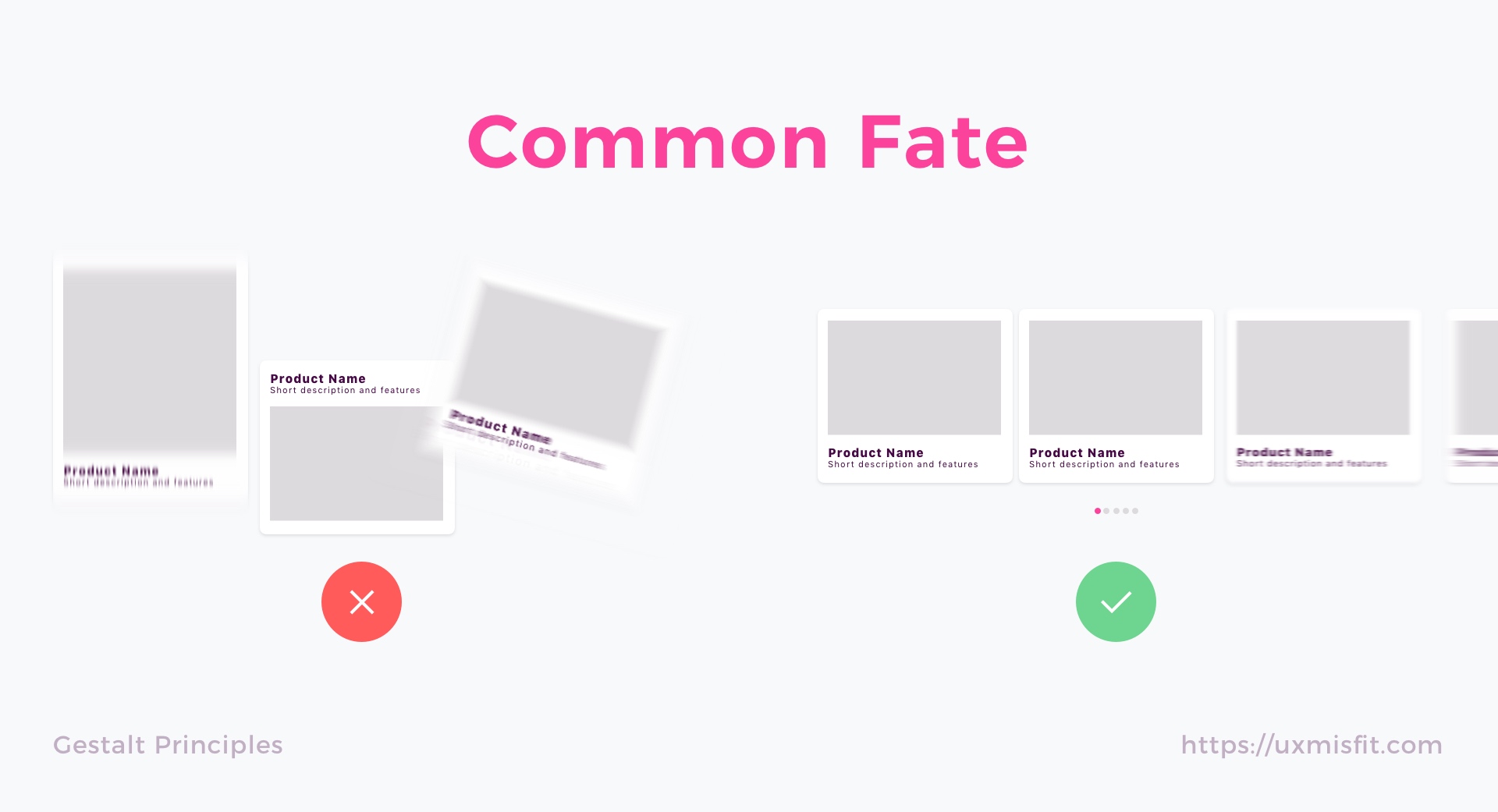
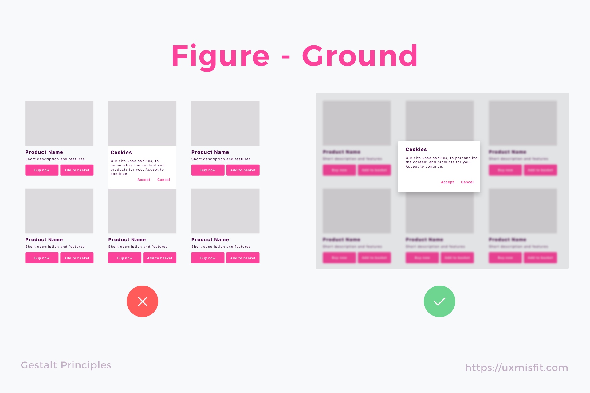
Figure-Ground Principle
The human eye is able to separate object on different plans of focus. We know which elements are placed in the foreground and with ones are in the background intuitively.
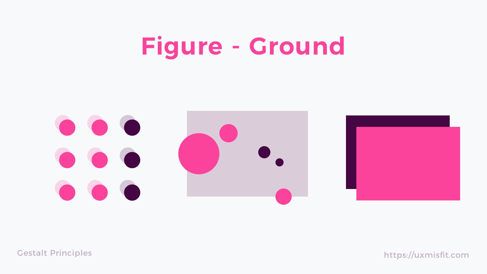
Figure-Ground Principle – How It Is Used in UI Design?
Every time you see the modal page or popup you are a witness of Figure-Ground Principle usage in action. There are several techniques to distinguish plans of focus on mobile: you can use parallax background, semi-transparent overlay, shadows or blur the elements in the background.
There are design systems that prefer each technique to be used in them: Material Design uses overlays and drops shadows, but iOS Human Interface guidelines recommend to use blur.
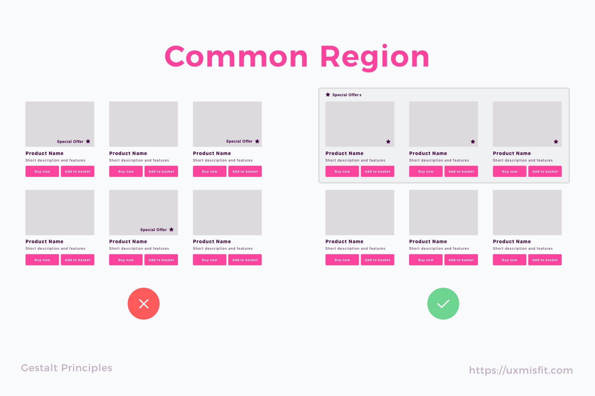
Common Region Principle
Objects placed within the same region are perceived to be in the same group. This is similar to the Proximity Principle.
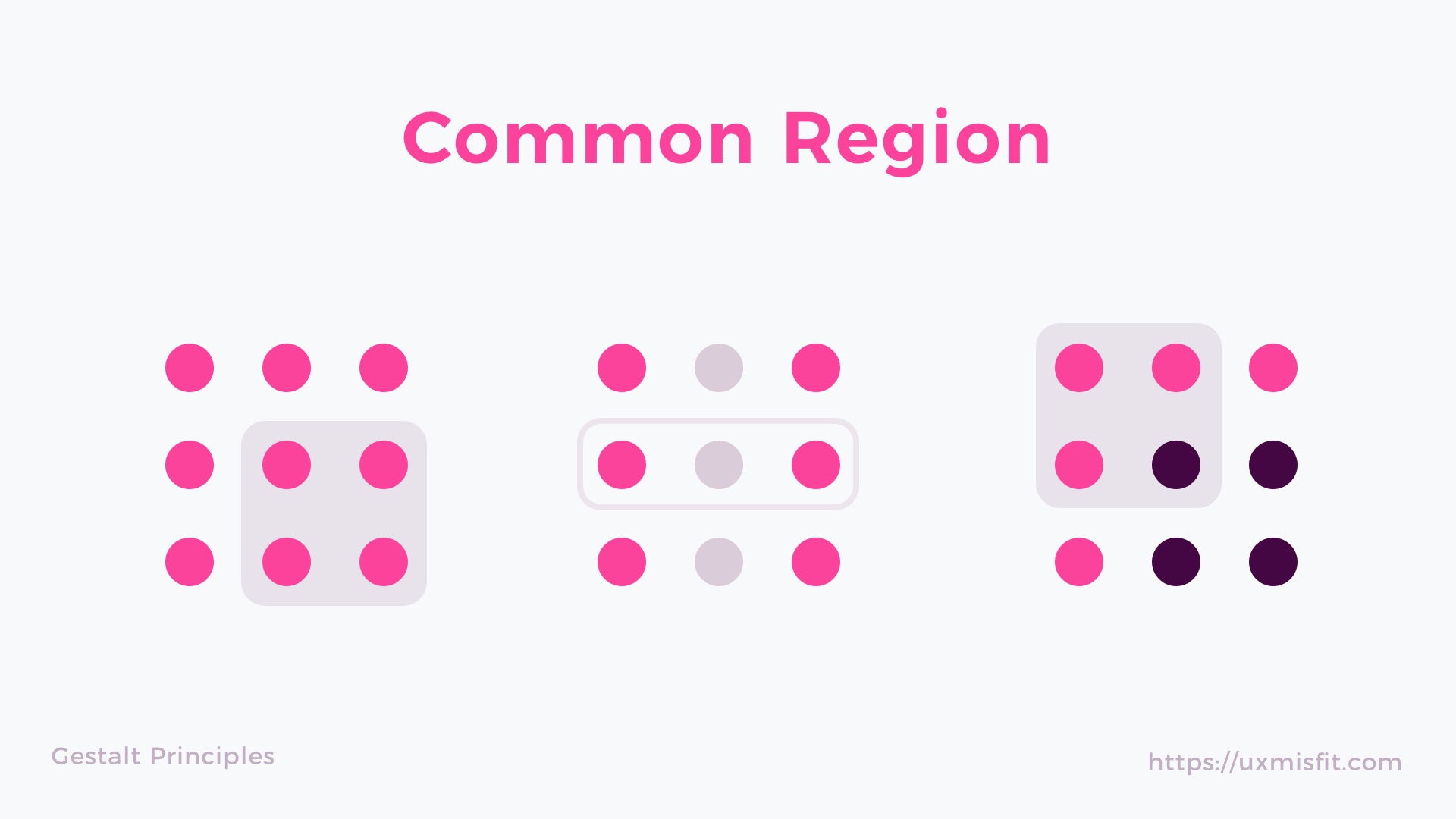
Common Region Principle – How It Is Used in UI Design?
This is a very useful law in UI Design. Let’s take an example of cards from Material Design. They may include various elements like images, icons, text blocks or buttons. However thanks to the card (white rounded rectangle with subtle shadow), they are perceived as a single object.
Common Region helps to structure the content and make it easily scannable. It also applies to elements like navigation bars, tables, menus, form sections, etc.
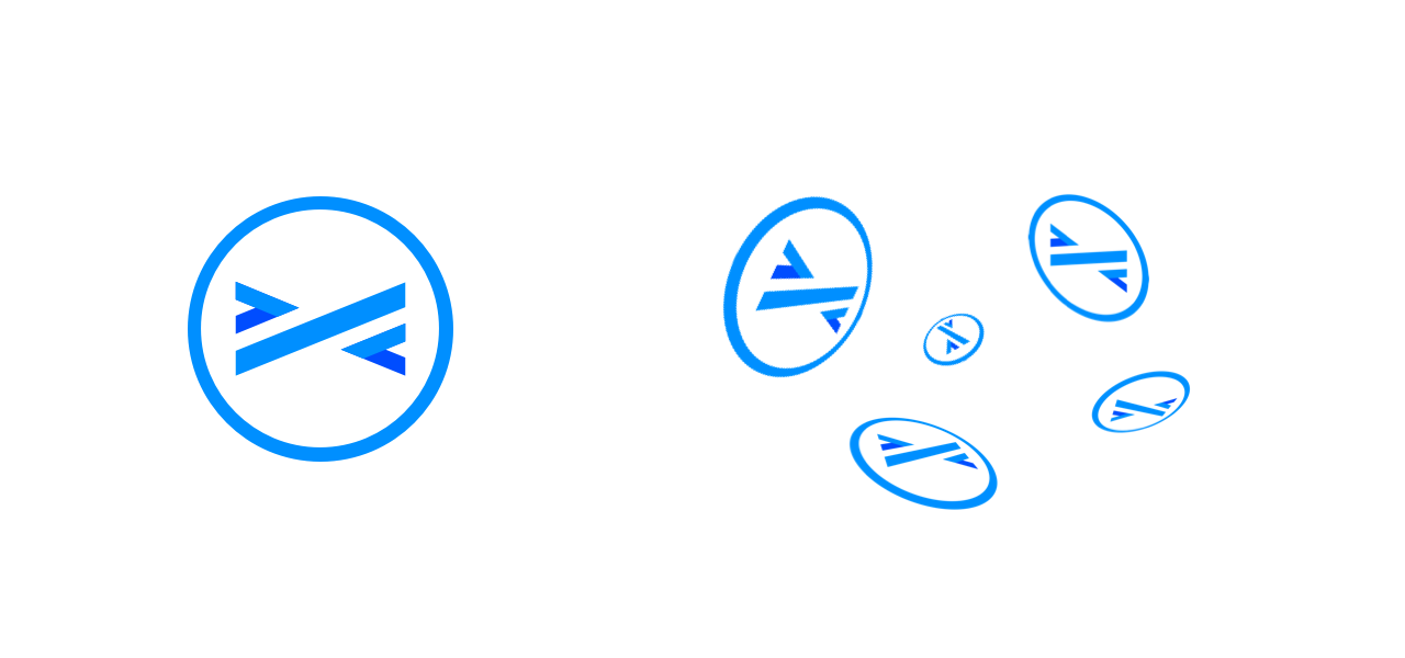
Periodicity Principle
Elements that appear multiple times in similar distances are perceived as related.
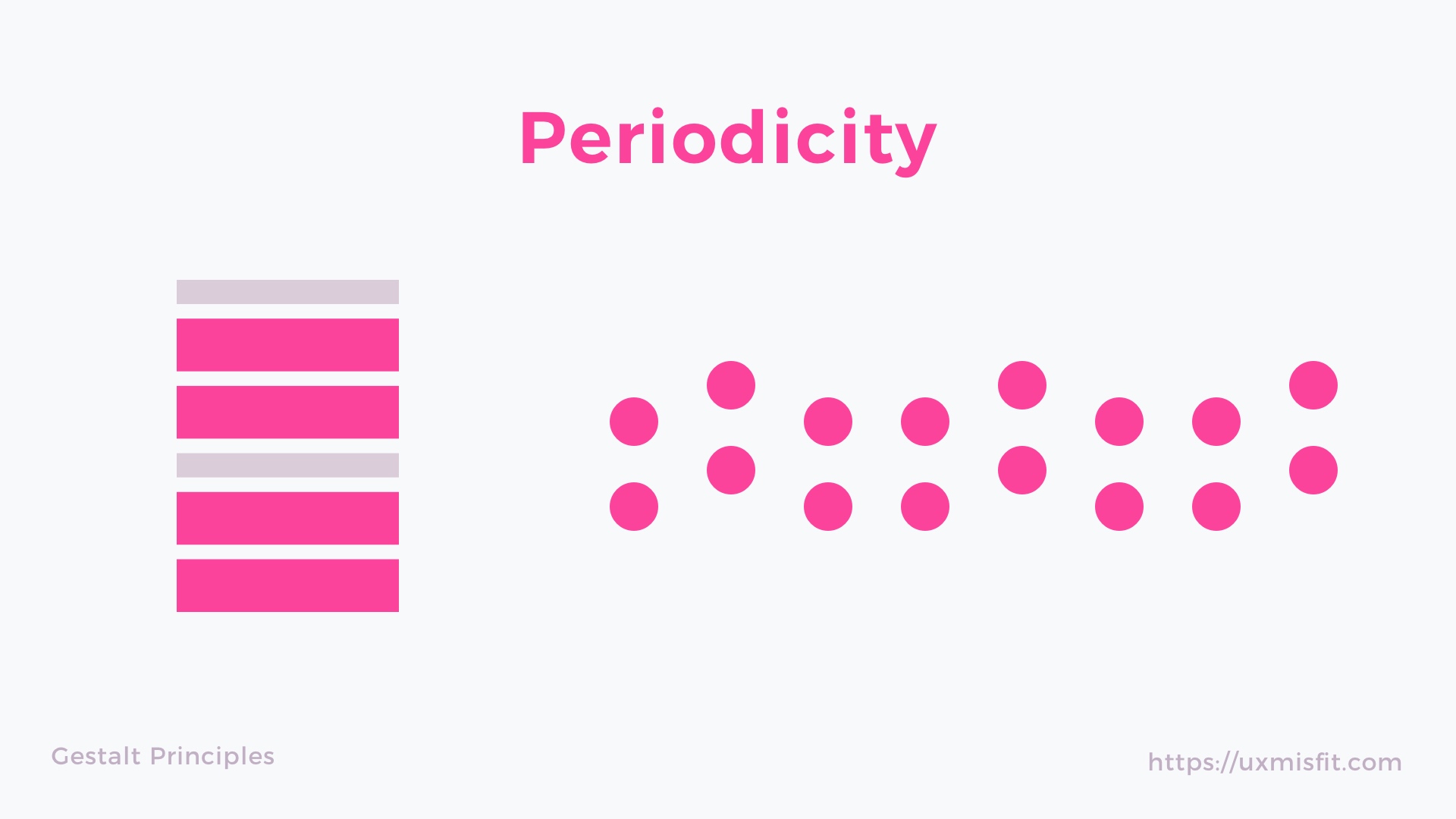
Periodicity Principle – How It Is Used in UI Design?
Periodicity helps users to recognize patterns in UI Design. This rule is used in tabs (elements are placed in the same rhythm), you scroll the list or grid (objects appears multiple times in similar distance). This may also be used in sections of the web page, to build a rhythm.

To conclude
Knowledge about Gestalt Principles is an essential part of UI Design Discipline. While many rules are applied intuitively by Designers, knowing the rules helps to make more conscious decisions.
By the way…
Are you using Sketch? Would you like to design faster and more efficiently? Below you may find some resources that apply various time-saving techniques to help you:
Create User Flows faster in Sketch – With SQUID you can create User Flows directly in Sketch the sketch file with your artboards. Everything may be done within a couple of clicks. See how it works..
Create Web or Mobile Designs within minutes – Starting UI Design from scratch is boring. I wondered, how to skip this part of work to focus on more interesting tasks. Prime Design System Kit is the resource that lets you customize all essential UI elements quickly and jump right into the most engaging parts of the design process. What is more, it includes Charts, Device Templates, and Illustration Kit to speed up specific pieces of work. Thanks to Prime you create Web or Mobile design within minutes. See Prime in action.
If you are looking for more practical tips, feel free to subscribe to the newsletter (as a subscriber you get an extra discount for design resources).


