Design System is a big thing in UX Design Process. Lots of blog posts, videos or tweets mention the benefits of creating this resource. This article fills the gaps in the knowledge and covers every aspect of this matter. Let’s summarize what Design System is, remind the benefits and see the best existing examples.
TL;DR
Design System is much more than UI Style-guide. It is a source of truth for the whole team. This means UI Component Library for Designers, Ready to use UI Elements in a code for Developers and the Principles described in the documentation. Design System helps you maintain consistency and design faster. It helps to communicate with the rest of the team.
OK, now you have a quick summary. Let’s read the full story with more information.
What is a Design System?
Design System is a comprehensive guide for project design – a collection of rules, principles, constraints and best practices. The core element of Design System is often a Library of UI Components. These UI elements have also their representation implemented in code.
Design Systems are often called the single source of truth for the team involved in product creation. It allows the team to design, develop and maintain the quality of the product.
The benefits of Design Systems
Creating systems sounds like a lot of work (however, you can save lots of hours using some tools – I will describe this in the next paragraphs). However, it has got multiple benefits that make the system worth preparing. Here are the main ones:
- Consistency – thanks to Design System developers are able to implement consistent UI much easier. They can think of the particular page as of the set of components. Example: Developer does not have to think that this is a button with #0302fa background, 14pt Open Sans Bold font, and 8px padding. The engineer knows that this is just a Primary Button, and he is using this component in multiple pages.
- Higher quality – consistency makes the impression of higher quality. QA Specialists will easily monitor the implemented design with Design System documentation. Inconsistency should appear rarely.
- Better Communication with Development Team – Design System is the single source of truth – this means it also contains vocabulary that may be used in the project. When the developer and designer discuss the page, they will use the same names of the components. Thanks to this you will not talk about “this small purple button,” but the “Secondary one.” Many mistakes where done because misunderstanding, Design System allows you to speak in the same naming convention.
- Faster Design Process – You have already built or purchased the Library of UI controls needed to implement UI. Now you just use them when the new feature requires to create a new page or modify the existing one. Even if you decided to build the UI Library from scratch – these tons of hours spent on that task would allow you to create UI for new features quickly.
- Focus more on UX, less on visuals – Using UI Library means you do not have to figure out every time what should be the appearance of the input field on this page – it is already defined. The visuals are previously described in the system – now you can compose new pages with them and focus more on better usability and delightful experiences.
Examples of Design Systems
Design Systems are big. It is hard to imagine how many hours of work it costs to create one. But it is worth it!
Fortunately, many of the great teams made their systems public. Thanks to this you may learn good practices of creating Design System from the existing ones. I recommend to analyze these:
- Material Design – This is one of the most popular systems. It was shaped for many years but now is used not only by Google Team but also by many creators of Android and Web Apps.
- Atlassian Design System – One of the most complete ones in the market used in real products made by Atlassian.
- Polaris – The Design System made by Shopify
- Carbon – The one made by IBM
- Human Interface Guidelines – Apple prepared the Design System for all their platforms
- Nachos – Prepared by Trello. It is good to see how they have described illustration principles in the documentation.
- Grommet – Design System by Hewlett-Packard presented in a very friendly way.
Do I need to build Design System?
Yes. It may seem not obvious especially for quick projects, but the decision pays off.
At first, you and your team may feel overwhelmed by constraints. You may think that it limits you, but in the end, the solution should be created much faster with better quality.
How to start creating a Design System
Commonly there are two cases: The first one when you are starting a new project. The second, you are working with existing products. In both cases the path is similar, but the second one needs some additional steps.
For fresh projects you naturally start to play around some visual samples. This may be some initial UI elements or mockups. Make various concepts and pick the most promising ones. This should be the most creative part of the initial design when you find “this Thing” that makes you (and stakeholders) feel satisfied start preparing the system from it.
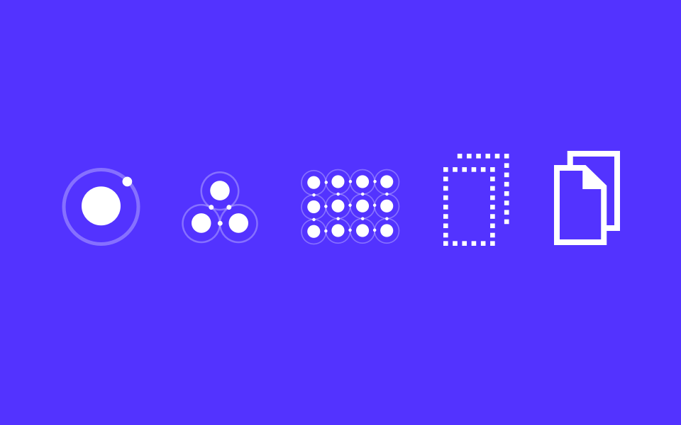
Next, use Atomic Design Principles – start with some particles like colors, fonts, shapes. Then move to atoms, buttons, inputs, checkboxes, radio buttons, etc. Finally compose molecules – search box, date pickers and organisms – navigation bars, side menus. Thanks to this you will be able to prepare collection page templates – something like UI kit for your system.
If you already work with existing project you have to make the inventory of all UI elements first. You will probably discover many almost identical UI components with small differences. Gather all components, recognize these similar ones. When you group elements in their categories you will have to decide which one will be unified and which deleted. Simplify and reduce the number of components.
When you will end with a short collection of elements, structure them and group with their purpose. Use reverse engineering to decompose them with Atomic Design Philosophy in mind. You can also apply a Design System Kit to speed up the process.
 Use Design System Kit
During my professional work, I discovered that starting every new project from scratch is simply a waste of time. The repeatable process of establishing fonts, colors, essential UI elements, charts, and device templates takes to much time.
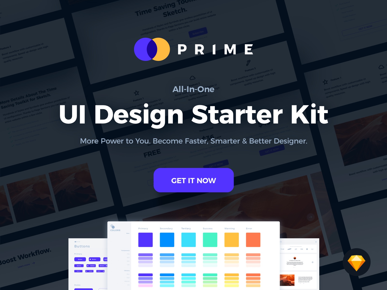
I have found a solution and made a design resource – Prime Design System Kit. Thanks to this UI Framework made for Sketch I save many many many hours and start to work on more advanced topics within minutes.
To learn more about the Design System Kit feel free to read this article – Quick Start Guide
Read more about creating Design Systems
If you are creating your system’s UI Library in Sketch, here you will find extra tips:
Design Systems + Sketch — How to start preparing UI Components Library
If you use Sketch, you may add some plugins to work faster:
Sketch Plugins to manage Design System UI Library
Summing up
Design System is no longer a vision from the future. These deliverables live in many valuable projects. It is time to starting implementing one in yours.
If you already prepared your Design System and you made it public. Feel free to share it in comments!
I am sure that Design Systems save a lot of time when you design a product. The usage of Design System Kit may even help to save dozens of extra hours.
By the way…
If you plan to start a new project soon or to organize your UI Library — do not waste your time creating everything from scratch. Feel free to use the Prime — Design System Kit. It helps you design UI with the best Sketch techniques — Smart Layout, Symbol Overrides and more.
To make it easier there is a gift 🎁 Use UXMISFIT10 offer code to get 10% Off.
 You can also Create User Flows faster in Sketch — With SQUID you can create User Flows directly in Sketch the sketch file with your artboards. Everything may be done within a couple of clicks. See how it works.
Thanks for reading!
