
Learn the finest way to create your design system efficiently.
Important Note:
There is a newer version of Prime Design System Kit for Sketch. Quick Start Guide for Prime 2.0 is available here:

Introduction
Prime is a Design System Kit – The UI framework that lets you build the source of truth for the UI of your design system. It may be successfully implemented when you start a project or if you would like to enhance an existing one.
The tool was build exclusively for Sketch app. Thanks to this Prime uses the smartest techniques of the software, so your workflow will be optimized to design with high efficiency.
Prime Design System Kit contains following files with components:
- Prime Library – the core of the UI Design Framework, includes all necessary elements to build UI for Design System, plus all major chart types.
- Prime Illustration System – the set of predefined and customizable elements for UI illustration purpose
- Prime Devices – vector device mockups of iPhone, Apple Watch and MacBook Pro created for Sketch
- Prime Font Primary – the file with additional customizable typography system
- Prime Font Secondary – the second file with another customizable typography system
For the best results add Prime Library, Devices, Font Primary and Secondary files as the Sketch Shared Libraries.
This quick start guide will help you to learn how to get most of the Design System Kit.
Overview
The article will guide you through the following steps:
- Color Palette Setup
- Typography Setup
- UI Components
- UI Kit for Web
- Layout Presets
- Icons
- Charts
- Illustration System
- Symbols
Color Palette Setup
If you build your UI Design Library with Atomic Design philosophy, you know that the colors are the particles/quarks to the UI atoms. Obviously, it is the best way to start a design setup.
Prime contains the following colors: Primary, Secondary, Success, Warning, Error. This naming convention works well when you will change tones to the ones that match your project. You do not have to worry when your brand primary color is red, and for the error you use purple, Prime is prepared for that.
Obviously, there are additional colors included for more neutral elements: Black, Grey, Light Grey, and White.
All of the mentioned colors comes with Fills and Border comes with five opacity options: 100%, 75%, 50%, 25%, and 10%. Thanks to this you will be able to be consistent even with subtle UI elements.
Colors
Customizing Fills and Borders in Prime is extremely simple:
Open “🎛 Setup” select “Colors” artboard. Now drag the cursor around the whole Color Element (for example Primary Color) to select all layers. Change the color fill and border using from the inspector panel (it’s the one on the right). Now update Layers Styles to apply changes.
Look at this video how it impacts the whole Library:
While on the video you have seen only updated buttons, the color theme is propagated through all UI Components containing particular style.
Adding a new Color
Prime philosophy is to deliver flexible consistency, that means you can easily customize and add elements even colors. For the best results prepare your new Layer Style in following naming conventions:
Color Fills:
- Color with 100% opacity: Fill/[ColorName]/[ColorName]
- 10% opacity: Fill/[ColorName]/[ColorName] 10
- 25% opacity: Fill/[ColorName]/[ColorName] 25
- 50% opacity: Fill/[ColorName]/[ColorName] 50
- 75% opacity: Fill/[ColorName]/[ColorName] 75
Color Borders:
- Color with 100% opacity: Border/[ColorName]/[ColorName]
- 10% opacity: Border/[ColorName]/[ColorName] 10
- 25% opacity: Border/[ColorName]/[ColorName] 25
- 50% opacity: Border/[ColorName]/[ColorName] 50
- 75% opacity: Border/[ColorName]/[ColorName] 75
With this naming, your newly created color will act like the native element of the UI Framework.
Gradients
Some say that gradients are new colors. Indeed more and more design contains this subtle color transitions. That’s why Prime includes the set of handpicked gradient palette, that may be expanded to your needs.
To modify gradient in “Colors” artboard: Select the gradient you want to change. Change the fill using the inspector panel and update Layers styles to apply changes.
You can also add your own gradients. For the best results keep the following Layer Style naming convention:
- Gradient/[GradientName]
Shadows
Flat design has evolved into a more friendly form. It is still minimalistic, but it contains subtle shadows for better perception.
By default, Prime contains two types of shadows. The first one is neutral. The second is a colorful one (Tip: for the best results it should correspond with Primary Color). It is made this way because the new modern UI styles contain shadows that correspond to the element style (gradient or color). Thanks to this UI looks like it is made from some type of “semitransparent material.”
Prime’s shadows are prepared in 4 styles:
- Shadow 100% with 32 blur points
- Shadow 75% with 24 blur
- Shadow 50% with 16 blur
- Shadow 25% with 8 blur
To modify a shadow: Select the one you want to change. Modify the shadow properties using the inspector panel. Update the Layers styles to apply changes
Typography Setup
When the color palette is ready, it is good to prepare Typography System.
Prime Library contains one font style inside the file. If you need more, you can expand the typography system within seconds using two additional external Sketch library files (Prime Font Primary and Prime Font Secondary). All files are consistent, and the setup method is the same.
Typography systems contain the set of 26 Text styles (regular and bold ones) with 13 sizes and 7 colors: Black, Primary, Success, Warning, Error, Grey and White one.
To modify the particular set (for example Primary one) of Text Styles, drag cursors around the single column to select the all text items at once. Change the color or typeface using from the inspector panel on the right.
After typeface modification, some new alignment of text layers may be useful for better visual appearance.
When you are done remember to update the Text Styles to apply changes.
Take a look at the video below how modification impacts the library:
UI Components
All essential Components are Sketch Symbols. Because Prime was inspired by Atomic Design Philosophy, this atoms helps to build more complex molecules that finally combines in Organisms that are elements of Web UI Kit.
Atoms and molecules with sample setup are available to preview in “🎉 Components” Page. They are categorized and placed to demonstrate their different states and alternative appearance.
Components are built with Sketch best practices, so all of them take the full advantage of Shared Layer Styles and are of course stretchable to adjust to the final design.
Adding new components
If you would like to add a new element go to “⚙ Symbols” Page and create it there. Thanks to this you will gather all atoms of your UI Design System in one place. For the best results analyze the structure of similar element already existing in the library. This will give you inspiration how to build yours to keep the consistency of the system.
Web UI Kit
Page “🖥 Web UI Kit” contains over 40 sample web sections gathered into multiple categories. Web fragments help you to build an entire website or prototype it within minutes.
Categories available in UI Kit:
- Hero
- Features
- Galleries
- Commerce
- Pricing
- News/Blog
- Contact
- Order
- Testimonials
- Account
- Dashboard
- About
- Footer
- Other
All sections are placed in artboards with consistent layout grid and guidelines. Thanks to the sections you are able to build or prototype website in a couple of minutes.
Layout Presets
When you open “📐 Layout Presets” Page you will find multiple dartboards with Layout Grid.
Layouts are prepared for Desktop, Tablet Landscape and Portrait mode, iPhone and Android Devices.
Icons
Prime contains over 60 essential icons within 24×24 point grid. They are solid and outline ones. In the future releases, more icons will appear in the “💎 Icons” Page. All icons are designed to take advantage of Layer Style overrides (no more color masks in Sketch!)
If you look for more icons to build your website, Prime will work fine with these great consents:
- Font Awesome – probably the best and most comprehensive icon font in the web
- Material Icons – the most known icon set delivered by Google’s Material Design Team.
- Icons8 – the collection of thousands of icons with multiple styles. Free and premium sets available.
Charts
Data Visualization is the next important topic. While almost every Dribbble Dashboard contains a chart, it is good to have a consistent style of various type of visualizations in your Design System to use it in real solutions.
Prime contains all major types of charts including Linear (Line and Fill), Smooth (also Line and fill), Bar charts, Pie, Donut ones and Radar charts.
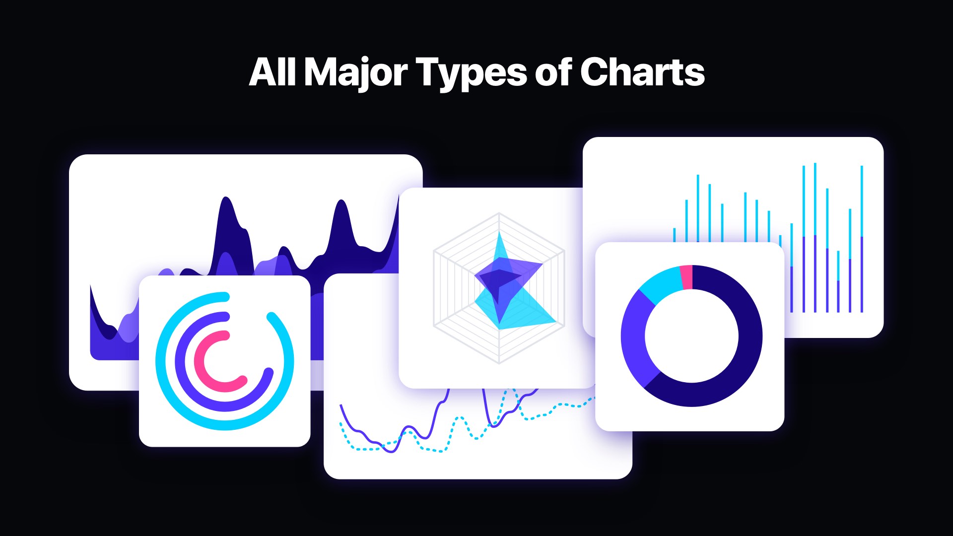
Customization is very simple. “📈 Charts” Page contains “Chart_Colors” artboard where you can change the color palette. It is the same technique as in the general color setup: drag the cursor around the whole Color Element to select all layers. Change the color fill and border using from the inspector panel. You can also change border width there. When you finish – update Layers Styles to apply all changes.
Illustration System Setup
Prime is the first Design System Kit that contains customizable elements for illustration purposes. It is included as a separate file. These elements were added to the Kit because more and more designers decide to put handmade visuals on the websites instead of stock photos.

With Prime Illustration System you get multiple human figures, various elements like plants, credit card, devices or abstract visuals and several subtle backgrounds.
All elements may be modified to match the brand style and color palette. To do this use the same technique as in the previous setup. Select Color Element. Change the color fill using from the inspector panel. Remember to update Layers Styles to apply changes.
Symbols
The Symbol Page in the main Library file contains all the essential elements of the UI Framework. They were organized automatically using Symbol Organizer Plugin. If you will add your elements to the Kit, install this plugin and reorganize Symbols so you will be able to use them more efficiently.
Why Prime was created?
It is obvious that Design Systems is the thing every designer should build for long-term projects. Making them from scratch is painful. There are some UI Frameworks aka “Design Systems” that also try to help designers. I have spent hours on testing multiple Sketch libraries, but I was not completely satisfied with them.
As you may know, UXMisfit.com has a mission to help designers, and Design System Kits are the key elements that may speed up the design process. The choice was obvious: make the first holistic design system kit that takes advantage of modern Sketch features.
After spending almost half thousand hours of testing multiple libraries, experimenting with various options (there were about 20 iterations of many components) and structuring it into the easy to use Kit, Prime is finally here to help you build better Design Systems.
To conclude
This is Prime. The guide shows how it works… but how it feels like? Do you know how it is to speed up the Lamborghini and hear its engine roar? Do you remember the first time when you unboxed your new MacBook and touched its aluminum surface? Now, enjoy new design experience with Prime.
By the way, 🎁 you can try it now 10% discount. Just use UXMISFIT10 offer code.
 Thanks for reading!


