We all see lots of great animations published on Dribbble, Bechance or Uplabs. However, there is much less motion in the apps or websites. During my professional work, I came up with a conclusion that there are two main reasons for this situation.
The first is the technical feasibility. Sometimes motion cannot be directly implemented in code. Thankfully this is changing for better. The second reason for that we use apps with mostly static pages is following: very often Stakeholders do not see the business value of motion implementation in the solutions.
Animations are often the first elements to throw away if the estimations are bigger than the budget. However, if we want to create solutions 10 times better than competitors, stakeholders should consider taking the risk. To explain why motion matters, this story contains an explanation of its real business value.
Let’s dive into the money in motion.
Motion helps to accomplish a task by providing visual clues
There are many situations when a user does not know what to do on the page. This may be the moment when the process is abandoned. If a user cannot accomplish the task, they can become frustrated and never come back to a website or an app. If that moment occurred during a purchase process, it would cause the loss of the potential income.
The good animation suggests what happened and what can be done next. Just take a look at the macOS dock and the bouncing icon of an iTunes that tries to inform us that the app needs your attention. Notice how the system windows are minimized, they provide a simple visual clue that shows where the element is hiding.
It builds an impression of higher quality
If the animation is natural and the elements move with ease, users have a better impression that leads to the belief of higher quality. Users may think that if someone was able to make this kind of animation, it was undoubtedly a very professional and talented team.
The lack of natural motion was the primary disadvantage of not native mobile apps. Users instantly noticed the lower quality of the solution. They did not think about that it was the same data presented or the same tasks accomplished. If there was no motion or animation lagged the conclusion was simple.
App feels to work faster
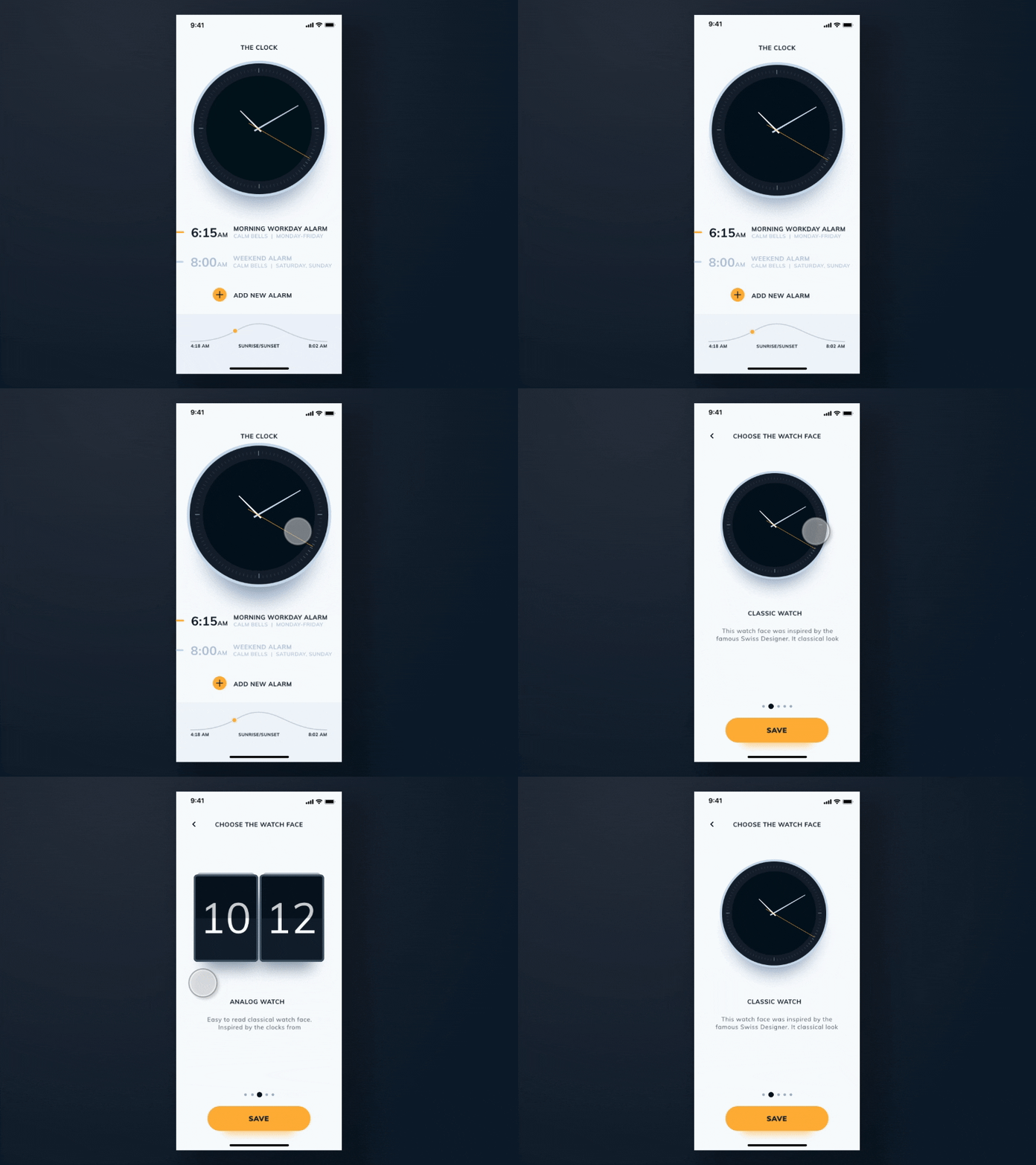
Users hate to wait. They require solutions to answer their actions immediately. Thanks to the animated transitions, an app may feel faster. The data load in the background while the animation continuous to play. Instead of showing blank screen by a 1 second, a user has an impression that he waited just a couple of milliseconds.
Note: Beware of overuse of this technique. Animations longer than 400ms may feel unnatural and frustrate users if they have to watch them every time they interact with the solution.
Animation ensures the user that the action has an effect
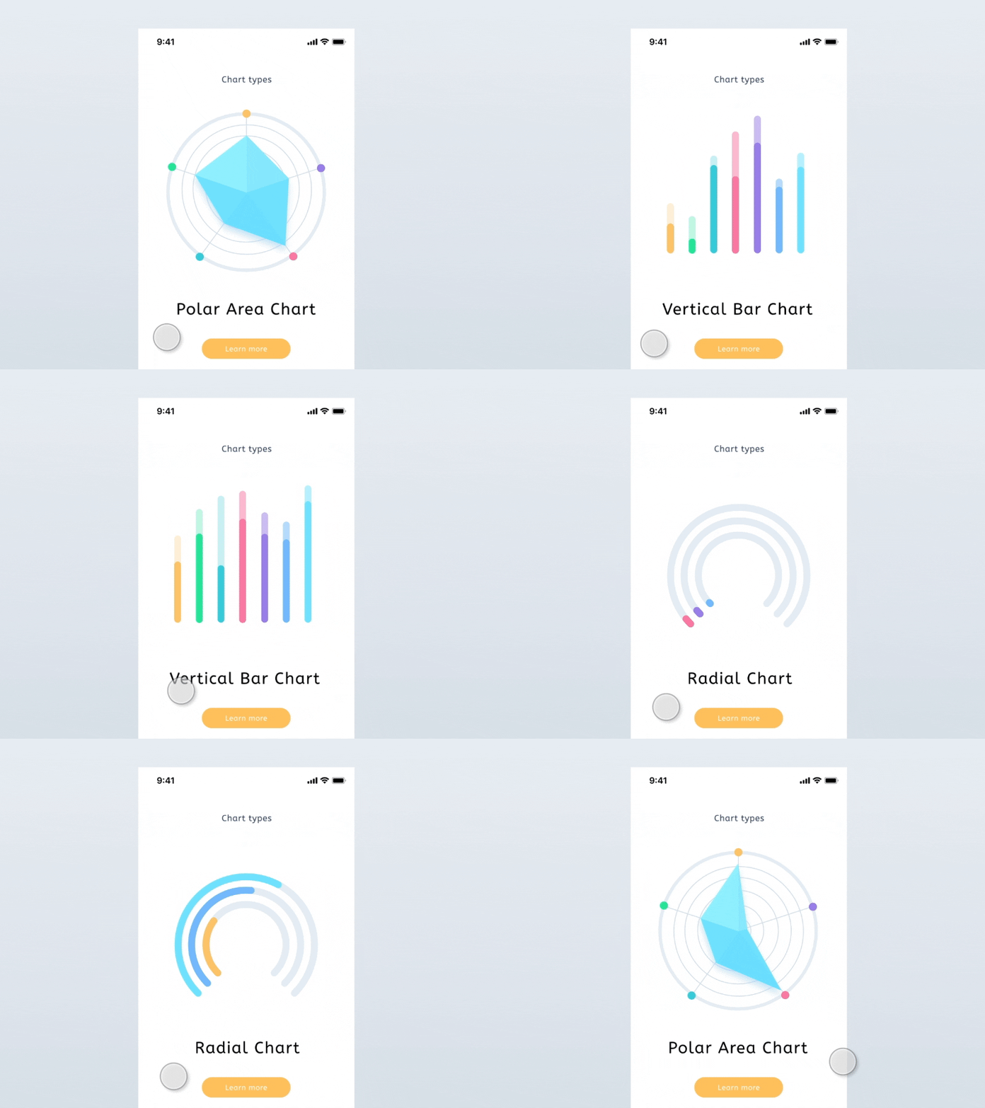
Users love to have control over the solution they use. It means that every initiated interaction should give the right feedback. Sometimes the button changing its color and displaying circle progress indicator is enough. It can prevent the user from abandoning the page and your business from losing the money.
This kind of motion can give a clue to the user that it is worth to wait for a while to finish what they started.

Design Faster in Figma and Sketch
Never start Your work from scratch. Use the Kit that already have 1500+ components with well structured styles, variants & auto layout.
Use Prime Design System Kit to boost your workflow. Create for Web, Mobile, and Desktop. You may use it as the entire UI Library for Design System or just create Landing Page for your next Client. Perfect for those who want to save time while creating UI designs and learn best practices of Figma and Sketch at the same time.
Motion helps to embrace the brand personality
Brands spend tons of money to design a unique appearance that will be remembered by the users. However, the way something move is also a part of the brand experience.
The holistic approach to branding process has to remember about all aspects of interaction with a customer, this may be sound, scent and of course motion. An animation may feel joyful, playful or professional and minimalistic.
Better customer satisfaction and engagement.
We all love to be served well, in a way that feels more than a standard. If we get more than we expected, we surely remember this particular moment.
Following example may also be a perfect case for animation. Friendly motion after accomplishing the particular task may bring the smile to the face of user. The more satisfied users are, more likely they return to the solution.
Motion that may ruin your business
The previous paragraphs mention mostly the positive aspect of the motion and its implementation in digital solutions. However, there are also some cases where bad motion may hurt your solution. Here are a couple of things to avoid:
- Lags – Lags are real engagement killer. If you make the motion, it has to animate with ease. It is even better to disable the motion if you cannot achieve smooth movement.
- Flashy motion – Every animation should have an intention. Making too much of motion or random ones may annoy users instead of amaze them.
- Expensive animation – the investment made in animation implementation may be worth its prize. However, if developers warn you about very serious costs that are required to implement a particular element consider alternatives.
- Overcomplicated motion – Simplicity is ultimate sophistication. Making animation that has a purpose is often a simple set of a few parameters. Do not make complicate choreography because it distracts users.
Do not like to waste your time during design work?
To improve design workflow and cooperation with front-end developers, you can use Motion Design Specification to make the communication more precise. **Time is money, so if the design process will be organized more smoothly (Specs always help with that), the return of investment should be higher. **
If you would like to read more about the making specs techniques here is the further reading:
Motion Design Specs – How to Present Animations and Interactions to Developers
UI Motion Design Specs – 2 Methods Comparison. Which one suits you?
To conclude
More and more solutions discover the value of animations that are not just a caprice of creators but has got a serious business value. Modern software libraries and SDKs allow developers to build more complex motion with ease. Now, there are also tools like Lottie that generates the file with animation directly from designers source files without any effort of a software developer.
It is the time to implement motion in the solutions wisely. If you found this matter interesting, feel free to discover more about motion design and how to prepare specification that may help developers implement it faster.
—
By the way…
Are you using Sketch in your daily work?
Designing digital solutions in Sketch is very effective, but no one wants to make boring and repeatable work. Time is a very precious asset for us – Designers. This is why beside writing UX articles I build time-saving design tools to make you a better and more efficient Designer.
Create User Flows faster in Sketch – With SQUID you can create User Flows directly in Sketch the sketch file with your artboards. Everything may be done within a couple of clicks. See how it works..
Create Web or Mobile Designs within minutes – Starting UI Design from scratch is boring. I wondered, how to skip this part of work to focus on more interesting tasks. Prime Design System Kit is the resource that lets you customize all essential UI elements quickly and jump right into the most engaging parts of the design process. What is more, it includes Charts, Device Templates, and Illustration Kit to speed up specific pieces of work. Thanks to Prime you create Web or Mobile design within minutes. See Prime in action.
Subscribe UXMisfit.com (and get some discounts)
Follow me on Medium
Follow me on Twitter
You can also follow me on Dribbble!
