There is an old saying that good design should be long-lasting. Dieter Rams specify that Designers creations should void being fashionable. This way the product will never become antiquated.
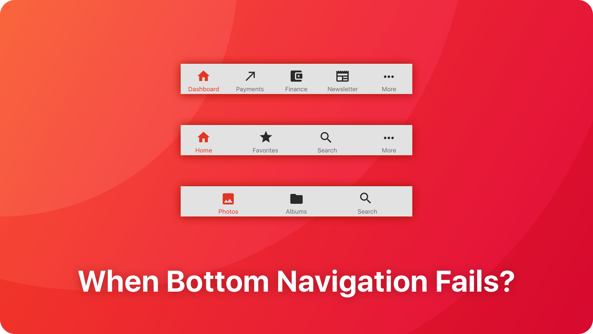
A few years ago there was a big hype around the Side Menu in mobile apps. Now, it seems that bottom navigation has become a new trend. Should we implement this pattern in all types of apps? Or maybe this is just a next transient fashion?
Bottom Navigation Principles
Before we dive into a little critique, let’s explain what the characteristics of this Bottom Navigation are.
Material Design
Bottom Navigation Bar is one of the newest patterns in Google’s Visual Framework. It lets to explore top-level views in just one tap.
Material Design Guidelines recommends displaying from 3 to 5 elements. If the app has got only two major destinations, it should use Material’s “Tab” pattern. This one is displayed at the top of the screen (inside or below the App Bar).
The height of the Bottom Navigation Bar is 56dp. It should guarantee proper touch area. The size of an icon is 24dp, the text label has got 14sp (selected element) and 12 sp (inactive elements).
Selected tab should tint the active icon with the app’s primary color. The rest of the icons should have the same color. Google recommends that should lead to destinations that require direct access from anywhere in the app.
What is more, it is allowed to display only icons (without text labels) in Bottom Navigation Bar. The pattern may be also hidden when the list or grid is scrolling downward and reveals after upward scroll. On Android, Bottom Navigation does not react to the pressing “Back” button. It is designed this way because it navigates parallel windows of the solution. Finally, Material Design guidelines suggest not to use the last element as the “more” option – this should be the function of the Navigation Drawer (Material Design version of Side Menu).
This UI pattern is specially dedicated for mobile use. Google recommends to avoid it on a desktop (Designers should use sidebars there).

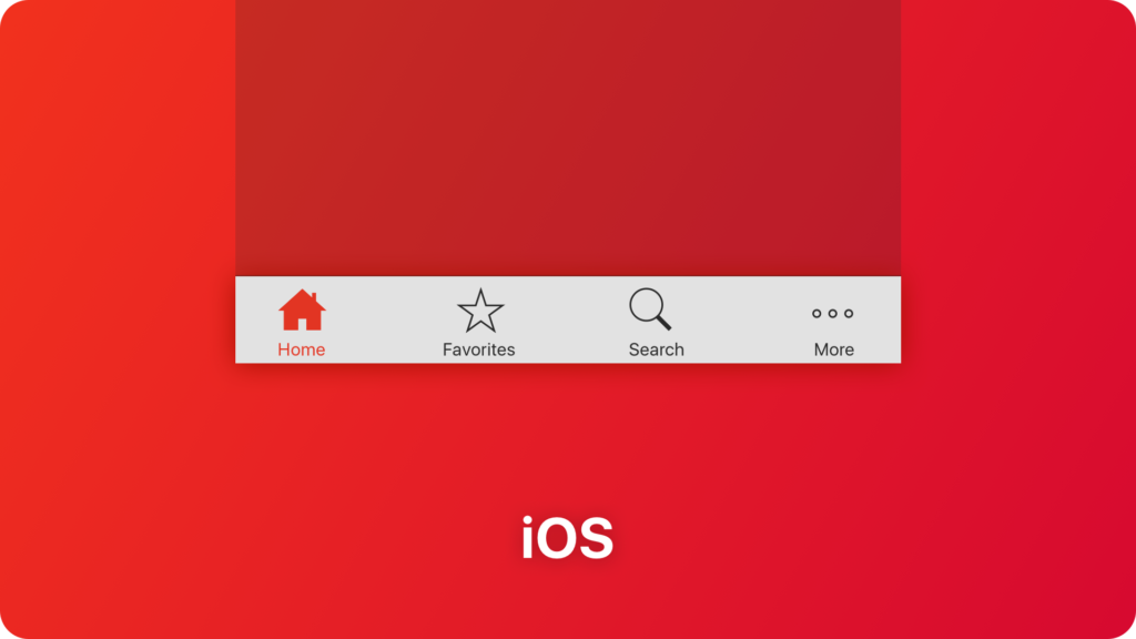
iOS
Bottom Navigation UI element in iOS is well known as the Tab Bar. It is implemented in Apple’s Mobile OS from the beginning. This navigation pattern has passed a few visual tweaks, but it’s principles remain the same.
Tab Bars are placed at the bottom of the screen. It gives an ability to switch between major windows of the app quickly. The selected tab has got a different color than the rest ones. This way it gains an informative function.
Apple recommends using the Bottom Navigation pattern to organize the information at the top level of the app navigation. Tab Bar should be used only for navigation purpose. Do not implement any actions for the window content there.
Human Interface Guidelines tells that the app should not hide or disable a tab when its function is not available. Tabs should have the same content across the whole solution. Only then your product will feel stable & reliable in the eyes of your users.
Recommended size of the icon should be around 25pt. Text labels have about 10pt. Whole height of the Tab Bar is 49pt.
Use between 3 and 5 tabs in the bottom navigation. Less than three elements will feel not natural, more than five will be hard to tap. If there are more sections of your solution, the last of 5 tabs should be a “More” option that will lead to the menu of remaining position.
Common Pain Points of Bottom Navigation
After acknowledgment with core principles of Bottom Navigation, you may notice that it is straightforward and easy to use pattern. But, there are also some disadvantages.
Confusing Navigation Structure
While the recommendation of including only 3 or 5 top-level navigation elements in this UI pattern is very rational. Personally, I do not understand why it should be displayed in the whole app. The space on mobile devices is still precious, and deeper levels of navigation do not need the bottom bar.
The application navigation will be much cleaner when the bar is displayed only on the destinations which are presented in the tabs. Parallel navigation should not mix with the hierarchical one. This way the user will be able to build a mental model of the app faster.
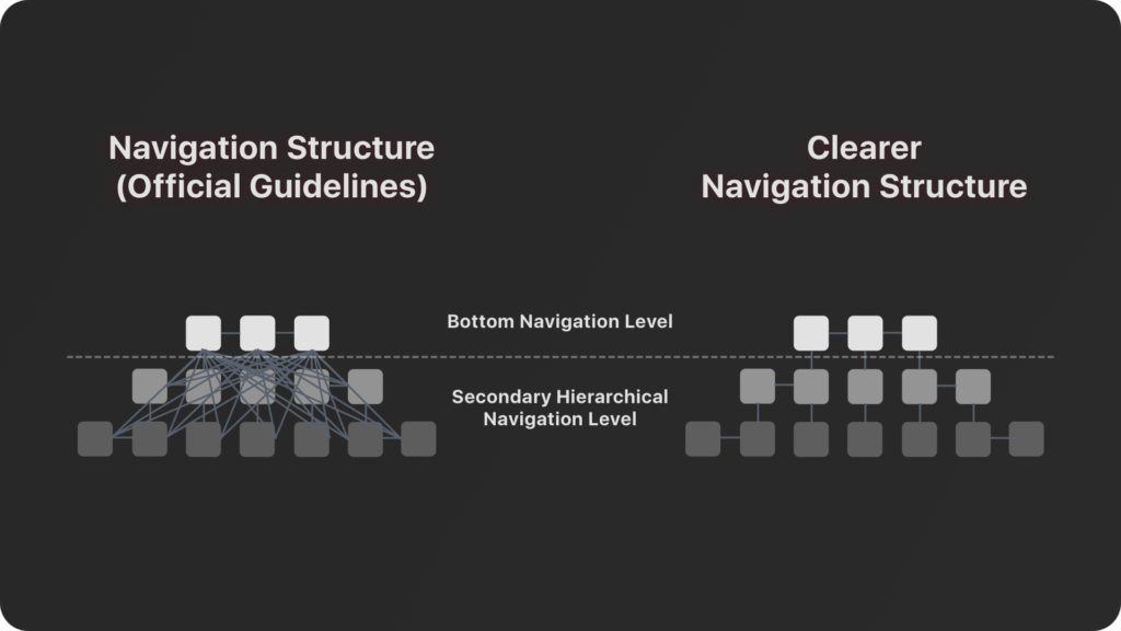
As you can see from the image above the Bottom Navigation would become a little bit clearer.
The Bar Takes Too Much Precious Space of The Smartphone Screen
Both, Google and Apple recommend displaying Bottom Navigation Bar on all of the screens. Tab Bar on iOS takes about 50pt, Material Design 56dp. It is still a noticeable UI element, that takes quite a significant amount of precious space.
I believe that we may successfully extend some rules of iOS and Material Design. As I mentioned, We should display bottom bar only when it is a window that is included in the tabs. The rest of the screens do not need that.
Too Small Text
Text labels presented with only 12sp may be hard to read by a lot of people. What is more, the iOS Tab Bar guidelines with its only 10pt for text is only worse.
For the fresh users that learn the app, the icon may not be enough to guess what destination is triggered after tapping on the particular item. Small, hard to read text should not be used for the primary element of the app.
Every Navigation Pattern should be designed to be easily used by all of the users. Some time ago I wrote some useful tips about making apps more accessible for everyone. If you would like to know more about these principles, feel free to read this article – Design Apps That Do Not SUX. Accessibility on Mobile.
Lack of Text
While iOS Tab Bar guidelines recommend displaying text below an icon, Material Design principles allow showing only symbols for the item that are not selected.
This decision may lower user engagement because everyone has to guess what hides behind the icon. Not every icon has got a clear meaning to users. Some of them will not have enough courage or motivation to discover what is the symbol.
Accidental Touches (Especially on Android)
I remember the series of articles covering tabs pattern introduced in Holo UI Style. Lots of them said that Android apps should never implement tabs at the bottom of the screen, because the elements may be accidentally touched when a user would like to press one of 3 system buttons.
It is confusing why Google decided to break its initial guidelines. I have seen in my eyes people that pressed the wrong button because it was close to the bottom navigation.
Tab Bar is Easily Confused with iOS Toolbar.
The situation is better on iOS, but it is not perfect. Tab Bar is often confused with Toolbar, because of the visual similarity of these two UI elements.
However, the function of the Toolbar is very different. It was created to present icons that perform actions relevant to the content of the screen. Tab Bar is created to be used as the navigation element.
When Not To Use Bottom Navigation
Do not implement blindly this UI pattern in every project you design. There are some cases when Bottom Navigation Bar is redundant.
If your app has the one major feature does not use Bottom Navigation. When your users should spend more than 90% of their time in the app in the one window, you should never use this pattern. The most obvious examples of this type of apps are mailboxes and chats.
You should also avoid using Bottom Navigation Bar for projects that are not dedicated for mobile devices. Bottom tabs on wider screens look strange and take to much space without any additional benefits.
What to use instead of Bottom Navigation
If you already discovered that your app does not need mentioned UI element, what another navigation pattern should be used instead?
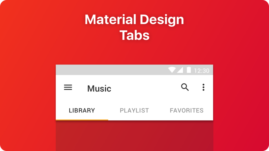
Tabs (Android)
If your solution has only two major features or more than five but less than 7 (Bottom Navigation should have from 3 to 5 elements) – use the Tabs pattern known from Material Design.
Tabs also make the app easy to explore. Switching between views in simple. Tabs are presented near the app bar, so the whole navigation elements are nearby. What’s more, they may be scrolled. While Bottom Navigation does not allow this type of interaction, tabs guidelines recommend this behavior in some situations.
Moreover, Tabs may be displayed on mobile, tablets and desktops. If you would like to maintain more visual consistency to your omnichannel service, this UI element may be a rational choice.
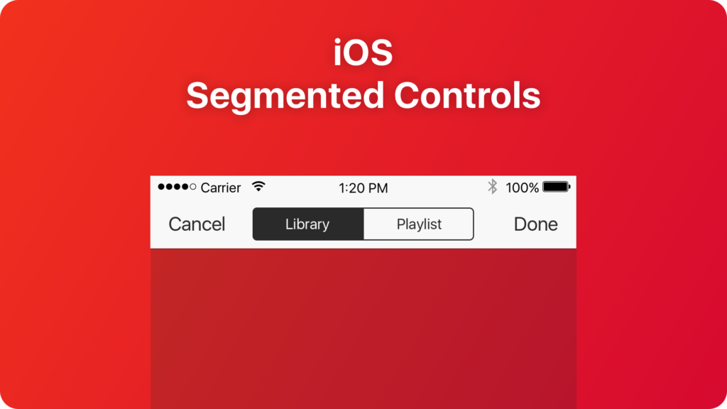
Segmented Controls (iOS)
Use it if the content of your solution has to organized in a different way and it is the main feature of your solution.
The Segmented control is a view that is a set of at least two segments. A single segment may contain text or images. All elements are always equal width. Segmented controls are commonly used to present different views. It may be used to switch between categories of the products (Free, Best Selling, Promotion) or to organize the content of your music app (Playlist, Library).
Side Menu
There are lots of blog posts with a critical opinion regarding this UI pattern. But, is it always a bad thing to use Side Menu?
What if your solution has got only one major feature? If you would like to hide the additional and unnecessary complexity of the solution. Simply, hide the features that are not used frequently in the Side Menu.
The excellent example of effective Side Menu implementation is the Slack mobile app. You spend most of your time on a conversation, so there is no need to place redundant bottom navigation bar on the screen. However, there is still some option that should be easy to reach when you need them.
Do not be afraid of Side Menus, just use them wisely.
Useful Techniques of Improving Bottom Navigation Behavior
Now, when you are familiar with some defects of Bottom Navigation and its alternatives. Let’s consider how to improve a bit its behavior to become more user-friendly.
Hide on Scroll
One of the main disadvantages of Bottom Navigation Bar is its continuous presence on the screen. However, there is a way to enhance it.
As I mentioned earlier, Material Design has tempting advice regarding this case. Some apps start to hide the bar when a user scrolls down the list. Thanks to this, a user gains more space to consume the content he started to browse a moment ago. What is more, he is not distracted by a visual element at the bottom of the view.
How to make the Bottom Navigation visible again? The user has to scroll up a bit the list, and everything appears again. Very elegant and foreseeing strategy.
Progressive icon with disappearing text label
The first few times of the navigating the app may be a bit tedious and slow because the user discovers the solution. But, he learns the product in time.
So why do not make the use of the user’s memory and knowledge?
Let’s imagine the following situation:
You use the app with the bottom bar frequently. Its bottom navigation bar contains a detailed icon and text label. After a few weeks, you remember where is the desired view or the action. You start to use the product automatically. Then, a month later you recommend to your friend to install the app on his device. When he launches the main screen, and you compare it with your own. There is a surprise!
Your app has got clean, minimalistic icons without text labels. The second one has got more detailed icons with clearly displayed description. You did not notice the difference earlier. What happened?

The app detects that your memory has got the right mental model of the app and you do not read text labels below the icons. After a few weeks, it changed the labels to smaller ones. The efficiency of use did not drop, so a few weeks later all descriptions below the icons disappeared completely. You still use the app intuitively, that’s the power of the habit.
Have you seen the apps acting like that?
There is a similar case in the market. Open your Facebook iOS app. You will notice that the icons in the bottom bar do not have any descriptions. But if you see the archival screenshots of the bottom bar has got both – the icons and the text labels.

Design Faster in Figma and Sketch
Never start Your work from scratch. Use the Kit that already have 1500+ components with well structured styles, variants & auto layout.
Use Prime Design System Kit to boost your workflow. Create for Web, Mobile, and Desktop. You may use it as the entire UI Library for Design System or just create Landing Page for your next Client. Perfect for those who want to save time while creating UI designs and learn best practices of Figma and Sketch at the same time.
Is The Bottom Navigation Bar So Bad?
Winston Churchill said, “Democracy is the worst form of government, except for all the others.”. The similar situation is with Bottom Navigation Bar.
Its aesthetics do not stand out. The bar takes the precious place on the screen, and the symbols with tiny text may not be perfectly readable. But, it is a useful and easy to understand UI component. It solves many issues and engages users incomparably better than the Side Menu.
Designers should still use Bottom Navigation as the fundamental UI pattern to navigate between major screens. However, it is important to remember about disadvantages of this UI component.
To sum up
You should never blindly follow trends in UX Design. Some of them will remain and become a standard; some will be forgotten after a few months.
Use the Bottom Navigation wisely. It may be a powerful tool to engage your users in your app. But, it is important to know its limits and to overcome some disadvantages.
If you are like me and you constantly search for the unique insight into UX & UI Design, I am happy to announce that I am there is a community around the UX Misfit blog. If you would like to read and share some inspiring stuff with people like you – please join UX Misfits Community on Facebook.
I am really curious what are your experiences with the Bottom Navigation Bar pattern. Do you agree with the mentioned observations? Please let me know in comments. Thanks!
Similar articles:


