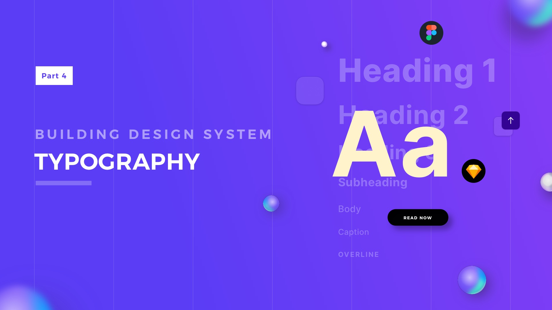
Have you ever thought that over 90% of UI Design is about Typography? There are two things certain in design, colors & typography. You might have a chance to learn about colors from a previous article. This time let’s focus on putting text styles into your Design System!
This is the series of articles helping you to create your own Design System UI Library, previous parts:
Good Naming Convention
A well-designed naming convention is a key to efficient UI Design based on the Design System. Prepare names of your text styles for specific projects and platforms.
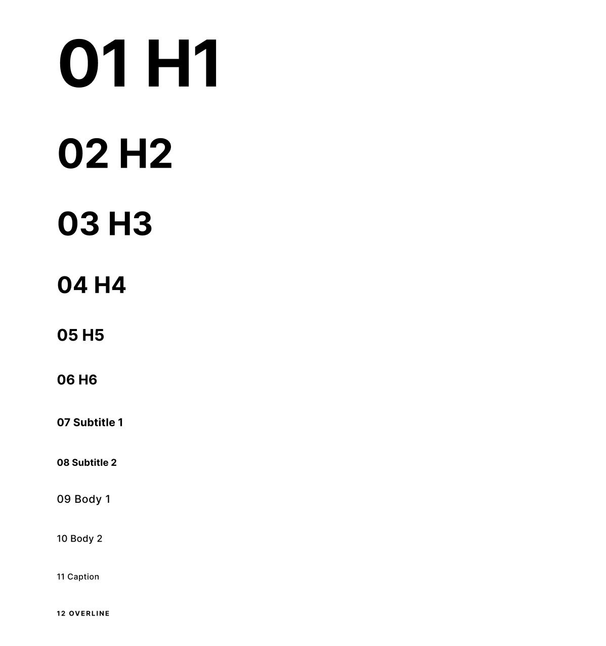
The key tactic I use to define the naming convention is numeric order. Thanks to this text, styles are ordered from the biggest one (for example 01 Heading 1), to the smallest text style (12 Overline)
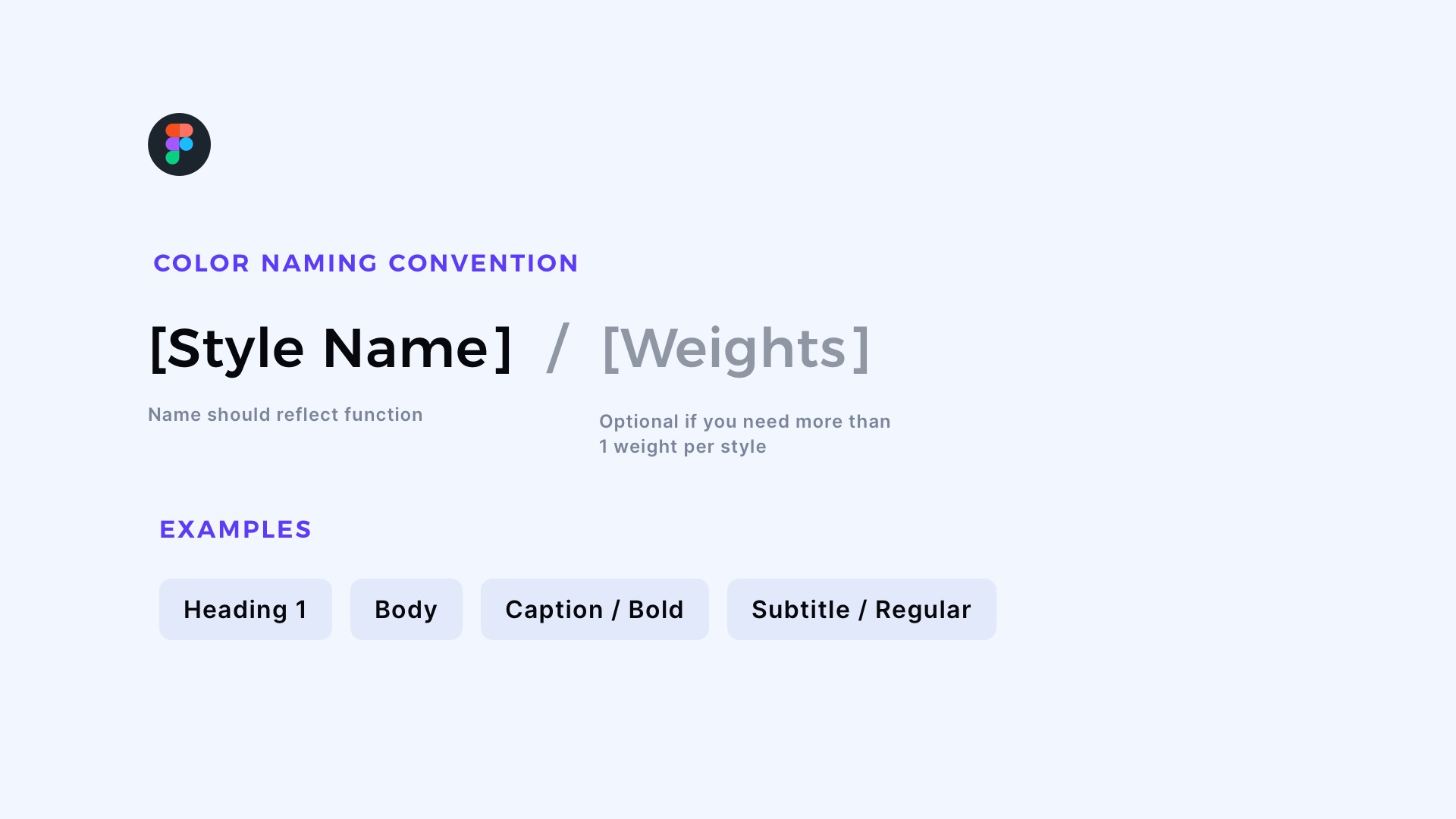
If you use Figma, things are pretty simple. Text Styles in this design tool require defining only typeface, size & some additional parameters. Colors & alignment are independent.
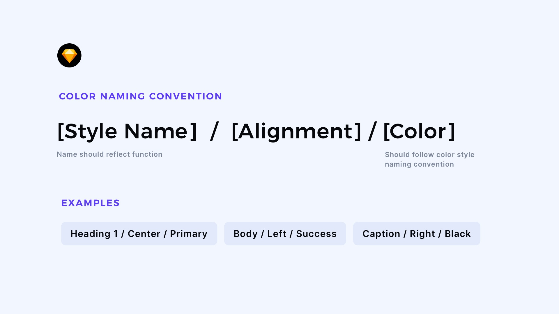
When you use Sketch, creating Text Styles is a bit more complex, and you have to create much more of them. You have to define the color & alignment of a specific style inside. The naming convention in Sketch will be following:
[Name of the style]/[Alignment]/[Color]
For example: 09 Body/Center/Primary
Keep in mind that the part with colors should be named with the same naming convention as Layer Styles & Color Variables. I mentioned the strategy in the article for Design System Colors
I usually set the whole typography scale with the based visual style of text content: H1, H2, H3… H6, Subtile, Body, Caption, and Overline.
However, there may be some utility styles related to specific components like buttons, actions, etc.
Choose the Right Typeface
Picking the typeface is the key to building the brand awareness and personality of the app.
If your project already has fonts that may be used in the Design System, include them in UI Library. If not, take your time to find the best one for a specific product.
When searching for a good typeface, you have to remember that the font has to support a specific language. You should also pay attention to the number of weights/styles, so your UI Library will be flexible enough.
If you design for mobile, the first choice may be the system-related font of Android or iOS. However, do not limit yourself. Look at the other apps – the majority of them use brand-related fonts.

Get Free Chapter
15,000+ designers are already subscribed (no spam! Only design tips, tutorials + design resource news).
Join now, get the free chapter of my eBook right to your inbox. With these tactics, you will solve common design issues with ease.
Sign up - Get Free Chapter
How many Font Families for Design System?
There is always a temptation to put multiple typefaces in UI Library. I would like to encourage you to start with only one and, if needed, expand to a maximum of 2 font families.
One may be used for headings, the second font for other text styles. Choosing no more than two families will help you to maintain consistency across Design System. However, one font family may be enough. In my design system, I picked Inter font – it is a pretty universal and modern one – a great choice to start playing with UI.
Typographic scale
Creating a Typography scale is always challenging. You have to think about the platforms on which your product will run – mobile, web, desktop, or maybe even watch?
If you are unsure how to build solid scale, use the tools that will create the base for you. Once created, you may adapt them to your needs. I use the following generators for the Typography scale:
What if I use Design System Kit?
Design System Kits are great starting points for your projects. They require customization, which should take a few minutes, and you are ready to design a product.
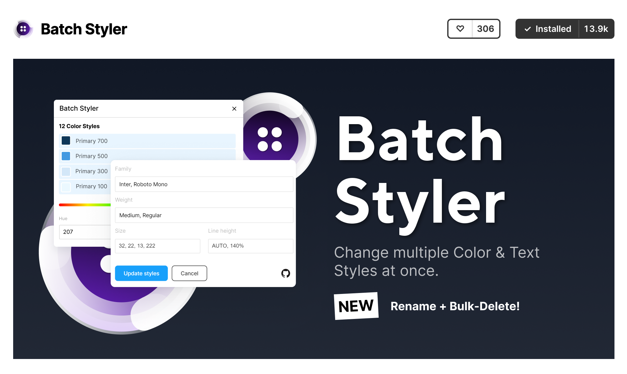
If you use this type of Kit in Figma, for customization of your UI Library, use plugin Batch Styler. It lets you select the specific styles (like Text Styles) and modify parameters, like font type, within a few clicks!
Additional Practical Tips
If you would like to create your Typography System from scratch, I have prepared a bunch of tips for you. Thanks to this, you will gain confidence while creating your UI Library.
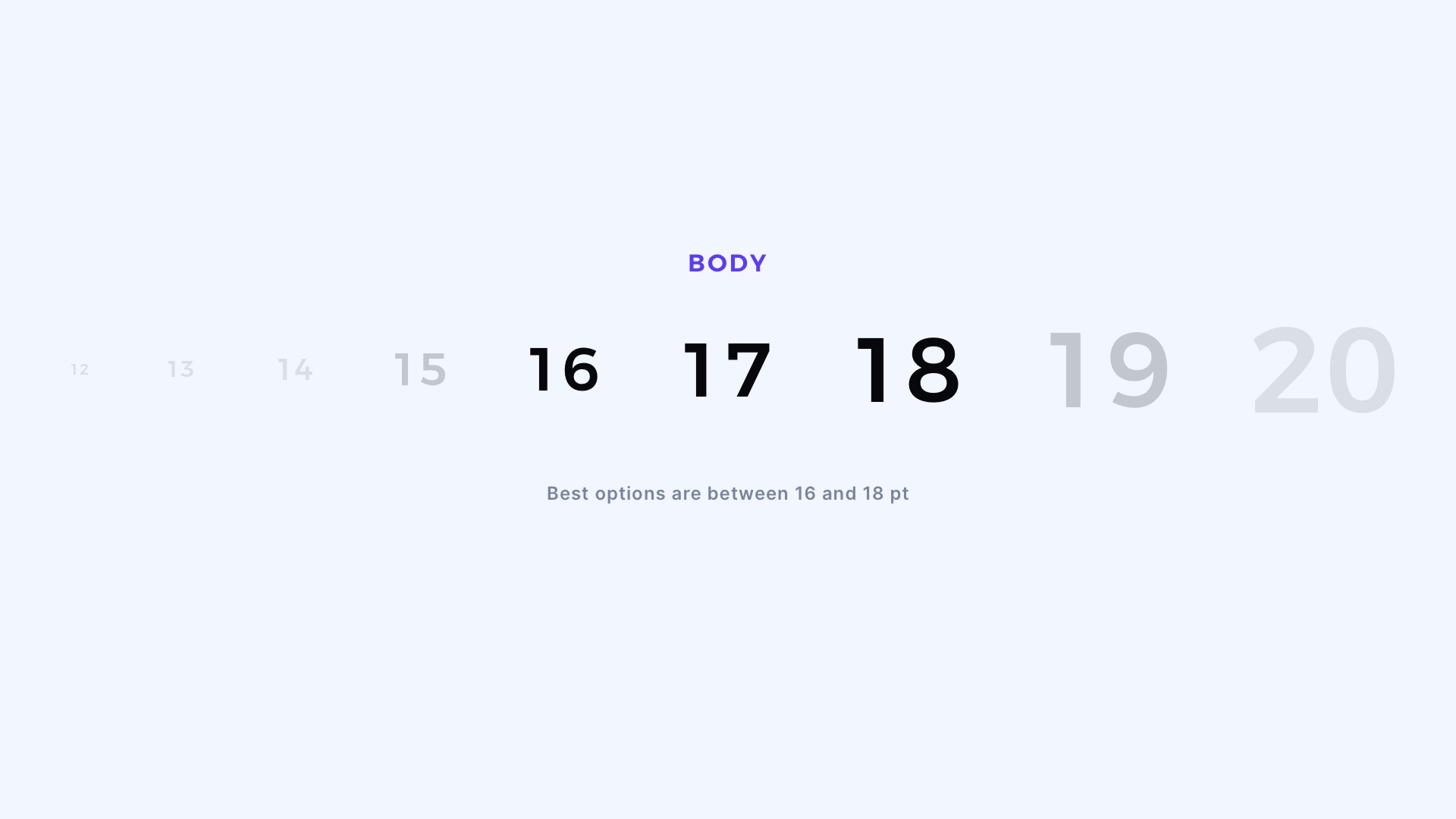
Set Body Font to 16-18pt
Keep the size of your Body Text Style between the above values. Thanks to this, you will ensure the good readability of your designs.
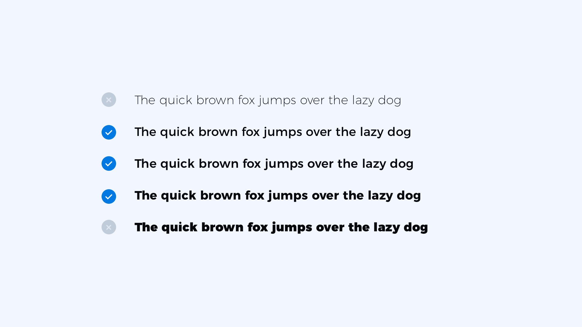
Avoid Ultra Light & Black weights
These extreme weights make the text hard to read. If your goal is to ensure a good clarity of design, avoid creating styles like this.
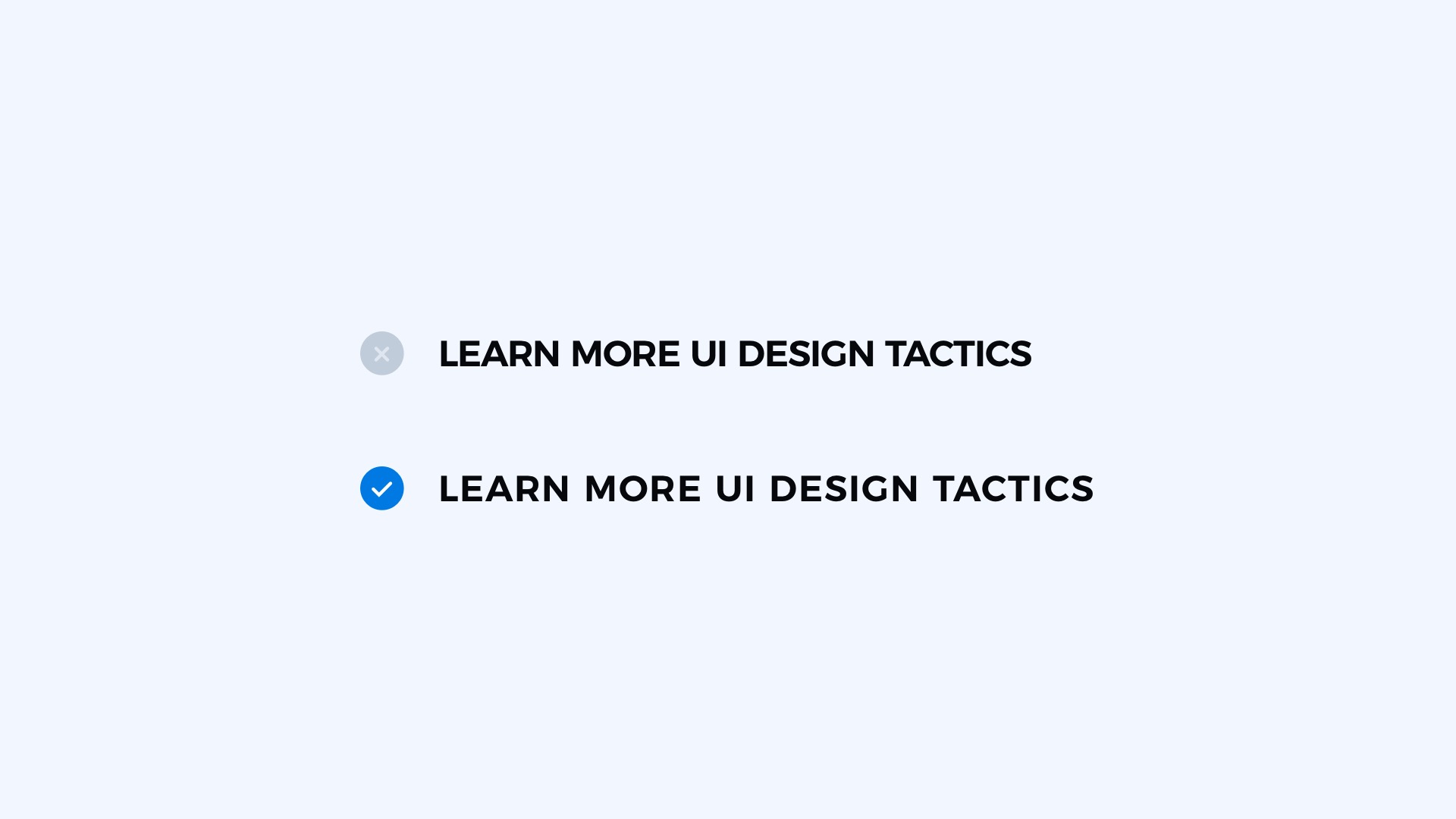
Increase Tracking for Uppercase
Uppercase letters are always a bit harder to read. Increase letter spacing a bit for this style and see how it improve readability.
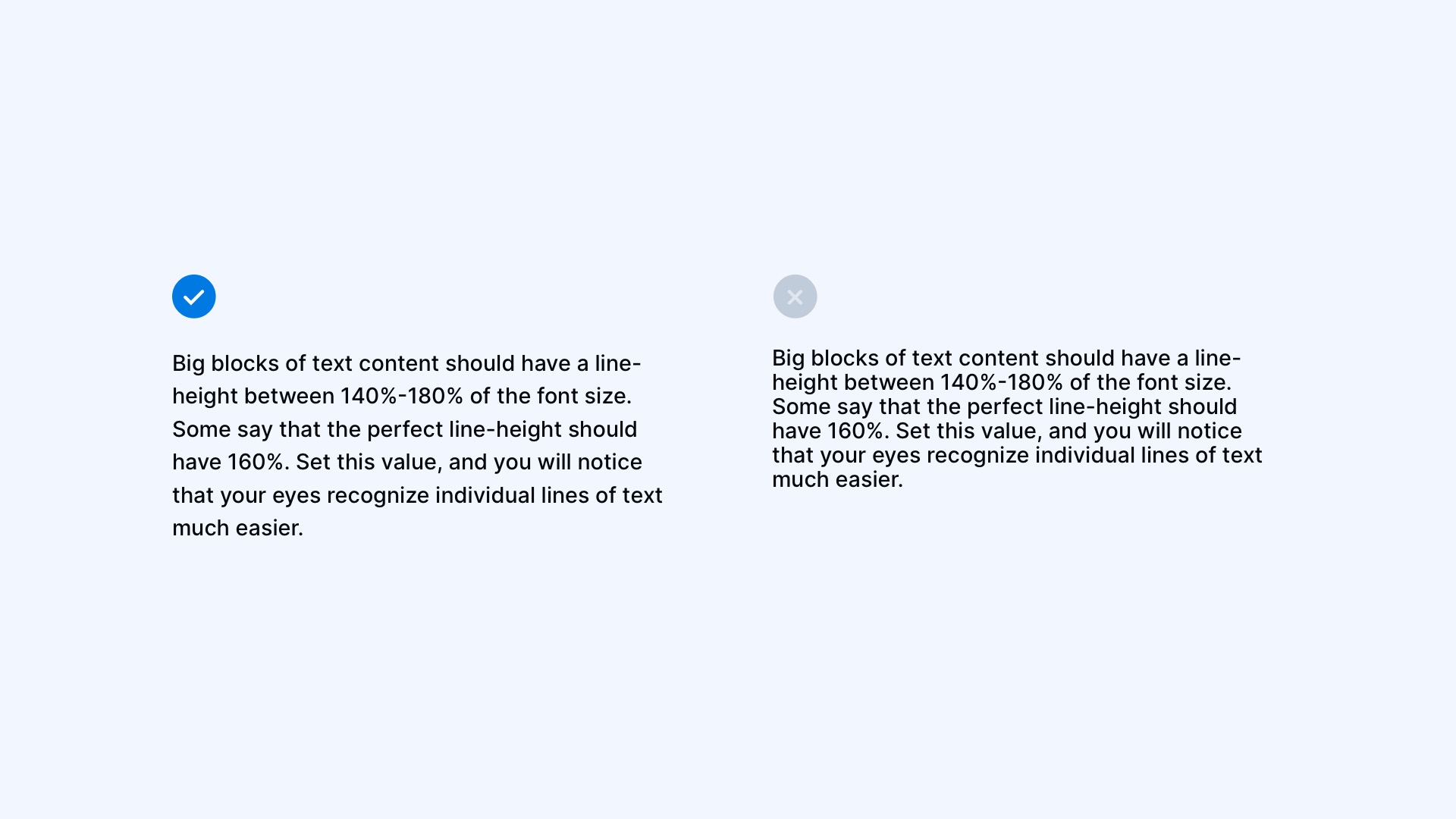
Set Good Line-Height
Big blocks of text content should have a line height between 140%-180% of the font size. Some say that the perfect line height should have 160%. Set this value, and you will notice that your eyes recognize individual lines of text much easier.
To sum up
Now you know how to create Typography System for your UI Library. You know how to pick the font and set the naming convention. A bunch of good practices will guide you in specific cases.
If you want to expand your typography knowledge, feel free to read the practical guide.
Good luck with your design system!
By the way…
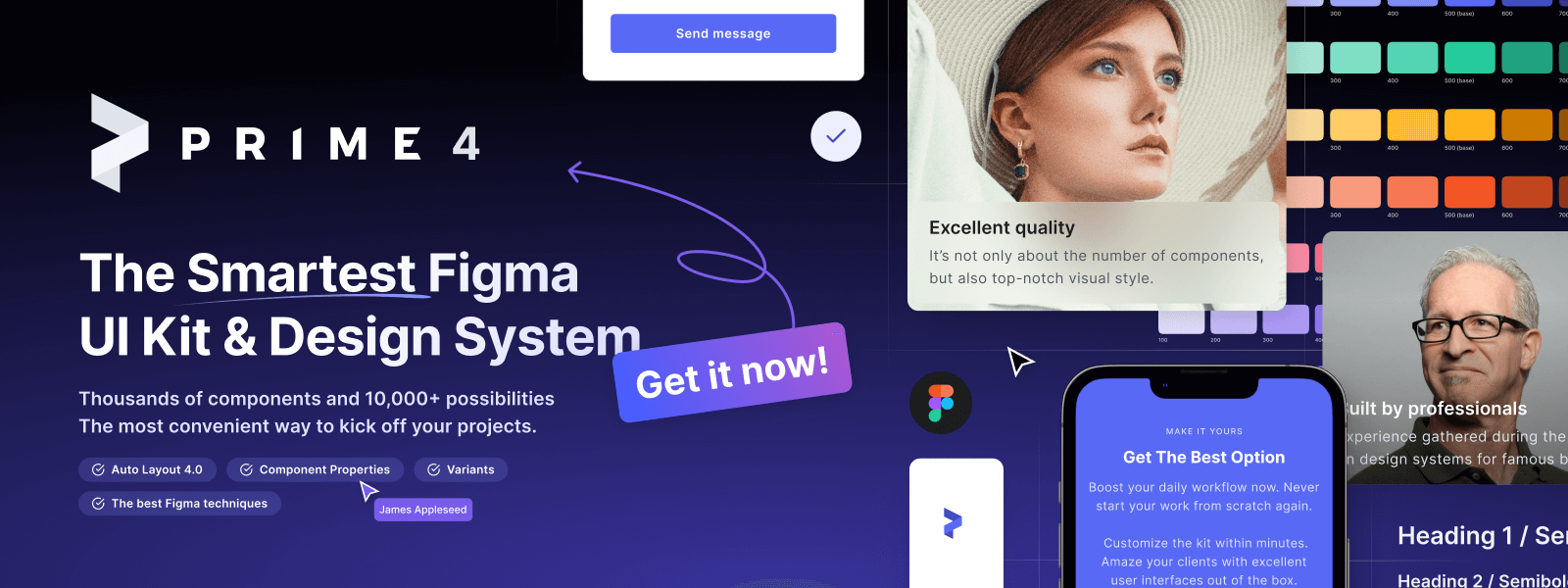
If you start a new project or would like to organize your UI Library in Figma — do not waste your time creating everything from scratch. Feel free to use the Prime — Design System Kit. It helps you design UI with the best Figma techniques — Component Properties, Variants, Auto Layout and more.See Prime in action.
To make it easier there is a gift 🎁 - Use UXMISFIT10 offer code to get 10% Off.
You can also Create User Flows faster in Figma & Sketch — With SQUID you can create User Flows directly in your favorite design tool. You may style them to your project brand within a couple of clicks. Prepare all kind of diagrams in minutes. See how it works.


