
Actionable tips to power up your design skills
Have you ever wondered why your designs do not look like the top-quality designs made by top UI Design Freelancers? Well, there are tiny details that distinguish average UI Designers from the best ones. With these series of tips, I will share with you over a decade of my tricks in making UI Design one step ahead of your competitors.
Do not forget to join the newsletter, so you will be notified about the next fresh portion of UI Design Tactics.
First, As we did in the first part of the UI Design Tactics, I would like you to turn on your creative brain and try to figure out on your own which UI design is better. Feel free to leave your thoughts in the comments!
Are you ready to see which one are good practices with some additional explanation? If yes, scroll down. If you are not sure, take your time. If you want to learn something truly (not only read & forget), take your time to analyze the content.
Ok, let’s move to the 🔥 UI Design Tactics!
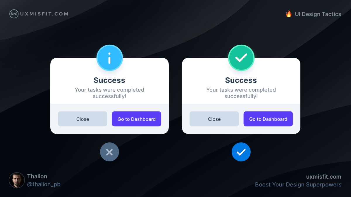
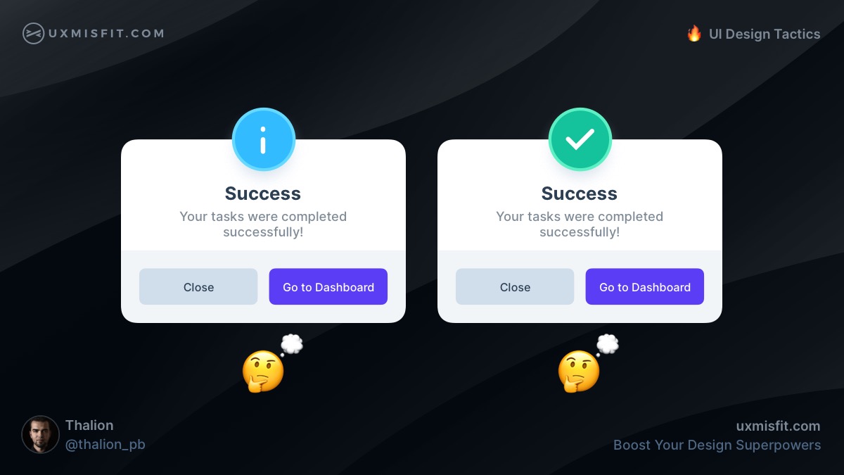
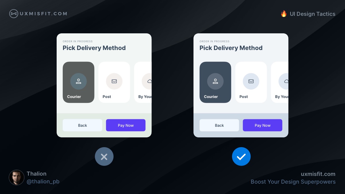
Add more context to the message you present to the user.
Both modals from the image above look pretty similar. The only difference is the status icon. The left symbol is generic. The one on the right is much more contextual.
This positive green symbol with a checkmark suggests user that the message is positive, even without reading the rest of the content.
Remember, communication is more than text. Images, icons, or illustrations will help immediately recognize the status of the performed action. Always help users recognize the intention.
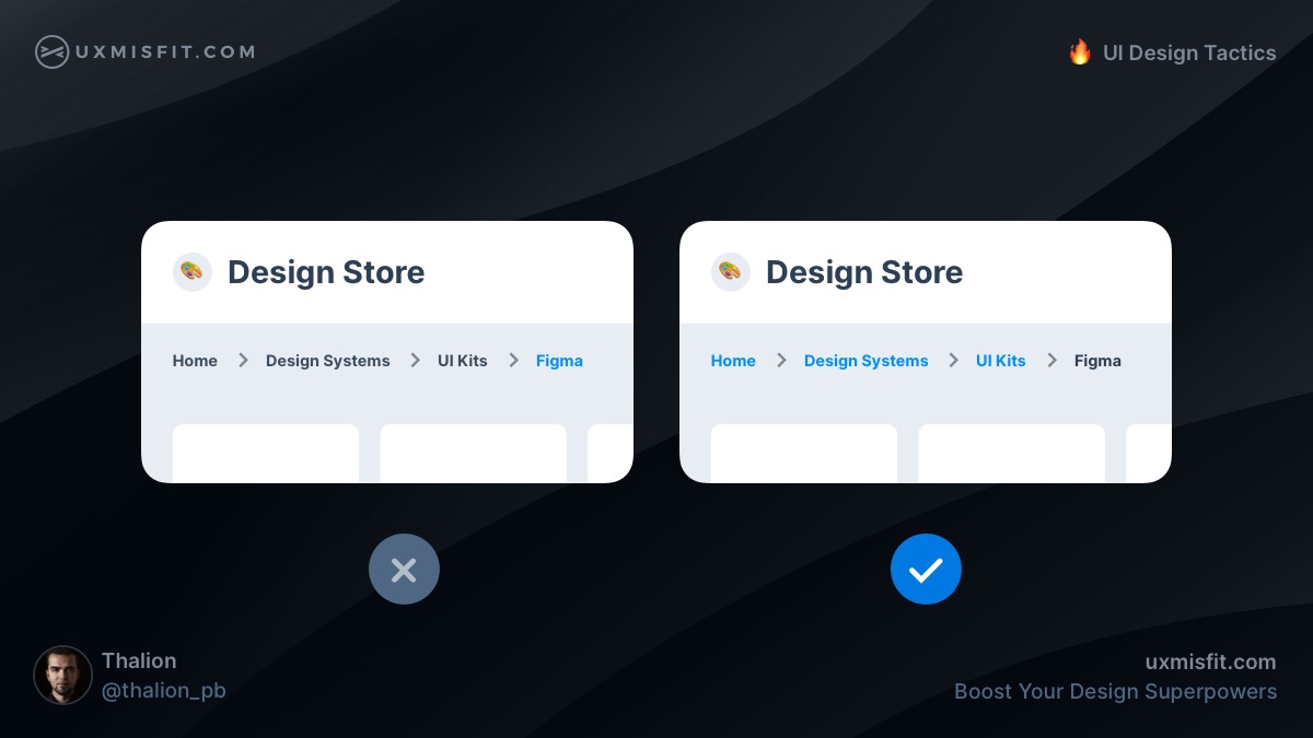
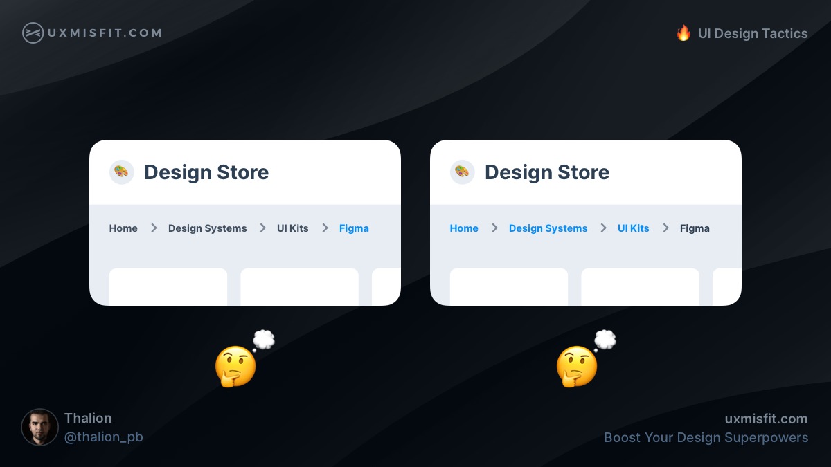
Use the color of the links for active breadcrumbs
This tactic depends on the context and goals of the specific solution. However, if you want to help users to browse through categories, use the color that you apply to links in the breadcrumbs.
Thanks to this, you will inform the user where he is and suggest where they may go from this point.
Avoid default presets for shadows. Apply soft ones
Shadow default preset in all design tools is ugly.
Learn to make soft shadows by blurring the layer behind the panel or use a few shadow layers to create a smooth effect.
Do your developers complain about the soft shadows?
Show them how to make them in css
Use the same hue for neutrals across the solution
Neutral colors help to establish balance in User Interface. However, it is easy to ruin this harmony by using various hues of gray.
Keep the same hue of neutral colors across the entire solution.
To make it easier, switch the color picker in your design tool to HSB.
This trick helps establish visual balance & makes it more attractive.
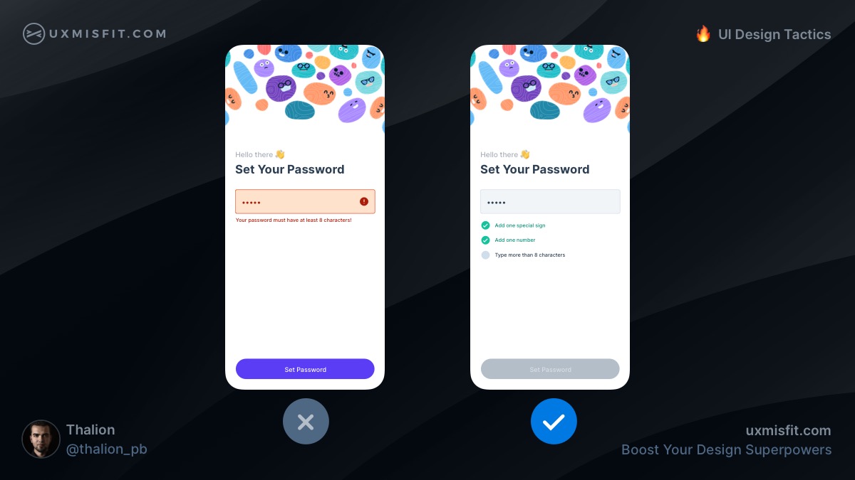
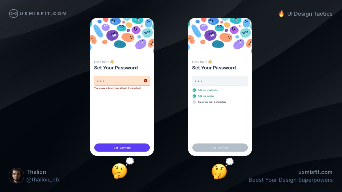
Guide user instead of showing errors
When your solution has got strict rules, like in the case of creating a password. Inform the user about the constraints and show the level of compliance. This way, users will feel comfortable using your app.
Avoid displaying errors in these cases. This is not the user’s fault that they didn’t know the rules!

Get Free Chapter
15,000+ designers are already subscribed (no spam! Only design tips, tutorials + design resource news).
Join now, get the free chapter of my eBook right to your inbox. With these tactics, you will solve common design issues with ease.
Sign up - Get Free Chapter
Prefer to watch it as a video?
Here you may watch UI Design Tactics on my YouTube channel. If you would like to see more tutorials like this, don’t forget to subscribe!
Summing up
These are the next 5 UI Design Tactics. These actionable UI Design Tips will help you move your skills to the next level. You will design more confident & spent less time trying to figure out which detail is better.
If you would like to get 100 UI Design Tactics, peorder the book and save $20! You may also grab a free chapter to start learning.
Do not forget to sign up for the newsletter to get more soon!
By the way…
If you start a new project or would like to organize your UI Library in Figma — do not waste your time creating everything from scratch. Feel free to use the Prime — Design System Kit. It helps you design UI with the best Figma techniques — Component Properties, Variants, Auto Layout and more.See Prime in action.
To make it easier there is a gift 🎁 - Use UXMISFIT10 offer code to get 10% Off.

You can also Create User Flows faster in Figma & Sketch — With SQUID you can create User Flows directly in your favorite design tool. You may style them to your project brand within a couple of clicks. Prepare all kind of diagrams in minutes. See how it works.


