Creating a Design System on your own is a long process. That’s why choosing the right tool is so important. Which tool should you use? There is no simple answer. It depends on your (and your team) needs, the requirements of your company, etc. Today I will cover the basic pros & cons of creating a Design System in Figma and Sketch, which are currently the most popular tool for digital design.
This article is part of the series about Building Design Systems, previous parts:
What is Figma?
Creators of the design tool say that Figma is a collaborative interface design tool. Indeed from its beginning, Figma offers Real-Time Collaboration – the feature that allows your team to work on the same file at the same time. It is worth to mention Figma is available for almost all platforms because you may launch it in the browser!
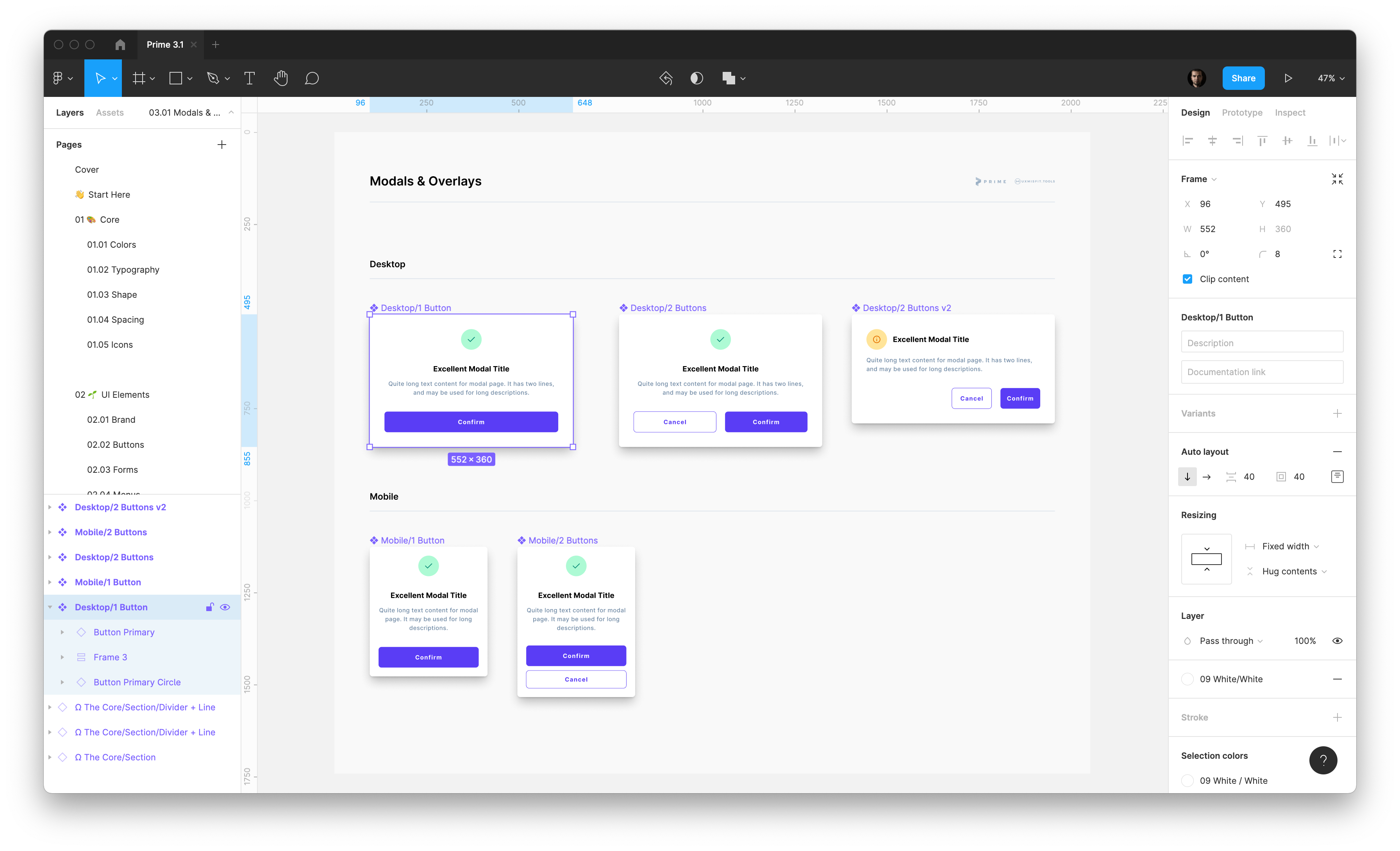
Figma includes a free Starter Plan, that has its limits, but for those who would like to start their UI Design career, it will be enough. In time you will be encouraged to jump into one of the paid options (subscriptions).
This design tool is famous for its Community feature, which is available right inside the software. You may get some free resources there or install plugins (In the following sections, I will cover some plugins that will help you build your own design system).
✅ Pros
- Works on all platforms (in browser, Mac & Windows apps)
- Smooth collaboration with the whole team
- Very fast
- Huge growing base of resources & plugins
❌ Cons
- Poor for offline work
- Not native experience
What is Sketch?
Sketch is the digital design tool, and its primary usage is UI and UX Design of mobile, web, desktop, and wearables. Sketch is vector-based. Thanks to this, all graphics are easily scalable.
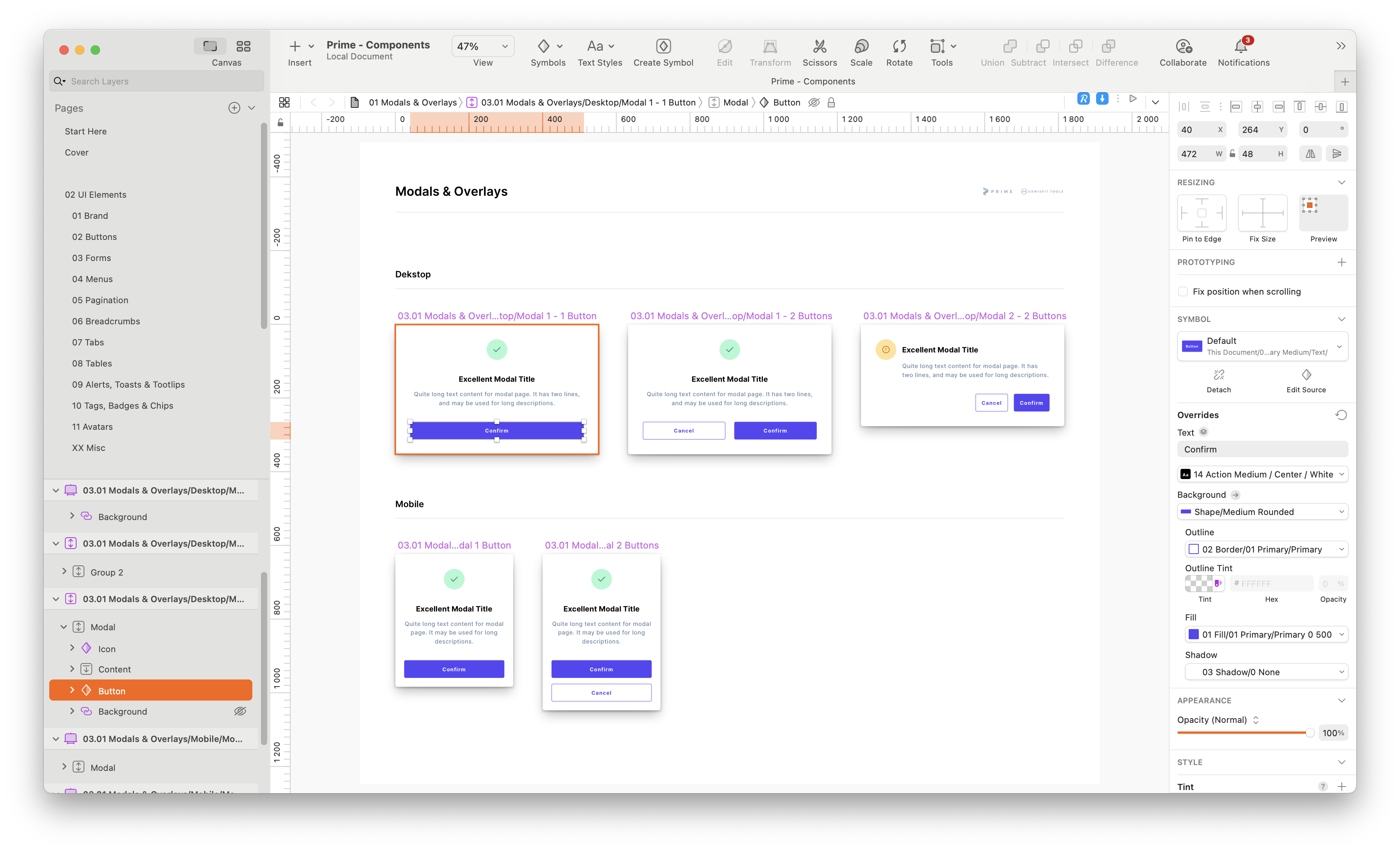
Sketch app is a native solution for macOS. There is also a web app where developers may inspect resources & discuss mockups with the team.
Its original license model is a one-time purchase with one year of free updates. After that time user can purchase the license for the next year of updates or use the last version. This plan does not include Cloud space to store the files.
That is why there is also a subscription (with Teams option), where you may collaborate with your Team in Real-Time and share files through the cloud.
✅ Pros
- Excellent native experience for macOS app
- Better pixel-perfect precision for designs (Figma’s Auto layout has some limits)
- Huge base of resources & plugins
❌ Cons
- A bit slower than Figma (but it was recently improved)
- App for designers work only for macOS
Design Systems in Figma & Sketch – Similarity
To design in these two tools, you have to master these essential features.
First is Shared Styles that will be used for Colors, Text, Shadows, etc. Defining styles will help you maintain visual consistency.
Next, Components (Symbols in Sketch). There is no Design System without components. These are reusable elements of the User Interface. It is good to create them with Atomic Design Philosophy in mind. Thanks to components usage, you do not have to worry about consistency. To offer more flexibility, you may override some properties in those components.
Libraries, setting the project document with style & component as the library is a must for the design system. Both Sketch & Figma allows you to publish your document in the cloud space, so the team may use elements from it.
Design Systems in Figma & Sketch – Differences
Let’s briefly reveal some differences between the tools, so you will be able to pick the right tool for your team much easier.
Figma offers much more flexibility for component overrides. This is an advantage and disadvantage at the same time. Sometimes it is better to have strict constraints – if your design team members require that, Sketch will be better.
Sketch offers Smart Layout for Components that adapt the size to their content. Figma’s analog feature is called Auto Layout. They seem similar but work differently. With Sketch, you are able to set elements with pixel-perfect precision. Figma’s Auto Layout has some limitations but works similar to the web development capabilities.
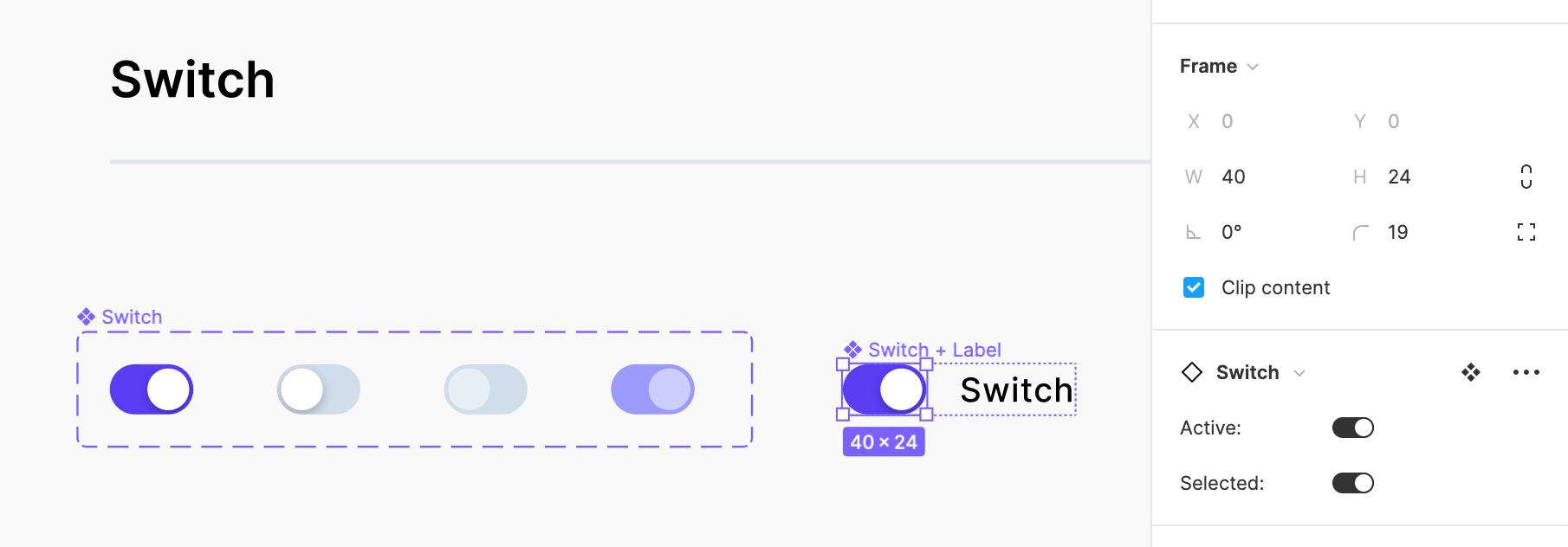
Variants – brilliant Figma feature. It allows to group components as one UI element. Then you may pick a variant as it could be a setting of a single element. For example you may have input with multiple states, with and without a label in one component! Sketch does not have a similar feature (replacing Symbols is not that convenient).
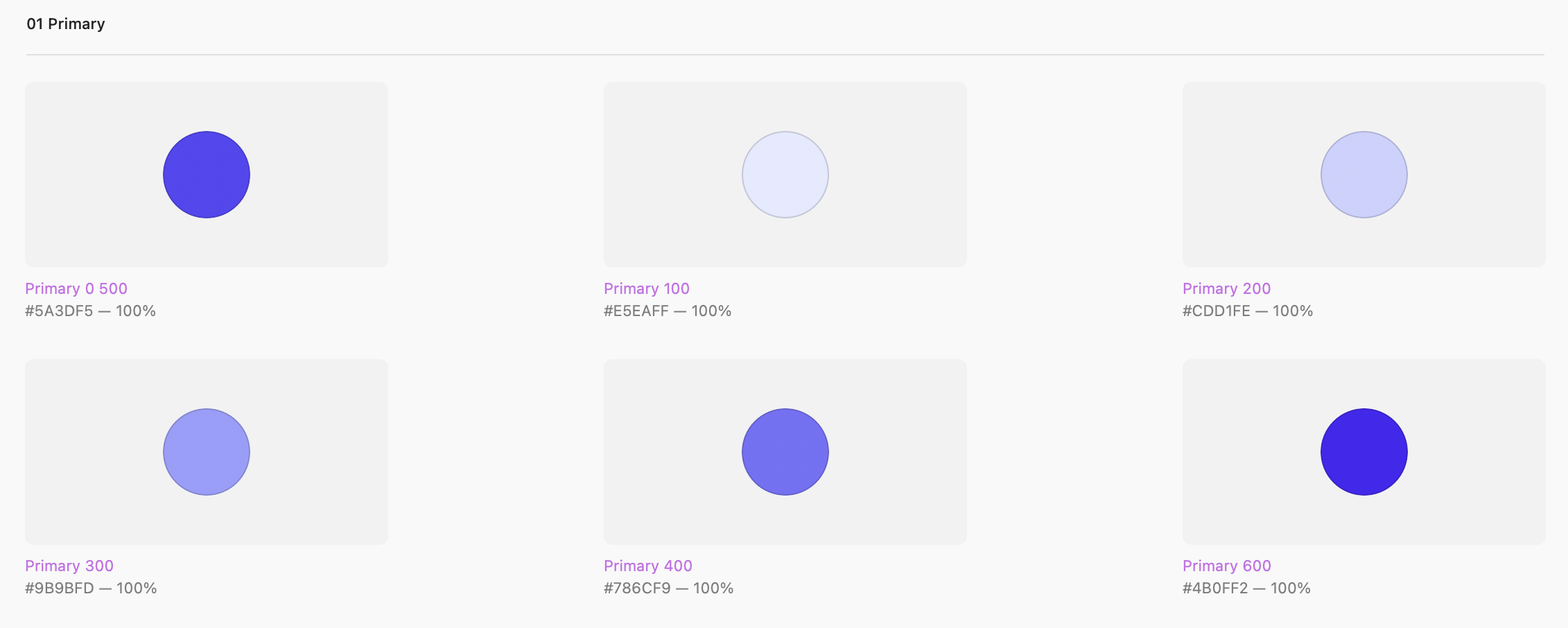
Layer Styles & Color Variables these two features are present in Sketch. While Color Variables are only for… color, Layer Styles may define the style for multiple aspects (gradient, fill, stroke, drop shadow or inner shadow) in as one.
In Figma, you have colors, text styles & effects, so you have to define the same properties as separate styles.
Prototyping – Sketch offers basic features for creating prototypes. You may connect mockups and mark some areas as a scrollable element, that’s all. Figma’s prototypes are much richer. You may animate them with the Auto Animate feature and create real Interactive Components, so the user experience will be similar to real apps.
To conclude
Figma & Sketch are kings of UI Design. They have large communities, plugins base & resources. However, they have their own advantages & disadvantages. I hope the article helped you choose the right tool for your design system.

Design Faster in Figma and Sketch
Never start Your work from scratch. Use the Kit that already have 1500+ components with well structured styles, variants & auto layout.
Use Prime Design System Kit to boost your workflow. Create for Web, Mobile, and Desktop. You may use it as the entire UI Library for Design System or just create Landing Page for your next Client. Perfect for those who want to save time while creating UI designs and learn best practices of Figma and Sketch at the same time.
