There is something necessary in every UI Design – Typography. To speed up your work, the design system must have well-prepared components and a typography system.
In this handy tutorial, I will show you how to improve yours with 6 practical tips:
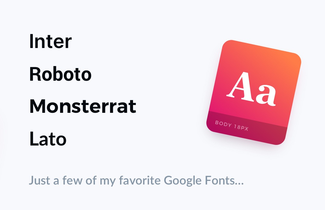
1. Pick a typeface
Usually, one typeface is enough. If you want to create a more outstanding experience, you may try to mix 2. Use one for headings or title and the second one for smaller sizes like Body, Caption, etc. I love to use good free fonts like Montserrat, Lato, Roboto or Inter. They ensure good readability and modern style.
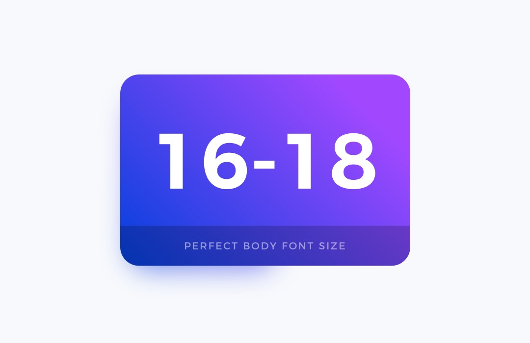
2. Set the base size
Body font is used to standard text content in your design. It is important to balance good readability with aesthetics. Usually, the perfect size, in this case, is around 16-18 pixels.
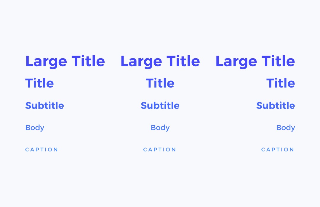
3. Create Type Scale
Creating a typography scale is always challenging. There are many techniques that allow you to create a harmonious set. I like to use strong foundations. When you want to create your use sites like type-scale.com or material.io to inspire yourself and build scale quickly.
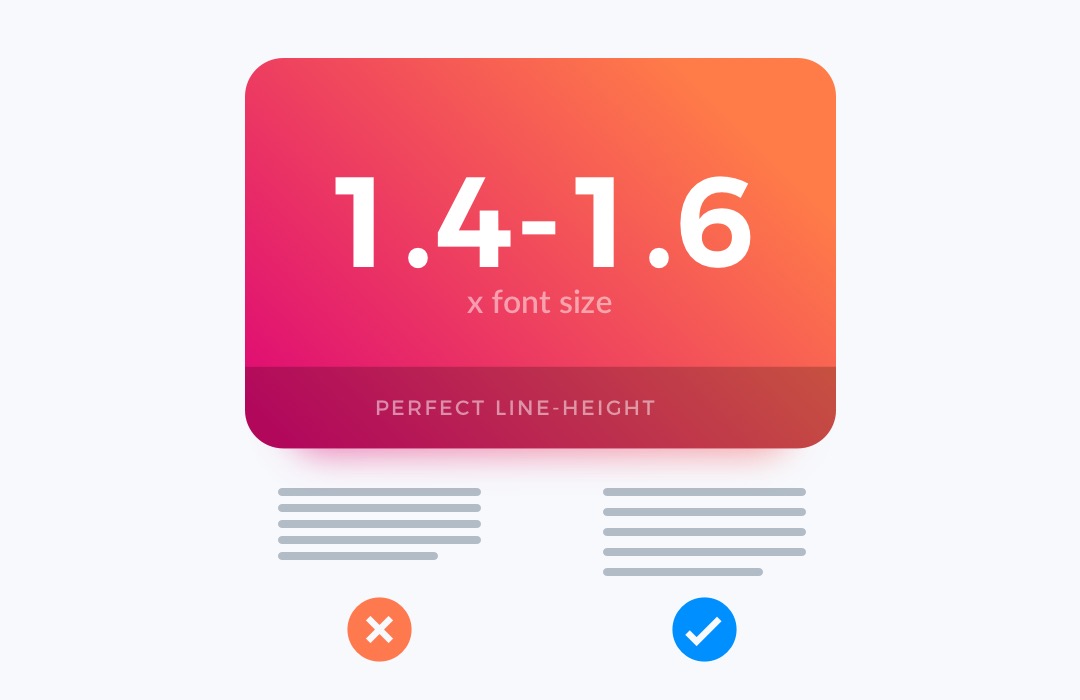
4. Set Good Line Height
To enhance text readability, it is not enough to have a good font size. Line-height has to fit the font size. For the best results, play with 1.4-1.6 of font size as a line-height. For example if your body font is 16px, the line-height should be around 24px. Try it on yourself, and see the difference in reading comfort.
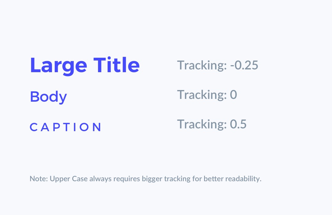
5. Adjust Tracking
In typography, readability is king. The next factor that helps to enhance it is tracking. Bigger sizes like Headings or Titles require less tracking value. Smaller ones (especially with Upper Case letters) need to have tracking increased.
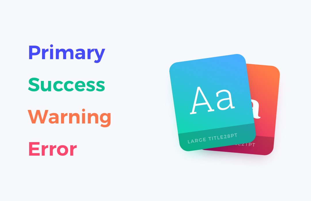
6. Define meaningful Colors
I always repeat that when it comes to Design System Creation do not use names like “Blue, Green or Yellow.” Make your colors meaningful. For example, give them the following names: “Primary, Secondary, Warning, or Error.” This also applies to font colors. This helps to recognize the right purpose of the element.
Bonus Tips!
Fee free to read the guide about Typography I have written on the blog:
👉 Typography – UI Design in Practice
To conclude
Building a Typography System is always challenging – every project requires an individual approach to reflect the brand. However, these simple tips will help you create your bullet-proof design system.
By the way…
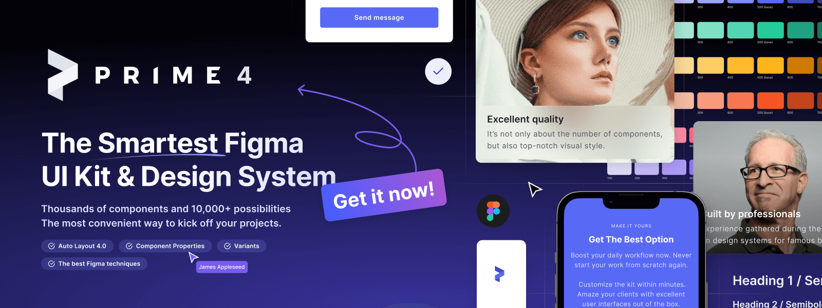
If you start a new project or would like to organize your UI Library in Figma — do not waste your time creating everything from scratch. Feel free to use the Prime — Design System Kit. It helps you design UI with the best Figma techniques — Component Properties, Variants, Auto Layout and more.See Prime in action.
To make it easier there is a gift 🎁 - Use UXMISFIT10 offer code to get 10% Off.
You can also Create User Flows faster in Figma & Sketch — With SQUID you can create User Flows directly in your favorite design tool. You may style them to your project brand within a couple of clicks. Prepare all kind of diagrams in minutes. See how it works.


