
The goal of the Prime Design System Kit is to become the most convenient and fastest kit for the designers. With version 2.5, it has become even better!
Let’s quickly sum up what was updated:
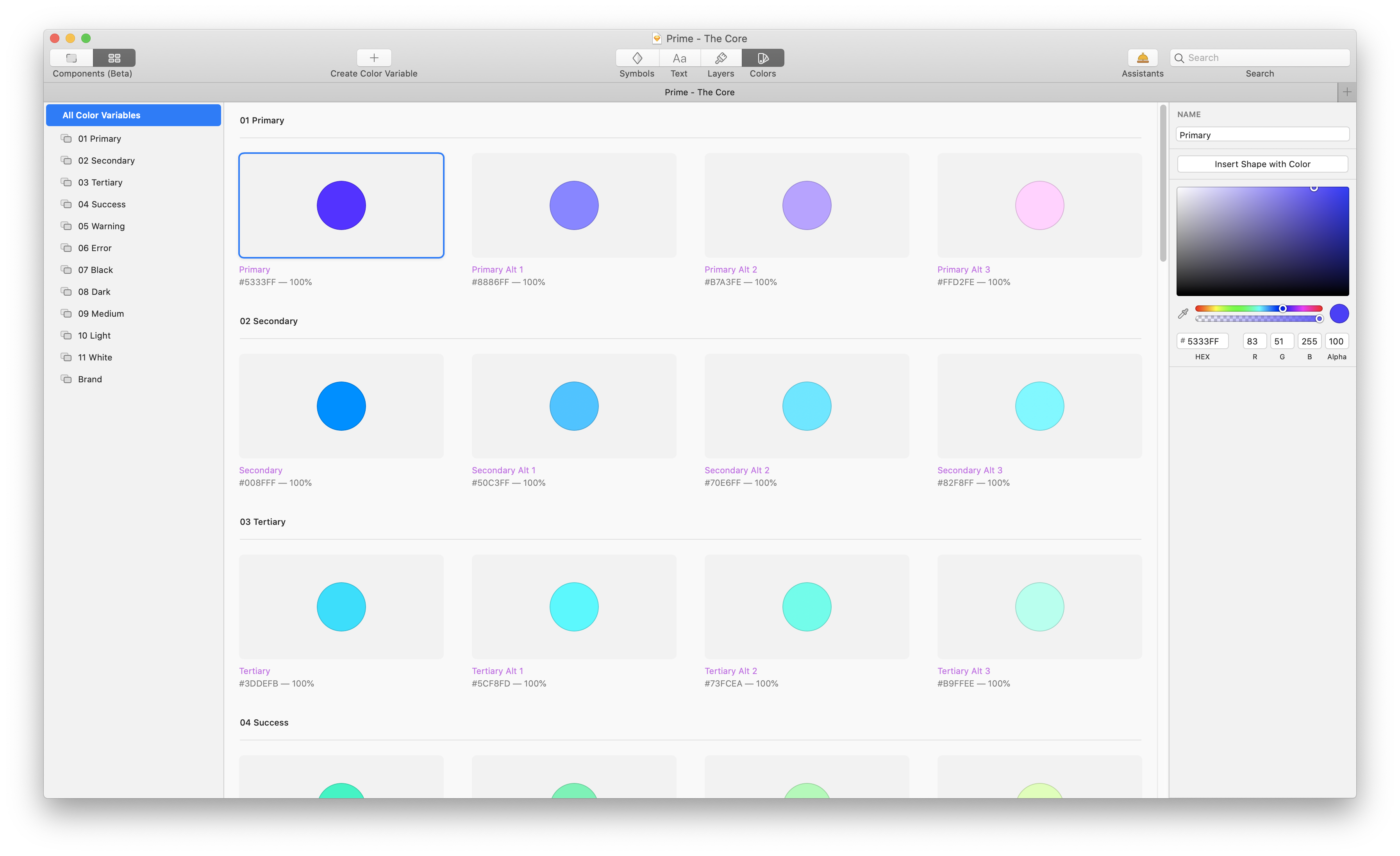
- Color Variables – With Sketch 69 we received Color Variables. Now Prime includes dozens of variables connected with Layer and Text Styles, so your Designs will be even more convenient
- Simplified Layer and Text Styles Structure – I decided to drop Dark Theme in “Prime – The Core” document to simplify the structure, so you can access styles and variables quicker this way. See tips below to get information on how to create Dark Theme quickly now.
- Brand Color – If you want to include some social media icons or buttons, now you have dedicated brand colors as Variables and Styles
- Naming Convention Improvements – Say hello to Alternatives “Alts” instead of “Vibrancy” Colors and Layer Styles
- iPhone 12 Pro vector mockups – Prime always included top Apple Devices recreated in Sketch as vectors. Now the new iPhone 12 Pro is also there!
- New Icons – a few new icons added: upload and device icons.
- Prime is 2x faster – thanks to Styles enhancements, Prime works much faster when you want to find a Layer or Text Style.
The important thing to note is that the update is free for all current users of Prime and UX Misfit Tools – Ultimate Access.
How to use Prime with Color Variables
Basic Colors are connected with Layer and Text Styles. This means that to change color for your project’s brand, you have to jump to components view and update only a few colors – all styles and components will be updated immediately!
Layer Styles still include variations with opacity (Color Variable always include 100% opacity). It is because you can change colors within the project quicker this way. Thanks to this, Prime is more flexible and adaptable.
All Symbols still include Layer Styles
Prime did not move everything into Color Variables. The reason is simple – Color Variables are not replaceable with Gradients. See the example: if your project requires you to have a button with a nice gradient, with Prime, you have to just change the Layer Style. It is that simple! With pure color variables, you would have to recreate the component on your own.
How to create Dark Theme with Prime
If you are familiar with my tutorials, you surely have seen the one with the Library Replacement. This tutorial includes a clue on how to create a Dark Theme. Here is the quick how-to:
- Copy “Prime – The Core.”
- Rename to “Prime – The Core Dark Theme” – or whatever your project is named
- Adjust colors and styles to the Dark Theme
- Copy the Library you need to create Dark Theme Components – for example, “Prime – Web”
- Rename to “Prime – Web Dark Theme”
- Open “Prime – Web Dark Theme”
- Use Automate or Camilo Plugin to replace core library to “Prime – The Core Dark Theme”.
That’s it! Now you may design Dark Themed version of your project this way.
Use iPhone 12 Pro Lineup
Prime 2.5 introduces the vector mockups of iPhone 12 Pro. The set includes all official colors: Graphite, Silver, Gold and brand new Pacific Blue. Everything to make your designs look modern and professional!

Summing up
Prime 2.5 brings a lot of improvements, but it is also familiar for the users from the beginning. Thousands of designers already discovered Prime. I am so happy that I may create a tool that enhances your workflow.
What do you think of the update? Please let me know in the comments or send me an email.
Thanks for reading!
By the way…
If you start a new project or would like to organize your UI Library in Figma — do not waste your time creating everything from scratch. Feel free to use the Prime — Design System Kit. It helps you design UI with the best Figma techniques — Component Properties, Variants, Auto Layout and more.See Prime in action.
To make it easier there is a gift 🎁 - Use UXMISFIT10 offer code to get 10% Off.

You can also Create User Flows faster in Figma & Sketch — With SQUID you can create User Flows directly in your favorite design tool. You may style them to your project brand within a couple of clicks. Prepare all kind of diagrams in minutes. See how it works.


