Through years of creating UX Resources, I came up with a thought: Tools you use determine much of your efficiency. Skilled designers can achieve the desired results from scratch, but it will always take time. Saving additional hours is essential because it frees minds and energy for more inspiring challenges.
This is the idea behind the creation of the Prime Design System Kit – the resource that lets you boost your workflow quickly. With newly introduced version 2.0 it is even more convenient!
Let’s see how it is possible to enhance the design workflow with UX/UI resources:
The work areas that allows you to save time
Creating a tool that saves time requires hours of observations and deduction – to find areas that may be optimized. Here are some outcomes from Prime 2.0 creation:
- Project kick-off – when you start a new thing, the worst thing (in terms of efficiency) is to start entirely from scratch. Starting UI Design requires the creation of color palette, typography scale, and then leads to making fundamental UI elements. This is an activity that may be optimized.
- Project development – If you work in agile methodology, you know that requirements and goals may change quickly after each sprint. Rearranging all created mockups may be a painful process if you did not plan your UI Library earlier.
- Project maintenance – One of the most critical elements of the Design System is its UI Library with ready to use components. If the designer did not prepare a set of UI elements and more complex components (even entire Web page sections), it might be hard to maintain consistency and be efficient at the same time.
- Tool mastery – Mastering the Tool (Sketch) is essential if you want to work faster and better. From my experience, lack of knowledge may cost you hours of additional and redundant work. Good resources should support the User with smart techniques of the design tool.
- Communicating design to others – if you are the only designer in a team some things are easier, some are harder. It is much easier to maintain consistency (only you design stuff), but it may be harder to convince more technical members of your team or stakeholders to your creations. Working with Sketch for Teams may solve lots of collaboration issues. However, you should also know how to organize source files for other designers and figure out the efficient and repeatable way of presenting a design to the rest of the team.
How to optimize the process with the Kit
Prime solves lots of issues I discovered through the design process. The first release was tested “in battle” so many times, I also received lots of inspiring feedback. Thanks to this, I gathered them all and prepared Prime 2.0 – really all-in-one and time-saving Kit for all kind of UI Design Projects.
Let’s see how it helps with previously noticed issues:
Speeding up Project Kick-Off
With Prime, you can fully customizable color palettes, with dozens of colors – from primary, secondary tones through neutral ones, gradients into the shadow colors. The Kit also includes insanely wide typography scale. Both colors and typography are prepared for Light and Dark Theme – it is very important these days.
What is most important: You can customize all parameters within a couple of minutes!
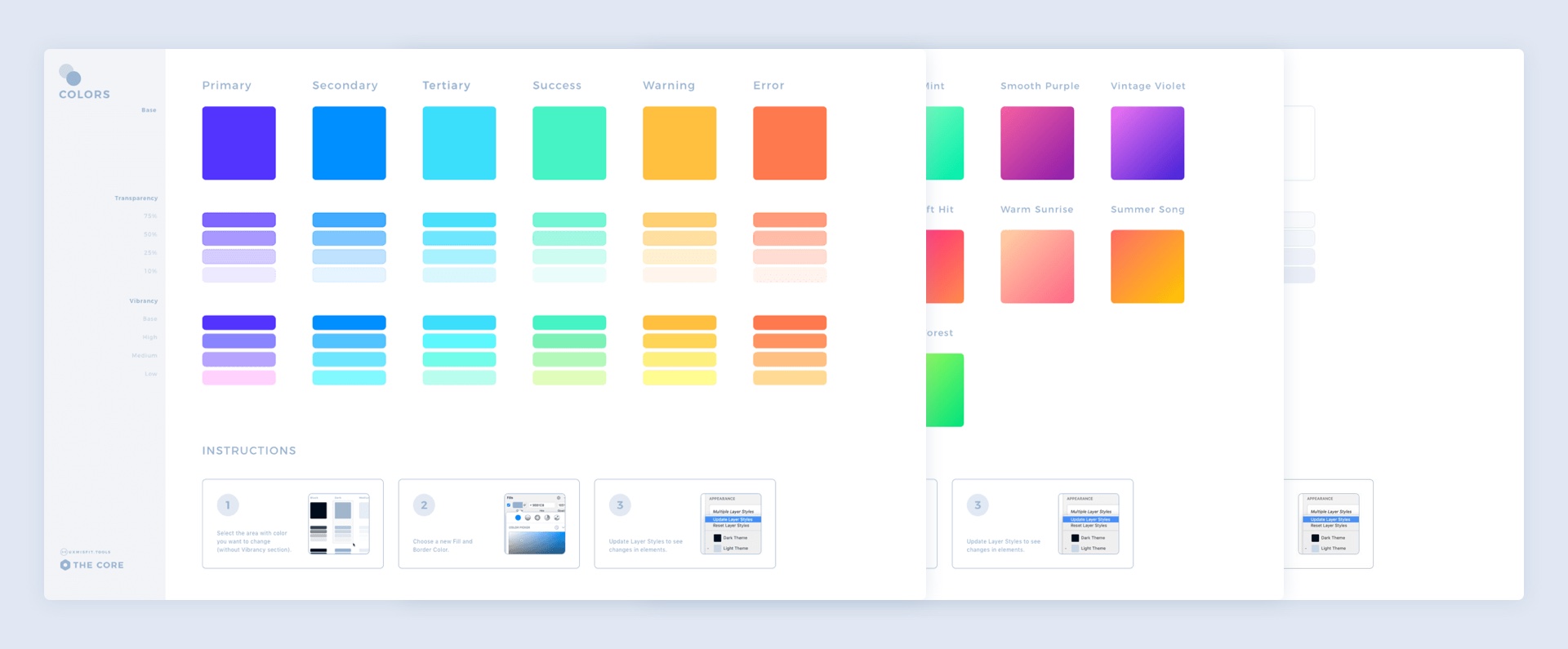
Next, shapes and iconography have to be consistent through the project, very often even across platforms. This is why “The Core” library also includes all shapes and fundamental icons.
Now imagine – the new project kicks off, and you are ready to create first mockups after a couple of minutes when other designers slowly start to create color palette and Layer & Text Styles.
Optimizing Project Development Process
Nowadays, everything is made from rebuild components – from cars to even houses. This makes them more durable and speeds up the manufacturing process.
Prime includes a whole UI Library: from simple UI Elements like a wide set of buttons, through more complex ones (Cards, Modals, etc.), into entire Page Section Templates (for Desktop and Mobile Web).
When you finish setup initial colors, typography and shapes, you can build an entire design from blocks insanely fast! Meanwhile, other designers start to think about the structure of the button symbol they just created.
Efficient Project Maintenance
Logically structured elements, build with Atomic Design Philosophy is a key to further project support and maintenance.
The Kit contains hundreds of basic elements, complex components and over 100 ready to use Web Page Section Templates (Desktop + Mobile) that may be instantly used to create the next feature and enhance an existing one.
However, Prime elements are not only aligned to these good practices – but the Library also uses the Sketch’s best practices so that you can maintain consistency in the project efficiently.
Helping to Master Sketch
Smart Layout, Symbols & Overrides, Layer, and Text Styles – these features are real workflow boosters. They save tons of hours and make you a smarter designer. Prime uses all the best practices and tricks in Sketch.
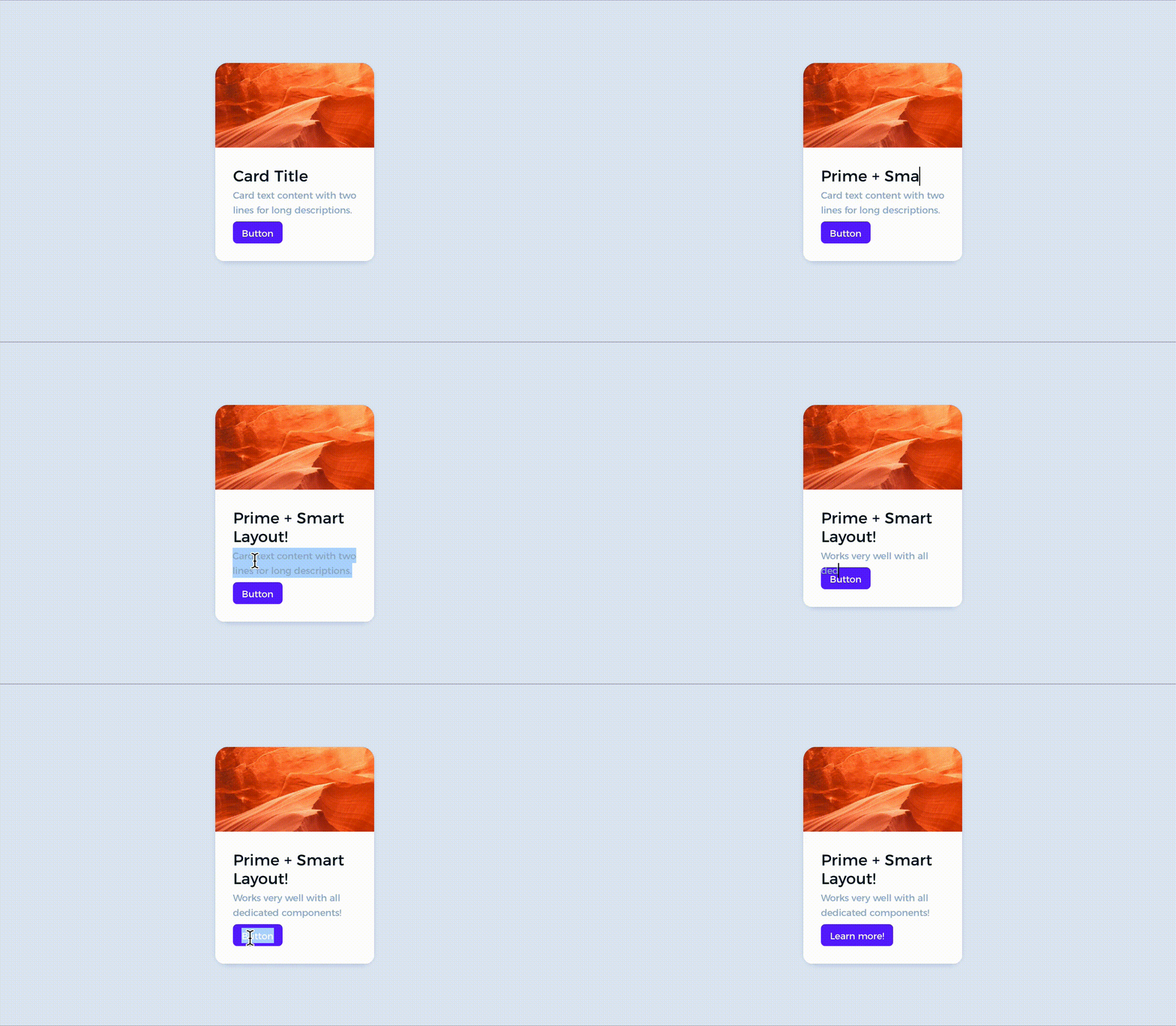 Using the Kit and analysis of its elements will help you build your new components that will behave the way you want! Inside Prime, I constantly put the official Sketch best practices and tricks I learned by using it every day in my work.
Better Collaboration
Prime is build to be used with Sketch. If you work with a team of designers, you probably use Sketch for Teams. Prime structure is modular – this means that each major set of elements is placed in a dedicated source file Library:
- The Core – basic stuff like colors, gradients shadows, typography, shapes, etc.
- Web – all UI elements needed to create Desktop and Mobile Web design structured with Atomic Design Philosophy
- Mobile – (coming soon) native mobile components
- Charts – all major chart types to support data visualization
- Device Templates – vector device templates (wearable, mobile, and desktop) are often used in web projects.
- Illustrations – the Kit includes sample elements that may be combined to create a new mood of the design.
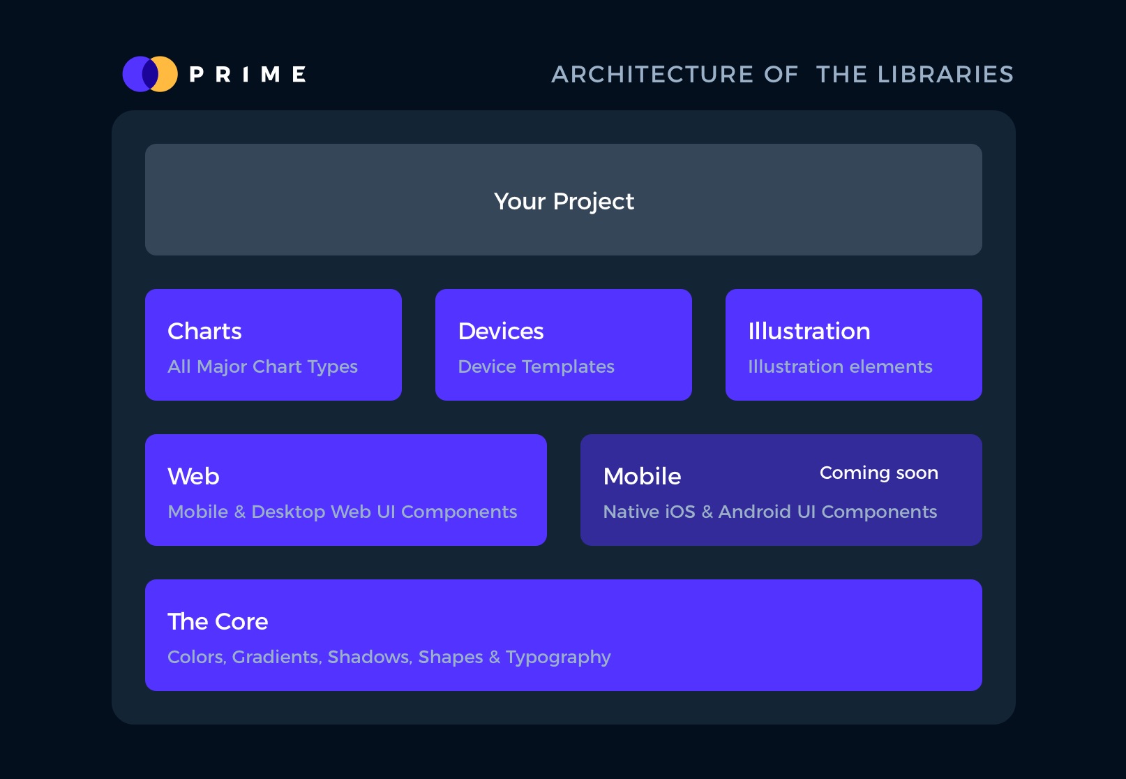 Thanks to this, all designers can easily add new or edit files they need without wasting time searching for the particular element.
If you would like to present design to your team, you can make a simple prototype in Sketch and share them. You can also build User Flows with SQUID – sometimes they work better than prototypes when you have to explain whole processes.
Summing up
There are multiple areas where we can do more faster with less effort. I am thrilled to create a resource that helps you with this goal.
If you remember the difference when you switched from the old-fashioned mobile into the iPhone if you can imagine the difference between hearing the roar of Lamborghini and the one from a regular car, you can feel how it feels to start using the Kit that speeds up your work instantly in all phases of your project.
Feel free to try it on your own. I have prepared a special discount 🎁. Just use UXMISFIT10 offer code and get 10% off!
