
We live in the golden age of tools for designers. I have mentioned many times that Sketch is the ultimate tool for UX design. There is much more to create with this software than only UI design.
If you are browsing Dribble, you may notice that major of shots are presenting various Dashboard. Many Designers knows that making a beautiful chart is the important element of many Dashboards. This is why I would like to show you, how easily create them in Sketch.
Creating a Line Chart
Creating a line chart is very simple. Press “V” and make the first point of the vector line, then make the second in the place where the chart line should end. Now press “Esc” to prevent vector tool from making the next connection.
Hold “Shift” and point the cursor on the line. By clicking the mouse button or touchpad you will make a point at the center of the line. Now repeat the sequence to make the point in the middle of two neighboring points. Make as many points as you need to ensure the right fidelity of the chart.
Now, you have got the straight line with multiple points ordered steadily. To create a nice chart you just have to move the points up and down to create fluctuations.
Some designers and extra gradients to the line charts, some of them add extra shadow. To add a nice shadow just copy the chart line and add Gaussian Blur effect, to make it subtle lower the opacity to 20%.
 To create a nice line chart with smooth lines you have to make the everything almost the same. After making all points (before moving them up and down) select all of them except the first and last one. Now change their property from “Straight” to “Mirrored” – voila! Move the points up and down and you will notice the elegant smooth bezier curves.
 Creating a Donut Chart
You can create a Donut Chart in Sketch in many ways. However, there is a smart trick that lets you create it extremely precisely.
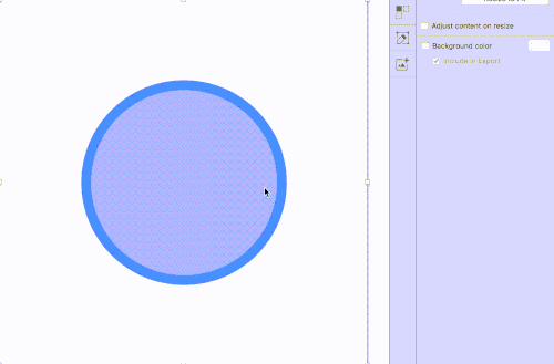
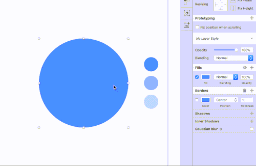
Draw a circle, for example, 200×200 size. Turn off the “Fill” and set up “Border”. Now open Border Properties – it is the place where the magic will happen.
First, we need to get the circumference of the circle. The formula is 2πr, where “r” is the radius. The circle with size 200×200 points has got 100 points of a radius. Let’s round off π to 3.14. Let’s make the calculation:
2 * 3.14 * 100 = 628
Now, enter the number into the Gap Field in “Border Properties” pane.
What kind of value would you like to see in donut chart? Let’s make it 73%. Let’s make the calculation:
628 * 0.73 = 458,44
Enter the value into the Dash Field in “Border Properties” pane.
Voila! You can calculate every needed value and have them presented in the chart. If you would like to make the chart that will from the top simple use the flip options.
Note: If you will change the size (also scale) the chart will start to act inappropriately. You will have to make the calculations again.

Design Faster in Figma and Sketch
Never start Your work from scratch. Use the Kit that already have 1500+ components with well structured styles, variants & auto layout.
Use Prime Design System Kit to boost your workflow. Create for Web, Mobile, and Desktop. You may use it as the entire UI Library for Design System or just create Landing Page for your next Client. Perfect for those who want to save time while creating UI designs and learn best practices of Figma and Sketch at the same time.
 Creating a Pie Chart
Creating this type of chart in Sketch is a little bit more challenging. To make it we will use Angular Gradient Fill. Draw the circle shape and switch the “Fill” to Angular Gradient. Add two color stops for each section you would like for the pie chart.
You are able to position precisely the color stops along the gradient precisely – to make the chart looking more professional. To do it use the number keys on your keyboard. If you hit 3, while the color stop is selected, Sketch will position it exactly 30% along the Angular Gradient.
 You can also create a Pie Chart by drawing a Circle and making it a mask. Then you can add Rectangle. Align Circle and Rectangle to the center. Move one corner of the Rectangle to the center of Circle. Edit its other points so they will work as a part of the chart.
To conclude
Charts are the popular elements of every dashboard. Making them in Sketch may be really convenient. I hope you will be able to make line, pie or donut chart even more precisely and beautifully.
Designing digital solutions in Sketch is very effective, but no one wants to make boring and repeatable work. Time is a very precious asset for us – Designers. This is why beside writing UX articles I build time-saving design tools to make you a better and more efficient Designer.
Create User Flows faster in Sketch – With SQUID you can create User Flows directly in Sketch the sketch file with your artboards. Everything may be done within a couple of clicks. See how it works..
Create Web or Mobile Designs within minutes – Starting UI Design from scratch is boring. I wondered, how to skip this part of work to focus on more interesting tasks. Prime Design System Kit is the resource that lets you customize all essential UI elements quickly and jump right into the most engaging parts of the design process. What is more, it includes Charts, Device Templates, and Illustration Kit to speed up specific pieces of work. Thanks to Prime you create Web or Mobile design within minutes. See Prime in action.
Subscribe UXMisfit.com (and get some discounts)
Follow me on Medium
Follow me on Twitter
You can also follow me on Dribbble!


