The principles defined by Jacob Nielsen are used by designers all over the world. They are some kind of compass for the ones who want to make their products easy to use. For decades they helped to shape patterns for graphic user interfaces, now when voice assistants are becoming more and more popular they may be successfully implemented for the new environment.
In this article, we will remind all of the Jacob Nielsen rules and consider how they may apply to a voice interface. So, grab the mug with coffee and let’s begin!
1. Visibility of system status
The first heuristic tells us that the system should always keep the user informed about what is going on.
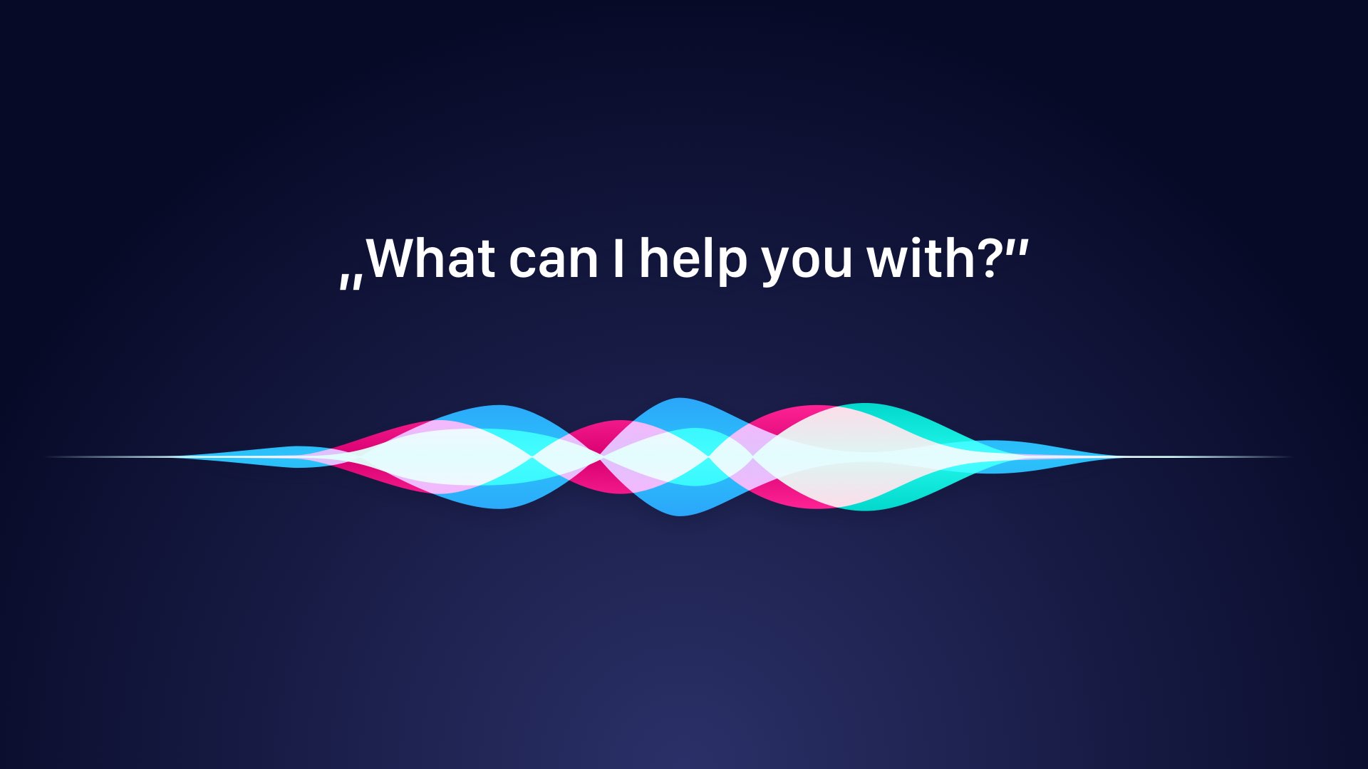
When you think of voice interface user should know that solution is listening. This may be a visual indicator (like Siri spectrum waves) or sound that informs about service activation.
2. Match between system and the real world
“The system should speak the users’ language, with words, phrases, and concepts familiar to the user” – this sentence from 10 Usability Heuristics for User Interface Design explains everything we need for voice interfaces.
The commands and responses should be natural. Their construction has to be the same as sentence we use in everyday life. Only this way users will be able to interact with voice interface comfortably.
3. User control and freedom
Users that would choose function by mistake should be able to use some kind of “emergency exit”. This point may sound like the big challenge for voice because the user cannot unsay something. However, there are some techniques.
For example, the voice interface may implement some kind of command that will cancel the ongoing action (like “Alexa, stop”). It is also good to ask the user for confirmation if the action is somehow destructive or cannot be undone.
4. Consistency and standards
Jacob Nielsen specifies that users should not have to wonder whether different words or actions mean the same thing.
Currently, available voice assistants provide several guidelines that ensure the consistency. I have described how SiriKit may be used to create better UX of your product. You have to remember to use plain language and focus on creating clear, simple commands.

5. Error prevention
It is always better to prevent errors that present even the best explanation of the issue to the user.
As I mentioned earlier it is good to ask the user before action if the solution had understood them well. For example, before the message would send it would be good to read it to the user check if everything is fine.
6. Recognition rather than recall
“Minimize the user’s memory load by making objects, actions, and options visible The user should not have to remember information from one part of the dialogue to another. Instructions for use of the system should be visible or easily retrievable whenever appropriate.”
Voice commands should be intuitive. The natural language with sentence structure is a must. What’s more, there should be a quick command or action that will remind the user about possibilities of the interface.
7. Flexibility and efficiency of use
Users deserve the flexibility. Because they do not have to remember everything, they should have to access the action that will reveal possibilities of voice assistant.
It would be also a good thing to give user possibility to configure own commands or shortcuts. Ideally, the assistant should learn from the user to discover them.
8. Aesthetic and minimalist design
While this point is obvious for graphic user interfaces, it may be hard to understand its importance in terms of voice interface.
Nielsen tells us that we should think of the language of the bots:
“Dialogues should not contain information which is irrelevant or rarely needed. Every extra unit of information in a dialogue competes with the relevant units of information and diminishes their relative visibility”.
In a few words: the commands and responses should be clear and concise.
9. Help users recognize, diagnose, and recover from errors
If error prevention is not possible then every error messages should be written or spoken in plain language. No error codes allowed.
Your solution should clearly explain what has occurred. What is more, if the product is able to suggest what user should do to undo error – it should inform about that.
10. Help and documentation
When everything will fail then reveal the manual. If your solution will detect that none of the commands were appropriate then it should inform the user what is possible to accomplish there.
While it is good to create as little documentation as possible, it is necessary to describe all of the fundamental parts. You have to prepare option that will let the user discover what he is able to do. It may be a voice instruction or a window of the app. It should be suggested when the solution will detect that user has got the problem with product usage.
Does Heuristics give 100% guarantee of good usability?
Jacob Nielsen’s 10 principles are not specific usability guidelines. They are tips that were created after multiple observations of user interactions with various solutions.
However, it is always necessary to validate your interface with potential users. Only usability research will give you a confirmation if your UX assumptions are right.
Summing up
Voice interfaces will always have some kind of graphical interface, but they are the only addition to the whole products.
When you are preparing the solution with voice commands use heuristics to design the product, but later you have to validate it through usability research.
If you would like to read and share articles like this with other designers – feel free to join UX Misfits Community on Facebook. UX Misfits is a group of designers who would like to discover inspiring articles.
Similar articles:


