Nowadays we tend to create everything digitally. There are lots tools that make the design process really convenient. However, every professional designer knows that the true power of the creative mind is unlocked during sketching phase. So how to make sketches efficiently?
What exactly sketch is
Do not confuse sketch with Sketch. 🙂 In this article, we will not talk about Sketch app. It is a great design tool for creating UI, but here we will discuss what to do before we launch any design software.
UI Sketching is, of course, kind of drawing on a paper… but it is not a usual drawing – its purpose is to reveal the result of problem-solving thinking. It communicates the idea to other people. It is also important to remember that sketches are not wireframes. Some designers mistake these both things.
The main purpose of sketches is to visualize quickly the core idea – how the user interface may look like and how it could work. Sketches are raw, but they give you the ability to draw your concept faster.
When you wireframe you visualize the concept in pixels using software tools. They are more detailed, but they are not high fidelity mockups. If you would like to create wireframes – they should be made after sketching the initial concepts. In my opinion, they are often redundant – Wireframes – The Fifth Wheel of UX Design Process. How to design without them?.
How to sketch like a Pro
Below you may find a list of quick guidelines for UI sketching:
- use only Sharpies for sketching
- always use three types of colors, black – for main UI elements, gray for shadows and ornaments, blue – for active buttons
- use a ruler to draw straight lines
- draw rectangles with exact screen proportions
- measure UI elements from the screen before drawing them on paper
- use only dotted paper
Well… the above list actually a joke 🙂 Please do not take it seriously. Below you will find some real tips.
UI Sketches are extremely useful during brainstorming phase so they should be quick. You should not waste time on being too precise here. Do not use the rulers, do not care about rectangle proportions. Nobody thinks about pencils you use.
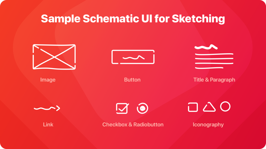
Focus on the idea visualization – this is the main goal of the sketch. If you would like to sketch more efficiently, try to practice sketching on a paper the core UI elements like checkboxes, tabs, buttons, nav bars or basic icon symbols – to build your own schematic UI sketching style. If you will be able to draw them immediately from your memory your sketches will be done even faster. It is especially important when you do whiteboard sketches during meetings.

If you would like to sketch on sticky notes, you may be interested in purchasing ones that have similar proportions to screens of the phones, not square ones.
Personally, I often do not use even printed device templates for sketching. They make drawings look better, but I think they limit creativity and do not give an ability to freely express all ideas.
If you would like to explore several techniques of sketches – The Messy Art of UX Sketching from Smashing Magazine will help you.
Why is it worth to make sketches
There are at least 7 main benefits of sketching the UI before you will dive into high fidelity mockups:
- They are the quickest idea visualization – simple sketch is without a doubt fastest way to show what is in our mind. When you sketch you are the hammer to a nail, there is no software tool that limits you.
- Drawing stimulates your brain – when you sketch on a paper your brain works better. More valuable ideas may come to your mind, or they can be validated earlier.
- Sketches may be quickly presented to stakeholders – when you brainstorm with clients you will be able to communicate the idea immediately. Making wireframes may not be enough efficient.
- Drawings does not have to be pretty – stakeholders or your team will get the idea you presented, but they will not pay attention to the aesthetics. This would be not so obvious if you would present wireframes or hi-fi mockups. People tend to focus on aesthetics when they see digital deliverables.
- Sketches may validate your idea – when you will start work with software design tools you will notice that you already solved lots of potential issues while sketching
- Sketches reveal the user flow – apps are not only static screens. There are lots of paths user has to follow to accomplish a single task. Sketches encourage to draw multiple pages not only one page UI.
- Sketches help to focus on a big picture of the solution – they are not limited to pixel canvas or artboard. You may draw overall concept on a paper and then add some details quickly.
Summing up
It does not matter if you draw pretty things or not. UI Sketches are the useful way to communicate your idea. The improve team collaboration. Sketching is an opportunity to validate concept before launching software tools. You should involve this activity in your standard design ideation process.
If you would like to read and share articles like this with other designers – feel free to join UX Misfits Community on Facebook. UX Misfits is a group of designers who would like to discover inspiring articles.
Similar articles:
- Wireframes – The Fifth Wheel of UX Design Process. How to design without them?
- Design Apps That Do Not SUX. Accessibility on Mobile.
- Skeuomorphic Design is good. Minimalism is overrated


