They are present in every app and website. Icons beautify our designs and save screen space without much effort. They are a quick solution if we would like to make our creation more catchy. Icons have become the “Fast Food” of the UX.
Despite the popularity of icons, they are not free from usability issues. Even the experienced designer must strive temptations to keep their design not only aesthetic but also usable. Let’s reveal some pain points of using icons. But first, some principles of their usage.
Icons Principles
Before human race discovered letters and started to combine them into the words, we used simple symbols to preserve information. This is why we tend to naturally use icons in our written communication.
Now in the era of Mobile Devices symbols has become very important again. To understand how to use them appropriately we have to know the rules of at least two most popular Operating Systems.
Material Design Icon Guidelines
Google recommends making icons as geometric shapes. They should communicate visually core ideas, topic or capabilities of the solution.
Material divides style of the symbols into the two types:
- Product icons – they are displayed in a phone dashboard and in the app menu. Their primary goal is to represent the brand of the solution. Product icons are colorful and may include some shadows.
- System icons – they are placed inside the apps. They communicate actions user can perform or the interactive objects. Symbols are very minimalistic, bold and usually filled with one color. Their priority is to ensure readability and clarity even if they are displayed at small sizes.
There is a rich chapter about iconography in Material Design Documentation.
iOS Icon Guidelines
Apple icon principles evolved from skeuomorphic ones into the minimalistic symbols. While iOS 7 was full of outlined icons, with iOS 11 they turned to be more filled, bold shapes.
iOS also has got principles for two types of iconography:
- App Icons – these should be beautiful and memorable symbols that attract user attention in the App Store and also on the Home Screen. They should communicate app’s purpose.
- System and Custom Icons – Apple recommends using System iconography in apps. However, if your solution includes tasks and actions that were not predicted by iOS creators, you should follow simple guidelines to create your own. Symbols should be simple and recognizable. They should be designed with a solid color and transparency. Drop shadows are not allowed. We should also avoid text inside the icons and do not use replicas of Apple products.
Apple’s Human Interface Guidelines is always a helpful resource to read before creating the apps iconography.
While both iOS and Material Design seems to share a lot of common principles their visual aesthetics differ. The user feels those differences between platforms.
Common Pain Points of Icons
When you will become more aware of usability issues caused by inappropriate symbols usage, you will be able to improve your designs. These are main pain points of apps:
Users do not understand a meaning of the icon.
One of the icon creation fundaments is to make them understandable to people. However, we sometimes tend to forget about that. When the clarity of the symbol is sacrificed, no matter the reason, we ruin usability of our designs. Always try to choose the most obvious icon and then test it recognizability with your coworkers and potential users.
The icon is too small.
In the era of the retina display, we love to create tiny pretty elements. However, users need to see the symbol clearly and touch it easily to interact firmly with our solution. Apple recommends to make icons the touch target at least 44×44 points, Google suggests optimum 48×48 dp. Even if our icon is smaller it is important to ensure those values.
The symbol is complex.
While the clarity is needed to ensure understandability of the icon. There is also need to provide good memorability of the elements. Users have to learn our app’s usage quickly. This is why icons should be simple. Complex symbols may look impressive, but they are hard to remember.
Icons are not consistent.
Sometimes we loose consistency of symbols in our app. This ruins the reliability of the design. Users will perceive our solution as made by amateurs if we will include random icon styles that do not have any strategy applied.
When Not to Use Icons
Icons are the elements that will work in many cases. However, there are some situations where the graphic symbols do not serve well.
Same icons everywhere.
If app’s screen would be full of the same or very similar icons. There is a very, very high possibility that those symbols are redundant. In this case, symbols become just a visual noise, because the user will have to read the element description instead of recognizing the symbol.
Icon meaning is not clear.
If you insist to represent action by an icon, while nobody is able to recognize it, your solution will fail at this point. Listen to the people’s opinion about the meaning of the icons.
Attraction without any value.
If the only reason to put the icon is to “beautify” screen, you should strongly consider avoiding using the symbol. Icons should always provide a value to the user.
Useful Techniques of Improving Icon Usage in Apps
To include icons or not to include them? Without any doubts, they are needed in our apps. This is why we have to ensure that they will serve users well. These tips will help you.
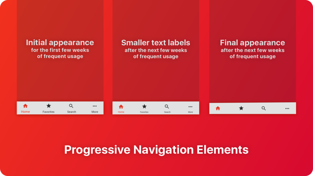
Include text labels where possible.
If it is possible to display a description of the symbol’s action nearby. This is especially important when the user is learning your app. I have mentioned about the concept of “Progressive navigation elements” in the article When Bottom Navigation Fails. Revealing Pain Points. This article is a good compromise between minimalistic aesthetics and good usability.
Ensure good visibility and appropriate touch target.
The good icon is easy to recognize and to interact. To remain the right touch target remember to include 44x44pt of the interactive area for iOS apps and 48x48dp for Material Design.
What size, color or contrast of an icon is the best? It always depends on users. If you would like to Design Apps that do not SUX remember about users with some disabilities.
Simplify symbols.
Icon has to be not only recognizable but also memorable. The simpler symbols are easier to remember. If the concept of the symbol may be painted by a 6-year-old child, you may be sure that it will do the job. However, remember about Einstein’s thought: “Everything should be made as simple as possible, but not simpler”. Too primitive symbols may not be attractive or reflect your brand style.
Make icons consistent.
Users may accept weak aesthetics if the icons are consistent with the platform guidelines. Learn and practice the styles of major digital platforms. It is equally important to prepare symbols consistent with your brand.
Test symbols with users.
All of these tips have to be validated with users. If it will take more than 5 seconds to recognize the symbol – symbol has to be refined. Prepare tests that validate recognizability but also memorability of the icons.
Summing up
Icons are the fundamental parts of our designs and they will be in the future. However, we have to resist the temptation of using them only as a “visual sugar” that enhances the aesthetics but ruins usability.
Always try to validate usage of symbols during tests with the users. This exercise will let your creation remain healthy.
If you would like to share articles like this with other designers – I have a good news for you. I would like to invite you to join UX Misfits Community on Facebook. UX Misfits is a group for open-minded designers who would like to read inspiring articles.
Similar articles:
- When Bottom Navigation Fails? Revealing Pain Points
- Design Apps That Do Not SUX. Accessibility on Mobile.
- Skeuomorphic Design is good. Minimalism is overrated


