We all remember the good old Nokia or Motorola phones with physical buttons. They seemed to be easy to use and convenient piece of technology. But, then iPhone happened and nothing was the same. Now, It seems that present UI of the Car Systems will share the fate of the first smartphones.
Currently, the Automotive Industry is impatiently waiting for someone who will present the iPhone of the Cars. However, Do We have to prepare for more touch screens in our vehicles? Some may say – yes! But, I have serious doubts. Would you like to know how the future of cars may look like from the UI perspective? In this article, I will try to predict some solutions.
A cup of your favorite coffee is ready? Let’s consider what’s wrong now in the automotive industry and try to imagine next big thing there.
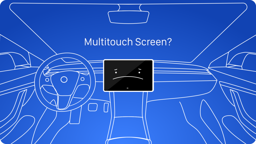
When Elon Musk presented Tesla Model 3 my emotions were ambivalent. The stylish design of the vehicle, minimalistic interior, looks like the recipe for a very tasty cake. But, someone has added a chunk of fatty salt bacon to this sweet meal… Yes, I am writing about the huge touchscreen display which is the only point of interaction with the car systems. I suppose that someone in Tesla did not make enough research, they just followed the latest trends. Why did this happen? The reasons are in the roots of the Post-PC era.
The current state of Automotive UI
After the iPhone presentation everyone fell in love with a multitouch screen technology. Other manufacturers quickly switched their concepts of mobile devices into the Apple-like ones. What is more, the other segments of the tech industry that were also inspired by this type of display. We all saw Laptops and All-In-One PC with touch screens, the fridges even ovens got them. Finally, this trend was adopted into the car displays.
Customers were delighted. Their favorite technology known from the pocket devices has arrived at their vehicles.
The next chapter of the “modern” Car UI has begun when Apple and Google have introduced their extensions to the mobile operating systems for cars.
Both CarPlay and Android Auto seemed to have been a step forward in a world of various car systems. Material Design was familiar with the users and icons of the CarPlay looked like the iPhone attached to the vehicle’s interior. All these “modern” solutions were focused around the Graphical User Interfaces on the touch screen display.
How the companies see the future of the Car UI
The future presented by main car companies visions looks interesting, but it is not completely solving the mentioned issues.
I am really aware when I hear that some manufacturers are removing all physical buttons from the cars, letting the touch screen displays to take all of the controls in the vehicle.
What Car UI should look like
Is the car’s UI really a perfect place for the multitouch? I do not believe that the technology that needs our attention more than a simple physical button, is the future of the Car UX.
Are We able to offer something better for drivers and their safety?
We all know how important is to stay focused when we drive our cars. The GUI presented on a tablet-like device distracts drivers a lot. This is a serious thing, that cannot be ignored. In the opposite physical buttons do not require such attention, you feel them under your fingers before you decide to press it. If you know your vehicle’s interior well you even do not have to look at the buttons.
Some may ask: What about self-driving cars? If we will be able to let the autopilot to take control over our vehicle, we may focus on something different. We can read a news, play games or even work during the drive. But still, it will be much more comfortable to make it on our own phones or tablets than a screen attached to the car dashboard.
Coming back to the cars that are controlled by human beings.
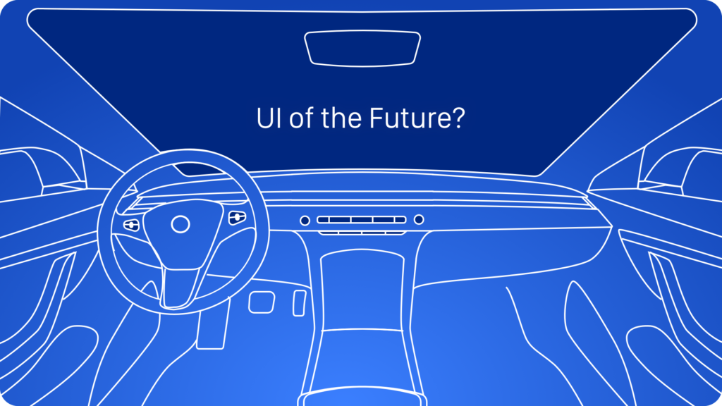
There is much more we can do in terms of Car User Interface there. The Augmented Reality should be the field of intensive research. I believe that the best place for the screen in the car is the windscreen. The Head Up Display technology combined with Extended Reality possibilities will be the perfect solution. The display will drive users attention in the appropriate level. What’s more, it may even help to make some decisions.
Why will windscreen be the best place for display in our cars? Just imagine following use cases:
-
You are waiting for the green light. Your Car Head Up Display displays the counter just under the traffic lights, so you are able to prepare yourself.
-
The first time in a new city, HUD displays the line on the road you see through a windscreen. It leads you to the place you would like to go.
-
You are driving back to home at night. There is a mist everywhere, and you barely see the road. HUD display shows you that there is a pedestrian crossing the road before you are able to see anything. You are able to slow down and stop the car safely.
Displaying content, suggestions, and information on a windscreen using AR technology will be a revolutionary UI. Driving will become much more convenient and safer.
Voice Assistant will be also a powerful ally. We already see assistants like Siri in Apple CarPlay in our vehicles. Verbal communication is much more natural than swiping and tapping glass display.
Voice commands make our life easier while driving. It is hard to search our favorite music or radio while we drive on a touchscreen. With a simple command, it would be a few seconds.
I also believe in physical buttons and controllers in cars, instead of touch screens. The ones on the steering wheel are comfortably reachable, we do not have to look at them to interact.
Extended Reality presented in the HUD combined with a windscreen. Voice Assistant helping us to perform actions and a few physical buttons to control the most needed features of the vehicle. In my opinion, this is a future Car’s User Interface. If there is a place for multitouch displays, they should be our own phones and tablets that will continually integrate with other Car Systems.
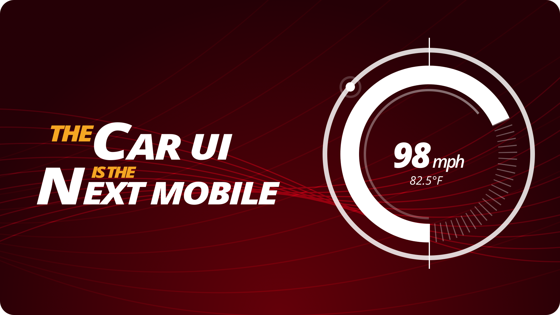
Why Cars UI is the Next Mobile
After the smartphones revolution, there were some innovative devices presented. Tablets and Smartwatches were warmly welcomed in the market, but they did not change industry like mobile.
Why did it not happened with those devices? We have the strong need for communication with each other – and it was perfectly solved by modern Smartphones that were inspired by iPhone. However, there were no serious needs in our souls that tablets or smartwatches could solve better than the smartphones.
Now, think about the cars. They also solve our important need. We have to move fast and we love to travel. We need vehicles to this purpose, but their UI is not so convenient. Like the old smartwatches – they are too complicated and not so convenient. I really believe that one of the companies will finally figure out the perfect recipe for the Car’s UI. When it will be presented to the market, it will be a revolution like those started by iPhone.

Design Faster in Figma and Sketch
Never start Your work from scratch. Use the Kit that already have 1500+ components with well structured styles, variants & auto layout.
Use Prime Design System Kit to boost your workflow. Create for Web, Mobile, and Desktop. You may use it as the entire UI Library for Design System or just create Landing Page for your next Client. Perfect for those who want to save time while creating UI designs and learn best practices of Figma and Sketch at the same time.
To conclude
We always should think of every product like of the delicious meal. Cars, like cakes, have to deliver coherently sweet experiences. Bringing the ingredient from the other world, like touchscreen from mobile phone industry, will create a weird dissonance, like a salty bacon in a strawberry cake.
It is important to carefully consider the technology that should be used in particular product.
If you are a passionate designer with a bit of curiosity and will to question status quo. I have a good news for you. I would like to invite you to join UX Misfits Community on Facebook.
Similar articles:
- Design Apps That Do Not SUX. Accessibility on Mobile.
- When Bottom Navigation Fails? Revealing Pain Points
- Skeuomorphic Design is good. Minimalism is overrated


