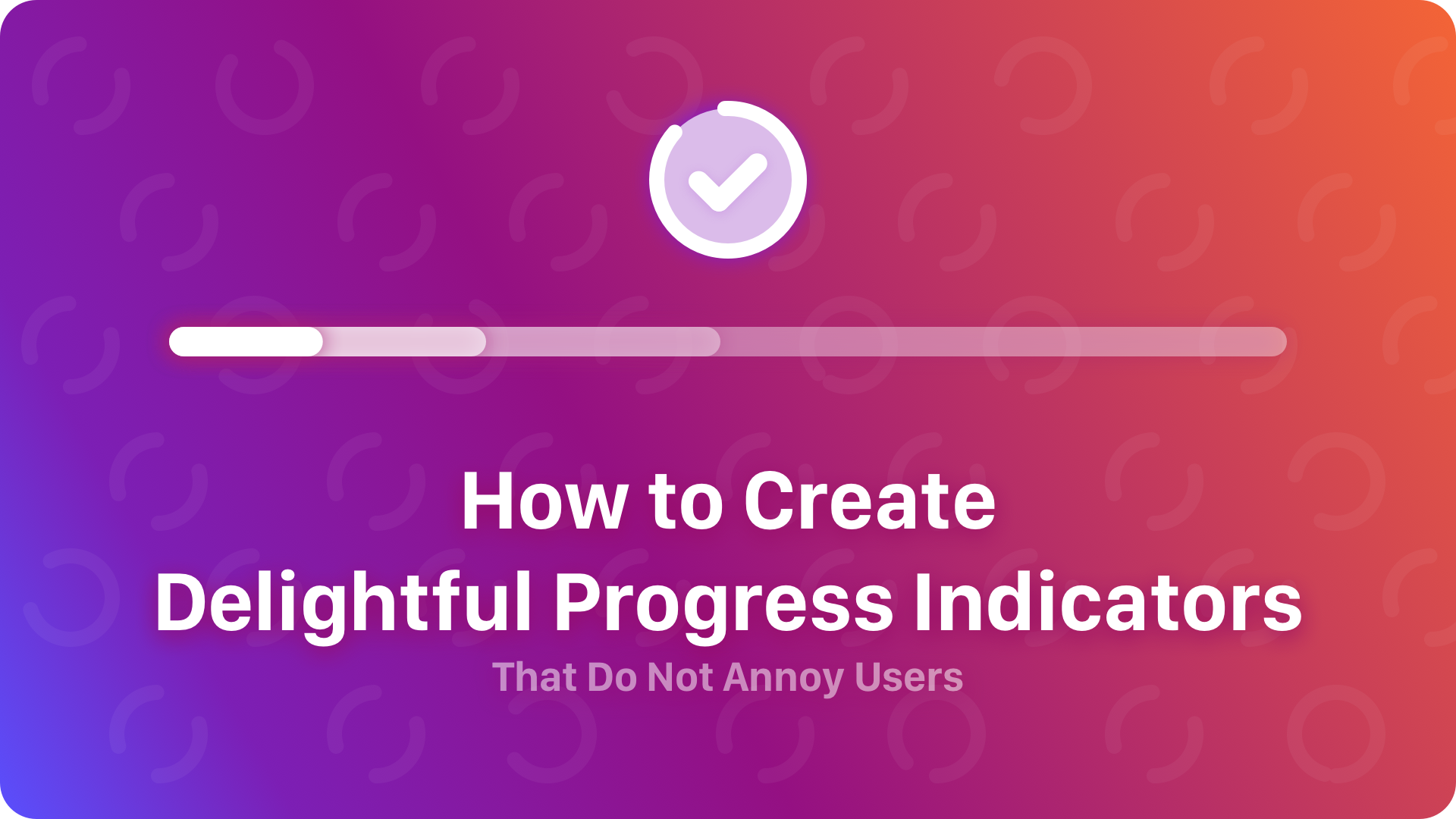
Since the beginning of the digital products there was a need to provide feedback to user when a requested feature was not displayed instantly. Now, we are able not only to inform user about the progress, but also to create a delightful experience.
Why users need progress indicators?
Jacob Nielsen’s first heuristic “Visibility of system status” tells that the system should always keep users informed about what is going on, through appropriate feedback within reasonable time. So we can simply say that every interaction requires feedback. This is why we should display progress indicators.
The progress indicator should be displayed for every background process that takes more than 1 second to finish. If you are not sure if the task will exceed that duration, you may simply wait 1 second and then show the indicator.
Animated feedback is crucial for the user who would like to know if the app is working. Static information or a graphic symbol is not enough. The animated indicator ensures that user will not perceive the task as stopped or suspended.
Animation is one of the fundaments of the successful apps. If you would like to know more about preparing motion design and how it should be implemented by developers, you may get some useful knowledge from this article:
Motion Design Specs – How to Present Animations and Interactions to Developers
What are the types of progress indicators
The main purpose of the progress indicator is to inform user that he has to wait until system finishes loading requested action. There are two types of UI controls that enhance the experience in particular situations.
If the app is able to estimate time, or predict the amount of downloaded data it will be great to display that information. You can simply show how long the operation will take. The perfect solution is the Determinate indicator. It is the UI element displayed to present actual state of elapsed time or downloaded data and the total amount that is needed to finish the task.
If the operation is not determinate, we are not able to estimate time or the data. In this case there is a need to display the Indeterminate indicator. This one usually shows looped animation to inform user about the operation working in the background. Indicator is not able to display how long the task will take.
How to design delightful experience
Beautifully animated progress is a must-have feature, but it does not guarantee good solution’s experience yet. There are some tips to follow to delight user.
Animate the indicator
It does not matter if the progress indicator is determinate or indeterminate. Motion is a fundamental element that has to work like magic.
Display overall time estimation if possible
It is always good to know how long a task will take. The overall duration presented to the user gives him a positive feedback.
Show the precise amount of done steps or work
If it is hard to estimate the time of the operation, but there is a possibility to display the total amount of steps that has to be done – display this type of information. Show which step is currently processing.
Inform why user is waiting
It may be simple information about the need of downloading data. This may be also a hint that there is a slow connection to the internet.
Make progress animation dynamic
Try to use different type of easing than linear for indeterminate indicators. EaseIn, EaseOut or EaseInOut will make the motion more natural. Appropriate setting will also create an illusion of better velocity of the operation.
Add visual detail to amaze and gain focus
Theatricality and distraction may be powerful allies. Use them to create illusion that the whole operation takes less time.
Progress indicator alternative?
Indicators are common UI elements of the digital products. However, there is an powerful alternative that may be successfully implemented.
Empty cards
Presenting the UI element empty layout mockup is becoming more and more important. It creates illusion that the screen already contains content. This technique is useful if you create a solution with repeatable items presented in list or grid view.
Micro games
Showing a simple mini game instead of progress is not popular behavior of the digital products. However, it may be the engaging surprise that will delight your users.
One more thing…
Progress indicators delivered by Android and iOS are elegant but not so much sophisticated. If you would like to delight your users this UI element should be something more than a standard component.
This is why I have prepared a set of 10 animated indeterminate progress indicators. They are available to purchase in UX Misfit Store here:
Powered by Creative Market
The product contains After Effects project file, videos and .json file exported by Bodymovin plugin. Progress animations may be quickly implemented in your Android, iOS or Web app if you will use Lottie library.
Bonus
If you would like to see sample file and see if this will work with your solution. You are welcome to join to the UX Misfits Community on Facebook and get the one free progress indicator from the set. Just join the the group and find the post with the following article. Link for download free progress will be included in a post.
To conlude
Every interaction requires a feedback. Progress indicators take care about this in a situation that user has to wait. Always use animation in your indicators. Try to surprise and delight your users to deliver better experience.


