There are lots of blog post around the web where the simplicity is presented as the fundamental element of good User Experience.
Paradoxically it is much easier to build complex products full of hypothetically must-have features. True simplicity is hard to achieve, but there are some helpful techniques.
Let’s take a closer look and analyze the ways of achieving it.
Remove unnecessary features
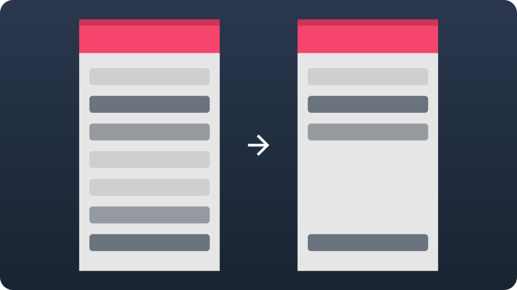
This is the most obvious tip of all from this article. In the other hand, there is always a temptation to create all-in-one products. The common myth says that more options and features your solution will have, the more users will want to get it. However, truth is different. There is a very high possibility users will need only 20% of the features. The good research and ability to focus on the important subjects will help you achieve this type of simplicity.
Organize information
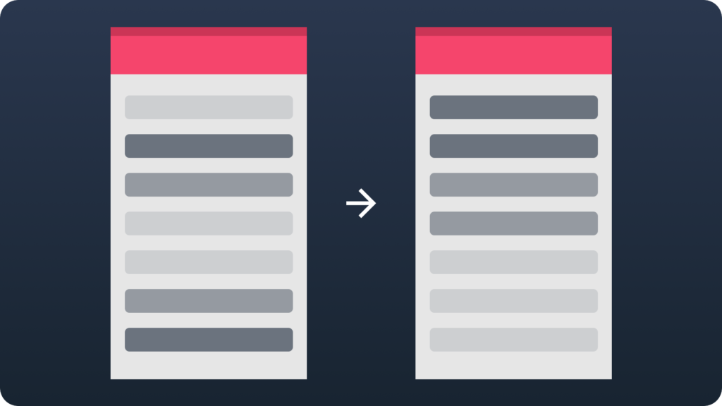
False complexity of the solution is accidentally created by wrong information architecture. Divide content into smaller pieces. Organize information and features into a meaningful groups. Highlight and prioritize the most important ones. Look how users perceive the content and find the connotations. Very often this trick will do the work and your solution will become more convenient to use.
Relocate

This is a perfect advice for products that works on multiple platforms. Some features of the multi channel solutions will not work on particular devices. For example smartwatches need only basic features. The ones reachable in a few seconds. More complex tasks will be completed on a smartphone or a tablet or PC. If a smartwatch app would have the same features like a mobile app or a web one, it would become too complex to use in an efficient way.
Hide elements
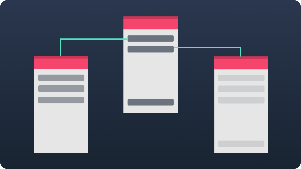
Hiding is perfect for necessary features that are not used frequently. Make the main window clear and focused on delivering only fundamental and most needed information. Move the rest to the other screens. Hiding some features will let you create an impression of simplicity for even very complex systems. Advanced users searching for the rich functionality will be also able to find them hidden in a sort of menu.
Mix of all options

Every solution is different. Sometimes a satisfying level of simplicity is achieved by using only one of above advices. However, the complex systems will need more than a one option to achieve it. This is why it is good to know all of above to apply them in particular situations.
Summing Up
Simplicity may be achieved by many ways. Every designer has to go through a complex process to discover the best way of product’s simplicity. There is no such thing as one simple solution for everything.
Always validate which option will work with your app. Also remember that “simple” does not have to mean “minimalistic”.
The last tip for the ones who want to design better:
If you are one of the Designers who would like to get an unique insight to UX Design – feel free to join to the UX Misfits Group on Facebook here!
