
The recent discussion in social media about a good and bad side of skeuomorphism and minimalism in UI design started by this article had the inspiring results. It showed that we should focus on making minimalistic user interfaces more understandable for people. Skeuomorphic design will not probably return as a major trend in UI design.
Let’s try to analyze how to help users understand our digital products better.
Follow the platform guidelines
Users that use their iPhone or Android Device for a few weeks should be familiar with the basic patterns from mentioned platforms. As the designers we should keep in mind that reusing this elements will make the solution easier to understand by users.
Create a consistent visual strategy
If you design a consequent User Interface, even if it is not so familiar from the very beginning, its strategy will make it intuitive in eyes of the user. He will learn the solution in time. Remember to reuse the same style for buttons, labels and other UI elements across the product. The right visual hierarchy and nomenclature transforms the uncomfortable product into the more accessible one.
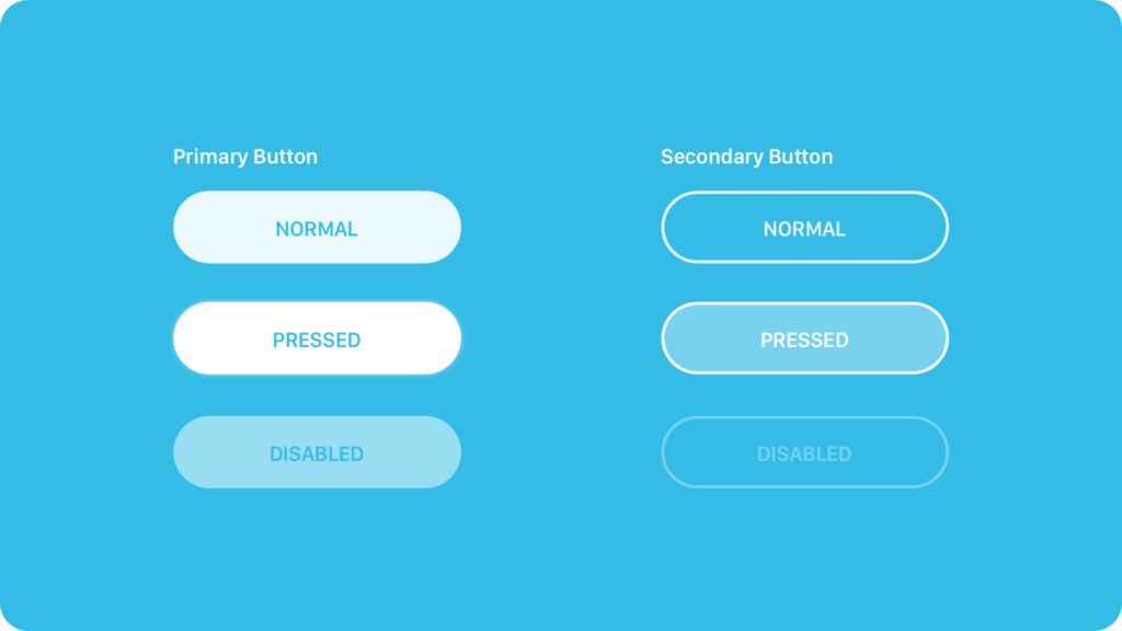
Use more shapes than lines
Minimalistic design is more than a typography. However, using only outlines or lines itself to highlight interactive elements may be misleading. User’s eyes recognizes shapes faster and perceive them as more interactive. Look at the evolution of iOS from 7 to 10. We may even predict this trend will continue in iOS 11
Use an animation to encourage an interaction
Apps are not static screenshots. Digital products live and should communicate its behavior to users. In minimalistic UI it is even more important to create the appropriate motion design. Motion leads users attention into the desired point, it helps to understand how the feature works and finally – delights user.
If you would like to know how to prepare a good motion design specification for the developers here are some useful tips
Use precise vocabulary
The information architecture is always important, but when there is no additional ornamentation to suggest an action it is crucial to treat this matter with a special care. For example, all primary action buttons should have the labels that clearly define the action like “Sign-in” or “Register account”. Buttons with just “OK”, “Done” and “Next” labels do not help a user to understand what will happen in many cases.
Break patterns when it is necessary
It is good to create visually consistent strategy across the app. However, humans are not robots. If your research will show that the element of the strategy that works perfectly in several functionalities will not work in a one case – consider making an exception and adjust it to users expectations. Design is always made for people. Solution has to be intuitive for them in the first place. Even flat and minimalistic GUI of iOS has some 3D elements like the Switch, Slider or Tabs in Safari. Know the rules, but break them if it will help your users.
Summing up
Minimalistic UI Design is on demand. It is a trend that will stay here for at least a few years. If you create UI of the digital products remember this tips to design intuitive ones.
In the other hand, if you are one of the enthusiasts of skeuomorphic approach, here is an article for you.
One more thing…
If you are one of the Designers who would like to get an unique insight to UX Design feel free to join to the UX Misfits Group on Facebook here!


