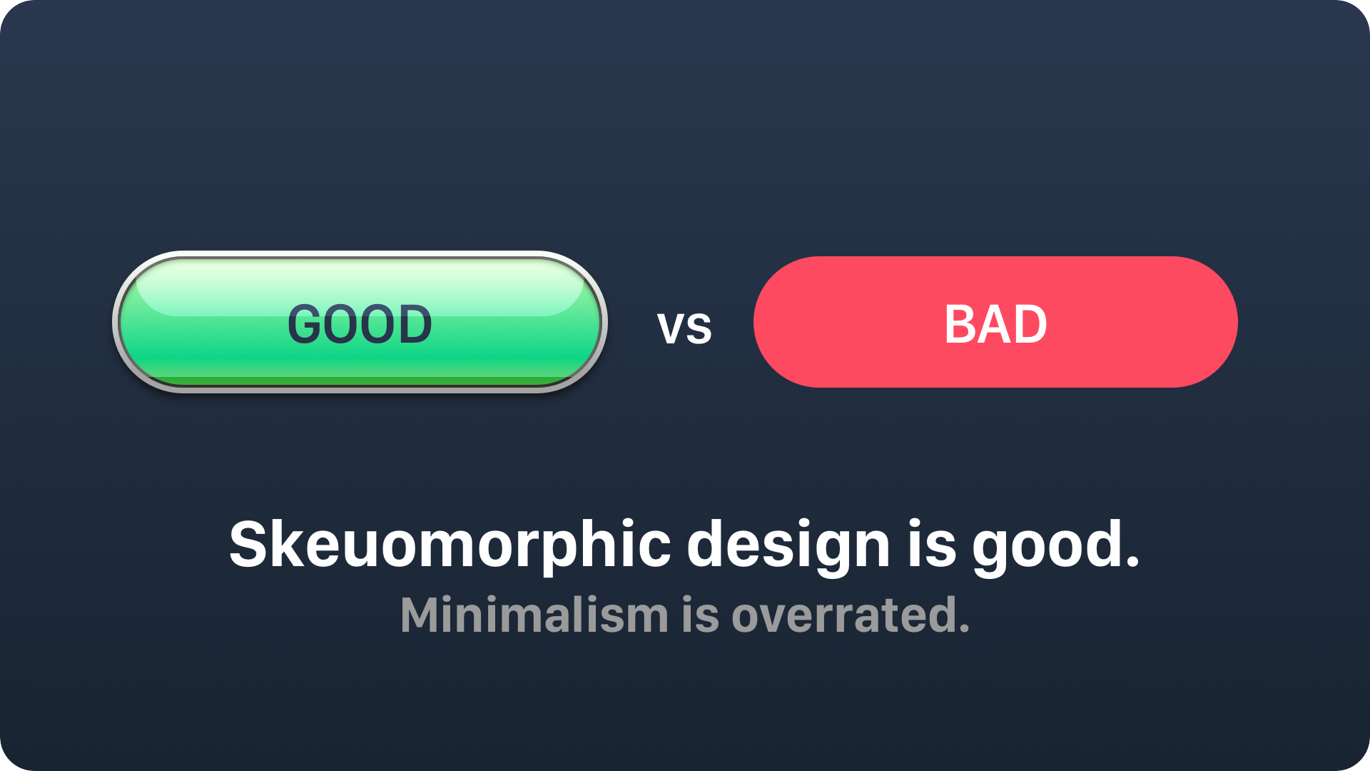
We all love to follow new design trends. However, have you ever validated how they impact the usability of your app? Last years the minimalism is glorified as the best solution for your digital products, but is it always a truth? Let’s try to analyze why it may be only an illusion.
Minimalism
With Windows Phone 7 and Metro Design (later Modern Design) Microsoft brought the minimalistic approach to a digital design to the world of apps. It was the time when iOS and Android User Interfaces where rich of visual ornaments and textures. For the few first years concept “content over chrome” was a niche.
However, when Jony Ive presented the concept of iOS 7, the others followed the idea. It was a controversial change, but in the next weeks designers started to refresh a design to the new flat style.
Next, on Google I/0 2014 conference the Material Design was introduced. It was not so flat, but still minimalistic. This powerful visual framework was the final step for the minimalistic UI design domination in the market.
Now, when almost every app does is aligned to the new trends, we should ask ourselves a question: Is this really good for all users?

Skeuomorphism
Concept of skeuomorphism is used in design almost since the beginning of Graphical User Interfaces. It is an emulation of esthetics of real world objects in a digital screen. The culmination of this trend has began when the The first iPhone introduced the revolutionary Multi Touch Interface.
With the first versions of iOS users where amazed by glossy icons, apps with rich textures. Notepad has an outstanding UI with paper and leather finish. Calculator looked as it was made of a high quality plastic.
Designers followed this principles and the rat race has began. You still can search popular Designer’s platforms for lovely crafted icons that are small pieces of art.
When minimalism does not work
Heavily promoted minimalistic approach to design causes confusion for some groups of users. Minimalistic solutions does not provide clues how to interact with specific elements, so people with less technical skills may have some difficulties.
If you design a solution for people that are not so familiar with digital devices, skeuomorphic approach to the app’s UI will be more understandable for them. Consider sacrificing the fashionable UI for the better usability.
The main principle of the minimalistic UI – content over chrome may lead to the less interactive solution in the eyes of the users. It is sure that minimal design can be more readable, but the people need to interact with apps to accomplish tasks.
Very often flat UI is going too far. Solid shapes or colorful labels are often not perceived as an interactive elements of the solution.
Young children or older people that begin their journey with digital products will treat apps designed this way as a more difficult to learn. The skeuomorphic elements of the UI are the most effective solution in those cases.
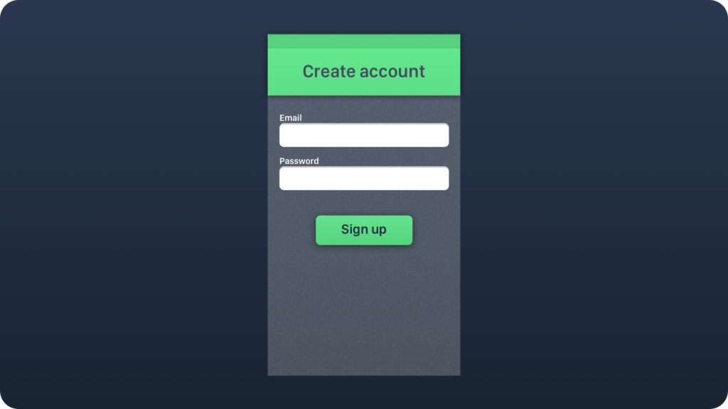
Skeuomorphism is present even in a minimalistic design
Skeuomorphic elements are event present in most flat and minimalistic UI designs.
Look at these examples. The first, the Switch UI Control from iOS. The whole mobile OS is flat, but the Switch is still 3D with some drop shadow. It makes it much more intuitive. Next, the tabs in Safari mobile app – they present pages in 3D. Even default weather app heavily implemented skeuomorphic patterns.
Successfully implemented aesthetics from a real world makes the solutions much more intuitive. This compromise is a good thing for the users.
Summary
Minimalistic and Flat design is now on demand. However, do not be too fanatic while implementing mentioned design approach. Skeuomorphic elements are good in many cases. They may be used even with flat UI when it is necessary to increase the usability and makes the product more user-friendly.
If you are one of the Designers who would like to get a unique insight to UX Design feel free to join to the UX Misfits Group on Facebook here!


